
|
|
The plugins that consistently dominate the plugin scene have a few things in common: they work as advertised, have few conflict issues, and are regularly updated. But more important than all of that? They provide a great UX.
The beauty of WordPress lies in its plugins. They allow you to extend your WordPress website and turn it from a simple blog into a full-fledged website with capabilities such as online menu ordering, eCommerce, appointment booking, learning platforms, membership websites, and so much more.
And while plugins allow complete beginners and non-coders to create complex websites, not all plugins are created equal. Some plugins offer great functionality and have high rankings and download rates. Some are just plain bad, usually due to the fact they don’t work as intended or are executed poorly.
The ones who consistently dominate the plugin scene though have a few things in common: they work as advertised, they have very few conflict issues, and they are regularly maintained and updated. But more important than all of that? They provide a great user experience.
So how can you make sure your plugin stands out from the rest, is easy to use, and overall is a pleasure to work with?
The idea for this post came from a question posted to a Facebook group by Mr. Nathan Porter:
What has been your experience with a post install welcome page? Do you find it to be useful to your plugin users? Does it increase conversion to known users?
We thought this question deserves an in-depth look, so in this post, we’ll provide you with tips and guidance that will help you ensure your plugin exceeds all expectations when it comes to the first-time user’s experience.
What is UX and Why Does It Matter?
User Experience or UX should be the top priority of developers and designers. It’s a complex subject and there are many books, articles, and case studies on the topic. But to put it simply, the concept of UX revolves around the emotional experience of a user and involves a person’s behaviors, attitudes, and emotions about using a particular product.
A good UX will leave the user satisfied rather than overwhelmed and confused. When it comes to WordPress plugins, this means your plugin should be easy to install, easy to set up, and easy to use.
The free version should offer an intuitive, delightful first-time user experience so that users simply cannot resist buying the premium version.
By making sure your plugin provides the best possible user experience, you increase the chances of users leaving a good review and recommending your plugin to other WordPress users. On top of that, if you offer both free and paid versions of your plugin, the free version should delight them in such a way that they cannot resist buying the premium version.
In the long run, a great user experience not only benefits the users of your plugin but you, the plugin author as well, because it leads to better conversion rates.
There are many ways to improve the UX of your plugin, but the simplest solution can be found by including a post-install welcome screen or a small dialogue box.
How to Improve the UX of Your Plugin With a Welcome Screen or a Dialogue Box
Nowadays, a good majority of WordPress users expect plugins to work with minimal, or without any setup required. Most website owners are also small business owners juggling multiple roles and don’t have time to read through pages and pages of documentation or search through your knowledge base.
Adding a welcome screen that explains where the plugin settings can be found and guide them through the setup can greatly improve the user experience in WordPress plugins. This solution would work particularly well for more complex ones.
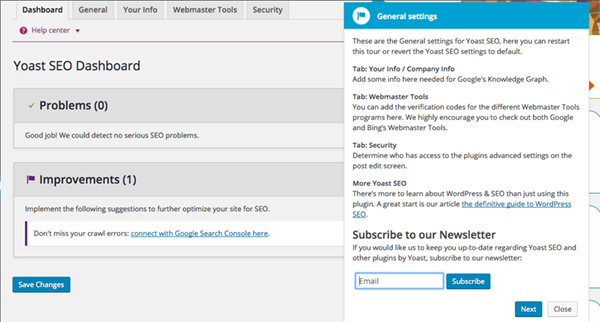
A great example of this approach in action is WordPress SEO by Yoast plugin which pops up with small boxes immediately after activation that gives a quick overview of the plugin settings.
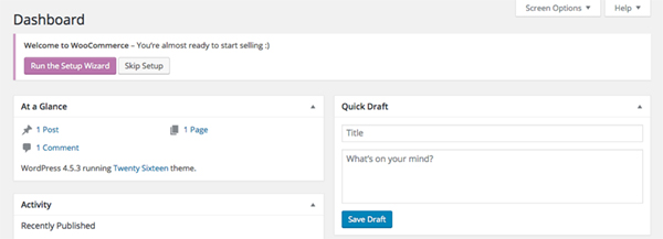
A similar example is found after activation of WooCommerce, whose welcome screen has a call to action that encourages the user to begin the setup process. The user is then guided through the basic setup needed for WooCommerce to work and the final page explains where the rest of the settings can be found.
A similar thing can be achieved with an unobtrusive dialogue box that points the user towards the settings and gives a quick walkthrough of the plugin’s interface which would add a nice touch in the case of simple plugins that don’t have a lot of options.
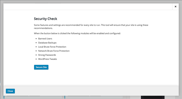
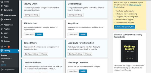
A very elegant solution could also be a dialogue box that offers one-click activation of the plugin’s recommended settings like in the case of the iThemes Security plugin. Given how complex iThemes Security is, adding this feature doesn’t leave the user feeling overwhelmed and reduces the chances of them configuring settings the wrong way.
Aside from adding a welcome screen or a dialogue box, there are a number of ways to improve the user experience of your WordPress plugin. Let’s address some of them below.
Make the Interface Familiar
Whenever possible, try to make sure that your plugin’s user interface tightly integrates with the core WordPress user interface. It makes your plugin look better and assures the user they didn’t install something completely unrelated to WordPress. If you are concerned about establishing your brand, there are ways to do it without employing a user interface that is all about your brand and looks completely foreign.
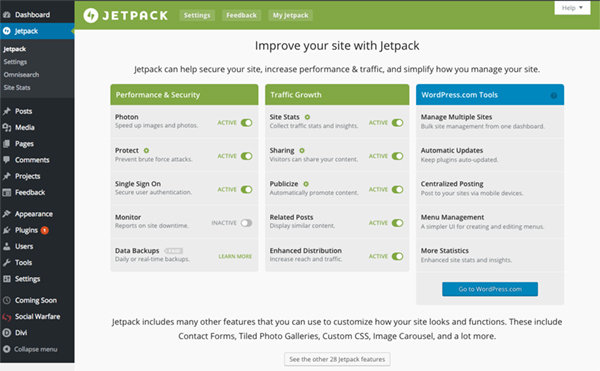
A good example of incorporating branding in the core WordPress user interface is Jetpack with its recognizable green color. As you can see, they managed to be on brand and still maintain the overall look and feel of WordPress UI.
Likewise, do keep all the plugin settings in the same interface, rather than scattering them throughout the dashboard. There are plugins that keep most of the settings in the same admin area but then hide the activation key in places like General Settings or Reading settings.
Keep the admin area of your plugin as simple as possible and similar settings grouped together for the most intuitive approach.
Consider the Placement of Your Plugin’s Menu
It’s natural that your plugin comes with its own admin menu. However, where you place that menu plays an important role. Some plugins have their own menu in the dashboard sidebar.
Some of them include their plugin menu in both the sidebar menu and the admin bar, utilizing the admin bar as a way of quickly accessing the most important features of the plugin.
Another benefit of this approach is the fact that the user can easily access those features from the front-end of the website.
Adding a plugin menu in the admin bar means users can access from the site’s front-end.
Placing your plugin’s menu as an individual menu item on the sidebar has the most sense because it’s easily accessible.
Considering many novice WordPress users can find the WordPress dashboard a bit overwhelming, hiding your plugin’s menu isn’t recommended. While it may seem intuitive to place it as a sub-menu under the general Settings menu or under Tools, a first-time user might not find it so obvious. This can lead to frustration as they have to click through different menus to find the settings for a particular plugin.
Consider placing your menu either below the rest of the menu items or as close as possible to the directly related menu. For example, if your plugin adds a portfolio or a slider functionality, it makes sense to have that menu in close proximity to Posts or Pages as it’s closely related to those two.
Setup a Demo Area
Another way to improve the user experience is to automatically create a sandbox environment by creating a draft of a post or a page that is integrated with your plugin and points the user to it from the previously mentioned welcome dialogue box. The draft in question could show how the plugin works. A useful addition would be to include the link to the editor or the plugin settings depending on your plugin’s functionality.
Have a dedicated demo area where people can test the plugin before installing it. A sense of familiarity increases the conversion rate.
A different way to approach this is to point users towards a dedicated demo area where they can test the plugin even before installing it. This would allow them to have the full experience of your plugin in action and go through all the settings and options without the fear of the plugin breaking their site. Having a sense of familiarity increases the chances of users opting to install your plugin.
Include Clear, Descriptive Names in Plugin Settings
Make sure all the plugin settings have clear and descriptive names that give clues as to what each particular setting does. It helps when you can be extremely precise as to what each setting changes so as not to confuse the user or to make sure all settings are working as intended.
Include Important Information and Make it Obvious
Even though the majority of users want the plugin to work almost out of the box, don’t forget to include relevant information such as a link to the support area for your plugin, your preferred contact method, a link to the knowledgebase or FAQ section, as well as a link to a premium version of the plugin if it exists.
You can also include a link for users to leave a rating and a review of your plugin but do make sure there is a way to turn it off after they have left a review or if they’d rather not do it. Constantly leaving it there might eventually lead them to leave a review just to turn that feature off, but it can also lead to frustration causing the user to leave a negative review simply because the constant nagging was getting annoying.
If your plugin requires another plugin to function as intended, as is the case with Genesis Connect for WooCommerce or Site Origin Page Builder, make that information as obvious as you can and include a menu item or a dialogue box which takes the user to the plugin installation screen where they can immediately install the required plugins.
Add Contextual Help Menus
Instead of including full-featured documentation in the plugin, some plugin authors chose to include contextual help menus marked by a question mark next to a particular setting or a Learn More button. When clicked, a box pops up with a short explanation of what the setting does or how it’s meant to be configured. This is a nice way of providing an immediate answer and helps reduce the chances of possible confusion.
Final Thoughts
The list of suggestions mentioned above is by no means complete. Likewise, you don’t have to implement all of the suggestions, especially if your plugin is a simple one with basic functionality. But if your plugin is more complex, then improving the user experience should be high on your priority list.
As a final word of note if you’re not sure whether what you are doing provides the best user experience, don’t be afraid to seek outside help and consult with someone who knows. Many people who work with WordPress on a daily basis are actually experts in user experience and accessibility. Asking for help while you are still working on the plugin leads to better-informed decisions and a product that leaves a great impression on its users.
Now over to you. What elements do you feel improve the UX for first-time plugin users?


Nice read!
I actually wrote about WordPress products and UX. Mentioned freemius in the latest article.
✔︎ 1. https://ahmda.ws/WPLUXp1
✔︎ 2. https://ahmda.ws/WPLUXp2
✔︎ 3. https://ahmda.ws/WPLUXp3
Very insightful pieces, Ahmad.
Thanks for sharing and enriching the knowledge on the topic!