# Various Components and Features
The React Starter Kit includes the following components. Please note that in all `import` statements, we assume you have set up the `@` [path alias](https://ui.shadcn.com/docs/components-json#aliases) in your project.
## Checkout Components[](#checkout-components "Direct link to Checkout Components")
You can use the following components to monetize your application with subscriptions or one-off purchases from Freemius.
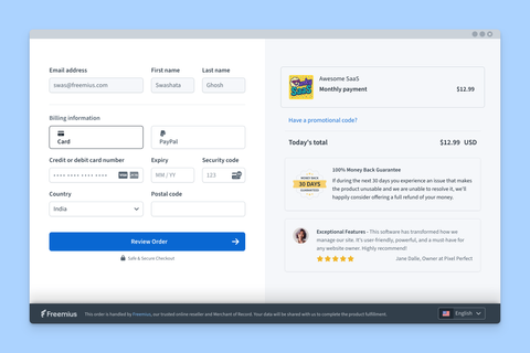
### Checkout Provider[](#checkout-provider "Direct link to Checkout Provider")
All Checkout-related components, as well as the Customer Portal component, must be wrapped in the `CheckoutProvider` component, which provides the necessary context.
The component requires two props:
* The [endpoint](https://freemius.com/help/help/documentation/saas-sdk/react-starter/installation/.md#setting-up-the-required-api-endpoints) from which to obtain the checkout data.
* The [configuration options](https://freemius.com/help/help/documentation/checkout/integration/freemius-checkout-buy-button/.md#arguments) to pass to Freemius Checkout.
```
import { type CheckoutOptions } from '@freemius/checkout';
import { CheckoutProvider } from '@/react-starter/components/checkout-provider';
const endpoint = process.env.PUBLIC_URL + '/api/checkout';
// @note - The `checkout` object must not change between renders to avoid unnecessary re-renders of the context provider.
const checkout: CheckoutSerialized = {
options: { product_id: process.env.PUBLIC_FREEMIUS_PRODUCT_ID! },
link: `https://checkout.freemius.com/${process.env.PUBLIC_FREEMIUS_PRODUCT_ID}/`,
};
export default function App() {
return (
{/* Your app components */}
);
}
```
Using the [JavaScript SDK](https://freemius.com/help/help/documentation/saas-sdk/js-sdk/checkout/.md#generating-checkout-options), you can also create the `checkout` object on your backend and pass it to your frontend.
In the example below, we show how to use `freemius.checkout` to create options on the server with user data.
```
import { freemius } from '@/lib/freemius';
import { auth } from '@/lib/auth';
export async function getServerSideProps() {
const session = await auth.api.getSession({
headers: await headers(),
});
const checkout = await freemius.checkout.create({
user: session?.user,
isSandbox: process.env.NODE_ENV !== 'production',
});
return {
props: {
checkout: checkout.serialize(),
},
};
}
```
To use Checkout anywhere in your application, you can leverage the `useCheckout` hook, which returns a [Freemius Checkout](https://github.com/Freemius/freemius-checkout-js/?tab=readme-ov-file#instantiate-the-class) object.
```
import { useCheckout } from '@/react-starter/hooks/checkout';
export default function SomeComponent() {
const checkout = useCheckout();
return ;
}
```
Customization
The `CheckoutProvider` component accepts various props to customize its behavior. See this [implementation example](https://github.com/Freemius/freemius-js/blob/main/packages/saas-kit/src/components/checkout-with-confetti-provider.tsx), which displays confetti on successful checkout.
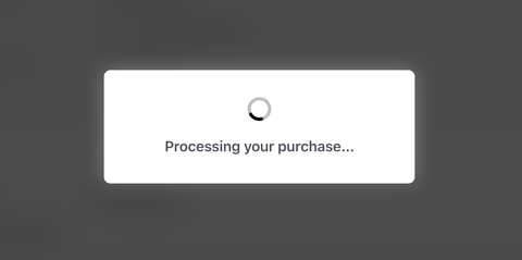
Once the checkout is successful, the component will automatically send the post-purchase data to the backend, and your API handler can process it accordingly.
note
All of the components below must be used within the `CheckoutProvider` component.
### Paywall[](#paywall "Direct link to Paywall")
The `Paywall` component allows you to easily place a feature behind a paywall. The idea is that the UI responsible for the feature is not blocked, but when the user tries to use it, the paywall is displayed.
With the `Paywall` component, you can display an attractive pricing table tailored to subscriptions or one-off purchases. The component will appear in an overlay, allowing the user to either subscribe or top up their account.
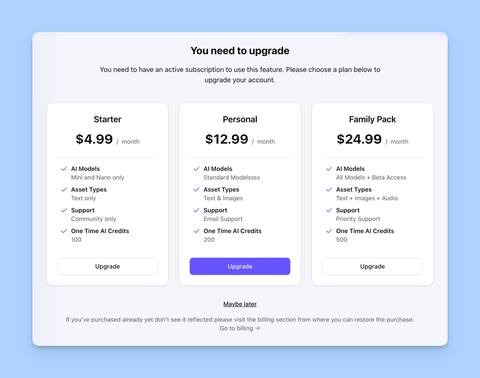
Here's how to use it:
```
import { Button } from '@/components/ui/button';
import { Paywall, usePaywall } from '@/react-starter/components/paywall';
export default function PaywallDemo() {
const { state, showNoActivePurchase, showInsufficientCredits, hidePaywall } =
usePaywall();
return (
<>
);
}
```
While the example above shows how to trigger the paywall, a more real-world use case can be [found here](https://github.com/Freemius/freemius-js/blob/main/packages/saas-kit/src/app/chat/ai-app.tsx).
### Subscription Plans Table[](#subscription-plans-table "Direct link to Subscription Plans Table")
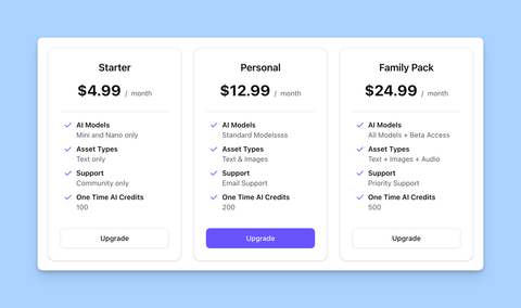
The `Subscribe` component allows you to display a dynamic pricing table for subscription plans. It fetches the available plans from the backend and manages the subscription process.
```
import { Subscribe } from '@/react-starter/components/subscribe';
export default function PricingPage() {
return ;
}
```
### One-off Purchase Table[](#one-off-purchase-table "Direct link to One-off Purchase Table")
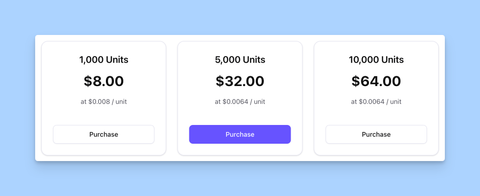
If you are selling consumable units (such as credits) or one-off purchases, you can use the `Topup` component to display a dynamic pricing table for those.
```
import { Topup } from '@/react-starter/components/topup';
export default function PricingPage() {
return ;
}
```
### Creating Custom Checkout Buttons[](#creating-custom-checkout-buttons "Direct link to Creating Custom Checkout Buttons")
After wrapping your application with the `CheckoutProvider`, you can create custom checkout buttons using the `useCheckout` hook. The example below shows two buttons: one opens the overlay in trial mode, and the other opens it in purchase mode:
```
export default function PurchasePage() {
const checkout = useCheckout();
return (
-
);
}
```
Full list of options that can be passed to the `checkout.open()` method can be found [here](https://freemius.com/help/help/documentation/checkout/integration/freemius-checkout-buy-button/.md).
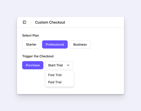
For a more comprehensive example like the screenshot above, refer to this [example implementation](https://github.com/Freemius/freemius-js/blob/main/packages/saas-kit/src/app/custom-checkout/checkout-demo.tsx).
## Customer Portal Component[](#customer-portal-component "Direct link to Customer Portal Component")
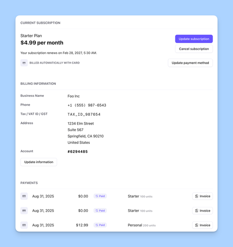
The `CustomerPortal` component provides a secure way for your customers to manage their subscriptions and billing information. It offers the following features:
1. Display current active subscriptions.
2. Manage payment methods.
3. Upgrade or downgrade subscriptions.
4. Cancel subscriptions. The mechanism includes a cancellation survey and feedback form, and also provides an option to reduce churn by offering a discount.
5. Manage billing information.
6. Download invoices.
Cancellation Coupon
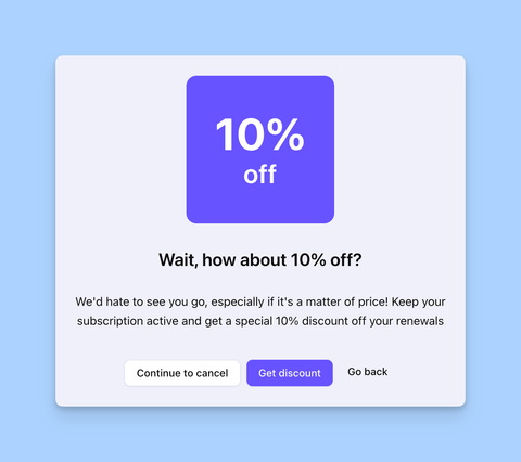
To reduce churn, we recommend offering a [discount coupon](https://freemius.com/help/help/documentation/marketing-automation/special-coupons-discounts/.md#subscription-cancellation-coupon). The Customer Portal will automatically offer to apply the coupon when a user tries to cancel their subscription.
Using the component is straightforward. It only requires an [`endpoint`](https://freemius.com/help/help/documentation/saas-sdk/react-starter/installation/.md#setting-up-the-required-api-endpoints) prop, which is the API endpoint that serves the Customer Portal data.
```
import { CustomerPortal } from '@/react-starter/components/customer-portal';
import { CheckoutProvider } from '@/react-starter/components/checkout-provider';
import { type CheckoutOptions } from '@freemius/checkout';
const checkoutEndpoint = process.env.PUBLIC_URL + '/api/checkout';
const checkoutOptions: CheckoutOptions = {
product_id: process.env.PUBLIC_FREEMIUS_PRODUCT_ID!,
};
const portalEndpoint = process.env.PUBLIC_URL + '/api/portal';
export default function AccountPage() {
return (
);
}
```
Please note that you must wrap the `CustomerPortal` component within the `CheckoutProvider` component to provide the necessary context.
### Subscription & Upgrade Flow[](#subscription--upgrade-flow "Direct link to Subscription & Upgrade Flow")
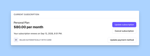
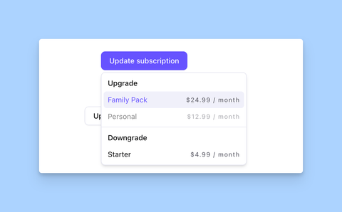
The **Current Subscription** section displays the currently active subscription for the user.
Single Subscription Per User
Freemius allows you to [limit a single active subscription per user](https://freemius.com/help/help/documentation/saas/saas-integration/.md#restricting-or-relaxing-single-subscription-per-user), providing a better experience for your customers.
The UI allows the user to upgrade or downgrade the subscription to another plan.
### Cancellation Flow[](#cancellation-flow "Direct link to Cancellation Flow")
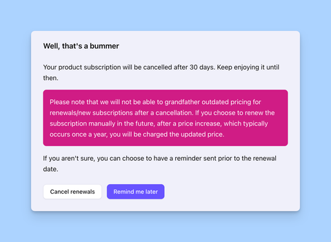
When the user clicks the **Cancel subscription** button, a wizard is displayed to guide the user through the cancellation process. It starts with a disclaimer:
If a discount coupon is configured for cancellations, the user is offered the option to apply it:
Finally, the user is asked to provide feedback on why they are cancelling:
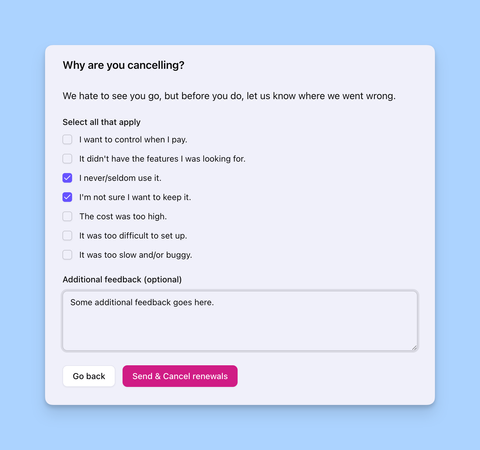
The last step is optional, and the user can skip the feedback and cancel the subscription directly.
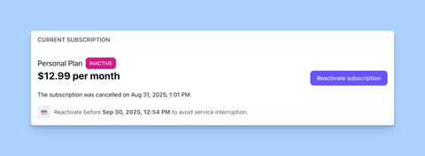
Once the cancellation is confirmed, the subscription is canceled immediately, but the license remains active until the end of the current billing cycle.
The UI also displays the canceled subscription with the end date:
### Billing Information[](#billing-information "Direct link to Billing Information")
The component includes a built-in billing information UI.
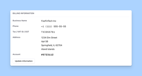
Your customers can update their billing information directly from the Customer Portal by clicking the **Update** button.
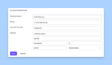
The changes are reflected in their invoice.
### Payments and Invoices[](#payments-and-invoices "Direct link to Payments and Invoices")
The last section of the portal displays all the payments the customer has made.
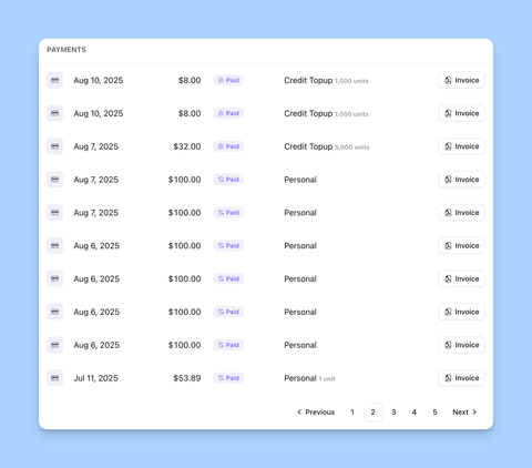
They can click the **Invoice** button to download the invoice for each payment.