New geolocation-based payments distribution chart & Audience Analytics charts UX improvements
Geo Payments chart (Sales Analytics dashboard)
We are super happy to announce the immediate availability of a geolocation-based payments distribution chart. This chart shows the total distribution of payments by geolocation or country.
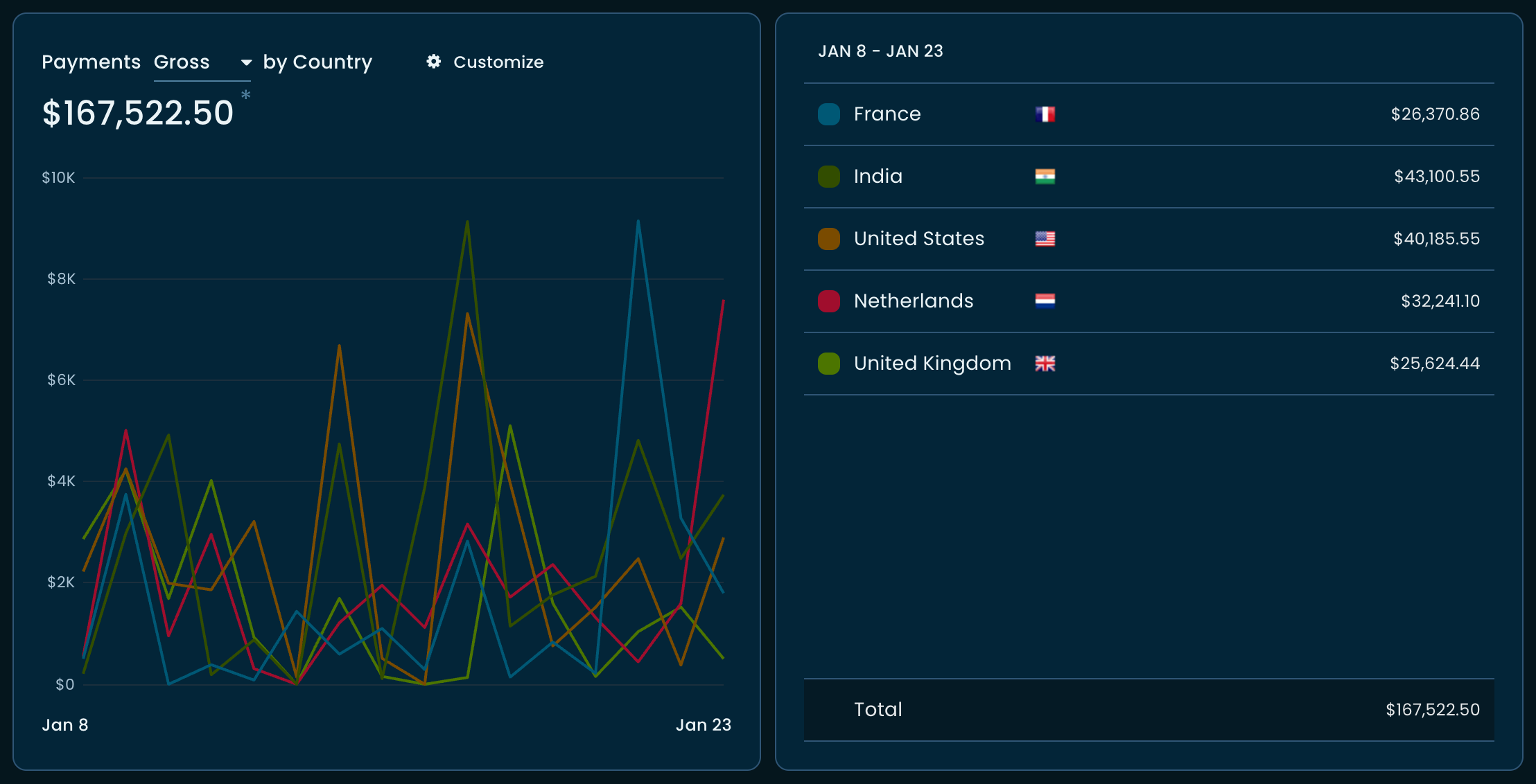
The chart helps determine the country of your major target audience.
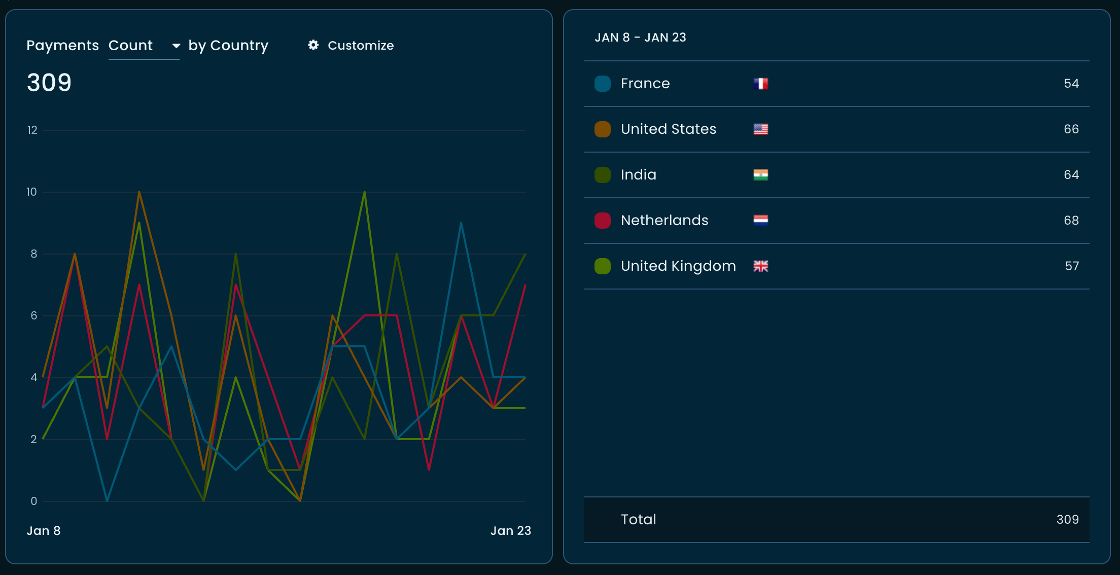
The chart also shows the gross volume of payments that occurred per day distributed over countries by default. It can also show the payment count (instead of gross).
You can also customize the chart to show the total gross volume of payments that occurred from the beginning to the selected day, plotted over a stacked area chart or a simple area chart, along with a tabular view to see the total volume of payment gross and payment count until the end date.
Enhancements to the existing Audience Analytics charts
Following the development of the Geo Payments chart, we piggybacked the features to the existing charts in the Audience Analytics page.
As you can see, the charts can now be plotted as ‘Area’ or ‘Diff’, along with the already existing ‘Stacked Area’ visualization.