Various UI/UX enhancements for the Developer Dashboard
With this week’s deployment, we are bringing some small yet meaningful enhancements to the Developer Dashboard. Please read below.
Dismiss option under store dashboard page
We’ve been showing a small notice under the store page to mention the list of products the data is relevant for.
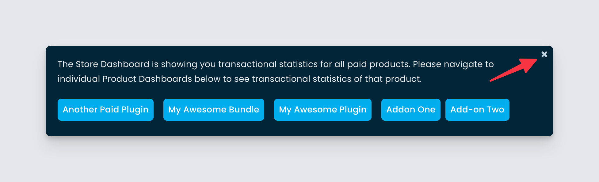
This notice can become overwhelming for stores with many products, taking up much real estate. Our partners suggested that we introduce an option to remove the notice. In this update, we did just that. Now you can click the close icon to make the notice disappear and it will not appear again under the same browser.
Icons to clarify the source of different entities
We’ve been offering migration services to partners coming from different platforms like EDD, CodeCanyon, ThemeForest, etc. We not only offer the first-time migration of payments, subscriptions, licenses, etc, but we also do ongoing sync for incoming payments from the subscription of the previous platforms. We do this to give a seamless licensing experience to the buyers.
As an advantage, partners can see the existing subscriptions and associated payments in the Developer Dashboard. But we understand the list can become confusing when there is a mixture of Freemius-sourced entities and migrated entities.
![]()
To solve this, we have introduced a new icon in the columns, which will indicate whether the entity came from Freemius or the old platform. Please note the icons will show up when there are any migrated entities to save real estate.
Other fixes
- We fixed some alignment issues in different UIs.
- We made improvements to the different icons we show throughout the app.