Better Metrics, Navigation, and Cleanup in Developer Dashboard
This week we’re rolling out various quality of life improvements to the Developer Dashboard.
Corrected Metric Badge Indicators
We identified an issue where some metric badges on the Analytics Dashboard page (for WordPress products) were showing incorrect comparisons. For example, a decrease in trial cancellation count was still marked in red with a downward arrow, indicating a negative change, whereas it is conceptually positive. This has now been corrected across relevant metrics.
![]()
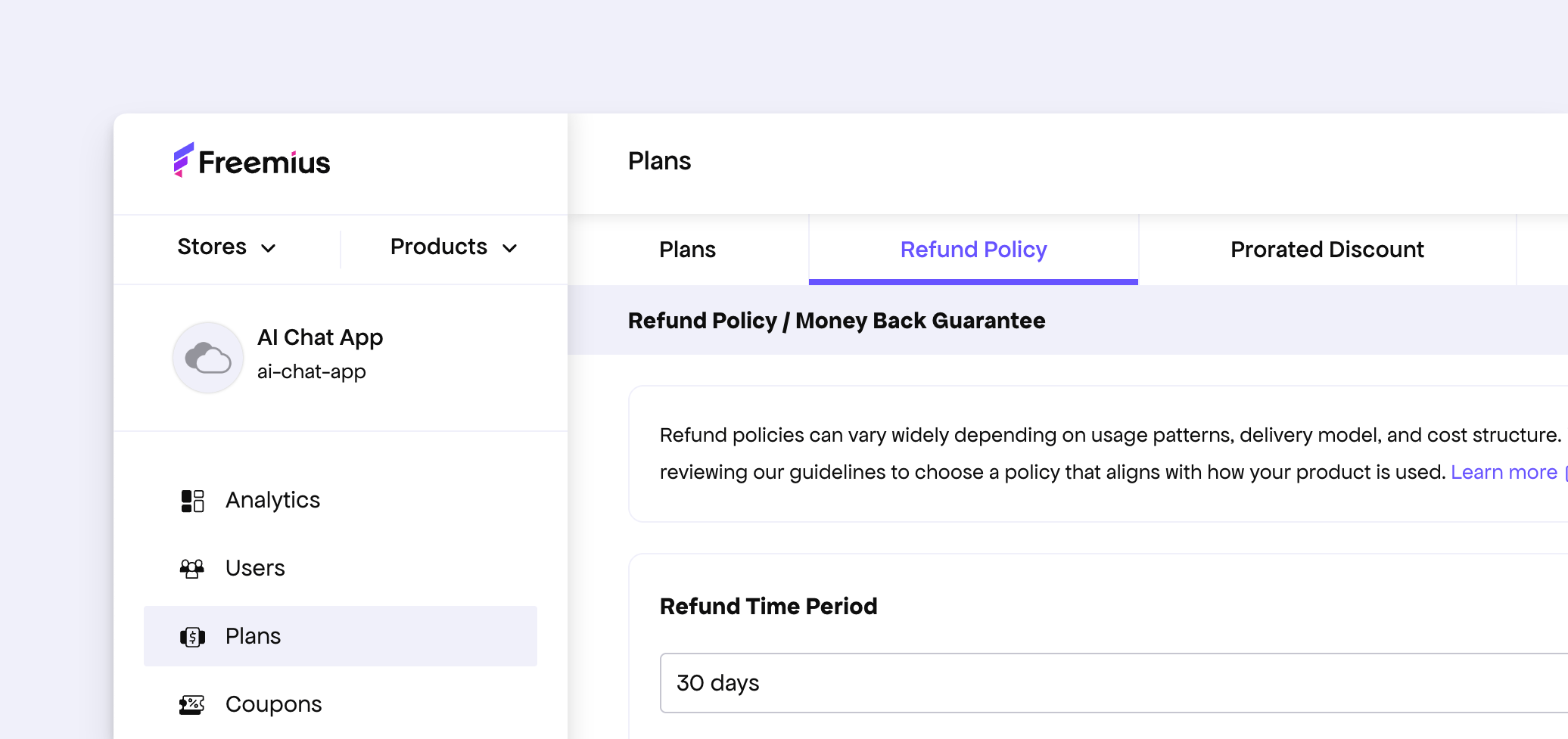
Shareable Links for Plans Tabs
All individual tabs in the Plans page now have unique URLs. This makes it easier to share direct links within teams and allows our support team to point to specific settings when needed.
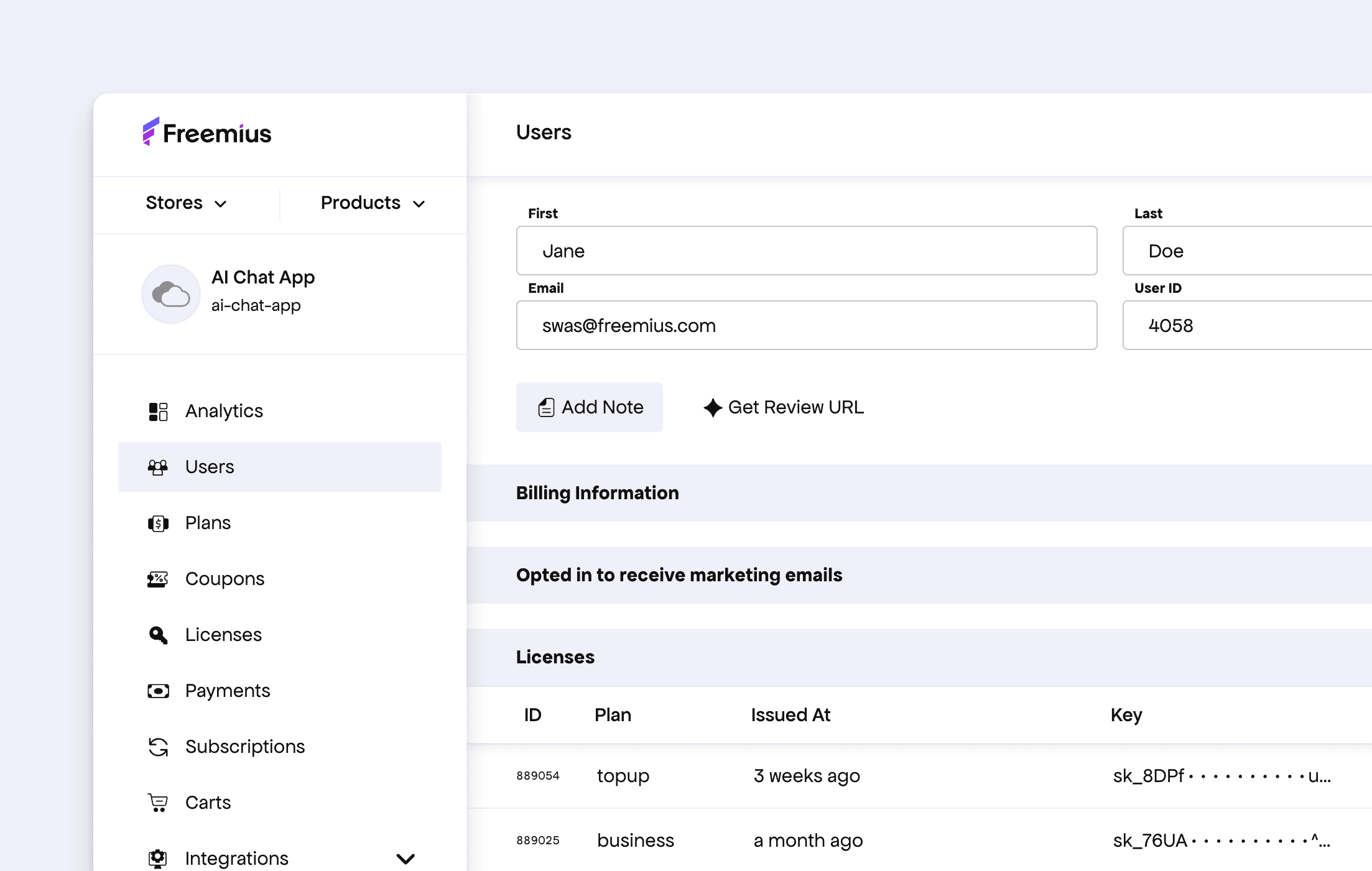
Improved App & SaaS Context by Removing “Sites” References
We identified some references to “Sites” that are not relevant for App & SaaS products. These have now been removed (especially inside individual user information and also from tables like Events, as well as Subscriptions), making the experience more consistent across product types.
Other Fixes
- The sidebar and detail panels of the Licenses and Subscriptions pages had some minor UI glitches. These have now been fixed.
- We noticed a regression where the “Join Freemius Slack” item in the Setup Checklist could not be marked as completed. This has been fixed.