Improvements to the Analytics Date selection logic and UI + Additional fixes
We’re super excited to bring you the most-requested analytics feature in the Developer Dashboard.
Starting today:
- We’ve removed the restriction of selecting the date in the main dashboard.
- You can now pick any date range with any resolution (daily, weekly, monthly, yearly) and both the start and end dates will be used when populating the data, without getting rounded off.
- The analytics charts are now faster than before.
The problem of rounding the date range
Previously, the server would round off the dates whenever you selected a date range that was not an hour or a day. For example:
- If you set the start date as 12 July and the end date as 25 December (with a monthly resolution), the server would round it off as data between 1 July and 31 December.
- Similarly, if you set the date to a weekly resolution, the server would round the start date to the first Sunday of the selected week and the end date to the last Saturday of the selected week.
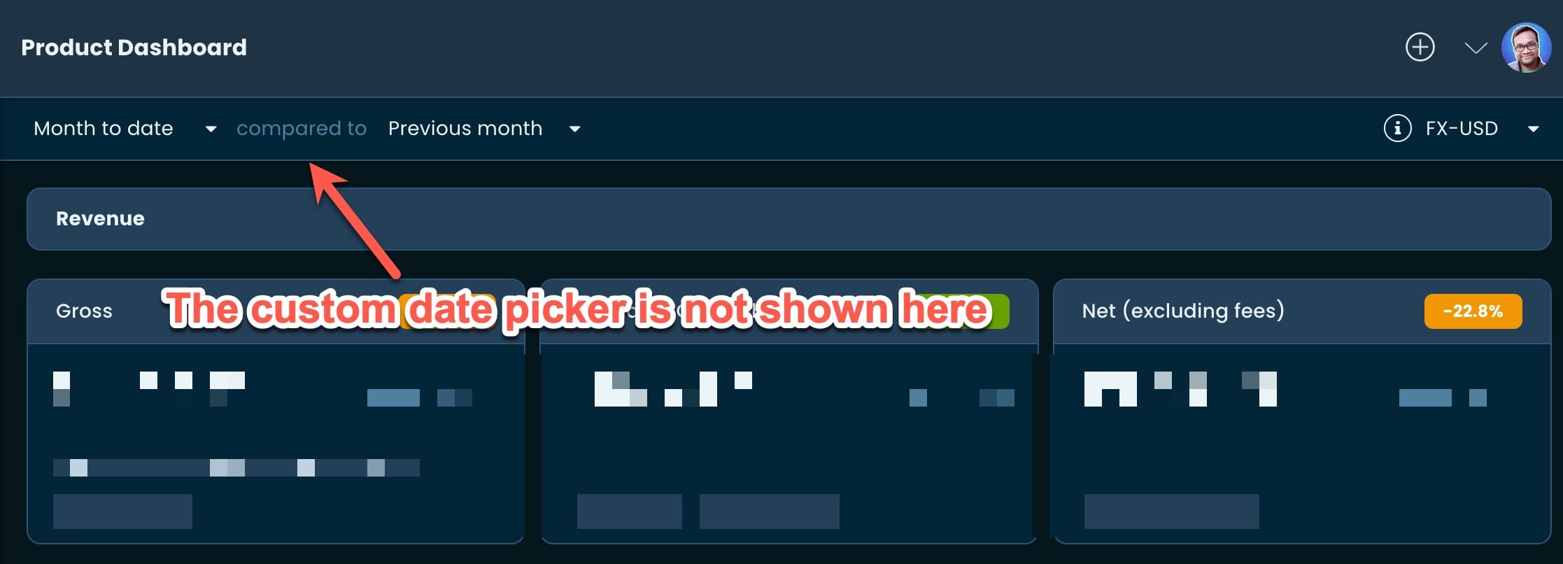
This not only created confusion when viewing the charts and the UI (since they represented different dates), but we also had to restrict not showing the custom date picker in the main dashboard. This is because the rounded date range being shown there would not be the same as the selected dates.
Fixing the restriction of picking custom dates
After we enhanced the stats API, we can now provide data in any requested range and period that starts and/or ends at any date. The API will adjust the data to ensure it represents the requested date range instead of rounding it off.
As a result:
(1) The custom date picker in the main dashboard is back.
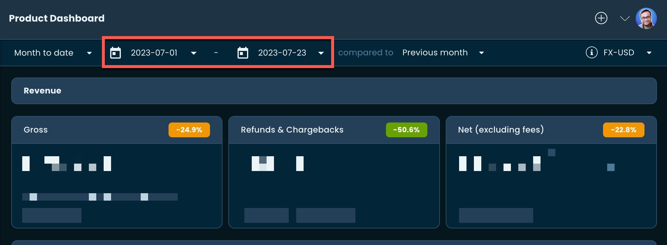
You can now get reports of aggregated data for any input.
(2) Charts and UI now correspond to the same date range.
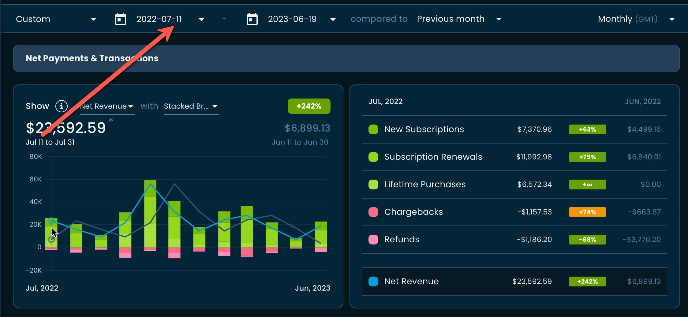
As seen in the above image, the start date (and the data) of the chart now corresponds to the same date as the UI. To make it even easier to spot and avoid any confusion, we’re now showing the full date range when hovering over a chart point.
Under the hood: Making the charts faster
While working on the fix, we did some major refactoring of the underlying system. We realized we were doing many calculations ad-hoc and using more processing time than needed. During the refactoring, we made some adjustments and saw immediate improvements in the snappiness of the charts.
But no performance improvement is worth mentioning without a benchmark. So let’s see the results:
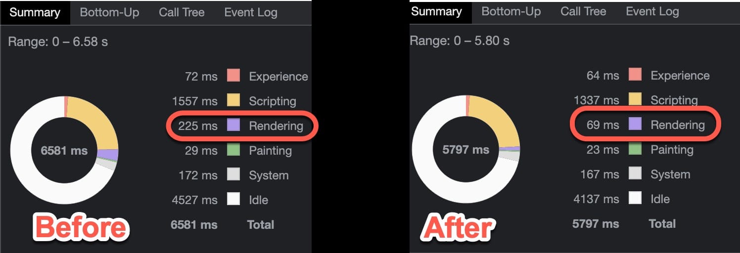
The benchmark itself was very simple. We took the main Net Payments & Transactions chart and hovered over the 7 data points while showing results for the last 7 days in Daily resolution. Co-incidentally, we also saw a 70% improvement in the rendering time 😁
Additional Fixes
Following upgrades of the dependencies, we noticed the New Bank Account… button on the Profile page was not working.
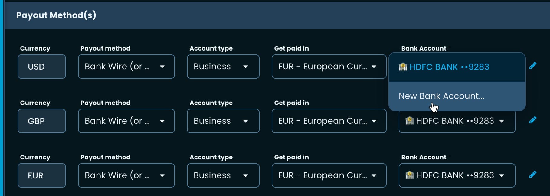
We fixed it in this iteration — apologies for any inconvenience!