|
|
Freemius is built on collaboration — within our team and within our community of software makers.
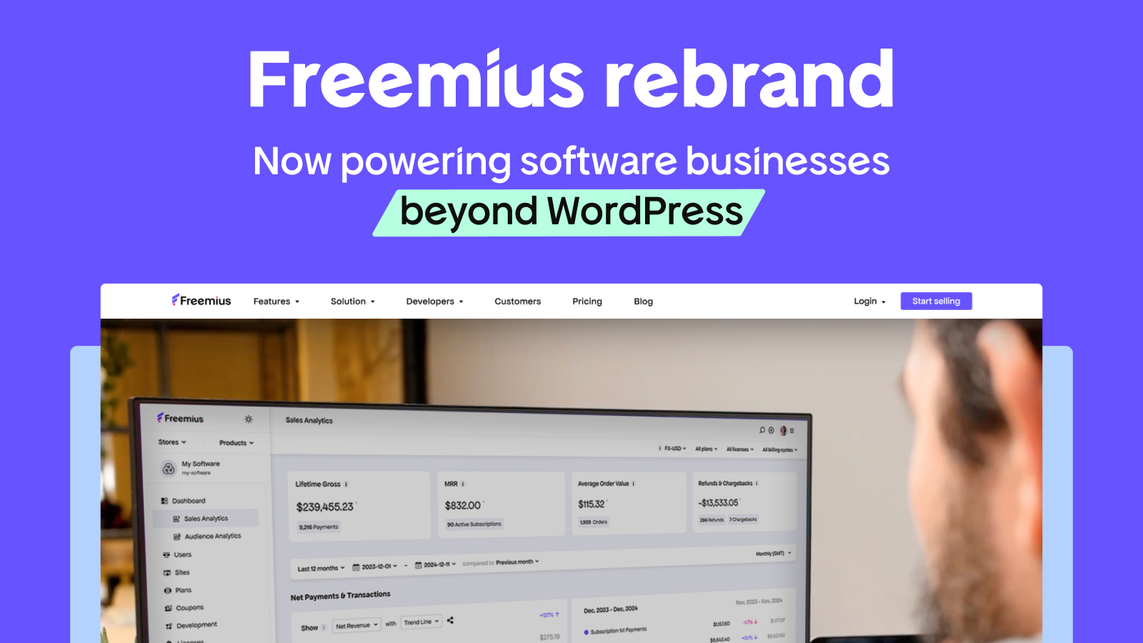
As we move beyond WordPress to encompass software making as a whole, our brand had to evolve. Not just visually, but in a way that reflects the makers, team, and vision behind it.
This transformation was led by Hadas Golzaker (Head of Brand) and Vitalii Romaniuk (Lead Designer), but they weren’t doing this alone.
With input from the Freemius team, community, and collaborators who believed in the vision, we achieved what most companies need full agencies for.
Hadas brought storytelling and strategy, while Vitalii ensured the product UI and Developer Dashboard seamlessly reflected the new identity.
But the driving force behind it all? A shared commitment to creating a brand that feels as bold, dynamic, and ambitious as the Freemius community itself.
Here’s how we made it happen (together).
Why It Was Time for Freemius to Rebrand
As an agile startup, Freemius moved fast. And so did our branding.
Without a strategic, unified vision, our visual identity evolved reactively, shaped by different designers, ideas, and marketing efforts over the years.
The result? A fragmented brand experience across our website, Developer Dashboard, and promotional materials, with each layer adding to the inconsistency.
A Patchwork Identity
Hadas recalls: “I knew a rebrand was in the works before I joined Freemius — this was one of the primary reasons I came on board. The branding was stale and it looked the way it did because it was a patchwork of different elements.”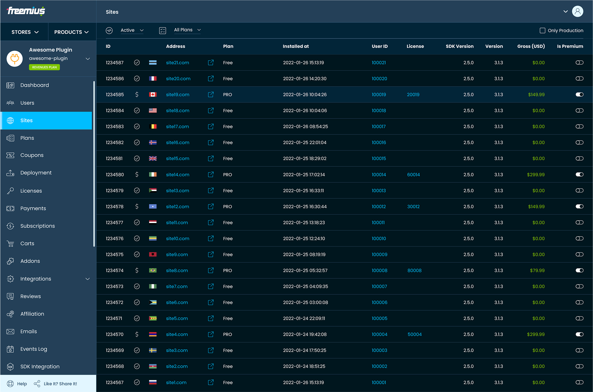
This wasn’t just an internal frustration. It impacted usability, messaging clarity, and how we were perceived externally.
“We’d been planning a redesign for a long time but never had the time or resources to do it,” adds Vitalii, a Freemius veteran with over six years of experience at the company. “There wasn’t a single moment when we decided to rebrand. It was similar to the problem at hand: An accumulation of recognizing that we needed it badly. An accumulation that became impossible to ignore.”
While the need for a refresh was obvious, the issue ran deeper than outdated visuals. Our branding no longer reflected what Freemius had become.
We’d Outgrown Our Old Look and Messaging
Freemius has evolved from a WordPress-centric platform to a solution for all software makers, including SaaS and app creators.
But our branding was telling a different story.
“The language still leaned heavily on ‘plugin and theme developers’, making it hard for SaaS founders and non-WordPress makers to see themselves using Freemius,” explains Hadas. “Even as the product outpaced the branding, our visual identity and messaging failed to keep up and reflect our growth. We’ll never leave WordPress behind, of course, but it’s important to look ahead.”
To fully step into our role as the go-to platform for software makers globally, we had to shed the remnants of our past and embody the same innovation and scalability that makers experience when they choose Freemius.
That meant letting go. Not just of outdated visuals and messaging, but of elements that no longer served the brand’s future…
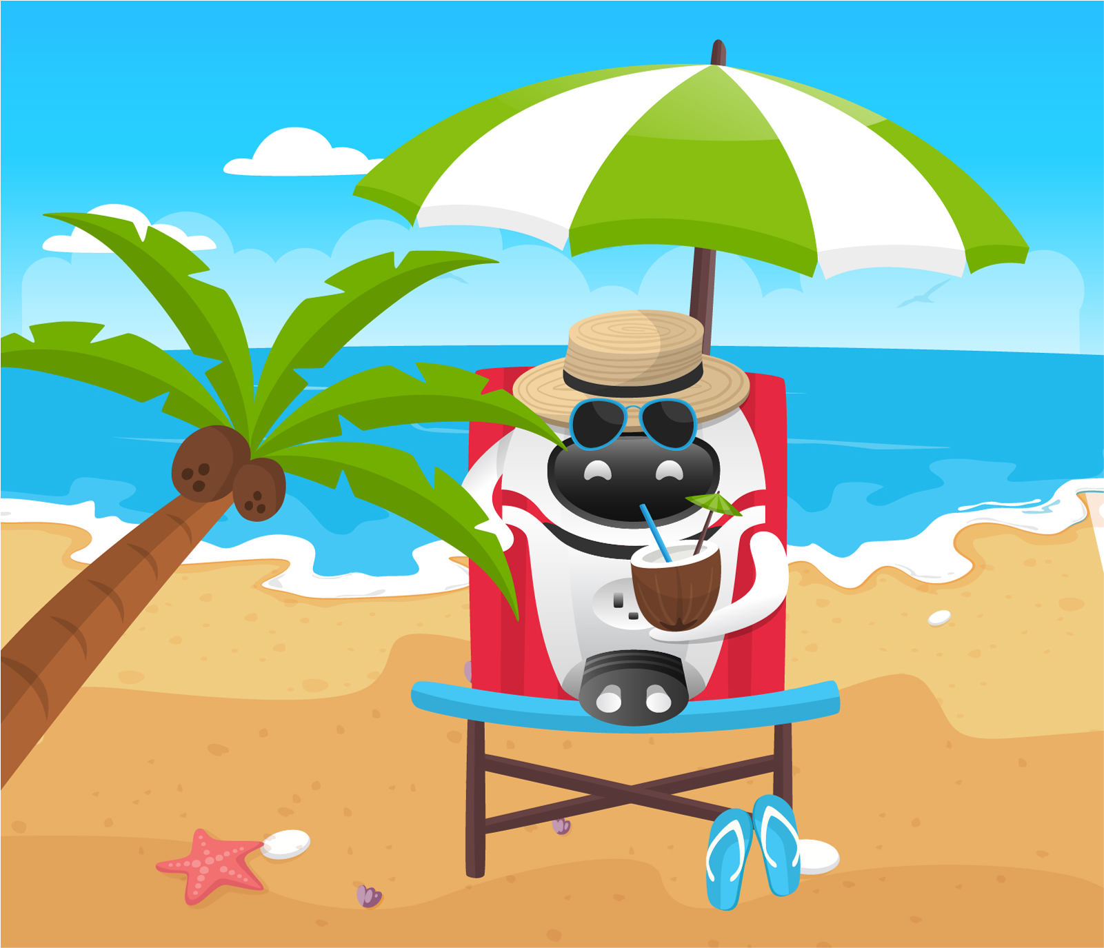
One of the biggest (and hardest) decisions? Saying goodbye to Freebo.
Freebo was a friendly, recognizable face and robot of many guises, appearing in blog posts, videos, and marketing materials from the beginning. But as the brand matured, it became clear that we’d outgrown our beloved mascot.
Hadas puts it into perspective: “It’s like holding onto a favorite t-shirt from summer camp. There are good memories… bittersweet nostalgia… but it no longer fits.”
Our New Identity: Defining Freemius for the Future
When creating a fresh brand identity, every design choice has to be intentional — crafted to reflect an evolution while staying true to the overarching mission.
At the heart of our transformation is:
Our New Logo: A Symbol of Growth, Change, and Progress
A logo anchors a brand’s identity — instantly recognizable, purposeful, built to last.
Vitalii and Hadas team let their creative minds roam free, sketching wild, abstract ideas, but ultimately, the ‘F’ was our North Star.
It’s recognizable, timeless, and undeniably Freemius.
![]()
“It’s more intentional. The logo’s shape flows naturally, representing motion, progression, and how software makers refine and expand their businesses over time,” explains Vitalii.
“For the logotype, we aimed for a balance — friendly and approachable typography that still reflects a professional, business-first identity. We chose sans-serif letters for a feeling of innovation and softness, added a rotated ‘E’ as a symbolic ‘wink,’ and refined the angles with a 1% corner radius to maintain cohesion with the logomark.”
![]()
![]()
![]()
A great concept is only as strong as its execution.
The logo was tested across different backgrounds, formats, and use cases to ensure versatility and impact. Over 30 variations were refined, balancing spacing, curves, and weight to create a logo that’s distinct, modern, and scalable.
![]()
By grounding the new identity in the real experiences of software makers, Freemius’ logo becomes more than a symbol — it’s also a commitment to growth, adaptability, and our shared success.
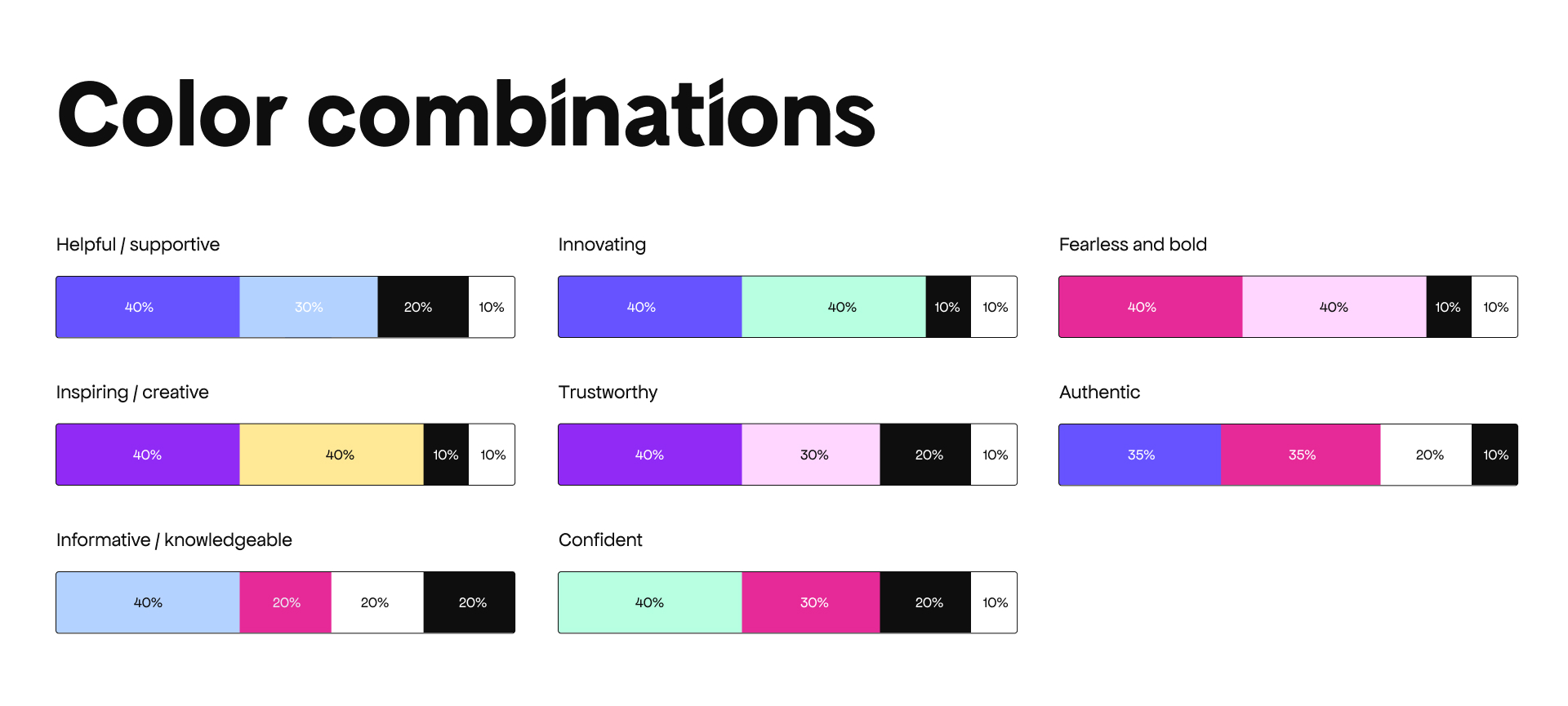
Color Strategy: More Than Pretty Aesthetics
Still deeply tied to its WordPress-first origins, the old branding no longer reflected our broader vision. We needed a fresh, modern identity that stands out visually and tells a compelling story in a completely accessible way.
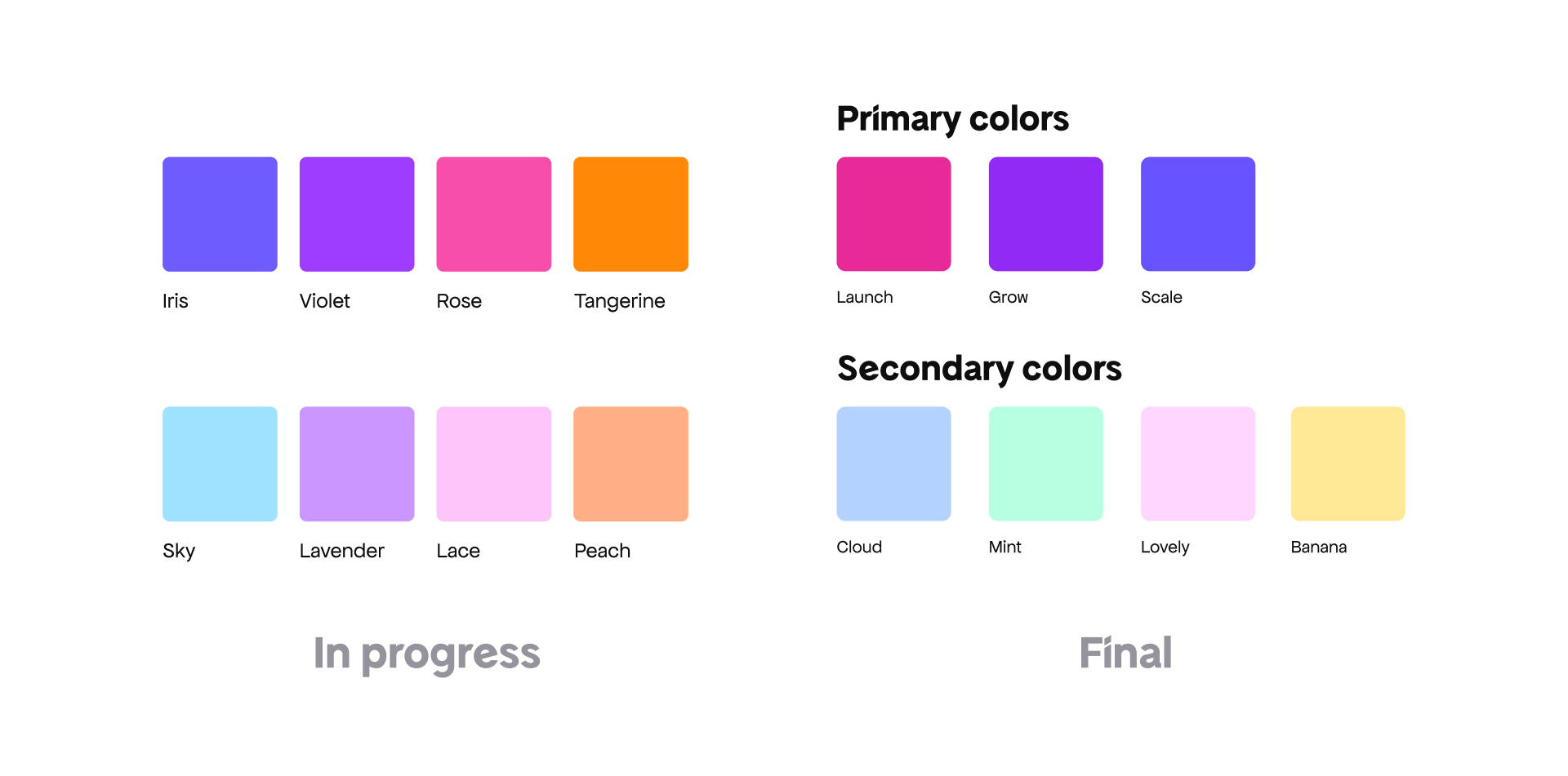
“We started with the logo, in black and white, to get the design fundamentals right before adding color. Visual appeal is important, but colors evoke emotion, and we wanted them to align with the journey of software makers,” explains Hadas.
From there, we experimented with multiple directions — including a deep bottle green that, while sleek, felt too old money, too traditional for a brand built on innovation.
Instead, we gravitated to a color system that mirrors the journey of a software maker.
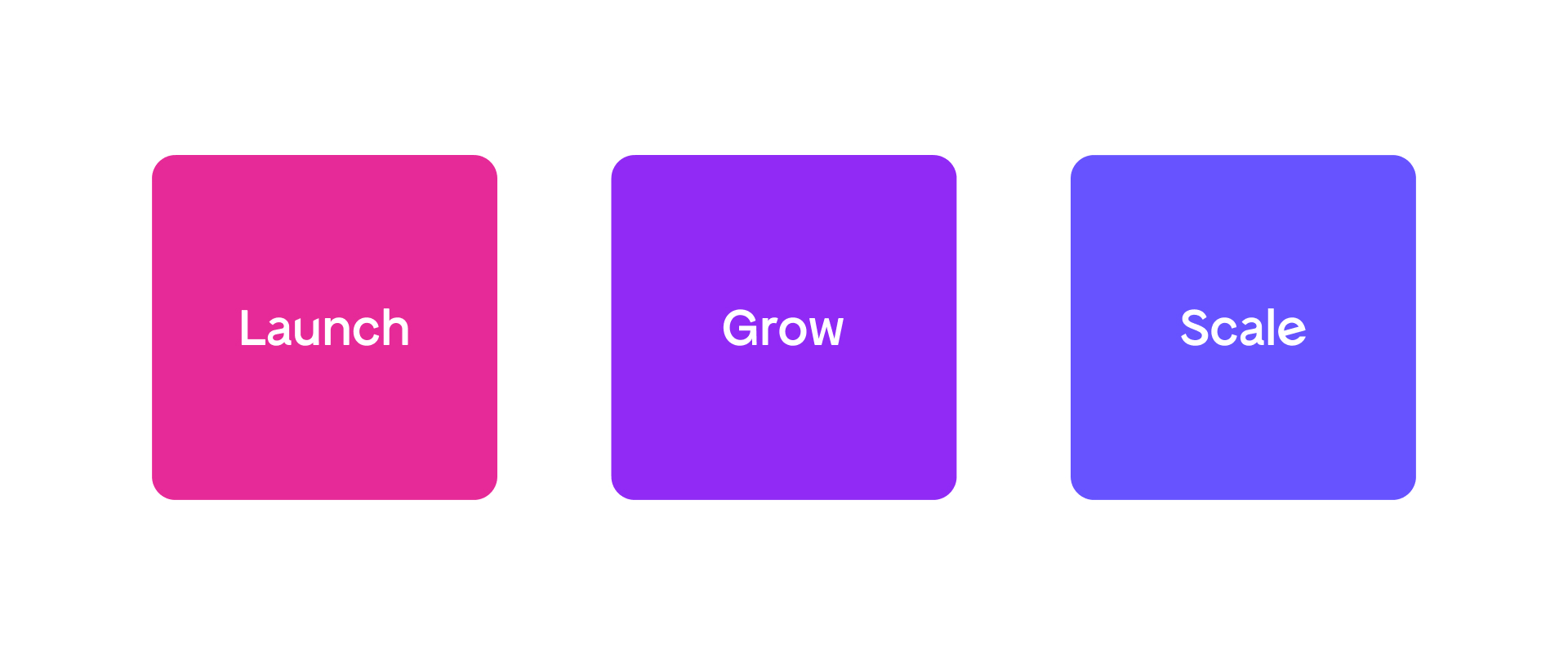
Vitalii breaks it down:
Each color in the gradient represents a different part of the journey:
- Pink (Launch): The passion-driven startup phase.
- Purple (Growth): Taking it to the next level, from start-up to bonafide business.
- Blue (Scale): Stability, professionalism, and long-term success. The maker moves beyond just ‘developer’ — they’re now a business owner, focused on sustainability and growth. In many cases, they are now responsible for a team and their livelihoods.
Hadas adds: “We tested each and every color to ensure the combinations were working together. Accessibility was really, really important to us.”
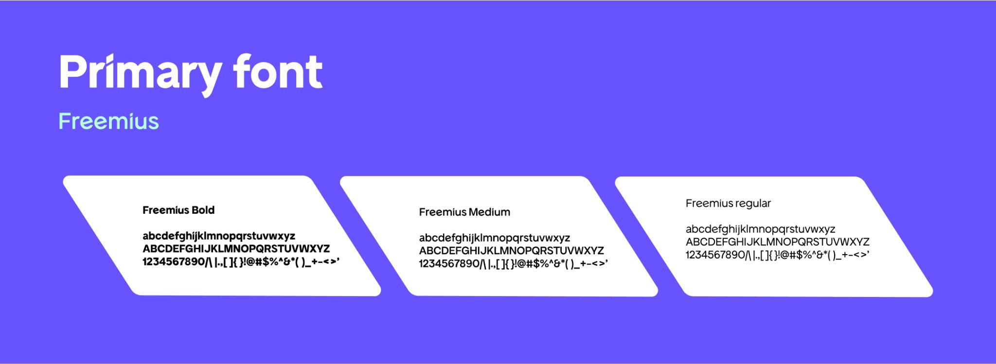
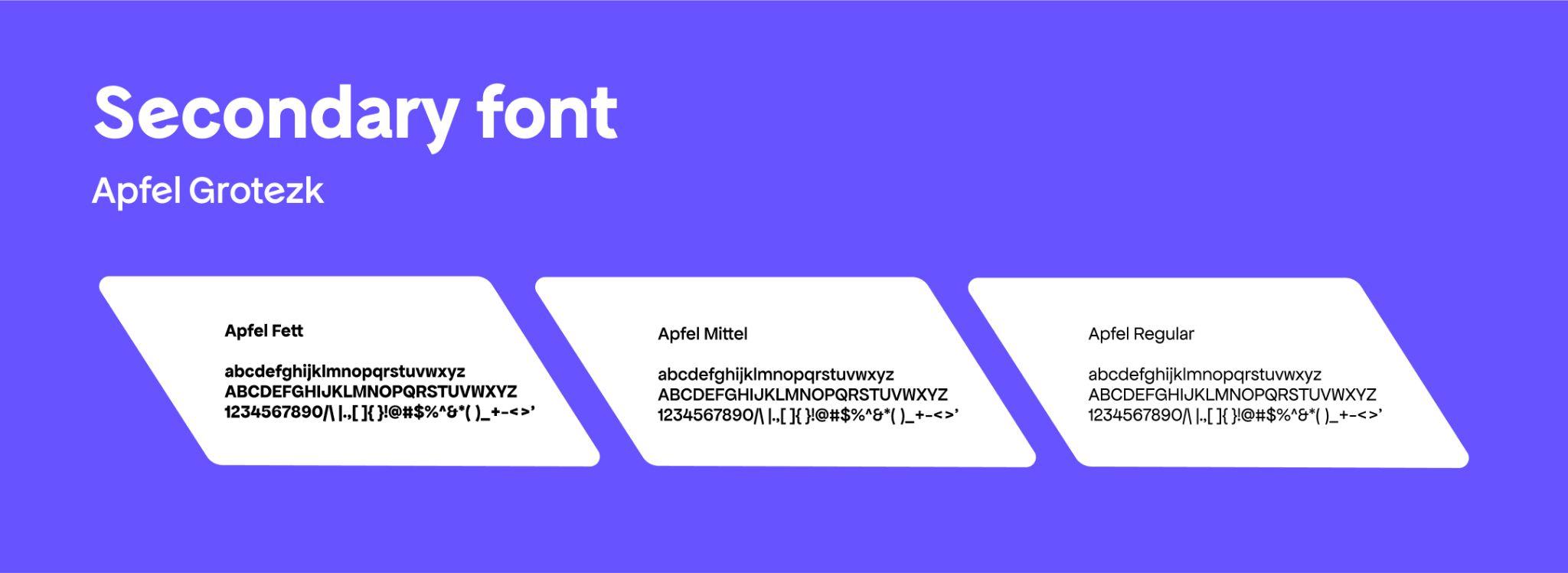
Typography: Balancing Professionalism with Friendliness
Typography shapes perception, turning a name into a presence and a message into an experience.
Our previous fonts lacked cohesion, leaving the brand without a distinct voice. The rebrand presented an opportunity to craft a type system that reflects clarity and personality — one that speaks to software makers in a way that feels both structured and engaging.
Our font started from the logo itself. The letterforms in ‘Freemius’ were unique, so we built on that foundation to create something that felt intentional and aligned with the brand’s evolution. — Vitalii Romaniuk, Freemius Lead Designer
The result is a balanced type system that visualizes the dual nature of software makers: technical yet creative, structured and logical yet approachable and expressive.
The new type system is built around three key elements:
- Freemius headline font → Slightly rounded edges soften its appearance, striking a balance between professionalism and personality.
- Apfel Grotezk for body text → A neutral, highly readable font designed for long-form content and smooth reading.
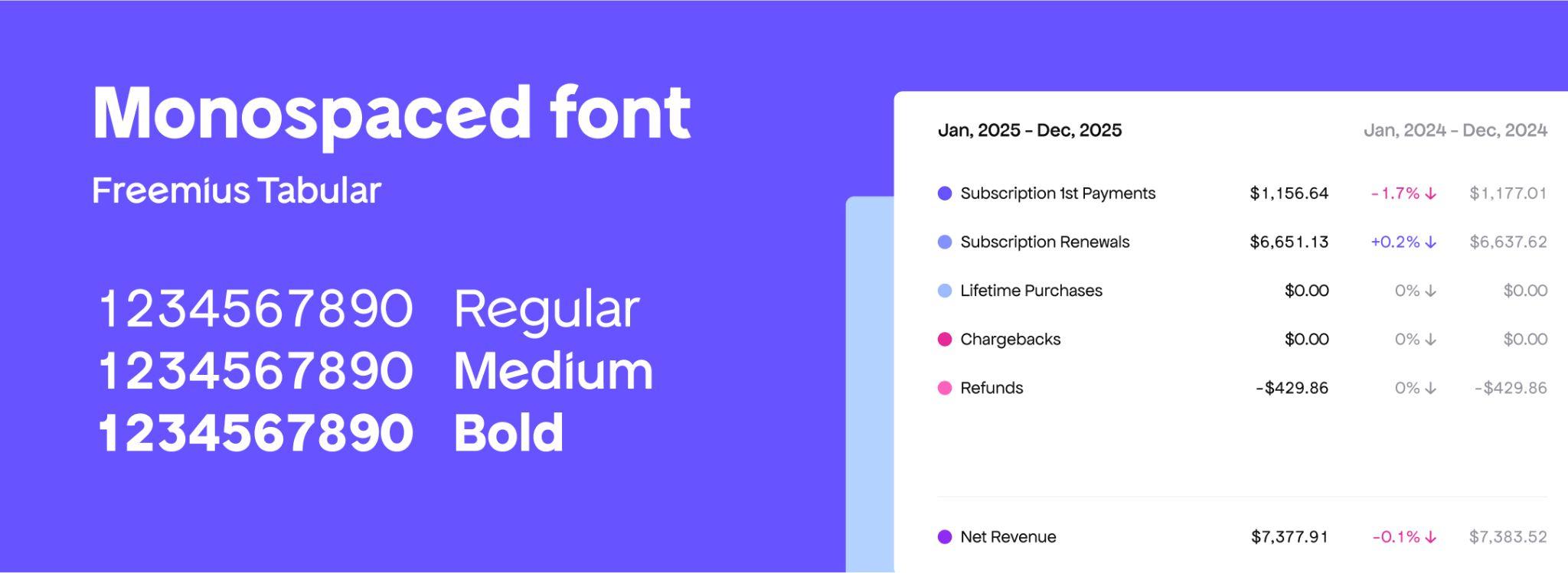
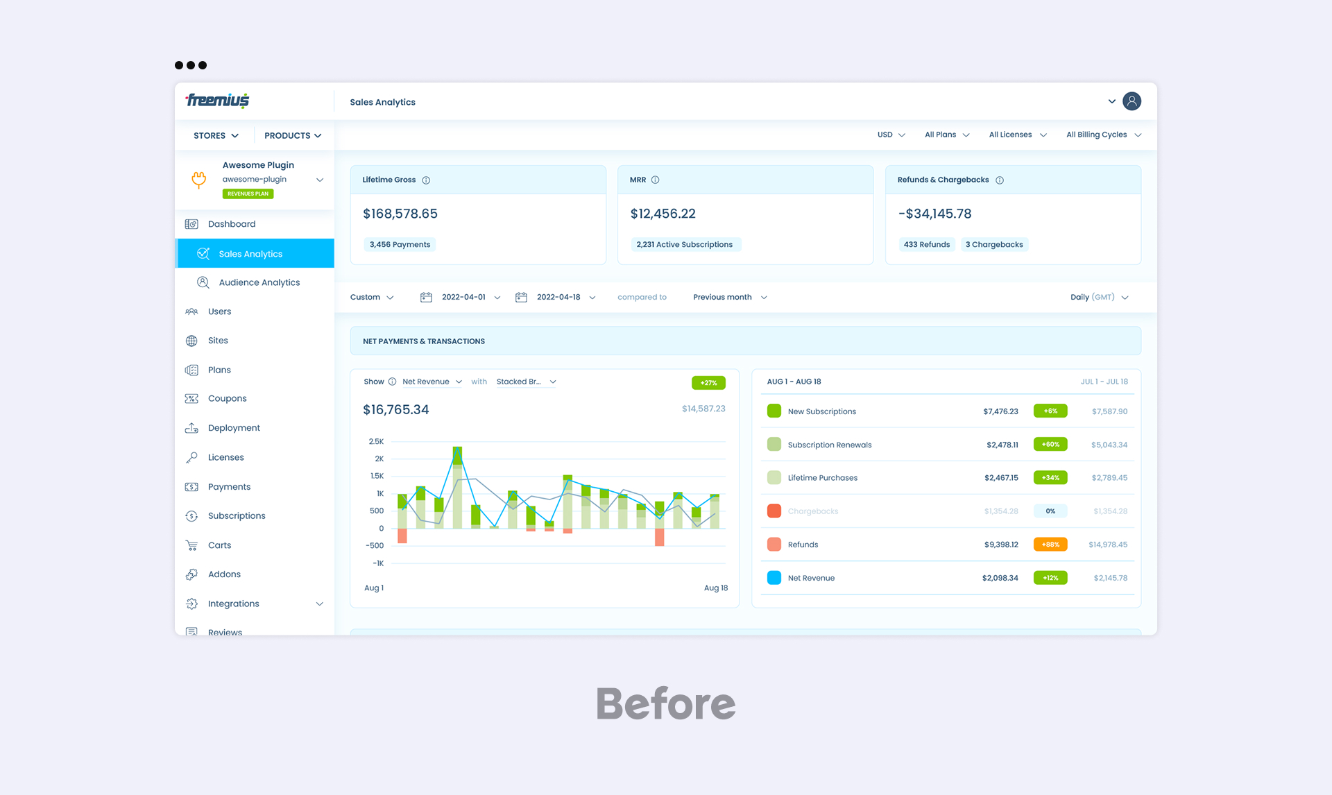
- Monospaced numbers in the Developer Dashboard → A functional upgrade that improves financial data visibility, making figures easier to scan and compare.
Hadas adds: “Spacing, contrast, and readability were key considerations. We wanted something that feels easy on the eyes but still conveys trust and authority.
“Even the smallest details — like the precise angling of letterforms to the optimized spacing — were fine-tuned to create an intuitive visual rhythm. Whether it’s a header on the website, a social media image, or a dashboard metric, the new typography makes Freemius instantly recognizable and effortlessly readable.”
![]()
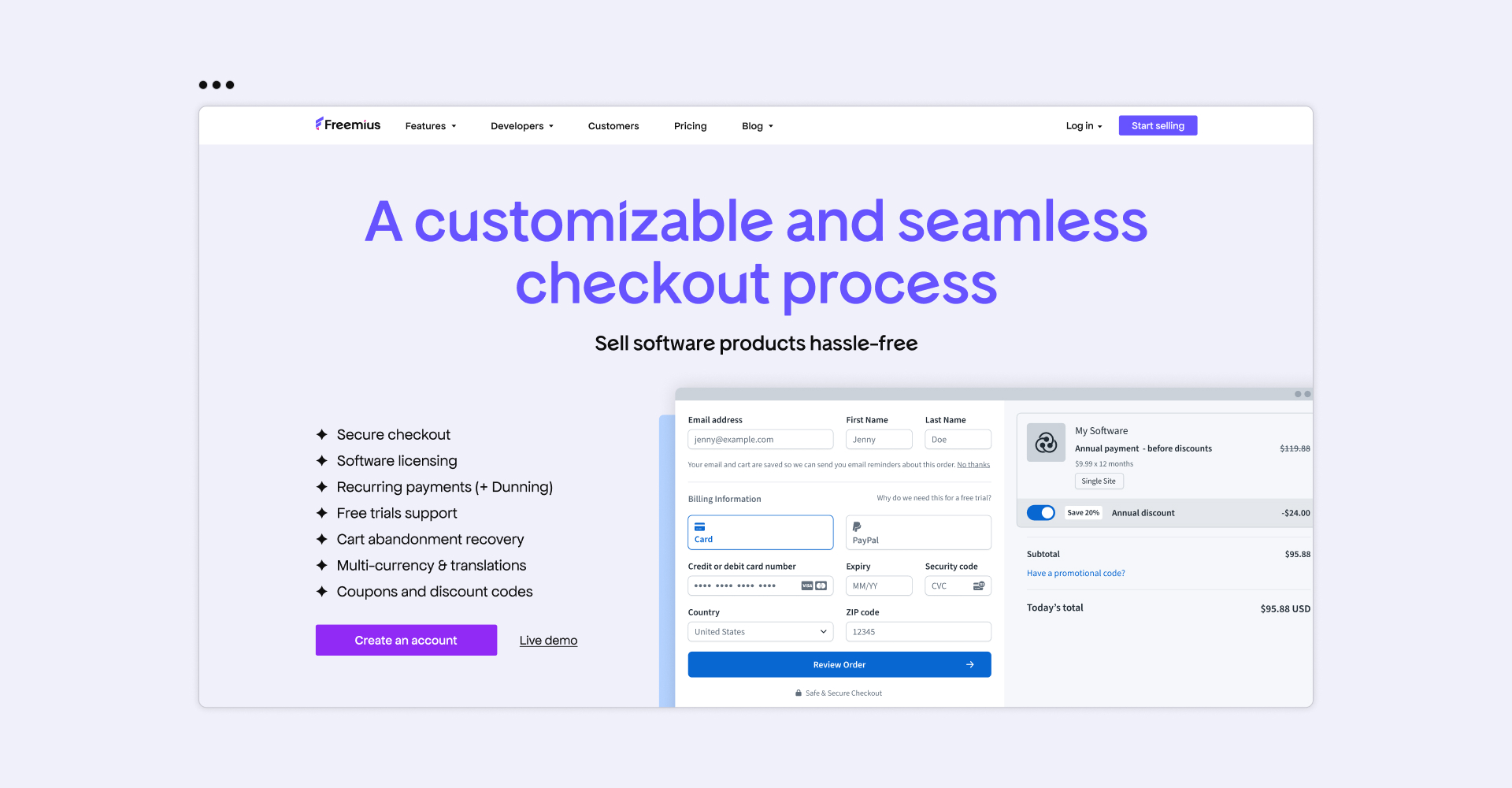
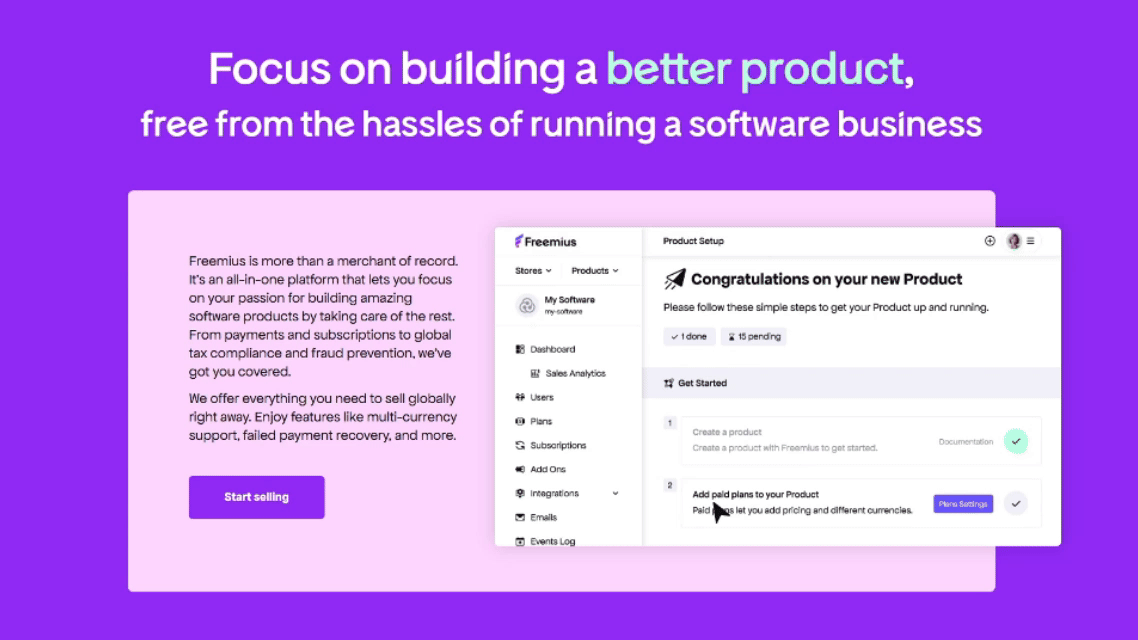
Website and Developer Dashboard: A Unified Experience
The new Freemius website and Developer Dashboard were redesigned to be more than just visually appealing. They now work seamlessly together to showcase and support software makers like you.
A Website Experience Built to Empower Software Makers
We’ll be brutally honest: The old website wasn’t working as hard as it should.
It lacked clarity, engagement, and — most critically — failed to showcase the product itself. Potential users had no crystal-clear understanding of what Freemius offers, making it harder to convert interest into action.
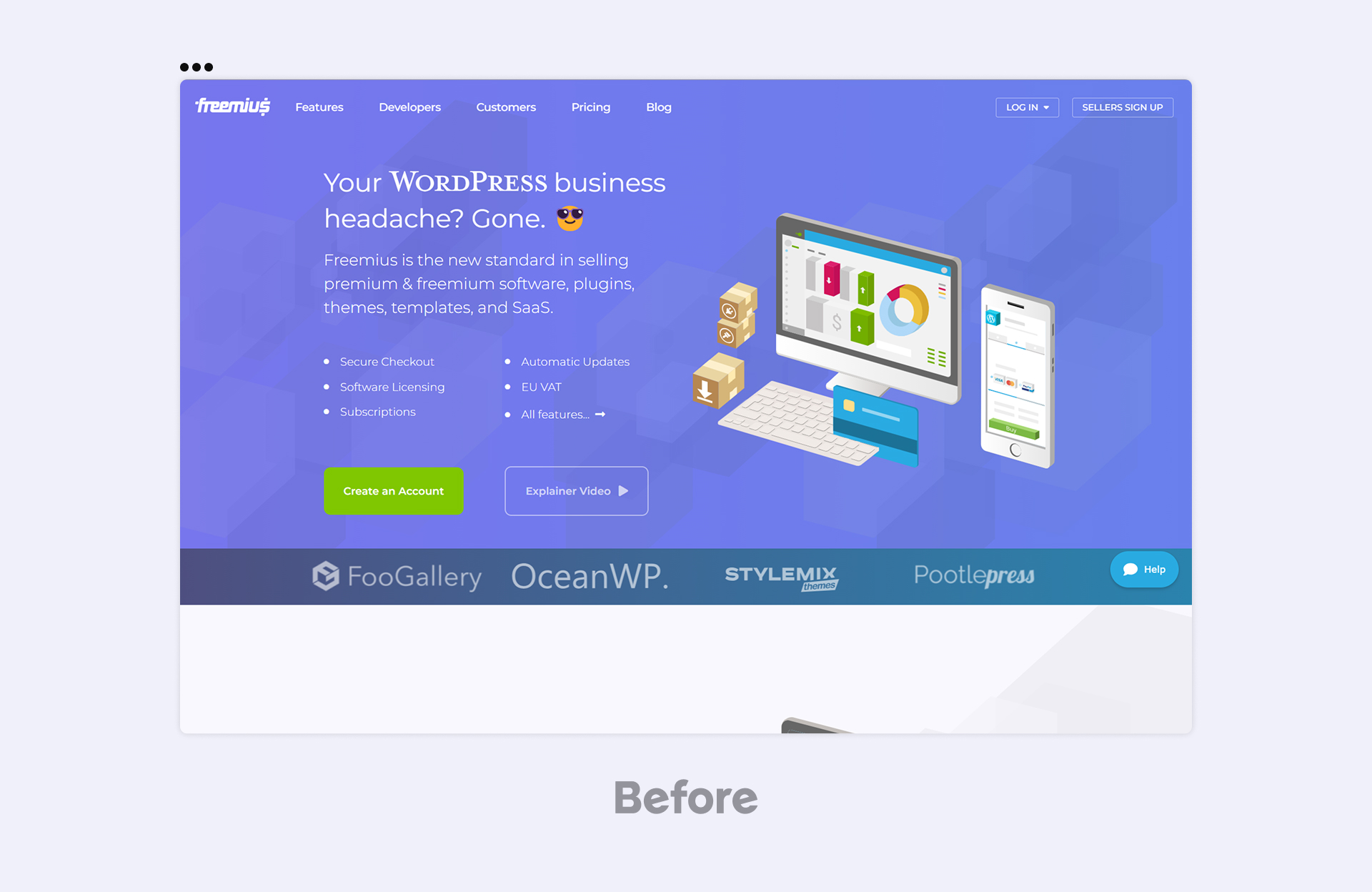
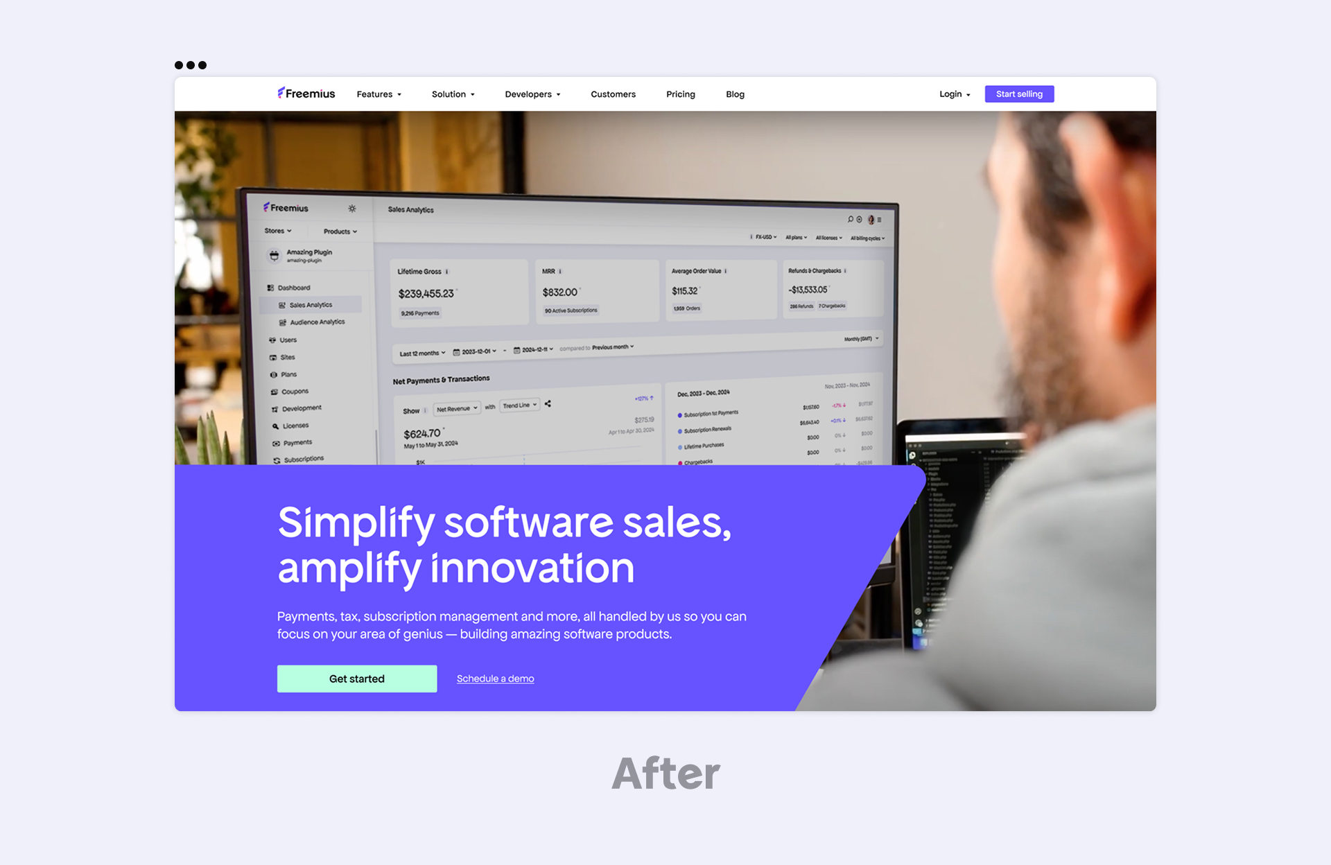
Hadas clarifies: “The product was barely on the storefront. That had to change. So, for me, the strongest message now is that we’re backing up our product and driving home the scope and quality of its features. A ton of work goes on behind the scenes, and it’s great to see the platform getting the love it deserves.”
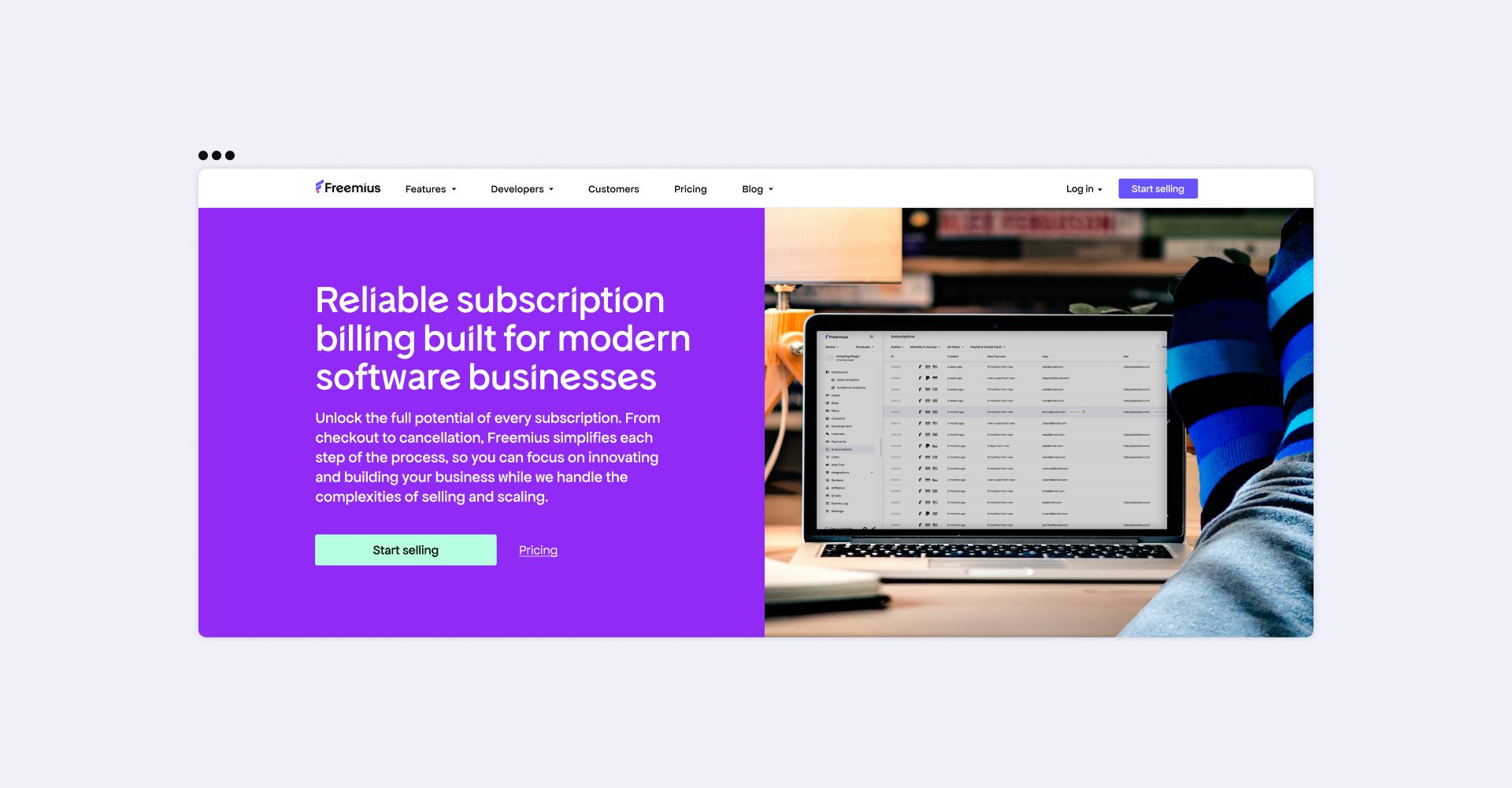
Freemius and our community of software makers are now the stars, ensuring that every page highlights both real experiences and the platform’s value.
A More Engaging, Interactive UX
Like a well-crafted, compelling story, our new website doesn’t just tell visitors about Freemius — it shows them:
- Product-focused visuals: UI previews, animations, and walkthroughs make Freemius’ value immediately clear.
- Carousels, accordions, and interactive elements: Designed not just to look good, but to break down key information into digestible, engaging sections.
- Testimonial carousel with video content: Real software makers sharing their experiences, making the benefits of Freemius tangible and relatable.
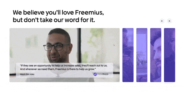
Hadas explains why the last point was non-negotiable for her: “The testimonial carousel was something I really pushed for. It took time to build, but having real users sharing their stories in a visually engaging way makes a huge impact.”
Beyond aesthetics, the new UX is designed to keep visitors engaged longer and lead them seamlessly toward action.
A Unified Brand Language
Hadas clarifies:
“One of the biggest weaknesses of the previous website was inconsistent terminology. Our audience was sometimes referred to as developers, sometimes businesses, and other times makers — creating confusion and a lack of clarity. To address this, we didn’t just rethink our design — we redefined how we communicate. An internal tone of voice workshop helped align messaging across all touchpoints, ensuring Freemius sounds as clear and confident as it looks.”
We also reached out to our community:
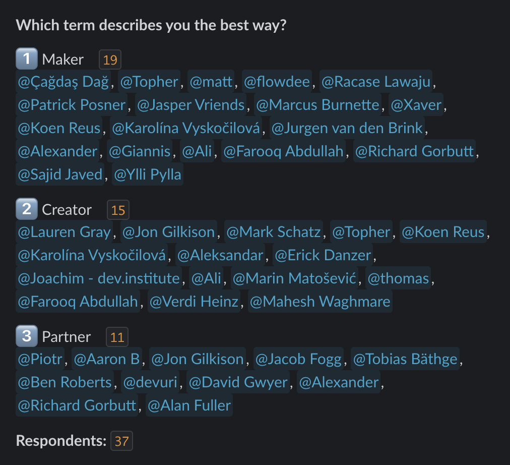
“To ensure we got it right, we went straight to the source — our community. We asked them what term best describes them: maker, creator, or partner. The response was clear: ‘software maker’ best captured their identity.”
More than a redesign, think of it as a reintroduction that’s built to inspire confidence, engagement, and action.
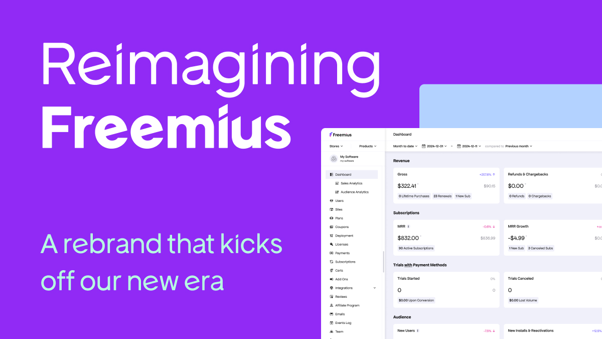
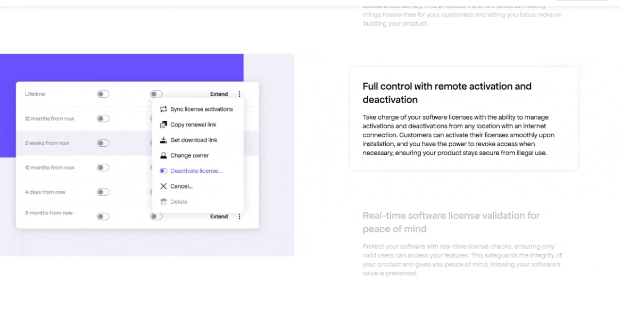
Developer Dashboard: A Visual Refresh That Significantly Enhances UX
This wasn’t just a reskin. The redesign fundamentally changes how the dashboard feels to use. The interface is modern, professional, and more intuitive, enhancing the experience and streamlining daily workflows.
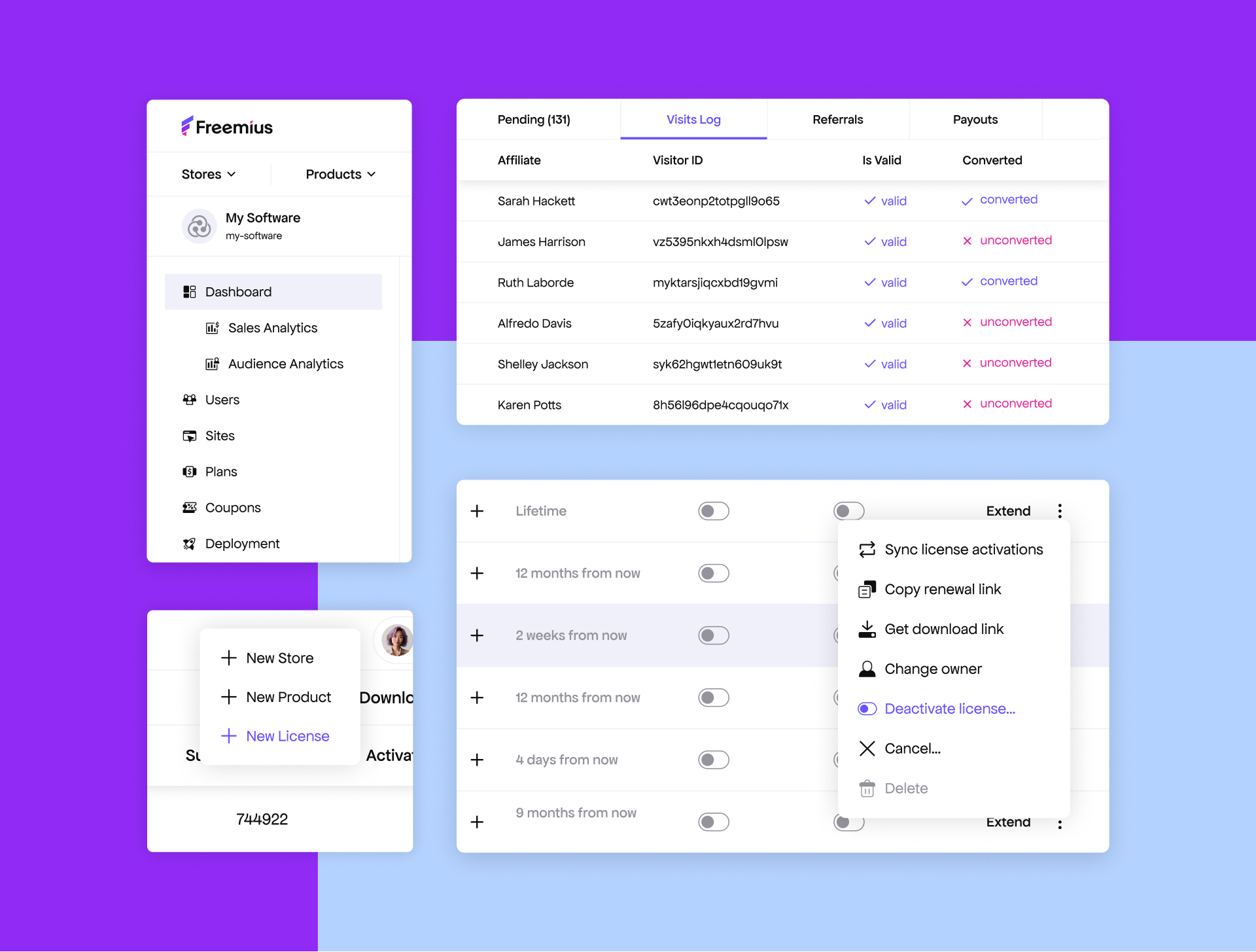
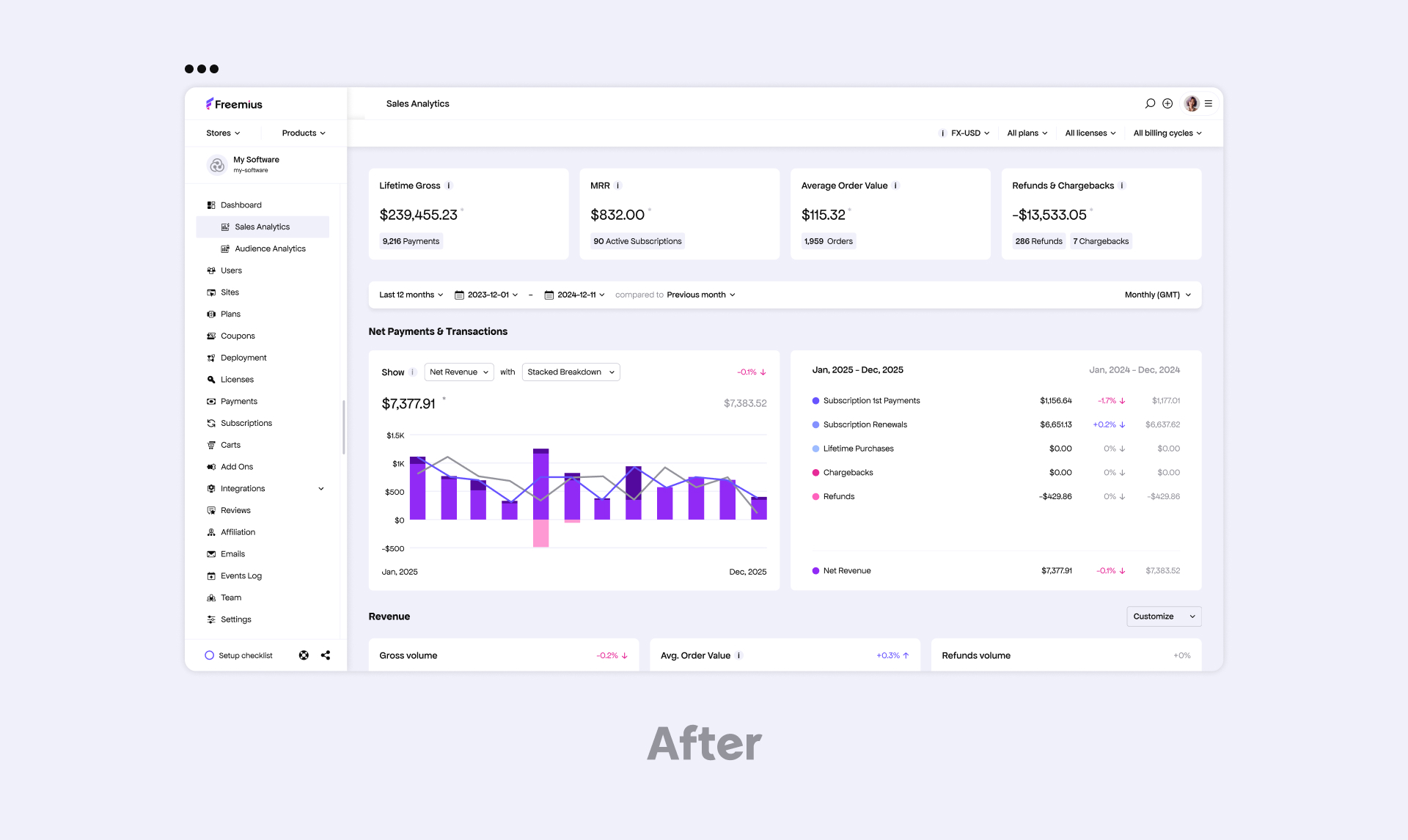
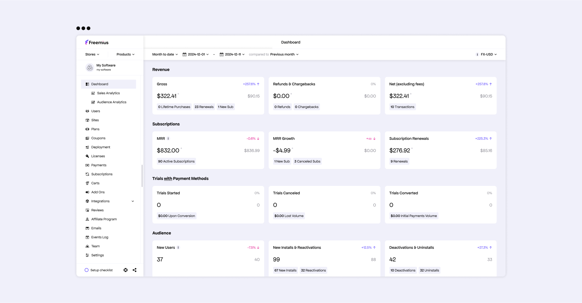
“The update focuses on cleaner layouts, improved readability, and refined interface elements, making it easier for software makers to focus on their data without distractions,” adds Vitalii.
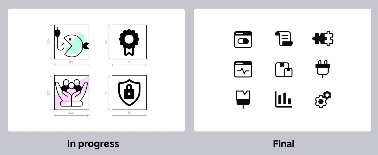
Icons Designed from Scratch
Each UI icon was custom-built by Vitalii.
He explains: “We treated every channel as part of one ecosystem. Consistency came from using the same fonts, colors, and design elements, rather than separate assets, and this naturally carried over to the Developer Dashboard. The difference here was that the iconography had to be completely overhauled to align with our new look and feel.”\
Strategic Phasing: Evolving, Not Overhauling
The Developer Dashboard redesign actually came before the website update — a strategic move to ensure software makers experienced the new brand identity first in the tool they use daily. The goal was to introduce the refresh without disruption, allowing for a smoother transition.
Vitalii adds: “Clutter was the issue. Now, it’s cleaner and easier to focus on the data.”
This is just the first phase. While the initial focus was on aligning the dashboard visually with the new brand, deeper UX improvements are on the horizon.
Hadas expands on this: “We created a structured system for the initial stage — every design decision had a clear purpose. This wasn’t about making things look good; it was about making them work together for a smoother, more intuitive navigation experience and alignment with the greater whole. The later phases will go deeper — that’s something I’m really looking forward to.”
We’re actively gathering feedback to guide the next round of enhancements to make workflows more intuitive and efficient. If you’d like to have your say, join the brand-new #Build-With-Us channel in our Slack group.
The Power of an Agile Team
Rebranding on this scale usually requires large teams and external agencies.
We did it with just two designers and the valuable feedback of an invested community.
Hadas explains: “A strong, synchronized team can achieve a lot. Unlike other rebrands I’ve worked on — where a whole team or external agency was involved— this was just the two of us, plus some extra help. I’m incredibly proud of the scale of what we achieved. It’s a testament to collaboration, belief in a shared vision, and the power of working without ego.”
Instead of siloed departments and lengthy approval cycles, the rebrand was driven by two clear areas of ownership:
- Vitalii focused on product design — leading the Developer Dashboard, UI elements, and platform updates.
- Hadas led marketing design — owning the website, branding, and visual assets.
Hadas: “When you find someone who cares about a single pixel as much as you do, you know you’ve found the right teammate.”
Their ability to critique each other’s work openly, without ego, made all the difference. The result? A sharper, stronger brand identity that could stand up to — and even surpass — those crafted by large teams.
Great Things Start Small: The Power of Collaboration
Freemius was built for software makers.
People who wear multiple hats, iterate fast, and push boundaries without the luxury of massive teams.
This rebrand isn’t just about refreshing a logo, a dashboard, or a website. It’s about embodying the agility, collaboration, and resourcefulness that define both Freemius and the makers we serve.
The lesson? Great things aren’t reserved for big teams with endless resources. Whether you’re a software maker, a designer, or an entrepreneur, the right collaboration, shared vision, and relentless execution can move mountains.
And this is just the beginning of what we’ve started together.