
|
|
Did you know the #1 reason users deactivate a WordPress plugin or theme is that they couldn’t figure out how to use it? This thought makes me toss and turn at night as I imagine users installing my plugins and giving them a test drive. Is the problem that users are just missing something? Or can developers do more to help bridge the gap? It’s worth thinking through the answer in order to help minimize abandonment of your product before its real benefits are actually seen.
Take a second to put yourself in the shoes of a user installing your plugin or theme for the very first time.
Who are they? What is their goal? Why are they using your product?
In order to build successful plugins and themes, you need to identify common users’ wants and needs when they activate your product so you can create the best First-time User Experience (FTUE), which can significantly reduce abandonment rate and increase customer satisfaction.
What is FTUE in the Scope of WordPress Plugins & Themes?
First-time user experience for WordPress plugins and themes is the process that users go through after activation of your product, at which point they proceed to learn and use the functionality your product offers.
First-time user experience for WordPress plugins and themes is the process that users go through after activation of your product, at which point they proceed to learn and use the functionality your product offers.
First-time user experience encompasses pretty much anything that can happen after activation.
Some common examples are:
- Redirection to the WP Admin or settings area of the plugin
- A step-by-step wizard that collects info or lets the user configure settings
- Allowing the user to “learn-by-doing”
- Incorporating a “wow” factor by impressing users with your functionality
On that note, it’s important to remember that every WordPress product is different. Especially when it comes to the wide variety of functionality and design available on a website, what might work extraordinarily well as a setup process for one plugin or theme may end being completely wrong for another.
The point of this article is to give you some strategies and tools to think through what could be the most effective first-time user experience for the unique needs of your users. Let’s talk about how you can build an effective first-time UX and hopefully even “WOW” your users.
Planning Your First-time User Experience
Given the variety of first-time user experiences you can create, what is the right approach for your plugin or theme? To find the answer to this question, you’ve got to understand your users.
Who are your users?
Most WordPressers can be classified into three segments.
Beginners + DIYers
The first group are people who are building a site for themselves or their business – usually beginner-level folks, with perhaps some limited experience in the WP Admin or basic coding skills in HTML/CSS. As DIYers, they might be willing to spend some money to make their lives a bit easier because they probably don’t have a ton of time to spend on their site or lack the skills for advanced customization.
Professionals
The second group are building sites for others as a project, side-gig, or career. These users are generally more advanced in terms of their expertise in WordPress and have more experience in making tweaks and customizations either through the WP Admin or with CSS/PHP. These users might be under pressure to build something that is heavily customized and/or works exactly the way their client wants.
Maintainers
A subset of the professionals group definitely worth mentioning are those who maintain tens or even hundreds of WordPress sites. These folks don’t have time for many of the setup processes out there – they just want to activate, quickly configure, and move on.
You can probably segment your user base even more definitively. And it’s worth spending time identifying your user base so you can better understand what they’re looking for.
The experience level of your first-time users is an important distinction to make because their technical capabilities vary widely between, which means that if we want to create loyal customers, we have to cater our first-time user experience to what the people want and need.
If you find that you have a variety of experience levels among your users, which is probably the case in most situations, I suggest to offer all users the option to choose if they want to go through your setup process or not. WooCommerce does this pretty well in their activation screen, which I’ll cover below.
Why are customers using your product and what are the common use-cases?
If you’re looking to achieve the “WOW” factor in your first-time UX, or just get your customers happily using your product, identifying your users’ goals can help you offer a quick and easy solution to their needs.
Understanding the most common use-cases means you can offer pre-configured “packages” or “templates” for common users, and put less important or less frequently-used settings later on in the first time experience.
Theme developers have done this extremely well with the option to import theme demos, which are common use-cases theme developers want to target in their products – from florists to accountants to hoteliers – you can find a theme demo for pretty much any kind of business, and the heavy customization comes after the “WOW” factor.
Because themes have such heavy visual components, it makes it easy for theme developers to offer use cases.
Many plugins, on the other hand, are a lot more difficult to pre-configure with many complex settings involved, and plugin developers that do take the time to implemetn a setup wizard usually end up asking their users a bunch of questions to help configure the plugin properly.
Imagine your top 3 perfect customers: What is their story? Are they setting up a WooCommerce store in order to grow their eCommerce business? Are they setting up a simple form to collect survey data? Are they selling tickets for an online event?
Many plugins and themes lack a setup process of any kind, but the ecosystem has matured to the point where users are expecting higher quality products that will significantly improve their sites in some way, and make it easy to get major tasks accomplished.
Who wants to take a survey when they activate a WordPress plugin for the first time?
This can be pretty tedious for users, even if the setup process is done with a nice UI and the questions are framed in an easy way to answer.
If you can define why your average customers are using your product, offer them quick and easy solutions with common use-cases, then it’s a lot easier to create the “WOW” factor instead of guiding them through a setup wizard that requires a bunch of questions.
Creating the “WOW” Factor
It’s almost always possible to create a memorable experience in your first-time activation.
Offering pre-configured use-cases is one way to do that, but one of the best opportunities is to combine that with a “learn-by-doing” experience that will help the user make the specific customizations they will want for their site (most products will inevitably need some kind of configuration).
As a UX evangelist, I think the WOW factor is probably one of the coolest factors you can implement into the first-time user experience – and it’s certainly a great selling point. If you’ve been part of the WordPress space for many years, it’s the famous WordPress 5 minute install wizard introduced somewhere around 2009 that gave the platform an enormous competitive edge over the other CMS’ – leading to a much quicker adoption and a rapid increase in market share.
What is the WOW factor? Well, it basically means you make your users say “WOW!” as soon as possible after they click activate.
Subscribe and grab a free copy of our WordPress Plugin Business Book
Exactly how to create a prosperous WordPress plugin business in the subscription economy.

If you can inspire and surprise your users by showing off the functionality that your product offers as quickly as possible after they click activate, then you will surely have more users and paying customers who are committed to your product.
The WOW factor leaves a memorable impression that can instigate strong emotions in your users – like happiness, glee, or excitement about the cool new functionality they’ve been able to obtain for their site in such a short time.
Learning by Doing
How many times have you sat around with your friends trying to learn a card game, and one of them says, “Let’s just start the game, and you’ll get it.”
If everyone tries to explain the details of playing the game, you’ll never get started playing the game, and it will never be any fun.
You can see where I’m going here: The longer you delay the actual “game playing” – the “WOW” factor – for your plugin or theme users – the higher abandonment rate you will have.
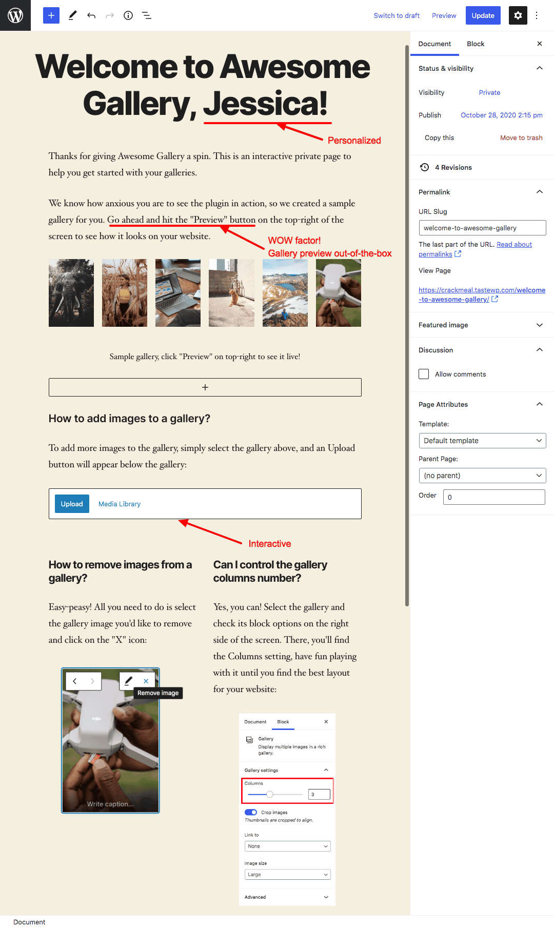
To be more concrete, I’ll give an example. If you have a gallery plugin, on activation, you can create a draft page with a dummy gallery already inserted in it, redirect the user to edit the page with Gutenberg (or any other page builder you want) and include some copy that explains how to configure the settings and setup the plugin – interactively.
That way, the user can immediately see the gallery in action and instructions on how to customize it – all in one place.
I mocked up an example of what I mean. This could be much prettier, of course, but if you read through the screenshot, you should get what I mean.
This approach doesn’t work for all plugins, and may require some heavy customization in some cases, and in others it can sometimes be the fastest solution for both users and developers.
No visual element for your plugin?
Page builders like Elementor or Visual Composer, or plugins that have a strong visual component have an advantage, but for products without any strong visuals, there are still solutions available.
Yoast SEO has done an amazing job of using their red, yellow, and green lights to help users identify page optimization opportunities quickly – and their plugin has zero design or visual component available to it because it’s so technical.
What are the most common FTUE practices for WordPress plugins & themes?
Many developers and users have a strong opinion about onboarding processes and activation redirection in particular, and there is a camp of folks who believe that a plugin or theme should not redirect you anywhere – no matter what.
I strongly disagree with that view, and I’ll tell you why.
The Problem with No Redirection
Unless your plugin or theme does something in the background (automatically), you probably want to:
- Redirect users to the settings page of your plugin; or
- Show an admin notice to explain what’s next, with a link to the settings page; or
- Provide some kind of setup/onboarding process.
The exception is the most simple plugins that do something strictly in the backend and don’t have any settings that need to be customized, in which case FTUE is pretty irrelevant. This is probably less than 5% of plugins today, as there’s almost always something to configure.
Keeping the default activation UX without redirecting users anywhere leaves them wondering: “What’s next?”, and we all know that users don’t like to be left asking this question.
Think about it – when you buy pretty much anything these days – let’s take microwaveable meals, for example – the instructions on the back give you a simple “process” to cook your food – just like using a plugin should give you a simple way to use it, no matter if it’s your first time using it or you’ve used it many times.
Keeping users on the WP Admin Dashboard (without any follow-up details), instead of your settings area, is the equivalent of not including cooking instructions on a microwaveable meal.
Why should you force your users to go digging through the settings of the WP Admin to find the location of your settings page or leave them hanging?
Why should you force your users to go digging through the settings of the WP Admin to find the location of your settings page or leave them hanging?
I can hear the folks who maintain tons of WordPress sites yelling through the screen – “No way! It’s not the same.” And, you know what? You’re right.
The difference here is that you’re not forced to read the instructions. For those people cooking microwavable meals all the time – or maintaining many, many sites – not every plugin needs a customized First-time User Experience that forces users to go through it – or even to configure their settings right away.
I agree that all types of users should have an “easy out” whether they want to stay in your settings area or not.
The Middle Road – WP Admin Notifications
There is a middle road – you can add an admin notification indicating that the user can configure settings or setup the plugin at their leisure.
It is far less invasive to the User Experience, and this way, you don’t force your user to do anything. Ultimately, the user gets a choice.
While this approach is still good, psychologically, it doesn’t always make the most sense for the average user.
Why are users installing your plugin?
Most users have “high-intent” to move forward with configuring or setting up your plugin when they click “activate” in the WP Admin. Their goal is to move forward.
Redirecting to the Settings Page
Redirecting users to the settings page is more actionable. If you do this, I would suggest to avoid overwhelming users with a ton of options upfront.
You can organize your settings in any number of ways, but if you’re going to be redirecting first-time users to your settings, it’s important they’re clearly organized in some logical way.
While this seems like simple advice, practically half of the plugins I’ve installed over the years have major flaws to their logic or flow in the settings area.
If you don’t have a setup wizard, then I think this approach is a great alternative for your first-time users, but it can lead to lower conversions if it’s not structured properly, so it’s an easy pitfall for many developers.
Redirecting to a Setup or Onboarding Wizard
This is one of the better approaches that plugin and theme developers use to onboard first-time users. By guiding users through a linear, step-by-step wizard process, developers can easily identify their needs and guide them to configure the settings they want, which can be highly effective if implemented properly.
This is usually the best approach for first-time users who have never installed your plugin or theme before, and it can easily be combined with a “WOW” factor.
Let’s say you need your users to configure 1 or 2 quick settings and you can put them into a page builder to customize the main visual component of your plugin with other settings preconfigured or a template installed – that sounds like taking care of the user to me.
For example, if you offer a 5-star ratings plugin, some websites will use it for collecting feedback from their visitors, while others will use it for reviewing products and rating them based on author opinion. By simply asking the admin about their use-case, you can pre-configure many of the plugin’s settings, bury irrelevant options, and highlight settings that are more relevant to the admin’s specific needs. .
Why is FTUE even more important for Free Plugins and Themes?
Free users can easily switch between any of the hundreds of plugins or themes available with low commitment to any of them. Unless they’re looking for a niche functionality that only you or a few other folks offer, there’s even higher competition to keep a free user than a paying customer.
This is what makes the experience for free users even more important to the success of a freemium product. If you’re not impressing free users, or at least giving them what they need, your product might get uninstalled in seconds.
Customers who have already signed up for a free trial or paid for your product are much more committed to the process and are more likely to contact support or look through your documentation.
Most paying customers will ask for help or be willing to accept a solution before requiring a refund.
WooCommerce First-time User Experience
Let’s take a look at what one of the biggest players in the ecosystem includes in their FTUE.
The goal here is not to say that any of the aspects of this setup process are right or wrong (that’s for the plugin developers themselves to decide since they know their users best) but to learn from their practices and see what you might be able to do for your product.
WooCommerce Activation Screen
Upon activation, WooCommerce immediately redirects users to an onboarding wizard and asks if they want to go through a “new and improved setup experience” or if they want to skip setup by clicking “Not right now”.
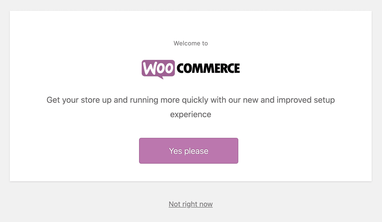
The activation screen is a highly effective filter for all types of users, which makes sense because WooCommerce has users of all experience levels.
You’ll notice that WooCommerce didn’t frame this screen as “Beginner” or “Advanced” by using an “Advanced Setup” option – they simply give users the choice to say “Not right now”, which is an “easy out”. This tactic avoids categorizing users, which might make some users feel uncomfortable if they think they’re too advanced for the easy setup process, or, alternatively, if they’re “afraid” the advanced setup is too complex.
Additionally, to minimize distractions as much as possible and help the user complete the setup process efficiently, the plugin uses a full-screen onboarding wizard, which hides the entire WP Admin UI so the focus is on just these options.
Store Setup Process
The “Yes please” button leads users to the 5 step setup process below, the likes of which I’ve seen in many plugins and themes over the years. WooCommerce is a fairly complex plugin that requires a bunch of configuration just to get started, and it’s important to recognize that the developers thought these would be the most important pieces of information to collect on activation.

Opt-in Mechanism
After filling out Store Details in Step 1, this data collection opt-in form pops up before displaying Step 2.
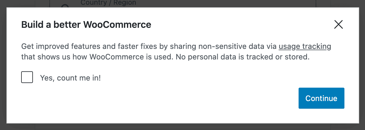
I won’t go into detail about the best practices of opt-in mechanisms (that’s a topic for a whole other article), but the placement interrupts the natural process of this FTUE.
Additionally, the opt-in mechanism requires that the user goes out of their way to actually click the checkbox “Yes, count me in!”, which will lead to far fewer conversions. The point is that when thinking through your first-time user experience, the placement and functionality of the opt-in mechanism can dramatically affect your ability to communicate with and market new features to your users.
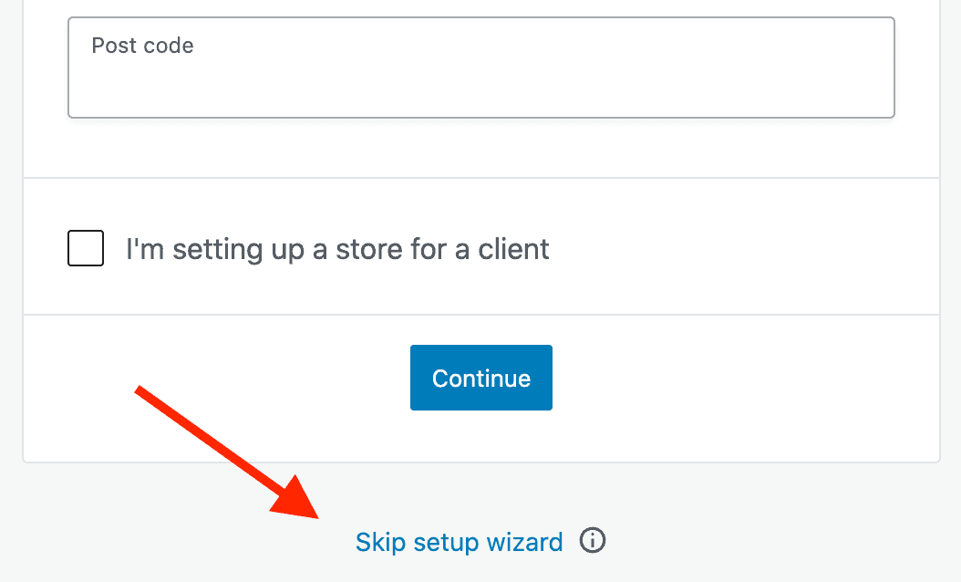
Skipping the Setup Process
It’s worth pointing out in the WooCommerce setup process that users can skip the Setup Wizard during Step 1 (Store details), but not during Steps 2 through 5.
This tactic of reducing distractions and removing the option to abandon the wizard after the user has already shown an intent to complete it is a great way to increase a wizard’s completion rate.
Upselling
Looking more closely at steps 3 and 5 of the setup process, I found that WooCommerce is doing a great job of upselling their paid extensions right in their own onboarding process!
They offer a Subscriptions add-on in Step 3:
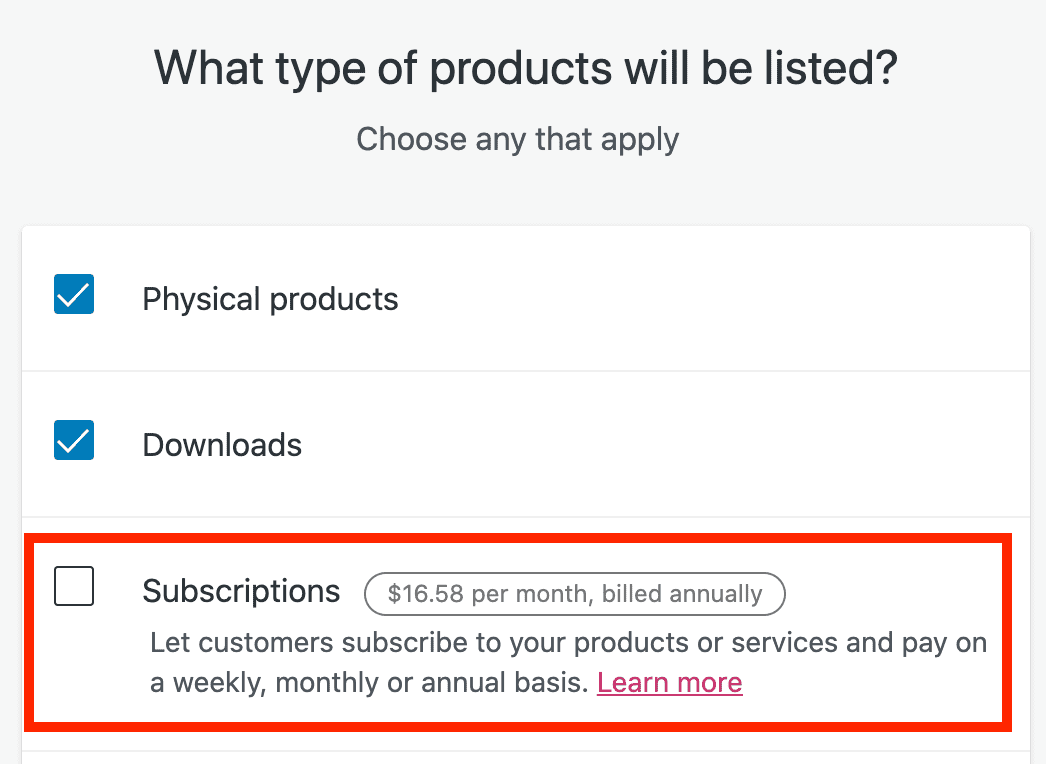
This is a great strategy if you want to entice users to complete plugin setup while raising their awareness of additional features or products you have.
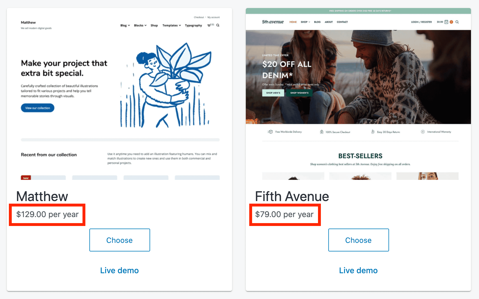
They offer paid themes in Step 5:
Extended Setup Process
The WooCommerce setup is so extended that these first 5 steps are part of a series of 7 components of setting up a WooCommerce store.
This progress checklist appears in the WooCommerce settings area after finishing Steps 1-5 above:
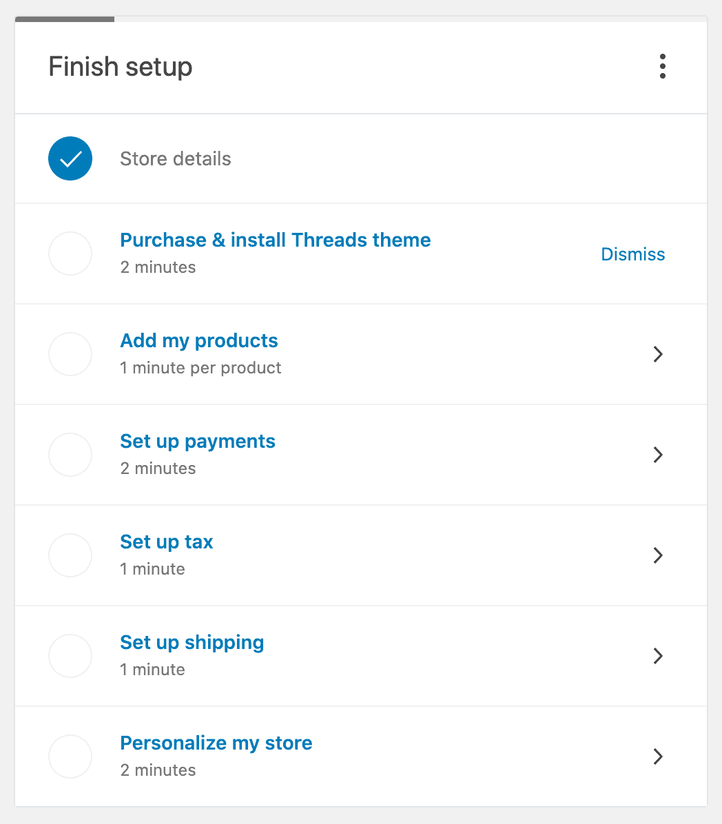
If users selected a paid product in Steps 3 or 5, they are reminded to purchase it in the checklist in order to complete the setup process for WooCommerce.
Overall, the WooCommerce setup process doesn’t “WOW” me, but it gets the job done.
If you have a more complicated plugin, you can break your setup process into steps like this in order to make every piece more bite-sized for users. This works best for users who need to take a lot of steps to get where they need to go, or if they don’t have experience in customizing your product.
However, using the strategies earlier in the article, you might be able to create something much more impressive than WooCommerce offers for their plugin.
Lost on where to start?
If users are getting “stuck” at certain points after activating your product, you can improve the FTUE by surfacing the information they need at the right time. Your support tickets might give you a clue to this or you can incorporate other data tracking measures to see how users interact with your product.
Thinking ahead a few steps in the process can give you an edge in communicating valuable information in a way that will help guide users along.
Optimizing the first-time experience is more than just making users happy – it’s a good opportunity to discover gaps in your product and find opportunities to grow your sales.
The Satisfaction of a Great UX
As product developers, we all know how great it feels when something just works. Making your users feel the magic of your product with that “WOW” moment will make them confident to buy your product and keep their subscription in the long-term.
I love chatting about UX and how to impress users with the right approach, so if you have any questions/ideas, please share in the comments below.


I agree and disagree. On one hand redirectng users to a settings, onboarding or "wizard" page after installation is a nice thing from the UX perspective. On the other hand, do not forget that in WP there is an option to activate multiple plugins in bulk. In such cases automatic redirections are far from expected and it is plain annoying. Any solutions?
As a good practice, developers might consider redirecting only on the first activation of the plugin for that site. I imagine that most WP users are activating multiple plugins when testing or debugging compatibility issues or other site-wide issues, which means most of the plugins will have been activated at least once by that point and won't redirect again.
Besides that, and I know it might seem like a cop-out to say it but I'll say it anyway: WP should probably have a default mechanism to override any redirections when activating multiple plugins (if possible). There's so many variations in the ecosystem, and to prevent a bad UX, that's probably an easy solution for everyone.
Interesting article, thanks. We're planning to add setup wizards to all our plugins in the next year, and I agree that WooCommerce is the best one to use as inspiration.
Don't forget about onboarding emails. We send a plugin-specific 'Getting Started' email in addition to the purchase receipt email, which contains simple step-by-step instructions on the easiest way to get up and running. We also send an onboarding email sequence over the next few weeks, with further tips, features they might have missed, and recommendations of our other plugins that work well with the plugin they already purchased.
Thanks for sharing! I might have a spot to mention that in one of our upcoming articles about email automations, if you don't mind ;)
I wouldn't quite say WooCommerce is the best, but it works for their product. I think it could have more of a wow factor in a few ways (design of the UI could be nicer, it could be faster to create the 1st product, the more "complex" or less-important steps can come later, etc) - there are so many ways to approach FTUE though...definitely one of my favorite topics.