
A mega-project deserves a mega-announcement!
The new Multi-store Dashboard is by far our biggest milestone and most complex deployment in 2022. More than a year’s worth of hard work — scrutinizing, listening to feedback, making changes — has resulted in a brand new multi-store interface that’s powered by super-fast, granular, and customizable analytics.
What’s under the hood is mind-blowing and like nothing else on the market at the moment. But before we dive into those technicalities, let’s take a look at the reasons we’ve made such sweeping changes to our dashboard.
Our Initial Focus and Methodology
When we started Freemius, we focused specifically on free and freemium plugins because we identified — and believed in — the power of the WordPress.org economy (and still do).
We also wanted to help developers with products on the repository get rewarded for their efforts. That is, make money that could be reinvested in support, new features, and product improvements, instead of working for very little donation-based compensation.
As our focus was on helping developers of free plugins to monetize (who didn’t have “stores”), we structured our entire system and dashboard to work on a ‘per product’ and freemium methodology.
While we had use cases of developers with several products using Freemius, we had no instances of developers running multiple stores. Besides, we didn’t even have a Customer Portal back then and it didn’t matter to us whether devs sold their products on one website or twenty websites.
Introducing the Customer Portal and Multiple Stores
At a certain point, however, we introduced the concept of a Customer Portal that could be embedded in our partners’ websites.
For developers with multiple products belonging to different stores, this was a problem.
At the time, a common use case was theme shops, where there could be two websites (or more) with different branding and names that belonged to the same legal entity/company.
Let’s say there are two websites — Store 1 and Store 2. If you were to make a purchase from Store 1 and then log into its Customer Portal, it simply wouldn’t make sense for products from Store 2 to appear there.
Admittedly, this was a confusing experience for users and one that made us realize we had to implement a ‘store entity’ that aggregated products under a specific store.
From there, we automatically created a store for every developer and assigned their products to it. Technically, we still didn’t have a way for developers to manage multiple stores using the same account, so we advised them to sign up with other accounts to receive new stores and then register the relevant products there.
This was annoying for a few reasons:
- Developers needed to manage multiple stores from different accounts using different email addresses.
- As revenue share is per account, and not per product, we needed to manually adjust it for developers who wanted to start another store.
In addition to the process being broken and unstructured, the ‘per product’ view wasn’t optimal for developers with many products.
For example, if a customer reports an issue but doesn’t specify which product they’re talking about, a developer selling multiple products from a single website will need to reach out for further details or go to the dashboard and search for them in every product that’s configured with Freemius, just to locate the customer’s account.
There was no organized, centralized place to see a user profile, or to see how they were using products.
Clearly, the navigation and product management needed work.
The Legacy Analytics Dashboard and the Need for Change
Back in the day, we were running queries on the database to pull data in real time. This worked well for us for a few years — until we had a period of rapid growth. This meant that the database grew exponentially and started to consume significantly more resources, which brought with it dashboard malfunctions and API timeouts.
At this point, we realized that we needed to build a robust analytics layer. This was a mega-project that took over a year to complete. And for it to work properly, a system needs to run in the background indexing raw data into warehouses so that it’s ready to be delivered when a developer wants to see it.
We built (and optimized) this based on more than seven years of learnings, specifically for the needs of our audience to run a sustainable subscription-first business. Also, over the years, we learned about the flaws of some of the metrics we used to show in the dashboard. Specifically, those which are prone to errors or inaccuracies, such as the conversion rate (which is inaccurate because we don’t have full visibility of free installations and rely on voluntary opt-ins).
So, in addition to trimming inaccurate metrics, we also spent a ton of time considering what to show because we wanted to deliver data that developers really needed (and wanted) to see. A good example of this is a new chart that shows MRR growth over time, which is pretty complex and resource-heavy. With the new dashboard, we’re currently showing 95% of what developers need to see, and we have plans to add even more once we’re up and running.
I’m pretty confident in saying that the new analytics dashboard is the most advanced, flexible, and versatile platform that’s out there at the moment. It’s pretty incredible and I’m proud of what the team has accomplished.
Now that the history lesson is over, I’d like to formally introduce you to:
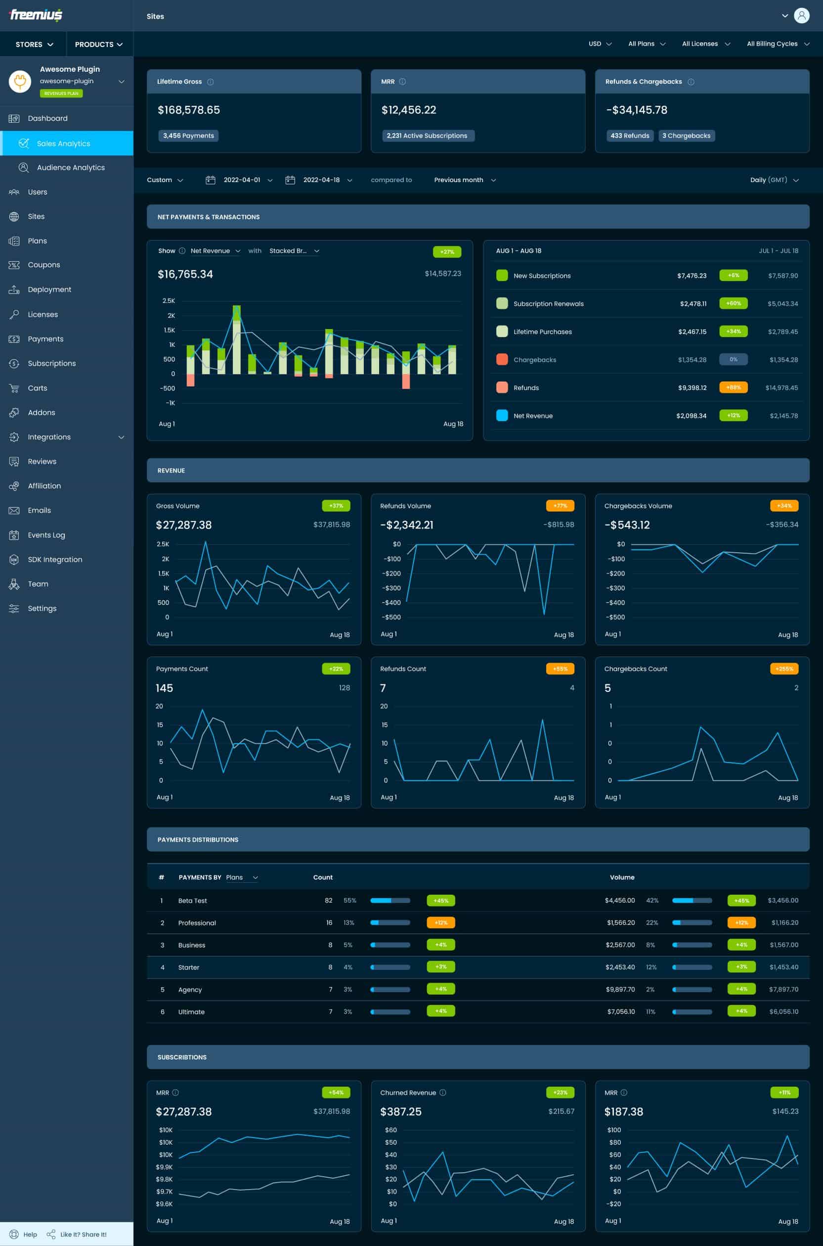
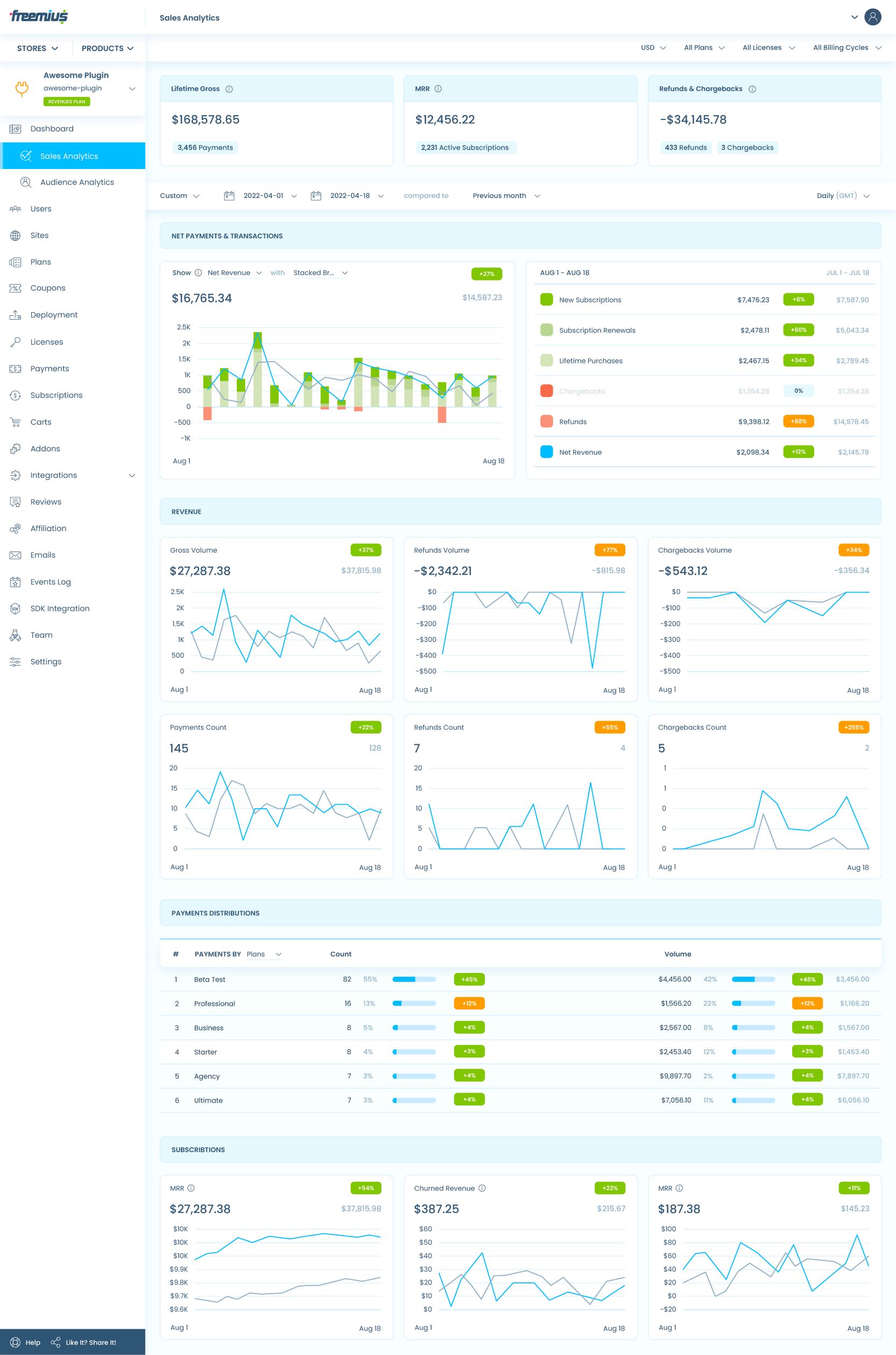
The New Super-powered Sales and Audience Analytics Dashboards
What a difference!
On the left side, you’re seeing a familiar sight — static information that can be toggled via a date range, etc. While some of the data that’s being presented is still valuable, the interface is pretty messy in places.
But this is all changing
Our legacy dashboard had sales and audience analytics in the same place. For the new dashboard, we decided to split these up, for two reasons:
- We’ve learned over time that developers who are monetizing their products prioritize sales performance over growth performance.
- We wanted to reduce the server’s load and make the experience faster, more efficient, and less overwhelming.
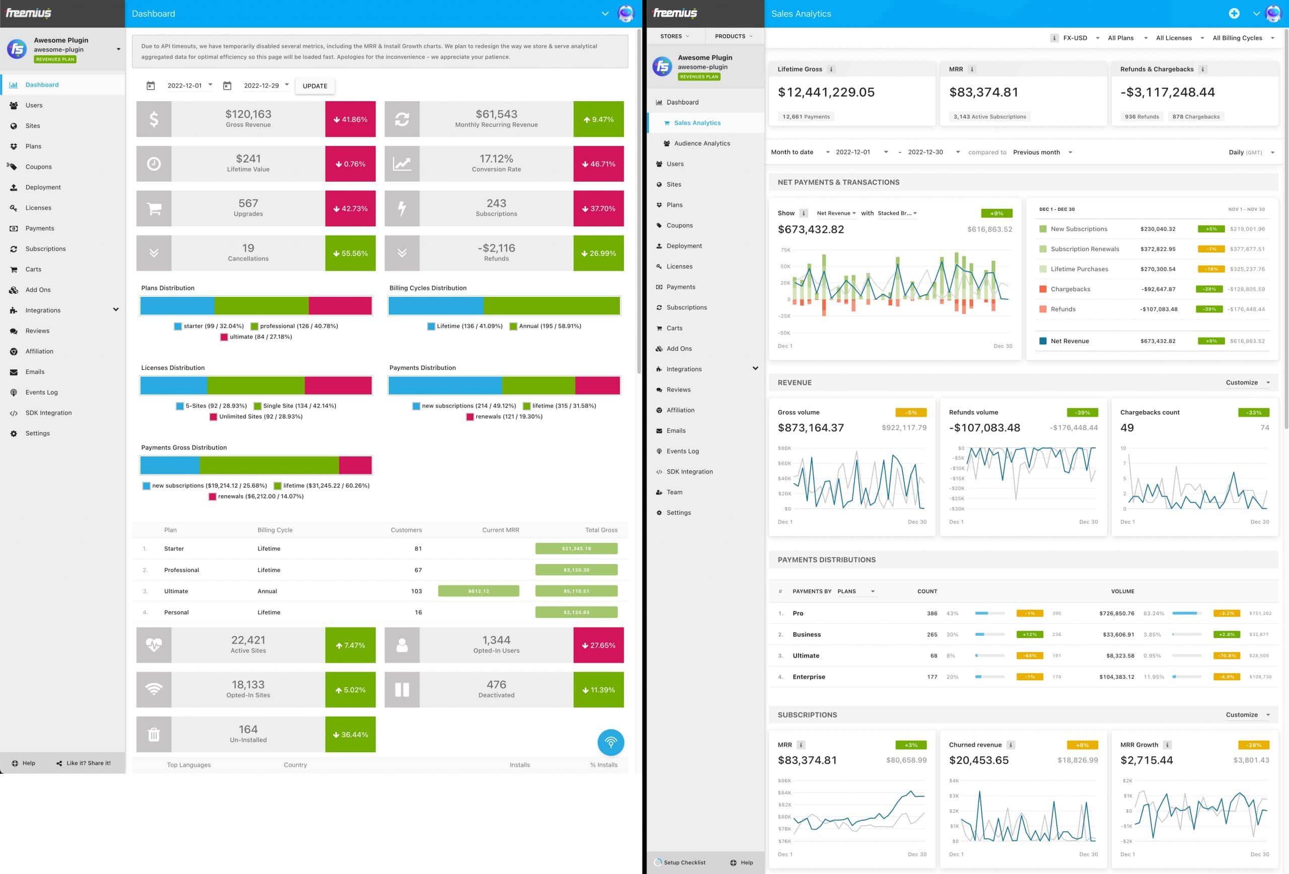
The New Sales Analytics Dashboard
You’ll see that there are several lifetime KPIs featured — sales, refunds, and chargebacks. These are there to give developers a snapshot of the success of their business over time using Freemius.
If you look at the other data points, you’ll see that they’re mostly made up of charts:
New Analytics Charts List
NET PAYMENTS & TRANSACTIONS
REVENUE
- Gross volume
- Refunds volume
- Chargebacks volume
- Payments count
- Refunds count
- Chargebacks count
PAYMENTS DISTRIBUTION by…
- Plans
- Licenses
- Billing cycles
SUBSCRIPTIONS
- MRR
- Churned revenue
- MRR growth
- Active subscriptions
- Canceled subscriptions
- New subscriptions subscribers
- Subscription renewals volume
- Subscription renewals count
TRIAL WITH PAYMENT METHOD
- New trials
- Potential volume
- Converted count
- Converted volume
- Cancellation count
TRIAL WITHOUT PAYMENT METHOD
- New trials
- Converted count
- Converted volume
- Cancellation count
There are now two layers to the Sale Analytics Dashboard — filtering and date range selection.
Date Range, Comparison, and Charts Resolution
We’ve also implemented predefined periods which will help developers easily compare product performance or campaign performance. For example, BFCM 2022 versus BFCM 2021, or a campaign against a normal sales window.
Below you can see how the comparisons are visualized:
You can see (in real-time) how the performance metrics you’ve selected compare to one another. In the above example, it’s shown as a weekly increment, but the new system is really flexible and you can swap it to daily resolution, plus you can even go deeper to the level of hourly resolution if you want to inspect the data in a more in-depth way.
It’s a big upgrade from what we’ve had before, and I really can’t wait for you guys to start playing around with it!
Now, onto the next layer
Granular Filtering and Insights
Not only is the filtering aspect super cool, but it’s also really helpful. Say you’re selling in multiple currencies, you can filter and change the entire dashboard to display whichever currency you’re wanting to see. And that’s only one filter.
If you’re running multiple plans and want to see how a specific plan is performing (or a combination of them), you can tick the boxes and watch the data update in real time. There’s no loading here. You can also see how different licenses and plans are performing and filter by billing cycles with the touch of a button. This really lends itself to research, analysis, and experimentation to see what’s working and what’s not.
Every pricing-related experiment is now backed by real-time data.
Another thing we learned was that some data points weren’t clear in the legacy dashboard. To remedy this, we’ve implemented an ‘info’ button alongside each non-obvious metric that explains exactly what it’s measuring and why.
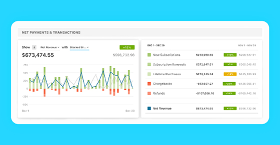
Stacked Charts
These features are … well … stacked!
We’ve implemented stacked charts to give you an overall view of performance from one centralized place.
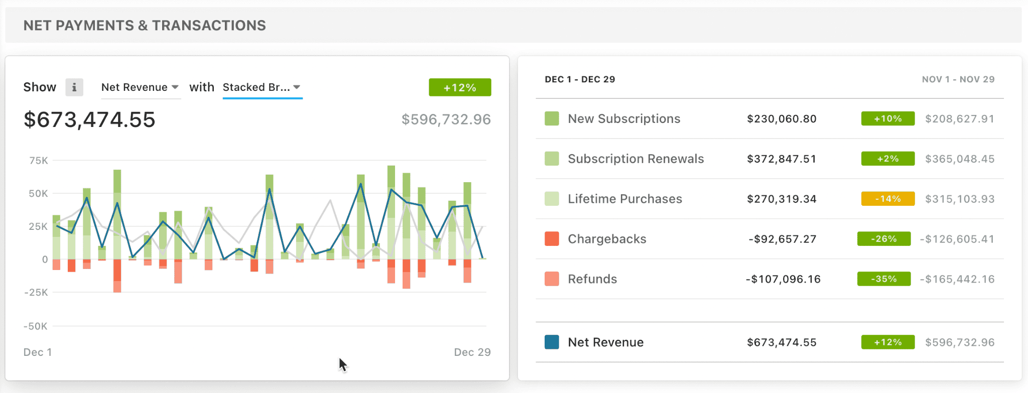
This gives developers a complete breakdown of where sales are coming from, such as subscriptions, renewals, lifetime purchases, etc. Product makers can also see how new subscriptions are comparing to chargebacks — for example, subscriptions may have grown by 115% but there’s also been a 200% increase in chargebacks.
You’ve got a lot of other options at your disposal too. For instance, you can analyze based on revenue or the number of transactions — it’s really up to you and what metrics you want to see.
And when you return to the dashboard at another time, the metrics you’ve selected will be exactly as you left them. It’s fully customizable and we’re not done — the engineering team wants to add new abilities in the future, but we’ll wait on you guys to feedback on these new ‘stacked’ features.
It’s a team effort
Minimizing Real Estate for Better Insights and Efficiency
Previously, the payment distribution wasn’t visualized very efficiently and it took up loads of real estate. To fix this, we’ve created a table that you can slice & dice based on plans, licenses, and billing cycles. Check out the side-by-side comparison (much better, right?):
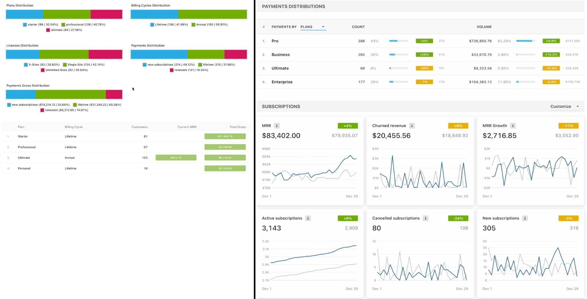
With this new visualization, you can see all of your plans, their volumes, and transactions, as well as compare them with whatever date range you’ve selected. There’s a lot of flexibility here too, and you can add/change/remove licenses as you see fit.
You can also compare all of them, over different periods. It’s really up to you and we really want to give you guys as much customizability/flexibility as possible.
An intention we’ve carried over to the second analytics section:
The New Audience Analytics Dashboard
Pretty cool, right?
The concept of the Audience Analytics Dashboard is similar to its sales counterpart in that you’ll see we’ve included all-time users, active installs, and all-time installs at the top of the page. While there’s no billing cycle filtering and similar options, you’ll still have the new date range selection and the ability to compare data to whatever ranges you want, plus you get resolutions too.
There’s also a growth chart that lets you compare activations over a certain period and displays the effective growth during the time window you’ve selected.
Real-time Charts Have Replaced Static KPIs
Just like with the new Sales Analytics Dashboard, we’ve changed the static KPIs in the Audience Analytics Dashboard to charts. These also come with clickable info points to clarify exactly what each chart is displaying. On top of that, we’ve changed the data points so that they’re as accurate (and relevant) as possible.
With the overhauled charts, you’ll know how many activations or opt ins there are, and whether they’re license activations or opt-ins. Not to mention you’ll know how many uninstalls and deactivations a product has had, at any period in time. Disclaimer: we only know this for websites that opted-in or activated a license.
Visualizing the Complexities of Version Breakdowns
One of the most challenging parts of the new analytics was trying to figure out how we could store and then visualize different versions. It was pretty complex, but I’m happy with our eventual solution.
Someone in the team even joked that our new version breakdown chart looks like artwork — so bravo to our VP of Engineering, Swashata Ghosh, and CTO, Dror Yaakov, for turning something complicated into something visually appealing.
When you ask a Developer to create art , coming soon to your @freemius Developer Dashboard pic.twitter.com/JOCNvFqPgE
— Swashata ⚛️ (@swashata) September 12, 2022
The new version breakdown graph provides an aggregated distribution view of all versions at specific points in time. This allows you to see things like how a version adoption is performing, such as in this example:
A developer can literally move the date range in real-time to see where a version is growing or shrinking. And this functionality is not just for the plugin versions, we’ve implemented it for WordPress, PHP, and SDK versions too.
We’ve also introduced a ton of flexibility in these charts, but there are too many to cover here and it’s probably best for you guys to get your hands dirty and discover them
Suffice to say our engineers really enjoyed getting technically ‘crazy’ with the options and the customizability.
Languages and Locations
Previously, languages and locations were combined, but the new dashboard splits these data points for deeper insights into your product distribution. Now, the languages and countries are aggregated and you can customize the table to show distribution by language and region, etc.
Again, we’ve tried to bring a serious amount of customizability and flexibility to these metrics.
It’s worth noting that we still don’t store reasons for uninstallation in the new dashboard. This decision is not set in stone, and we’re open to adding this data point back if we see that there’s a need for it.
Preserving the Old Dashboard
We’re not saying goodbye to the old dashboard right away. Developers will still be able to access the previous version for a limited time in case we’ve missed/forgotten something. That said, we’re hoping this won’t be the case as we ran the new dashboard in beta mode for at least 6 months, so there was a healthy period of testing, feedback, and scrutiny.
Now that we’ve taken a close look at the new analytics features, I’m excited to dive into:
The New Multi-store Management
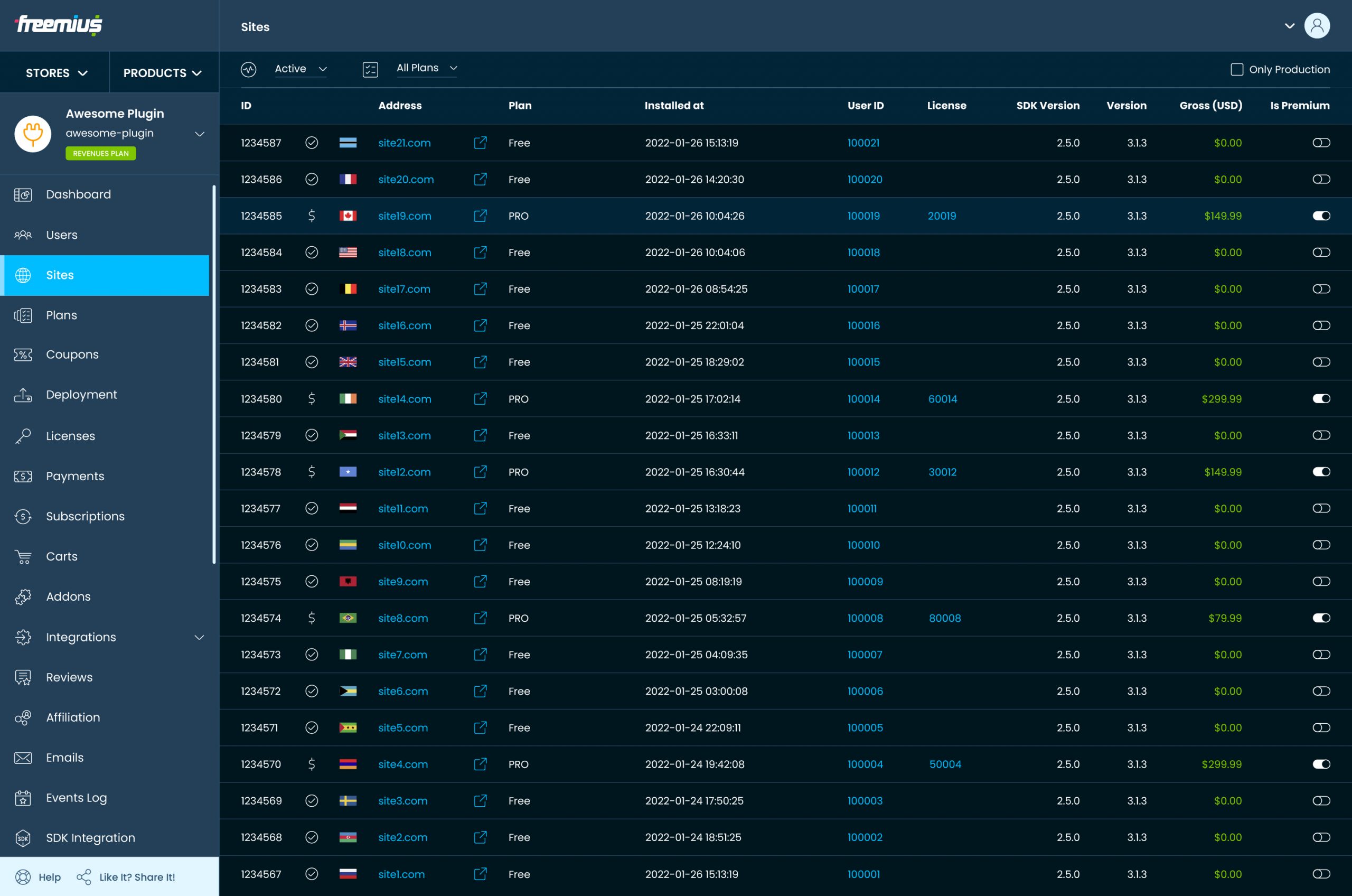
As mentioned, a developer looking for a user of another product would need to switch the context and search for that user under that product. It’s super time-consuming and inefficient.
With the new interface, product sellers can access different areas of the dashboard directly from the store. Now you’ll be able to see every user associated with a specific product, as well as those users who have multiple products associated with them. From here, developers can go even deeper and see everything related to that user in the context of the store. For example, licenses, subscriptions, payments, etc.
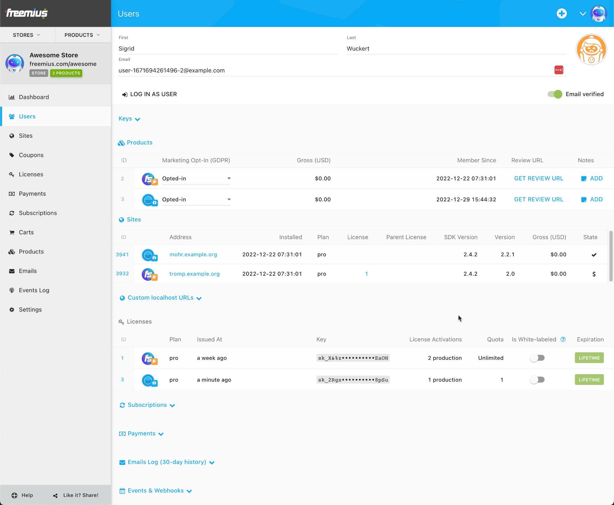
This gives developers, marketers, or support reps a centralized place to view user data in the scope/context of an entire store.
And this holds true for websites too. You can easily search for a website in the store context and see which products are being used on that specific website.
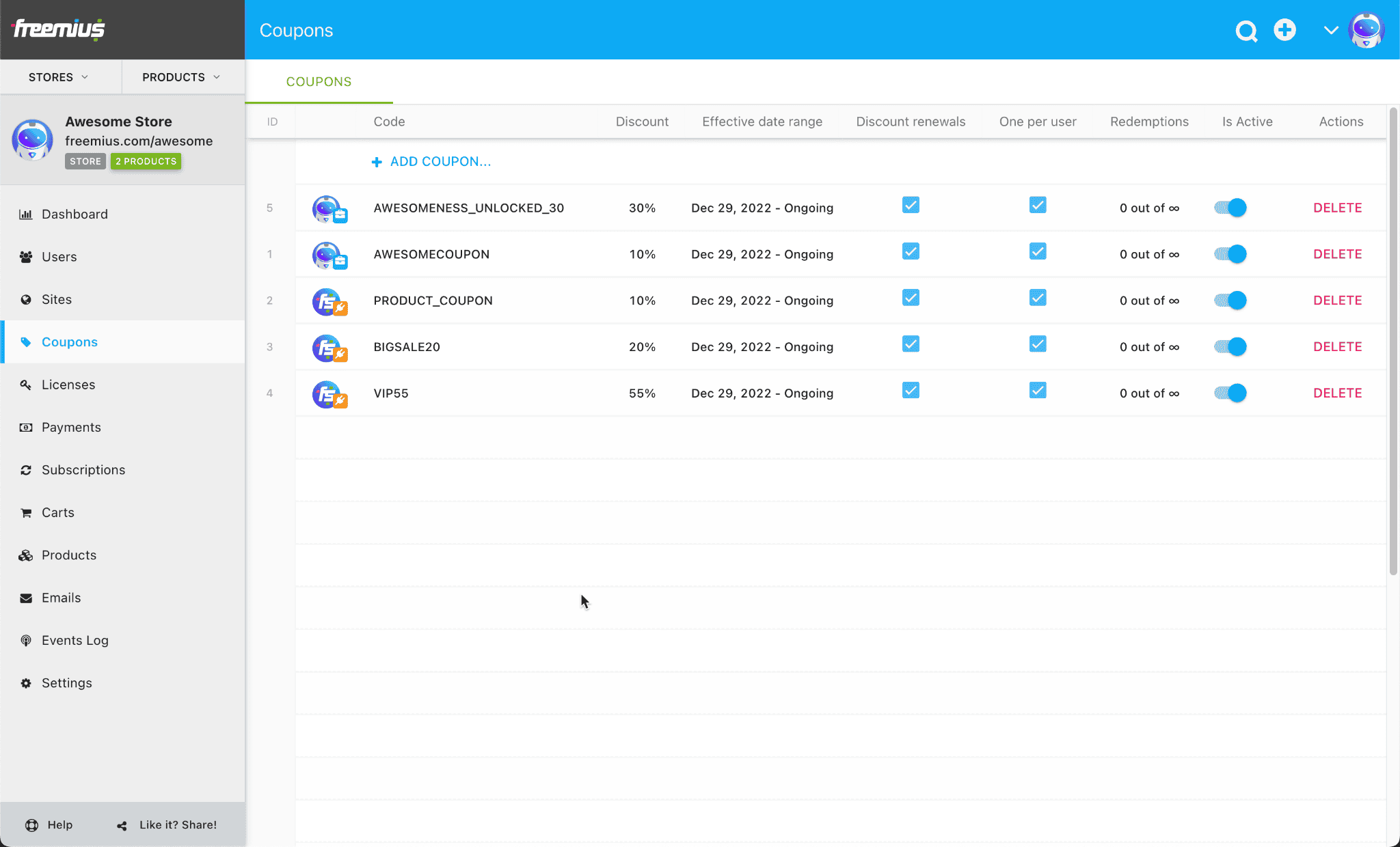
Coupons Codes: One Action Instead of Twenty
In cases where it makes sense to create assets like coupons at store level, we’ve introduced a layer that allows you to selectively choose which products and plans to attach assets to. Now, devs can go to the coupon section at store level and add the discount code to the products and plans they choose. In the past, you had to create a coupon for every product, even if it was using the same code.
The new store-level coupon section is a massive time-saver, and one that’s even more beneficial for developers who have theme shops or WooCommerce extension stores with many products.
Sales Performance Overview
If you go to the Dashboard section at store level, you’ll now see the sales performance for the entire store, i.e., how all of your products are performing together. We’ve implemented a consolidated view with powerful filtering and date range selection that still allows for choosing licenses and billing cycles, etc.
Basically, you are getting the same powerful sales analytics at store level that you’re used to getting per product.
We’re also analyzing the above to get an understanding on what future actions to take on the entire store versus products. This is an iterative process and we’ll be introducing more options that you can apply as we receive feedback.
Multiple Store Creation and Product Aggregation
We’ve mentioned the challenges of our previous dashboard and how stores were assigned by product, which meant developers had to create new accounts to add new products.
These problems are a thing of the past!
Like the name says, you can create multiple stores. In addition, you can move products between stores, plus you can manage multiple stores under the same account.
It’s the convenience of doing everything from one intuitive place that has us so excited about the new dashboard — and we can’t wait for you to try it out.
A Quick Tease of What’s to Come With Design
We can’t let the engineering team have all the fun, can we? On top of the technical overhaul to our dashboard, the creative team is in the process of refreshing the dashboard’s design, from iconography and fonts to the entire look and feel.
It’s fresh, modern, and gives a hint of what’s to come for Freemius’s brand identity too Massive kudos to our lead designer Vitalii Romaniuk on the progress:
What’s Next?
The dashboard is a powerhouse and it’s incredible depth and functionality is a testament to the skills and talent of the Freemius engineering team (we are hiring senior PHP devs and WordPress devs – join us!).
But you guys wants specifics, right? Here are a few of the plans we have in the pipeline:
- We also want to add a CLTV chart (Customer Lifetime Value). It’s important for us to include this metric because it will help our partners evaluate if they capture more value from customers overtime, with upselling, etc.
- The new dashboard metrics are almost 1:1 with the unit economics evaluated during WordPress acquisitions, which we’ve all seen massively growing in the past years. A vision I have is to include a button that exports all of the business data potential acquirers would need from sellers looking to exit.
- We are going to employ the power of our analytics layer for user-facing and affiliate analytics
This is just the beginning — a mega-project like the Multi-store Dashboard and its analytics layer is ongoing and iterative, especially in the early days. We welcome any feedback that will help us develop and improve it for Freemius partners and the WordPress community as a whole.
Onwards and upwards, together


Great update! Much needed. Thank you.
"We’re not saying goodbye to the old dashboard right away."
How can we access the old dashboard?
A huge improvement! Thank you and great job, Freemius Team.