|
|
You’ve probably read a lot about conversion rate optimization (CRO), the practice of testing user experiences to encourage visitors to take actions that drive value.
If you care about your WordPress plugin or theme business, you’ve been A/B testing landing pages, newsletter subscribe pages, in-plugin/theme upsell messaging, and any other place where visitors could give you money.
Did you know you can actually encourage users to do absolutely nothing and have an even BIGGER impact on your bottom line?
Encouraging users to do nothing can result in higher profits per customer and more efficient use of your advertising dollars. Money for nothing and clicks for free!
What is uCRO?
uCRO or “unconversion rate optimization” is the practice of testing user experiences to encourage users *not* to take actions that detract from profitability.
Unlike CRO which focuses attention at the top of the funnel, uCRO focuses attention on keeping customers from dropping out the other end by discouraging actions like canceling your recurring services, uninstalling your plugin/theme, requesting refunds, or increasing your operational expenses.
By focusing on both ends of the funnel, you can increase the value of customers you acquire, which allows you to exponentially grow your business.
Flyover country
In the center of the USA, there are a group of states called “flyover country”. The thought is that the middle of the country is just a place you fly over when going coast-to-coast. There’s nothing interesting going on there.
As someone who lives in “flyover country” (Austin, TX), I can assure you there’s more going on than an endless expanse of prairie and mountains slipping past an airplane window. There is an amazing innovation, a diverse and rich culture, and a driving force in the world economy. If the “flyover country” were its own country it would be the #1 or #2 economy in the world for GDP. Okay, maybe there is something interesting going on there.
In the plugin and theme business there’s also a ton of valuable “flyover country”:
- Refund pages
- Cancellation pages
- Data export pages
- Plugin/theme admin pages
- Support pages
All of which are places where visitors can use the escape hatch in your funnel.
Despite all these places where revenue wastes away into space, developers and designers quickly breeze past these experiences when optimizing their funnels. Flyover country.
When was the last time you optimized experiences at the bottom of your funnel?
The good news is that there’s a lot of opportunities for you to plug up the bottom of your funnel and exponentially grow the profitability of your business. Let’s take a look at a few examples and discuss some optimizations you can try.
Decrease Cancellations Using Cancel Pages
Cancellation pages are one of the more sustainable ways to monetize your plugin or theme like Software as a Service (SaaS). Charging recurring payments helps you build upon your past success and allows you not to have to “start over” every month.
With a recurring revenue customer base, changes in search rankings, competitive pressure, and other unforeseen challenges don’t have to decimate your revenue.
Of course, recurring revenue models only work if the customer keeps recurring. Here is your opportunity to encourage someone to do nothing.
Providing users an easy way to cancel a recurring service is a must-have for customer service, but that doesn’t mean you have to give up!
Users visiting subscription cancellation pages have a reason why they want to cancel. You may even be asking them why they’re canceling so you can improve your product and prevent future cancellations, but there’s more you can do.
For starters, randomize the reasons on your cancel page to get more accurate results (evens out people who just pick the first one) and provide counter-arguments for each reason.
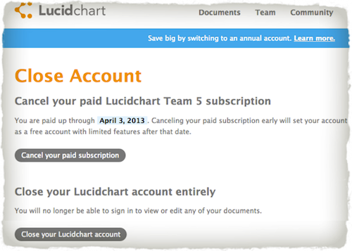
In this example of Lucid Chart’s cancellation page, you can see that they don’t ask the reasons why people are leaving (harder to improve), and of course, don’t offer counterarguments to leaving. Think about how you can help the customer solve a problem rather than just let them leave.
If one of your common reasons is “your service is too expensive”, maybe offer a counter reason like “Remember our plugin helps you make money. Read more about how to use our plugin for best results.”. Providing links in your counterarguments to supporting documentation or offers to contact support is a great way to draw clicks away from the dreaded “Cancel” button!
Trying different combinations and styles of counterarguments like videos, screenshots, and links to other resources can result in big gains.
Giving the customer the ability to put their account on hold or downgrade can also be super effective at cratering your cancellation rates. Even letting users have the option to upgrade to a service that may be a better fit could help you turn an unconversion into a conversion.
The bottom line is to A/B test experiences that help the customer overcome the reason they landed on your cancel page in the first place.
For Plugin Owners: Plugins View in WP-Admin
One of the most frustrating things about running a plugin business is that your customers can stop using your product and there’s very little you can do about it. All they have to do is log into WordPress and click the dreaded “Deactivate” and “Delete” links in the Plugins view. Your upgrade or recurring revenue funnel just exploded.
But there IS something you can do.
When you code your plugin, you define the “Description” attribute in the headers.
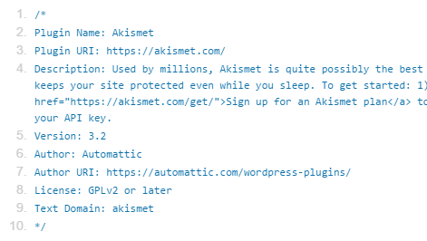
As of the date of this post, the Description attribute data is only used in the “Plugins” view inside of wp-admin.
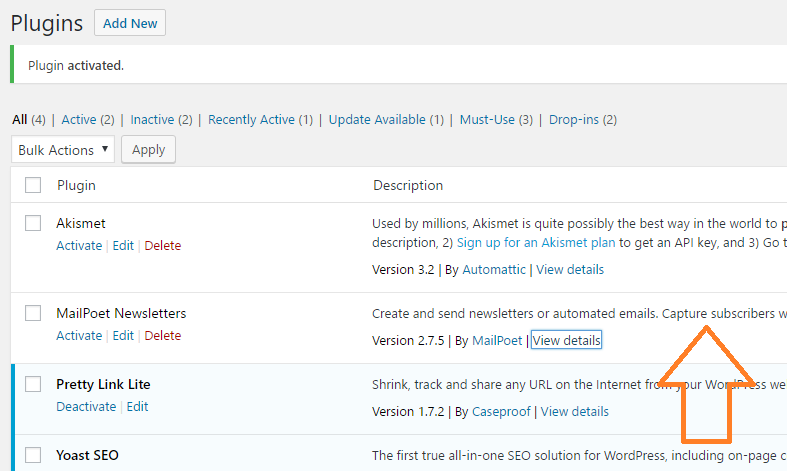
This is the very view that webmasters on the hunt for plugins to nuke from their stack will see. Use this opportunity to optimize your description to make sure your plugin isn’t piled on the heap of newly slain plugins.
Try providing links to support documentation and showcasing the value of your plugin to their business. You can add text links and strong tags in your description to help it stand out from bland plugin descriptions begging to be removed from the user’s site.
You can also try to upsell customers in your description. Perhaps the reason why they no longer want your plugin is because they’re ready for your SaaS upgrade, complimentary theme, or premium option. Turn your unconversion into a conversion and provide links to buy more!
Remember, the Description attribute is only used on the Plugins view in wp-admin, so you have a lot of latitudes to try to keep customers from uninstalling your plugin or to try to get them to add even more to your bottom line.
Uninstall / Exit Surveys
Another simple way to prevent customers from leaving is to collect uninstallation feedback from your users, just before they say goodbye. You can use this feedback to improve your product and later reach out to the user by email to announce the improvement and offer a solution.
If you’re reading the Freemius blog, you’re probably aware that exit surveys (AKA the ‘Feedback Form’) are a standard feature of the Freemius platform. Score!
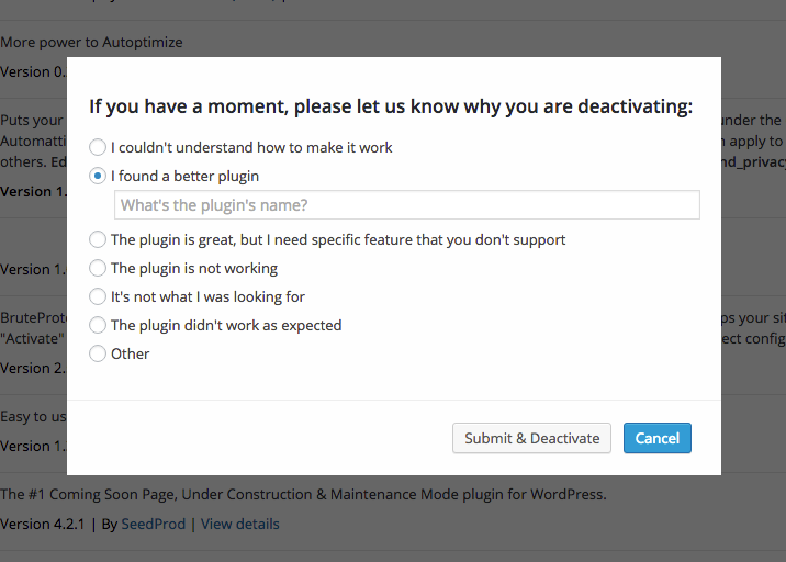
Freemius reports 8 out of 10 users are happy to tell you what’s wrong with your product so you should be able to collect plenty of data. In my personal experience, 11 out of 10 users are willing to tell you what’s wrong with your product. Ha.
For Theme Owners: Theme View in WP-Admin (Switching Themes)
If one of your theme customers is in the themes view on their wp-admin, your days are numbered. I’ve never met a person who was happy with their web design more than two weeks after their new design was launched.
Now it’s your turn to have your theme (upsells, SaaS offerings, etc.) shoved out the door for a fancy new theme that caught your customer’s eye. While your chances look grim, it’s not too late.
When creating your theme, you can place a Screenshot of the theme in the root folder of your theme named “screenshot. png/gif/jpg/jpeg”. The Screenshot you provide is the only thing you can control on the Themes view in wp-admin. This is the very view people look at when they are looking to switch themes (at some point anyway).
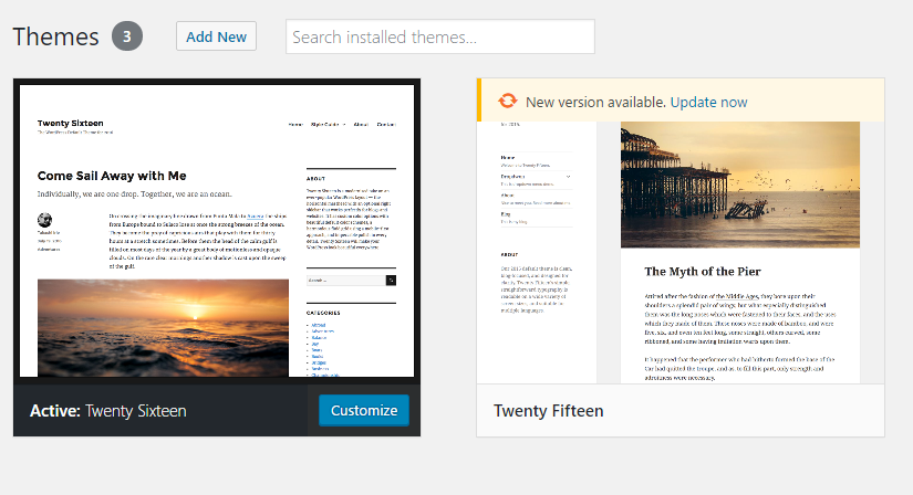
This is your opportunity to retain a customer who may buy support, complementary plugins, or other services from you in the future. You may even be able to convince the customer to buy one of your newer themes!
There are two approaches to screenshot strategy that you need to carefully consider:
If your goal is to get into the wordpress.org repo, you should tread with caution. If you’re too bold in your screenshot optimizations, you could tank your chances of getting accepted into the repo.
To make matters even more complicated, the screenshot will be used both in the repo search engine and on the Theme view in wp-admin. This means your audience is both people looking to possibly install your theme and people looking to uninstall it. Arghhh!
The theme screenshot is used both in the repo search engine and on the Theme view in wp-admin.
Themes looking to get into WordPress.org should provide a clear screenshot of the theme, but you do have room to work in CRO/uCRO messaging into the screenshot.
When you code the demo content for your theme, use messaging that enforces your brand and services if appropriate. Instead of Lorem Ipsum demo content, talk about your amazing support, the vast variety of themes, or complementary services in the demo content. Use your brand name or domain in the demo content so people can look you up.
You can’t put a link in a screenshot. Techniques like this can help you prevent people from uninstalling your theme by providing them valuable support information or opportunities to buy more.
If the user buys and installs one of your Premium Themes, the fun really starts. The only rule on screenshots for Premium Themes is “there are no rules.” Premium Themes can’t get listed in .org anyways.
While you should use good etiquette and not design messages or experiences that detract from the overall experience of WordPress, there is no real restriction on what you can do with your screenshot in Premium Themes.
Additionally, unlike repo themes, your screenshot will only be used in the Themes view inside of wp-admin (3rd party theme directories aside), so your audience is nearly 100% people who are looking to replace your theme. Now you can get your uCRO on!
With Premium Themes, try including a phone number or support URL visual overlay on top of your screenshot to offer assistance if people are having trouble with your theme. Maybe the customer just needs to fix one thing? If you charge for support, this may actually be a way for you to make even more money.
Show an easy upgrade URL within your screenshot so the customer can search your other themes or complimentary plugins. If the user is going to change themes, it might as well be to one of yours.
The other cool thing about Premium Themes is that you can use a GIF file for your screenshot. This means that your support info or calls-to-action can animate over the screenshot to attract the user’s eye. Use these techniques with caution though as animated GIFs are a quick path to the dark side…

*Bonus: If the customer still deactivates your theme and you’re a Freemius customer, don’t forget that you can use the exit / uninstall survey on themes as well!
Newsletter Unsubscribe Pages – “Punish Derrick”
Unsub pages are a fun place to flex your uCRO muscle. After furiously clicking on the “unsubscribe” link in your email your newsletter subscriber is in a heightened state of emotion. They’ll show you!
Try using humor and fear of what they’ll miss if they unsubscribe to keep the subscriber from jumping ship and missing out on your future content, offers, and upsell messages.
Groupon’s famous “Punish Derrick” unsub page showed their subscribers that poor Derrick would be punished with a face full of fake coffee if they unsubscribed. By using humor, you can turn that frown upside down and keep a few more subscribers on your list.
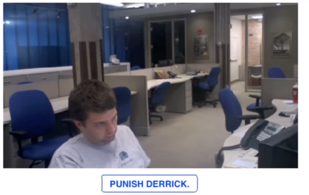
I’m also a big fan of offering different subscription options where the visitor can limit the number of emails they receive, or better yet, an option to buy something.
Just because someone doesn’t want your emails, doesn’t mean they don’t want to give you money!
Website Support Documentation
When your customers are visiting the support documentation on your website, they’re there for a reason. They need to solve a problem.
If the customer clicks on “Contact Support”, your support page didn’t solve the customer’s problem. This is going to cost you money (assuming you don’t charge for support) and it’s going to cost the customer time to resolve their problem. Lose, lose.
Experimenting with your website support pages is a great way to reduce the money you spend answering tickets and the effectiveness of your website copy to quickly resolve issues for your customers.
Effective support documentation testing methods include using Readability Score to test different reading levels for your copy, experimenting with videos vs. screenshots, and offering optional contact options for support channels that cost you less money (e.g. chat vs phone).
Even small gains in helping customers resolve problems and reducing support ticket volume can go a long way towards increasing the profitability of your business. Support page optimization can even have a measurable impact on your cancellation and upgrade rates!
Support page optimization could have a measurable impact on your cancellation and upgrade rates!
Just remember with support documentation testing, the goal is to help the customer solve their issue as quickly as possible while reducing your operational expenses for providing direct support.
Exponential Revenue Growth with “Negative Net Revenue Churn”
Every savvy plugin and theme developer knows the larger their business becomes, the harder it is to grow. The reason for this is that as you build large numbers of customers, the volume of customers who stop giving you money also grows.
The number of customers you have to acquire through marketing must always exceed your growing volume of cancellations and refunds for your business to have positive growth.
By focusing on the bottom of your funnel with uCRO you can not only increase the lifetime value of your customers, but you can also reduce “net revenue churn” (money lost from existing customer base) making it easier to grow your business with marketing.
When you couple uCRO with upselling/cross-sell experiments, you can actually create “negative net revenue churn” where the revenue you get from existing customers grows instead of shrinks (even when accounting for users who do cancel/get a refund)! You’re pinching off the bottom of the revenue funnel and making the middle of the funnel grow on its own.
By having negative net revenue churn, the users you acquire at the top of the funnel are more valuable allowing you to spend even more on an acquisition and giving you the ability to exponentially grow your plugin or theme business and leave your revenue-bleeding competitors in the dust. Money for nothing and clicks for free.
Work on Your uCRO
The ways to do some great “unconversion rate optimization” are varied. Spend some time testing and finding out what’s right for your plugins/themes and implement it in the right places. Of course, not all techniques work for everyone, but hey, even if you spend 2 hours working on it and can retain just one or two users with a recurring payment – you’ve done a great job and achieved profitability.
If this was interesting to you and you feel like learning more cool tricks, as well as advanced ways to do some next-generation, data-driven WordPress plugin & theme development – you should join Vova and me on our webinar, scheduled for Wednesday, March 22nd, 2017 at 11:00 am CST.
To register for the webinar click this banner:
See you there!
