|
|
You built a feature to solve a real problem.
It works. It’s useful. But no one’s using it.
Not because the code is broken. Not because the UX is clunky. But because users don’t understand why it matters, or how it fits into their real-world workflow. For more context, only 6 – 7 % of features drive 80 % of product engagement, meaning the other ~94% are largely ignored.
Most feature adoption doesn’t fail in the code — it fails in the education phase.
Too often, makers showcase what they built and not what it enables. And when content defaults to changelog announcements and tooltip tours, users are left guessing how a new toggle or setting actually helps them.
This guide is here to close that gap. We’ll show you how to turn low-touch features into high-impact habits with smarter educational content, grounded in real examples and expert input from:
- Saar Kedem, Head of Product Marketing at Freemius
- Tony J Roma, Senior Technical Writer at Rebrandly
Let’s get into it.
Why Most Feature Content Falls Flat
Too often, feature content reads like this:
- Step 1: Click here
- Step 2: Toggle that
- Step 3: Save
Is this checklist functional? Sure. But it’s also dry, disconnected, and stripped of any real context.
It assumes the user already knows what the feature is for and just needs help turning it on. That’s rarely the case.
As Saar Kedem, Head of Product Marketing at Freemius, puts it:
“It’s not about how the feature works, it’s about why it matters. When the content clearly communicates the real-world outcome for the user, that’s when you see impact.”
Instead of writing a technical manual, write a use case that explains why a feature does what it does.
Instead of telling users where to click, show them what the feature actually helps them accomplish.
Here’s the difference:
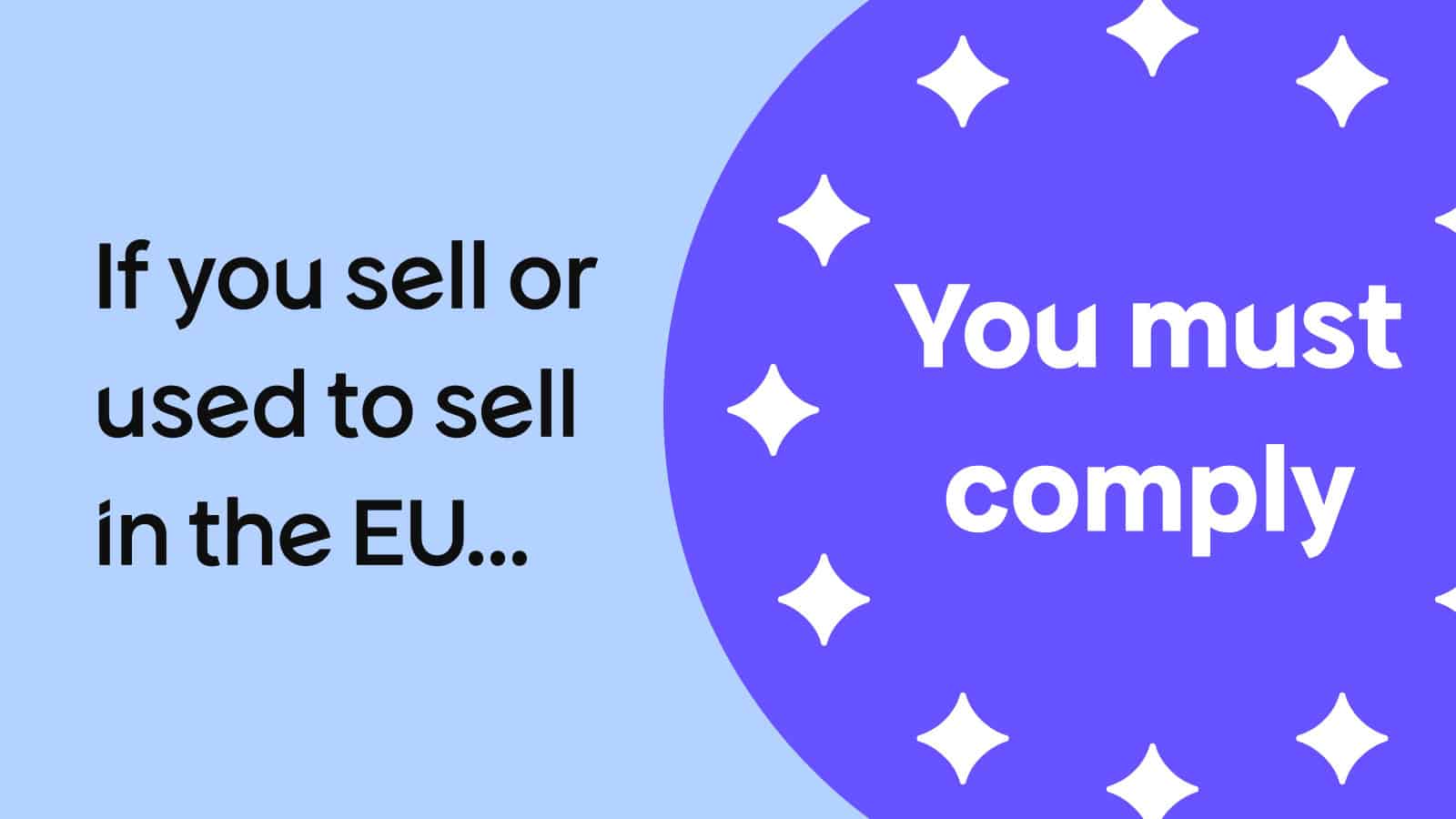
- Not helpful: How to set up custom tax rates
- Actually useful: How to stay compliant with international taxes in five minutes
The second one speaks to a real-world problem. It’s specific. It’s useful. And it’s far more likely to get someone to take action.
Stop Explaining Interfaces. Start Showing Usefulness.
Most feature announcements sound like this:
- “We’ve added a new toggle in Settings > Advanced > Preferences.”
- “Click here to enable multi-currency support.”
- “Now available: bulk editing mode.”
It’s all about location and mechanics. But for most users, especially those who don’t read changelogs religiously, this kind of messaging fails to answer the only question that matters:
Why should I care?
Just because a feature exists doesn’t mean its purpose is obvious. If users can’t instantly grasp how it helps them save time, avoid friction, or get something important done, they’ll skip it, even if it’s brilliant.
The data backs this up:
Nearly 70% of users drop off within a week, and 40–60% of trial users never return if they don’t immediately experience value.
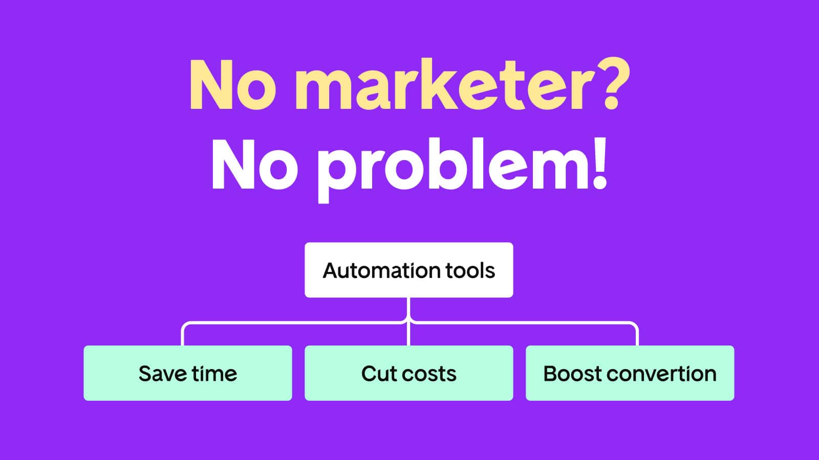
Treat every feature or update like it has to earn attention, and then explain the real-world benefits and why people should care (like we did when launching our Checkout 2.0). That’s the mindset shift.
Don’t lead with UI. Lead with outcome. Start with the problem the user is facing and then show how the feature helps solve it.
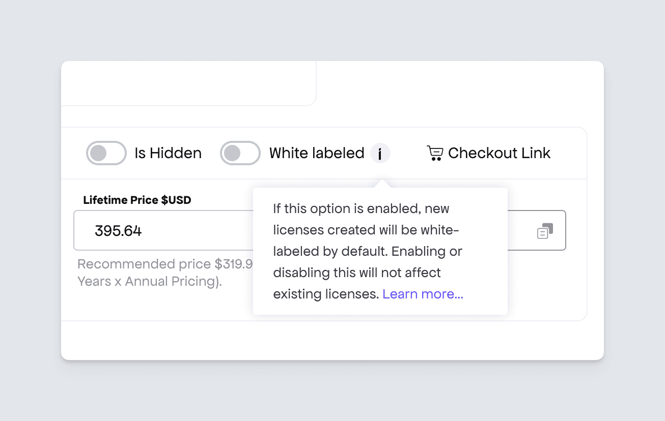
It can be something as simple as the below tip we show makers when setting up their products:
A Simple Litmus Test
How do you know if your feature content is actually user-focused?
Ask yourself:
- Would this content still make sense without UI screenshots?
- Does the user need this feature to complete a task they already care about?
- If someone only read the headline, would they know what’s in it for them?
If the answer to any of those is “no”, you’re probably writing from the product’s point of view and not the user’s.
This isn’t just a content check. It’s a relevance check. If the value isn’t obvious, the feature will be ignored or forgotten about.
Use Cases > Features
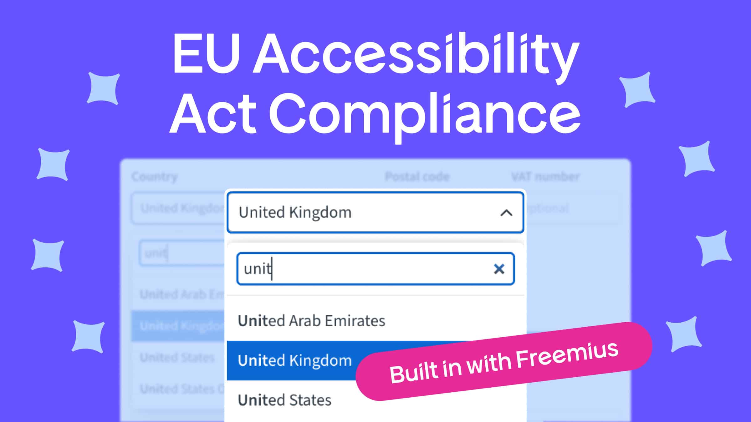
Let’s say you just shipped a feature that lets users set custom tax rates.
Here’s what most developers write:
“Go to Settings > Taxes. You can now add country-specific VAT rules.”
And here’s what a user actually needs to hear:
“Need to sell in the EU without dealing with tax penalties? Here’s how to get compliant in five minutes.”
Same feature. Completely different framing.
Tony J Roma from Rebrandly adds:
“We use pop-ups or callouts to guide users through the new steps to educate them and encourage adoption without derailing their flow.”
In other words: content should reduce friction, not add it. When someone is deep in a workflow, they don’t want a lesson, they want a shortcut:
Think of Feature Content Like Pair Programming
Great educational content feels like sitting next to a teammate and walking them through how you solved a problem.
- “Here’s what I was trying to do.”
- “Here’s where I got stuck.”
- “This little-known feature solved it, and here’s how.”
This kind of content lands because it’s grounded in a real scenario. It’s not a sales pitch, it’s a helping hand that makes things simpler.
You don’t need a polished setup to do this.
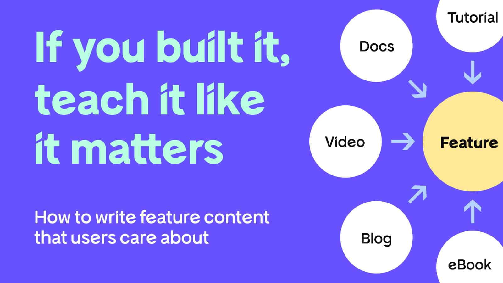
A short blog post, a quick Loom recording, even a GitHub comment with context can go a long way, as long as it focuses on what the feature unlocks, not just where it lives.
Where Feature Content Actually Belongs
(Hint: It’s not just in the docs)
A common trap: You ship a feature, write up the documentation, and check it off the list.
That’s fine for technical accuracy. But if your goal is adoption, not just support, you need to think beyond your help center.
Educational content works best when it meets users where they are, not where you assume they’ll go looking.
Because let’s be honest: most users don’t go hunting through your help center unless something’s broken. Instead, your content should show up naturally across different moments in the user journey.
Here’s how to think about when and where to educate for maximum impact.
1. Before Signup (Awareness)
Before someone even creates an account, they’re asking one question: “Can this tool help me solve my problem?”
This is where examples and tutorials matter most. But not abstract fluff. Real guides. Real code. Real use cases that speak to real needs.
If you want to write a blog post, don’t write “How Our New Import Tool Works.” Write “How We Migrated 100+ Users From a Legacy System in Under an Hour.”
B2B buyers complete 57–70% of their buying research before ever signing up or contacting a salesperson. Your content is often their first introduction, so you really need to make it count.
These stories double as search-friendly content and silent onboarding. They show potential users what’s possible, without asking them to commit first.
2. During Onboarding (Activation)
This is the moment when users either “get it” or churn quietly.
Your content should focus on removing friction and helping users hit their first success milestone as fast as possible.
“If retention is a challenge, I focus on content that unlocks value from features that often go underused,” says Saar.
You don’t need a polished video series to make an impact. Sometimes, a well-timed tooltip, a targeted onboarding email, or even an in-app nudge with a clear “why this matters” message is all it takes to shift a user from passive to activated.
8 in 10 users delete an app because they didn’t know how to use it. Don’t let confusion cost you conversions.
3. After Onboarding (Retention and Expansion)
Once someone is comfortable with your product, their behavior becomes predictable.
That’s great for habit formation, but risky for feature adoption.
Why? Because most users stop exploring. They do the same thing every time they log in. The result? Powerful features you’ve built remain undiscovered.
This is where smart, well-timed educational content can surface what they’re missing, especially advanced tools or edge-case features that unlock greater efficiency, control, or flexibility.
Tony explains: “Our data shows that people who use more features are less likely to churn. So we focus on content that helps them understand how each piece of the product fits into their workflow.”
This kind of content doesn’t have to be loud or pushy. Long-form guides, onboarding checklists, and lifecycle emails all have a role to play, as long as they’re helpful and not promotional.
For some actionable ideas, here’s how Freemius uses data to re‑engage users.
How to Prioritize What Deserves Content
(Because you can’t write about everything)
Your time is limited. Your team is small. You can’t produce a tutorial for every toggle, dropdown, or API flag. So, which features earn content?
Use this table to surface the features worth betting on:
| Prioritization criteria | What to look for | Actionable content idea |
| Core product value | Is this feature central to what your product promises? | Create a guide, use case story, or onboarding walkthrough. |
| Misunderstood or underused | Do support tickets/questions cluster around this feature? | Write an explainer, add contextual tooltips, record a demo. |
| Differentiator vs. competitors | Does this set you apart in a meaningful way? | Use it in competitive positioning content and highlight it during key upgrade moments. |
| Correlates with retention/revenue | Do power users or paid accounts rely on it regularly? | Embed it in retention-focused emails, in-app messaging, or advanced how-to articles. |
“Sometimes it starts with a gut feeling,” says Saar. “But I always validate with usage data and support feedback. If a feature has potential and low adoption, that’s a red flag, and an opportunity.”
Apply this filter quarterly (or alongside major releases) to make sure content tracks outcomes, not just your release calendar.
Format Doesn’t Matter Until the Message Is Clear
One of the most common content debates: Should we write a blog post, shoot a video, or record a podcast?
Answer: It doesn’t matter unless the message is clear.
“Format is just the vehicle,” says Saar. “The real impact comes from having one clear, consistent value proposition, and then choosing the format that delivers it best in each context.”
Start by getting the core story right:
- What’s the problem?
- What does this feature help users do better?
- What’s the cleanest, most effective way to show that?
Once the story’s solid, then adapt the format. One clear message can live across multiple channels:
| Format | Best for |
| Blog post | Deep dives, SEO discovery, long-form walkthroughs |
| Video | Visual explanations, UI flows, reducing support tickets |
| In-app guide | Timely nudges that catch users while they’re engaged |
| Re-engagement, feature spotlights, lifecycle touchpoints | |
| Help doc | Self-serve learning for users who prefer to search or skim |
You don’t need to reinvent the message for every channel. Just shape it to fit the moment.
Real Examples of Feature Education That Actually Worked
Making a Boring Feature Click
Some features are undeniably helpful but still get ignored. Why?
Probably because they sound technical or don’t scream “use me.”
“Some features are incredibly useful but just don’t seem exciting,” explains Saar. “The challenge is helping users see the value behind the complexity.”
Instead of focusing on how a feature works, Saar reframes it around what it enables.
Take a licensing key regeneration tool. On the surface? Not exactly thrilling. But reframed as: “Here’s how to instantly restore access after a support issue or prevent license key theft.”
It becomes relevant. Urgent, even.
The lesson: Boring features don’t need better descriptions, they need better stakes.
Breaking Down a Complex Feature
Tony recalls trying to explain a granular permissions system for a CRM platform. It was powerful but dense.
“The first draft was long and convoluted. I broke it down into concept articles, task articles, and reference materials. That structure helped users understand the feature step-by-step, and also explore at their own pace.”
The takeaway?
Don’t dumb it down. Break it up.
When you’re dealing with a complex feature:
- Start with concepts (what it is and why it matters)
- Then move into tasks (how to use it)
- And support it with reference docs (for edge cases and advanced needs)
We did something similar when we announced our API documentation.
Common Mistakes to Avoid
Even great features can flop if the content behind them misses the mark. Here are the traps that sink adoption and waste your team’s time and effort:
- Starting with “how” instead of “why”: Jumping straight into the steps skips the story. Always start by explaining the problem the feature solves.
- Leaving content to the last minute: Treating education as an afterthought leads to weak adoption. Plan for it early, just like QA, design, or release notes.
- Creating isolated content with no follow-up: One blog post won’t move the needle. Tie your feature content into onboarding flows, lifecycle messaging, and support responses.
And if you’re a solo maker or working with a lean team, don’t overcomplicate it.
“Start by stepping into your user’s shoes,” adds Saar. “Forget the specs and ask: what can this help someone achieve? Then build a story around that.”
You don’t need a polished landing page. Sometimes, a short email or well-placed tooltip can drive more adoption than a full campaign.
Final Thought: Documentation Explains. Education Guides.
Documentation teaches people what your product is. Educational content shows them what it does for them.
If all you provide is a list of features and configuration steps, you’re putting the burden on users to figure out the value.
Most won’t.
Educational content bridges the gap between what you built and why it matters by showing, clearly and practically, how it fits into someone’s real workflow.
You don’t need to be a writer to pull this off. You just need to be a good explainer.
If you build software, you already solve problems. Don’t let that work go unnoticed. Teach what your product makes possible and adoption will follow.