|
|
It doesn’t matter if your latest WordPress plugin is the greatest thing since sliced bread — if your home page doesn’t rock, nobody’s going to want to download it.
An enticing home page that compels readers to take action and download your plugin is an automatic prerequisite for successful freemium-based plugins.
In this post, we’ll analyze five key elements of successful home pages for WordPress plugins, including real-life examples of each element in action (and we’ll even have a bonus section in here as well, so make sure you read all the way till the end!).
1. A Clear, Concise Tagline
The first step to an effective home page for your plugin is a clear, concise tagline that briefly explains the following:
- What your plugin does
- How it improves WordPress websites
- Why your visitors need it
The key word here is brief. Don’t fill up the whole page with text. The tagline should be no more than one paragraph, and ideally as short as even a single sentence.
Think of it as a super-downsized elevator pitch.
The first step to an effective plugin homepage is a catchy, concise tagline.
Example: Gravity Forms
Gravity Forms is the perfect example of the tagline principle. If you take a look at their homepage, the one piece of text you notice right away is their tagline.
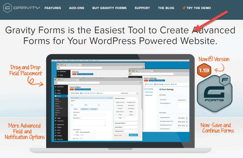
The short tagline reads: “Gravity Forms is the Easiest Tool to Create Advanced Forms for Your WordPress Powered Website”.
It answers all of the three questions we discussed above:
- What the plugin does – “Create Advanced Forms”
- How it improves WordPress websites – “Advanced Forms for Your WordPress Powered Website”
- Why visitors need it – “Easiest Tool”
2. Immediate Link/Call to Action
The very next element to have on your homepage is an immediate link to more information about the plugin or a call to action to learn more or purchase the plugin. This link/CTA should be above the fold (so visitors see it as soon as they access your homepage) or at the very least the next page down.
The immediate link/CTA accomplishes two purposes.
Firstly, it makes a better user experience for visitors who have already heard about your plugin and have come to your site with the explicit intention of either obtaining detailed information about the plugin or even downloading it straightaway. The immediate link allows them to forego scrolling down the entire page to find the appropriate link for more info/downloading.
Second, it enables those visitors whose interest has been piqued by that clear, concise tagline of yours to get more info, again without having to scroll through the rest of your copy.
Example: Akismet
Automattic’s own spam protection plugin is a great example of the immediate CTA. Right on the front page above the fold are two CTAs with links directing to a pricing page and a learn more page, respectively.
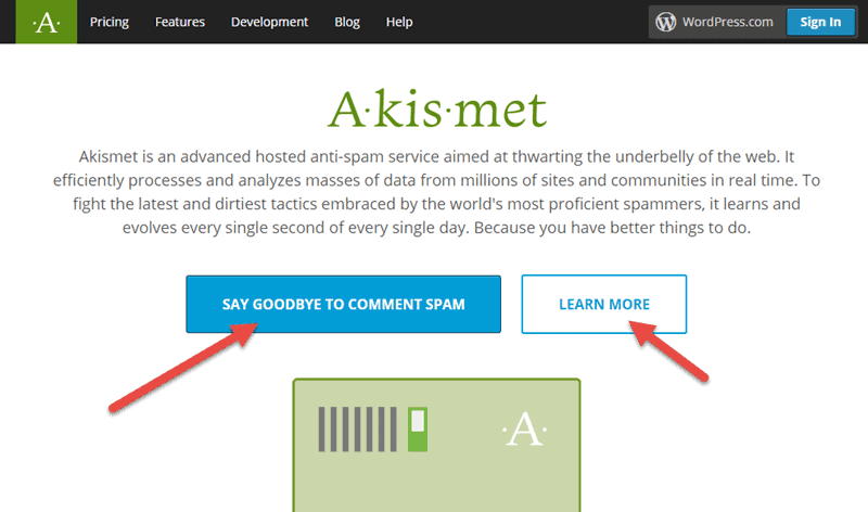
The “Say Goodbye to Comment Spam” button (note the creative deviation from a standard “See Pricing” kind of CTA) takes visitors to a page displaying Akismet’s pricing plans. The “Learn More” button redirects to a page with information about how Akismet works, how effective the plugin is, and the like.
3. Showcase Your Plugin
This element is definitely one of the most important ones, as it plays a major role in visitors’ ultimate decision of whether or not they like your plugin.
Essentially, in this part of your homepage you will be showcasing your plugin. Ideally, you’ll have a few screenshots of what it looks like in the front end and maybe a couple displaying the back end UI as well. The point is that you give your visitors a brief snapshot of your plugin so that they can decide instantly whether it’s a product that they could see themselves using.
Giving visitors a brief snapshot of your plugin’s UI on your homepage helps them quickly decide to download.
Obviously, you’re really going to have to approach this element with your A-game. If your showcase is low-quality or poorly thought out, that’s only going to create a negative impression in visitors’ minds.
Example: OptinMonster
OptinMonster does a great job exhibiting their product on their homepage.
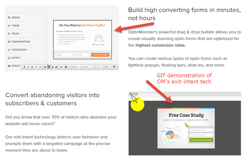
The homepage uses a combination of screenshots, gifs, and text-based explanations of a few of OM’s features to communicate the plugin’s functionality to the visitor. Note that the page also doesn’t go overboard or swamp us with large bunches of images one after the other. Instead, OM keeps it simple, clean, and minimal.
4. Social Proof
Social proof is a basic concept that drives conversion rate optimization. When your visitors see that your plugin already has lots of users and is associated with high-profile names, you gain credibility in their eyes, increasing the likelihood of a download.
Considering the context of a WP plugin homepage, here are three easy ways you can build social proof:
- Display logos of the various WordPress publications on which your plugin has been featured
- Feature testimonials from customers
- Show positive comments about your plugin from respected WordPress developers/companies
Example: WP Rocket
WP Rocket leverages social proof in several neat ways. First up, they show a live counter of customers already using the plugin.
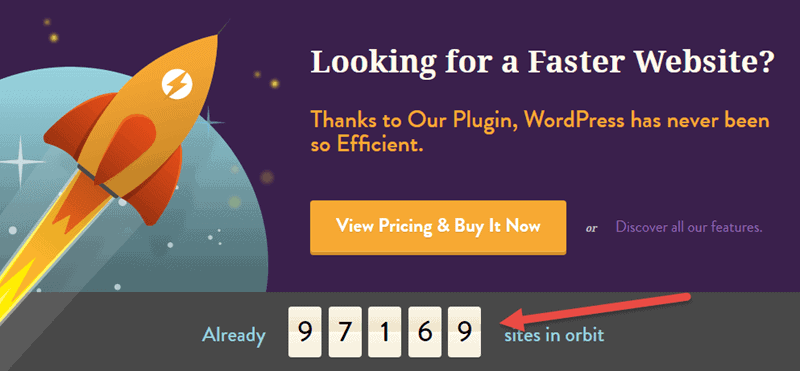
Second, they display a few of the logos of some of their most prominent users, like CoSchedule, ThemeIsle, and SeedProd.
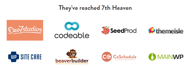
Finally, they have a testimonial from one of their customers, as well as a link to a “Wall of Astronauts” (a popup that displays more testimonials).
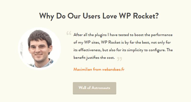
All of that social proof builds WP Rocket’s brand image and builds credibility for the developers.
5. Feature List
Last but certainly not least, we have the feature list. The feature list is exactly what its name implies: a brief catalog of your plugin’s functionality.
Once again, the key here is to be concise. You don’t want to list every single feature that your plugin is capable of. Most recently-built plugins, for example, are built translation-ready, so a common feature like that wouldn’t necessarily be something you’d want to list here.
Instead, you only want to highlight the most important features that are most relevant to the overall solution that you provide to your customers.
Example: ManageWP
ManageWP superbly incorporates a feature list into their homepage that highlights their WordPress dashboard’s functionality.
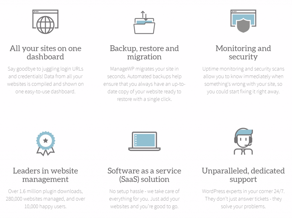
Note how they handpick only six of ManageWP’s features to display on the homepage. Each of these six picked features are meant to add another layer of certainty and to gradually make the visitor understand that this solution covers all of the their needs.
They’ve also ensured that the list is visually appealing with a structured design and a delicate (and gracefully animated) icons set that fits in seamlessly with the rest of the website’s design language.
BONUS: Creating an Effective Buy Button to Entice Paid Users
If you want your visitors to convert into paid users, then nailing your buy button is an absolute must.
A good buy button has the following traits:
- Very clearly stands out on the page.
- Incorporates an effective call to action.
Let’s go back to WP-Rocket, because their homepage also incorporates a great example of a buy button. The button is right on the homepage and above the fold so visitors can see it instantly and take action.
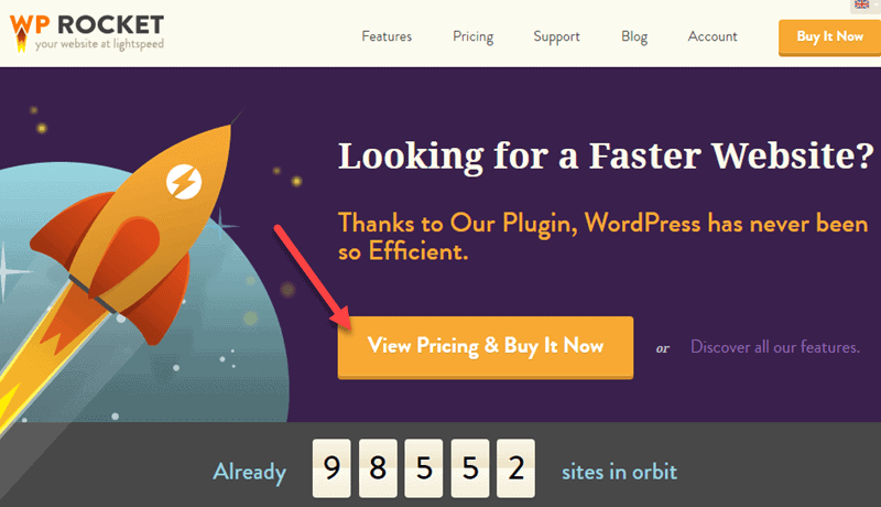
Gravity Forms also implements the buy button well. They use text like “Just $39” and “Instant Download” in the call to action to make visitors feel as if they’re getting a good deal.
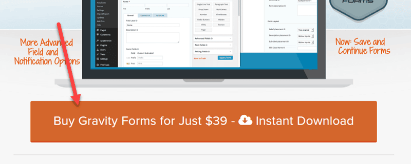
If you really want to take your buy button to the next level, then you should consider Freemius Checkout. One of the product’s features turns a buy button into a link that launches a popup from which visitors can directly purchase the premium version of your plugin.
You can demo that buy button on this page.
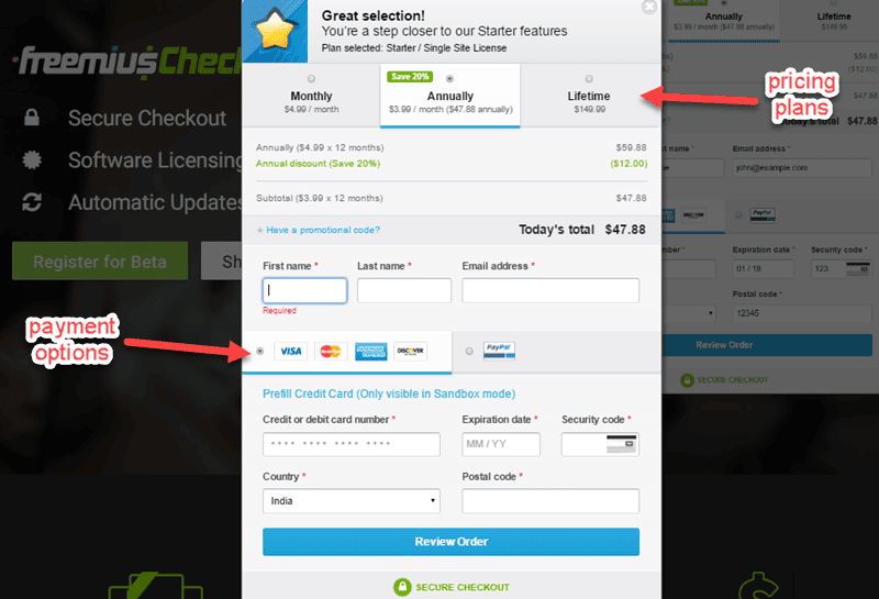
Notice how the popup loads quickly, and has all the necessary information: the different purchase plans and available payment options*. There’s no need for the user to go to any other page to start the secure checkout process.
Recap: How to Build an Effective Plugin Homepage
Let’s quickly recap the five critical components essential to a productive homepage we just discussed:
- A clear, concise tagline that explains what your product is, how its useful, and why visitors should download it in a few sentences.
- An immediate link/CTA following your tagline so that visitors can go directly to more info/download pages.
- A showcase of your plugin that demos some of its functionality.
- Obvious social proof to build your credibility.
- A brief feature list to highlight your plugin’s most important capabilities.
Now that you know all the elements that make one up, you have no excuse not to rock an awesome, download-product page for your WordPress plugin. Get to creating!
Over to you: how do you plan to use this info to improve your plugin’s home page? What other elements do you use on your website? Share your thoughts in the comments below!


Really great post, and the examples are spot on. These are the same sites I go to sometimes to be inspires, especially WP-Rocket