|
|
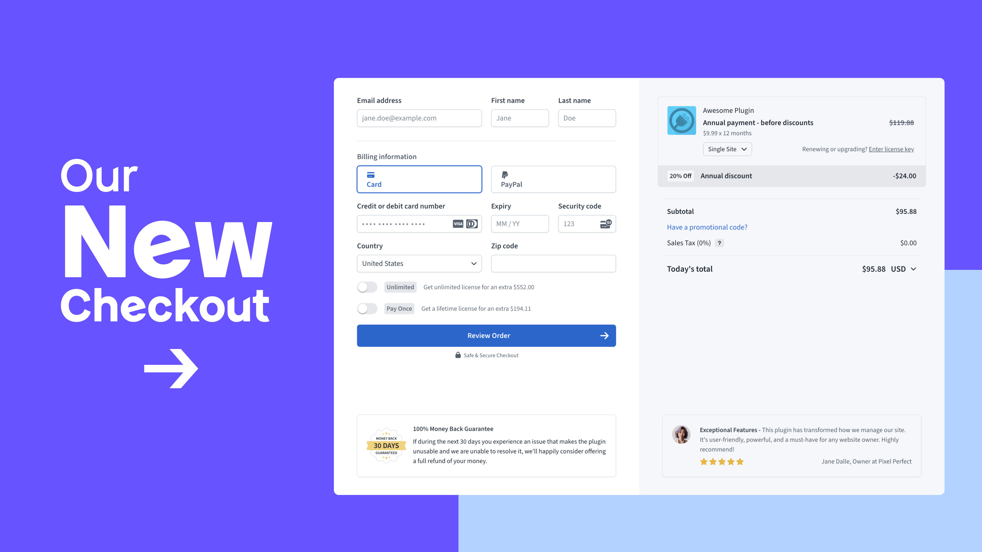
Refreshed and reconfigured to boost conversions and maximize sales price, the new Freemius Checkout has officially launched and is in production!
The best part? The new Checkout is the result of a collective effort between the Freemius team and our makers community:
We were incredibly fortunate to collaborate with a diverse group of makers from our community, bringing together unique backgrounds, experiences, and skill sets to the Checkout “task force”.
The back-and-forth process was exciting, iterative, and immensely enriching:
- We proposed ideas, pitched them to the community, received feedback, and then went back to the drawing board
- This creative cycle repeated four or five times — at least — until we’d incorporated the ideas and suggestions and hit upon a design that inspired the Freemius team and the community
Even better? Many of our makers were so impressed with the improvements that they started using the new Checkout during its beta phase — a testament to the quality of this new iteration!
We had three core goals for the new Checkout:
- Modernize the UI
- Improve the UX
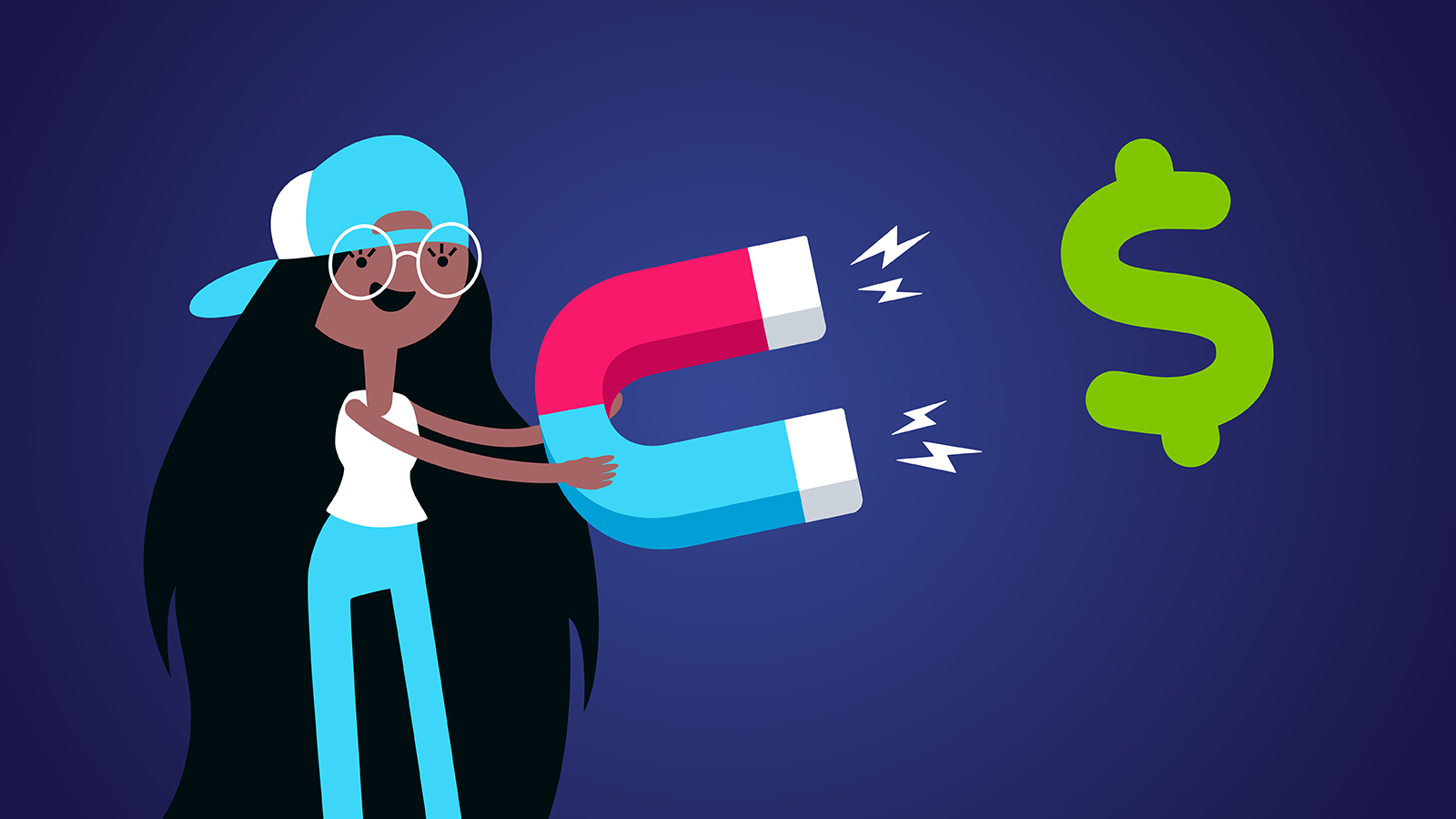
- Optimize for conversions and maximize average sales prices by reducing friction, including easy one-click upsells for higher variations and licenses of the same plan , and offering persuasive features like social proof (and much more)
With the milestones set and key goals in mind, we carefully planned each phase of the Checkout overhaul, starting with:
Phase One
Updating and Refreshing the Checkout UI
In 2016, our Checkout design was in step with modern UI practices.
But time — and trends — move on, and because we focused more on functionality and capabilities, the UI lost its original luster.
We recognized that the design needed a fresh, modern look to enhance conversion rates and elevate the brand’s perception. With this in mind, and with the help of our makers community, we went back to the drawing board.
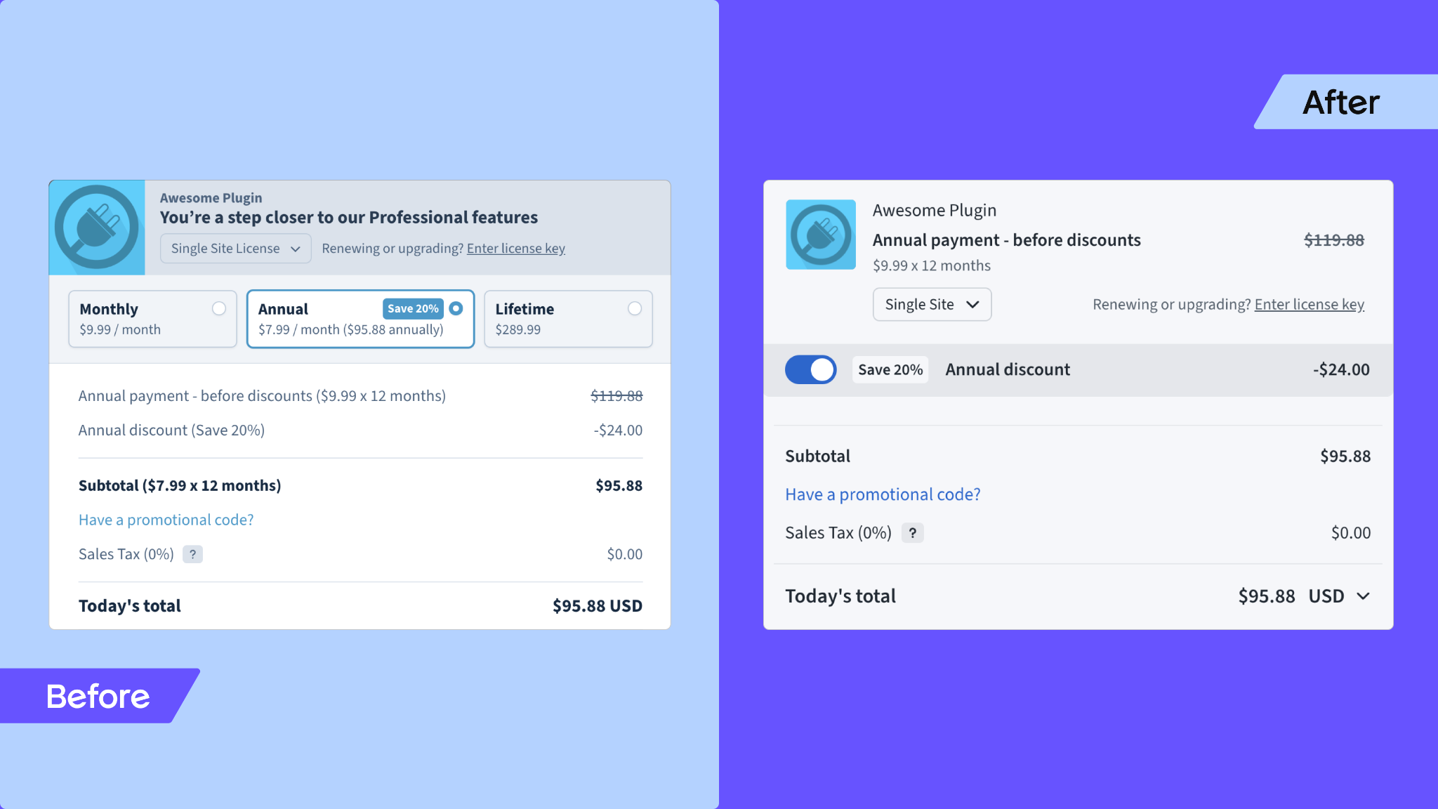
In the first iteration of the Checkout revamp, we modernized the UI using trendy, contemporary practices, reducing colors and distractions to replace cognitive overload with a layout that compels more users to hit “buy”.
Repositioning elements like the currency selector and security badges to more intuitive locations helped improve and further unclutter the Checkout.
In the footer, a disclaimer now informs users that Freemius is a reseller. While the transaction is processed through us, the transactional data is shared with the product owner. This transparency lets users know who is handling their purchase and how their data is managed, and also protects the seller should there be any queries/complaints down the line.
VAT handling was simplified in this phase too (er… one):
Previously, users could set their VAT based on the payment method or manually change their tax location, which was confusing. Now, VAT is solely determined by the payment method.
We also added a clear notice when VAT is applied during country selection to prevent unexpected charges during checkout. Clear information about taxes helps avoid drop-offs, and combining key elements into a smooth process makes it easier for users to finish their transactions.
With Phase One’s Checkout in the wild for five weeks, we were able to gather critical feedback from our makers community, which we actioned in:
Phase Two
Introducing the Dual-Column Checkout (Beta)
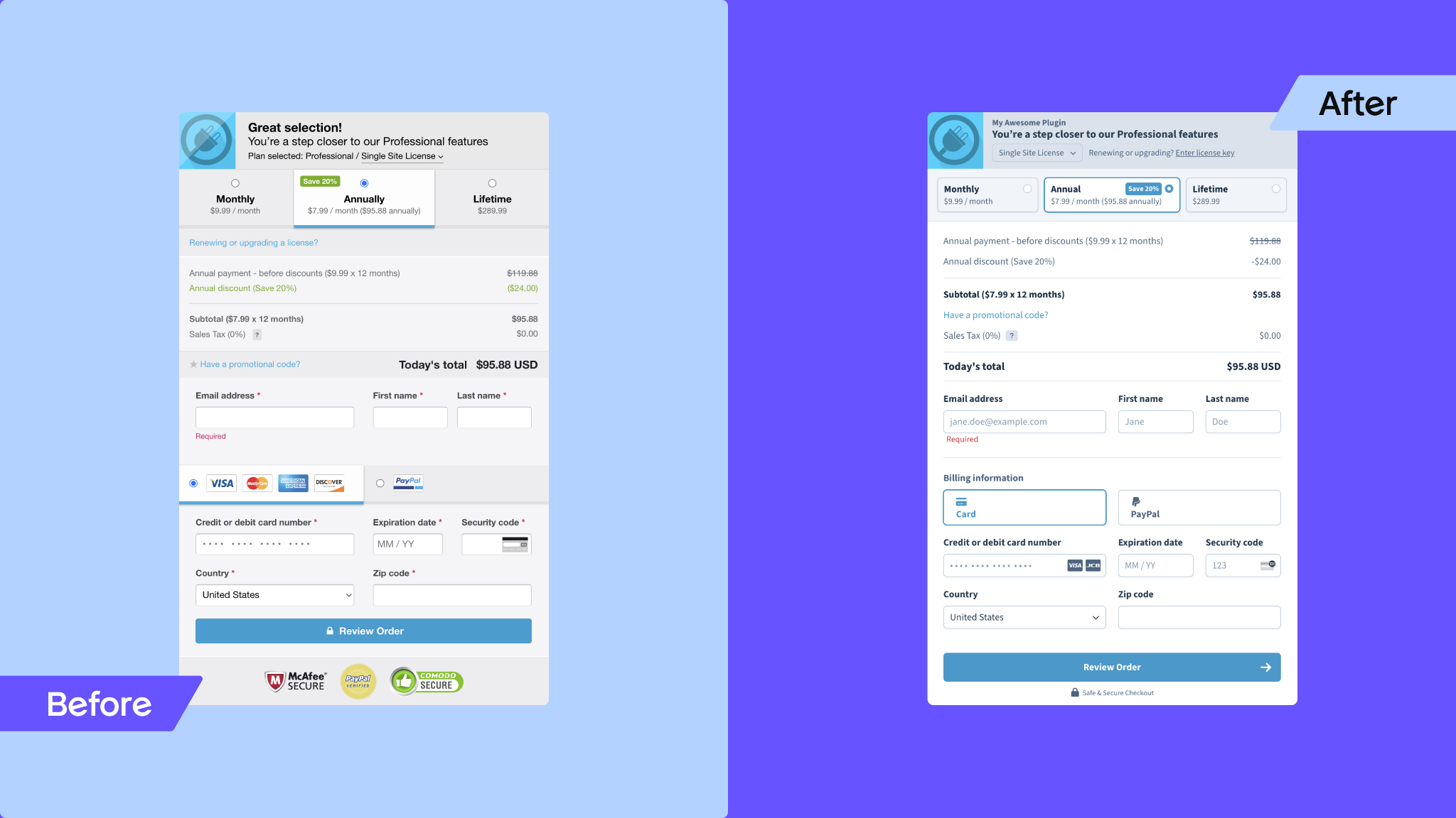
Following feedback, we didn’t kill our darling so much as carve it into two.
As you saw, Phase One’s Checkout presented itself in a vertical layout. This design was still overwhelming and a missed opportunity in terms of screen real estate, especially since most transactions happen on desktop which have more width than mobile.
Basically, the info was stacked, which wasn’t optimal. So, we got to work and we couldn’t be happier with the result:
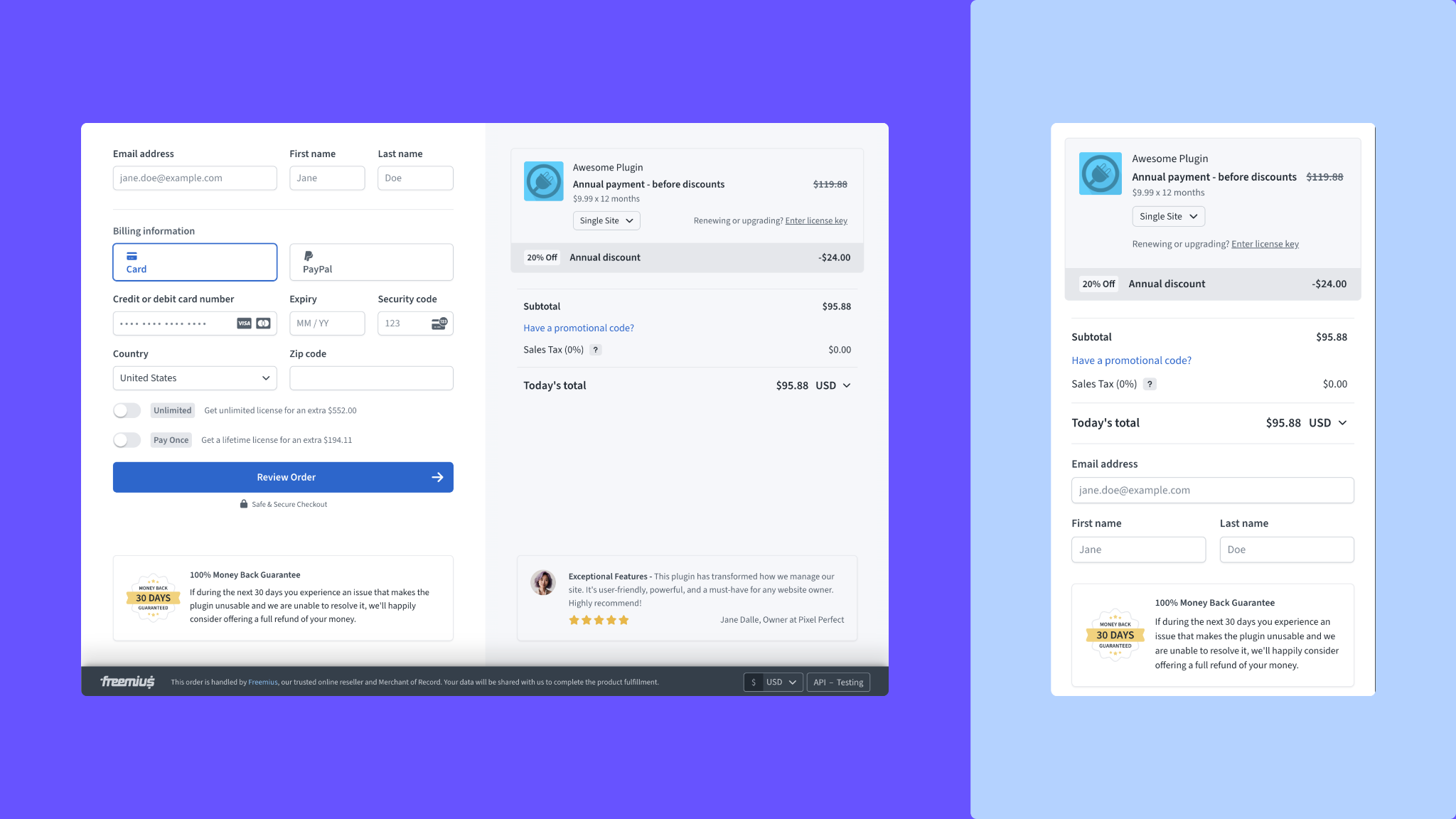
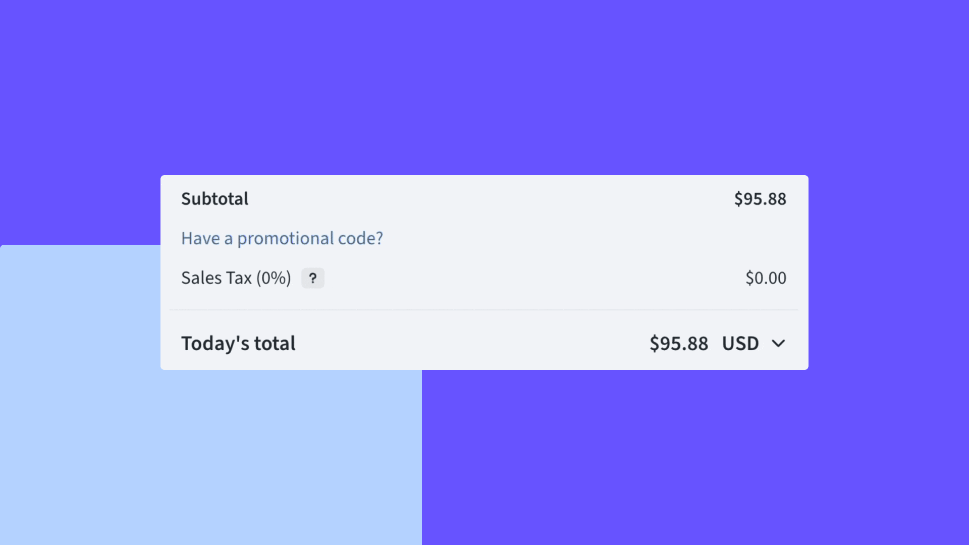
Introducing the optimized dual-column layout: one side for the Checkout form and the other for payment information breakdown. This impressive new layout can also be adjusted to full-page view on desktop to maximize screen real estate, providing a clearer, more organized checkout experience for different screens.
Let’s open the hood and dig into Phase Two’s new features and improvements:
Optional Components to Minimize Distractions and Drive Conversions
An important thing to mention here is that software makers have different experience levels and use our Checkout in various ways:
- Some have rich websites with detailed pricing pages that trigger the Checkout “there and then” when a customer clicks “buy”
- Others redirect to a link instead of integrating with JavaScript, resulting in a full-page redirection rather than a modal dialog
To accommodate different needs and technical levels, we’ve introduced customizable components like money-back guarantee badges and testimonials.
Right now, the functionality will pull the latest positive review. But, because Freemius collects reviews from verified buyers automatically, makers can easily surface and add reviews of their choice to their Checkouts to build purchase confidence.
Since developers can define their own refund policies — including the copy, duration, and type of policy — the money-back guarantee details are automatically generated based on their unique configurations.
Note: As with many of the Checkout’s new features, the above two are optional. Here’s why:
For software makers with rich pricing pages already showing money-back guarantees and social proof, we expect they’d want to minimize distractions and guide users to complete their purchases.
However, for those without detailed pages, these features can boost credibility and conversion rates by making the purchase process about more than just filling in credit card details with limited confidence.
For example, a Twitter influencer who’s launched a product but doesn’t have a website can simply share a direct and credible Checkout link featuring money-back guarantee and social proof components.
Billing Cycles
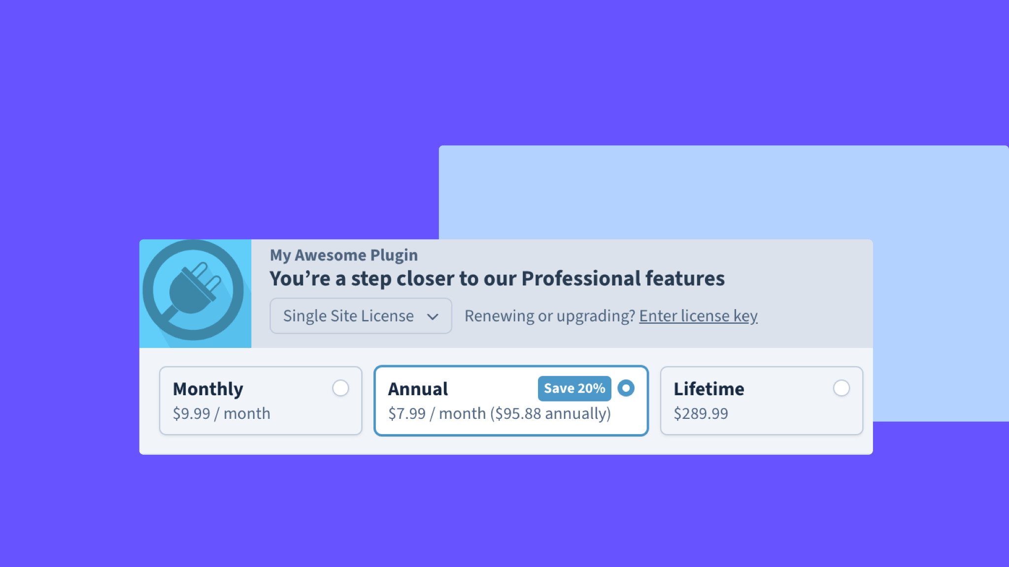
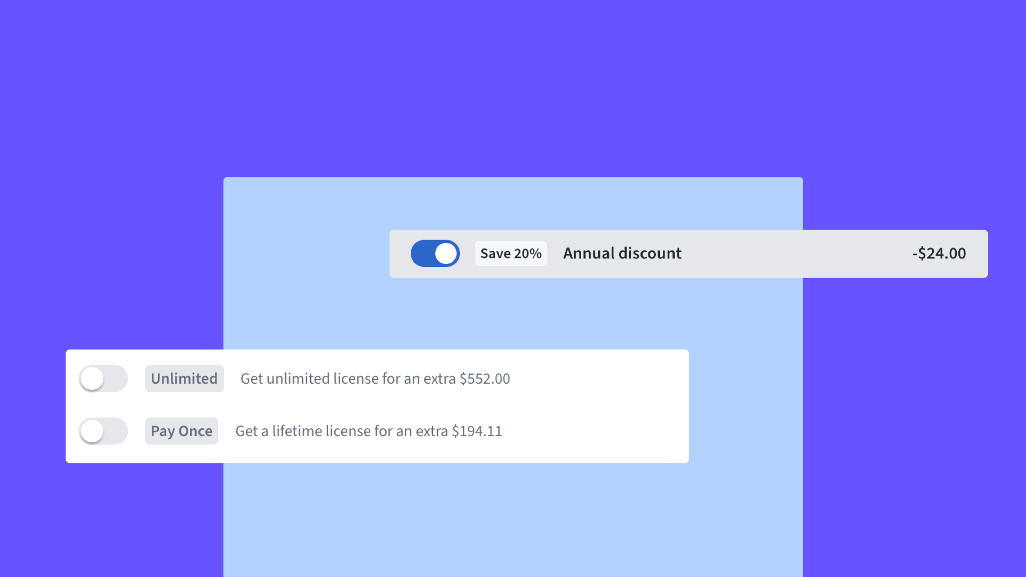
We’ve removed the above billing cycles and simplified the license selector in favor of three effective upsells. They are:
- Monthly to annual
- Annual to lifetime
- Limited to unlimited licenses
Why?
As seen in the image, all billing options were shown by default if the seller offered multiple cycles. This placement could potentially overwhelm users and lead them to select a cheaper package or one that’s less beneficial for sellers.
The new approach removes these components and only presents options to upgrade. How it works in practice:
- If the Checkout opens with a monthly cycle, users can switch to annual for a discount by simply toggling a switch (as seen in the screenshot below)
- If a user selects an annual billing cycle, there’s no option to switch back to a monthly one
- The same applies to the number of licenses — users can flick a switch to select Unlimited licenses (without the added hassle of having to manually select from the dropdown)
Note: We’re aware that some sellers rely on seeing all billing options. Therefore, we’ve introduced the option show_monthly_switch to always show the monthly toggle.
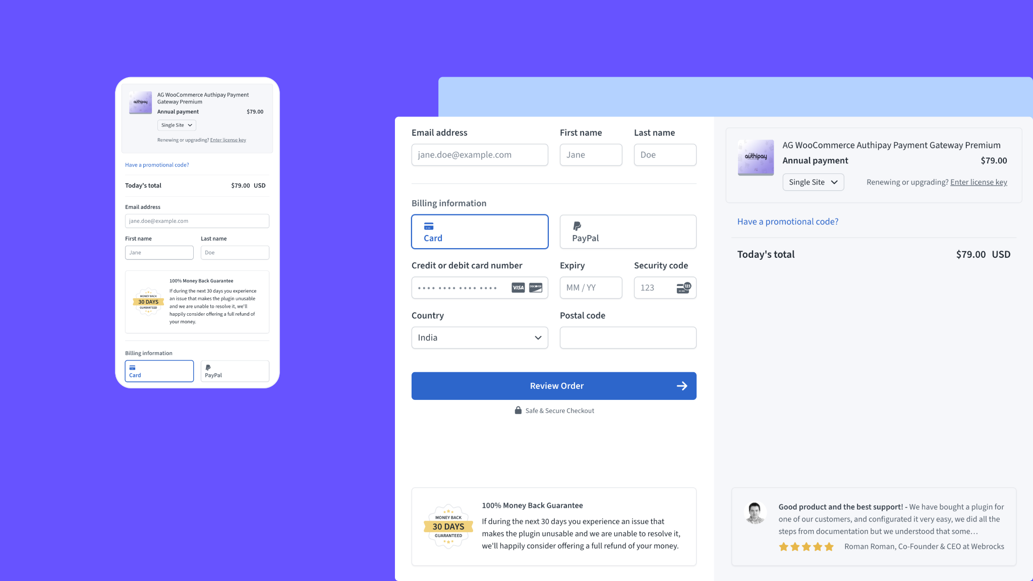
License Key and Site Selection
We’ve combined the number of site selections with the license key entry line, which is especially useful and relevant for WordPress users. For SaaS products — where license renewals don’t apply — this feature won’t be visible.
That said, the optional selector is handy for cases like selling AI credits for creating images, allowing users to easily purchase additional credits directly from the checkout.
While the legacy setup supported a single product, the new layout resembles a cart container and is flexible enough to accommodate multiple items — carts and products, etc. If we decide to expand this functionality in the future, this change will make the system more adaptable and ready to go for potential upgrades.
A Psychological “Twist” for Coupons
We made some changes to how coupons work. Previously, they had three states: you could add a coupon, then edit or cancel it. We’ve adjusted the behavior slightly to add a psychological twist (or should we say “nudge”) to this process.
Now, once the coupon is applied, you can’t edit it; you can only remove it and then enter a new one.
While this might seem similar to the old process, there’s a subtle psychological shift. Users might hesitate to cancel a coupon and leave the Checkout to look for other discounts because they’re unsure if they’ll be able to reapply anything. This reduces distractions/delays and encourages them to stick with the current discount and proceed with the purchase.
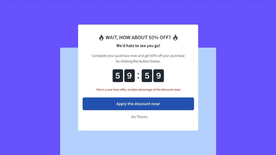
Exit Intent Coupons…
…can boost conversions and reduce churn.
If a seller so chooses, an exit-intent coupon automatically activates when certain triggers occur, such as when a user is about to leave the Checkout page. They’re time-sensitive, typically valid for only an hour, and create a sense of urgency that encourages users to complete their purchases quickly.
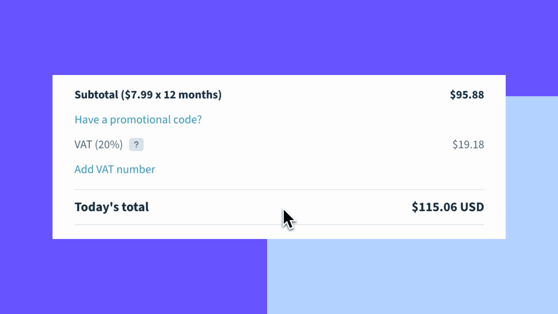
EU VAT Input Gets Its Own Form Field
When users add a valid VAT number, we can apply a reverse charge schema. This method — relevant mainly in Europe — eliminates the need for software sellers to reclaim VAT.
So, instead of the seller being tasked to reclaim manually, we validate the VAT number and issue an invoice, which streamlines transactions and reduces the administrative burden for both parties.
That said, a problem with this process surfaced in the Phase One Checkout — even though we added a warning to alert users about the VAT section, some missed it altogether and skipped providing their VAT details.
To combat this, we moved the VAT field from the payment breakdown to the form section to increase visibility for users and reduce the chances of sellers having to process VAT refunds manually.
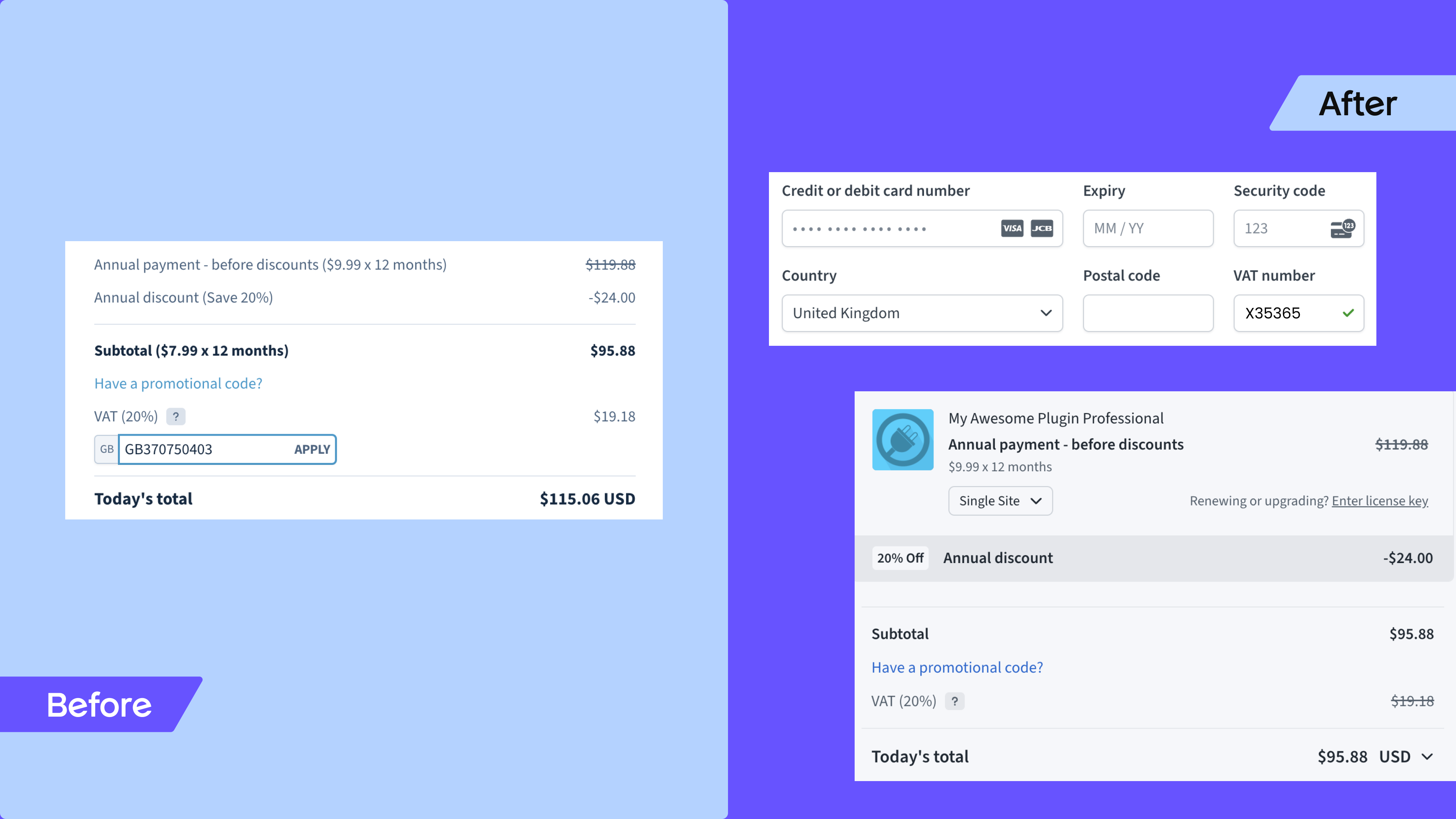
This change makes the VAT process clearer and more accessible during checkout, while also making it easier and more efficient for businesses to handle VAT in applicable regions.
Now that we’ve explored the ready-to-go features and improvements, let’s take a look at what’s on the horizon:
Phase Three: Looking Ahead to the “Checkout Builder”
With previous iterations, we took a rigid approach to the Checkout redesign. We followed one specific direction — chosen by us — and sellers and users either had to accept it or not.
We very quickly realized that a one-size-fits-all strategy doesn’t work for everyone, and we’ve shifted our approach.
Now, we aim to be more flexible and accommodating, understanding that we can’t make everyone happy with a single solution, especially as we continue to grow and evolve.
Our goal going forward is to make the Checkout system versatile and with plenty of customization options to cater to as many software makers as possible.
Starting with:
The WYSIWYG Checkout

The next iteration of the Checkout will introduce a “Checkout customizer” — or builder — for even more flexibility. Our goal is to make customization more accessible so that even those who aren’t tech-savvy can easily tailor the design.
The WYSIWYG (What You See Is What You Get) section will help software makers control and personalize various aspects like colors, dark mode, etc. without needing to dive into code or JavaScript.
It will also double as a marketing tool. During demos or in videos, it’s far more appealing to show configurations on the side, allowing users to see changes in the Checkout as they happen, without needing to update JavaScript and reload the page.
While we’re in a festive feature mood, here are a few more exciting updates on the cards:
Internationalization: Pretty soon, we’ll incrementally roll out functionality that allows sellers to customize their Checkout language for different audiences. For example, Spanish speakers will be presented with a Checkout in their language.
- This feature has recently come out of Beta, so any help or feedback will be most welcome
Upselling and smart cross-selling: We have plans to make our Checkout even smarter in the future, especially for cross-selling between developers.
That said, implementing this feature throws up some challenges, particularly because of PayPal and its integration.
So, before we shift hands to the complexities of the above, we’re focusing on simpler, low-hanging fruit tasks like upselling products from the same software developer.
Checkout Rollout
The new Checkout is being rolled out as we speak with Phase Two currently in production! Let’s take a look at where we were, are, and will be:
Checkout Phase One: 18 December 2023
- We started the gradual rollout of the new Checkout design in beta mode, followed by a wider release to our user base that took place over five weeks
- This first iteration rolled out for everyone on February 18, 2024
Checkout Phase Two: May 20, 2024
- After a few iterations and improvements to the first release of our Phase Two Checkout, we finally marked the Checkout as a release candidate and prepared for the production switch
- On August 4th, 2024, we made the Phase Two Checkout the default in production
- On August 18th, 2024, we’ll enable it for everyone but software sellers can still use
checkout_style=legacyto force load the Phase One checkout - On September 29th, 2024, we will completely remove the legacy Phase One checkout
Coming up! Checkout Phase Three: TBC
Phase Three will focus mainly on WYSIWYG-based customization support. We plan to create tools so you can:
- tailor the layout and appearance to your liking
- create or use predefined color schemes/themes easily
- define how you want various options like upsells and social proofing to appear and act
The goal is to provide software sellers with as much control as possible to customize the Checkout without having to dig into the code.
As we look ahead, we can’t help but be optimistic and excited about:
What a Feedback-Driven Future Holds for Freemius and Our Makers Community
We’re incredibly fortunate to have an audience of “product people” with deep, innate knowledge of what it takes to sell software successfully. The Freemius team couldn’t have reached this level on our own and input from our makers community is literally reflected in the outcome.
The advice and opinions we received were invaluable, especially because many of our contributors are highly skilled in UI/UX. Even though some feedback was not directly applicable, it played a crucial role in shaping the final product and will inform features going forward, for which we are extremely grateful.
The future of Freemius is one where feedback from software makers drives innovation and refinement. With their expert insights, we’re not just building better tools — we’re co-creating a platform that reflects the collective genius of our community and software makers in general.