|
|
With over 38,000 plugins in the WordPress directory, it can be difficult to make yours stand out and get people hitting the ‘download’ button. Your plugin page is really the first and last chance you have to convince someone that your plugin is the one for them, so you need to make the most of it.
With the above in mind, in this article we’re going to highlight six of the most important aspects to consider when optimizing your plugin page in order to get more people visiting and downloading.
1. Your Plugin’s Name
While it might be tempting to go for a clever or obscure name, you’re much better off reflecting the function of your plugin within the name. A misleading or irrelevant name can potentially cause real harm to your download figures.
Take the following plugins as examples of self-explanatory plugin names:
You know exactly what they do just from reading the names, and as such, people are far more likely to find them within the directory.
While you may find the more ‘functional’ names to be a bit uninspiring, they communicate to your audience exactly what they can achieve after downloading – and that’s ultimately the aim.
2. Your Plugin’s Description
These two sections perhaps contribute the most to getting people through to your page and clicking on that download link.
The description is what goes just below the name of the plugin. With only 150 characters to play with, you need to be as succinct and unambiguous as possible.

Akismet gets straight to the point with their description:
Akismet checks your comments against the Akismet Web service to see if they look like spam or not.
While the name doesn’t exactly match the straightforward and functional examples outlined above, Akismet’s description leaves no doubt in terms of learning what the plugin does.
It’s not hard to conclude that if your description either tells the user nothing (or even worse confuses them as to the function of the plugin), they’re probably not going to hit download! Take this example:
Your WordPress, Streamlined
For JetPack, you learn pretty much nothing about the plugin until you hit the extended description, which is where the page really takes off. This is a section with no limit, so you can pack in as much detail as you like, though bear in mind that users may start to lose interest if it’s too long winded.
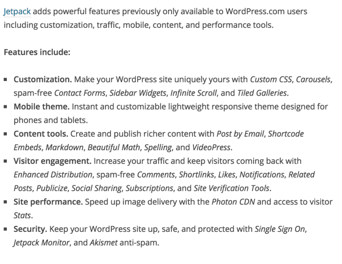
Here you want to be describing firstly the functionality, followed by the benefits. People are reading this section because they want to know that your plugin can remedy their pain point(s). A bullet point list is a great way of presenting the best side of your plugin, and keeps the section concise and legible. Above all, avoid just repeating the description, or telling the user your life story – that is a sure fire way to get them navigating away to download someone else’s plugin.
Some developers even have tutorial videos, screenshots and recommendations within their extended descriptions. These are all great ways to provide more information that isn’t just a solid block of text, and shows that people are actively using (and enjoying!) your plugin.
3. Plugin Updates
While this may not seem like a contributing factor of the plugin page, regularity of plugin updates is certainly something that users take into account. If a plugin hasn’t been updated within the last six months or so, you’ll find a lot of potential users turning their noses up.
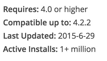
Now there is nothing inherently wrong about a plugin that hasn’t been updated in a while per se, but it insinuates that it’s no longer being actively supported, making it a poor long term prospect both in terms of functionality and security.
It’s very easy to keep your plugin ‘recent’, even if it is so simple that it doesn’t need any major updates. Just tweak the readme.txt file and hey presto – it reflects on the plugin page.
4. Plugin Compatibility
It may surprise you to learn that (according to WordPress’ official stats) only 40.4% of all WordPress users are currently operating on the most recent WordPress release:
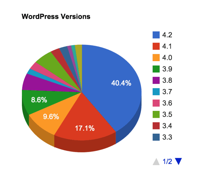
This means that a user looking to download your plugin may not be on the most recent version of WordPress, and might even be back on WordPress 3.0 (released a staggering five years ago). While you can probably get away with not going backwards compatible all the way to 3.0, you want to make sure that your plugin works with the most recent versions of WordPress or you risk alienating a large proportion of your users.
There are two stats shown on the plugin page: Requires and Compatible up to. The first is the oldest version of WordPress that your plugin will function with, and the second is the most recent release that will work. As you can see below, Hello Dolly has a wide range:
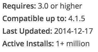
The more you test with older versions of WordPress, and keep abreast of newer releases, the more likely you are to see your download numbers begin to rise.
5. Your Plugin Author Profile
If you want your plugin to look professional and legitimate, there’s nothing that will harpoon that straight out of the water faster than an incomplete author profile.
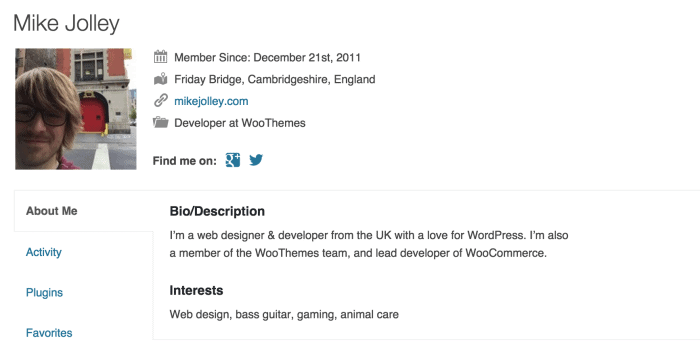
As Mike Jolley’s (lead developer at WooCommerce) profile shows, a little bit of information can really legitimize a developer, and by extension their plugin. Simply add in a photo, a short bio and a link to your website – that’s all you need. It shows that you are a real person, and people are generally more inclined to download a plugin if they can associate it with a personality.
6. Plugin Support
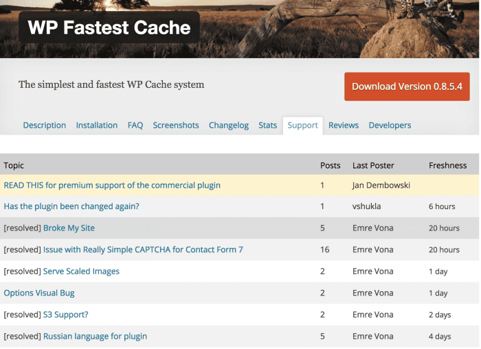
All plugin pages have a Support tab, where users can ask questions about problems they’re experiencing when using your plugin.
It’s your duty to make sure that you answer these questions in a timely and approachable manner. This is similar to keeping your plugin updated – if a user sees a forum full of issues that are six months old and unanswered, chances are they aren’t going to download your plugin. A user wants to know that if they ever do hit a problem, a reliable support system is in place to help them.
You want your forum to look like WP Fastest Cache’s, with a lot of ‘resolved’ tags:
In Conclusion
While a plugin page may seem like it has a lot of information to deal with, it’s actually very simple to get a decent and inviting page put together. Focus on these main elements first, and you should see your download rate begin to climb.
What do you look for on a plugin page? Do you have any good (or bad!) examples? Let us know in the comments below!



Comments
1 Comments