|
|
This is our third release of WordPress Products: Audited, where we help developers optimize their business strategy for more sales & conversions. We’ve realized over the years that many product people make the same business-related mistakes, so we started this series to help provide learning opportunities on the best practices for presenting, positioning, and pricing your plugins or themes. The advice we provide is based on data captured from hundreds of plugins and themes and years of experience working directly with WordPress product businesses.
In this audit, we’re analyzing the All-in-One Video Gallery plugin created by Plugins360, and we’ll mainly be focusing on marketing this time. Let’s start from the beginning – one of the most common places customers may find a WordPress product.
Search Results
I’m not just talking about Google folks, but also the WordPress.org plugin and theme repository. If you have a freemium product and you’re not already listing its free version on the repo, you’re missing out on a few great opportunities – namely, getting free, useful feedback on your product. By listing a free version of your WordPress plugin or theme on the repo (or a plugin connected to your SaaS application), you can potentially get 1000’s of free users with the right SEO practices.
By engaging with these free users through support and learning about how they use your product, you start to understand what features offer the most value. Then, you can plan and build your product around your users’ needs, incentivizing them to convert into purchasing more useful or valuable features at a premium price.
So, let’s take a look at how All-in-One Video Gallery stacks up on Google and then WordPress.org and how they have implemented their freemium conversion funnel and customer journey.
Google Search
In searching Google, I found that the Plugins360 homepage title isn’t optimized for providing the best information possible about the website.

Because the homepage of the website is the landing page for the All-in-One Video Gallery plugin, information about the product should probably be included in the title or description of the page.
Easily Add Videos to your Website | All-in-One Video Gallery
All-in-One Video Gallery lets you put responsive videos anywhere on your site – no coding required. Includes HTML5 Player, Custom Post Types & more

WordPress.org Search
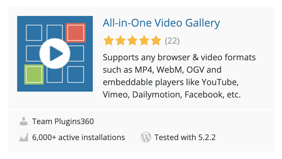
Moving on to the WordPress.org repo search results, the listing is pretty good with many positive reviews. The only suggestion I would make here is to update the description to be a bit more feature focused rather than focusing strictly on file types or platforms. However, it’s important to test this change and see if it makes any difference to the plugin’s search results rankings on the repo or if they see a change in the growth of new users.
WordPress.org Listing Page
After clicking through, the repo listing page is pretty useful and engaging. It uses a video as the focus of the page, which is definitely a good thing 👍
On this page, I would suggest utilizing the available real estate in the header and icon images more effectively. The logo in the header image doesn’t need to be as large, and more features or visualizations can be illustrated with all that available space.

Scrolling down the page, I found that the FAQs can be more actionable and informative, as they aren’t very extensive or diverse for the most common questions that would be asked for the plugin. The FAQs are also something that’s used in the WordPress.org search algorithm.
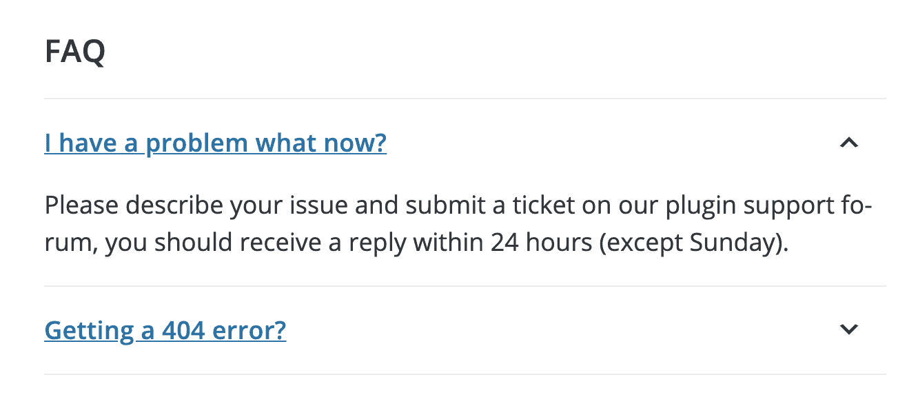
If the goal is to use the freemium business model try to convert as many free users as possible from WordPress.org into paying customers, this page should receive a lot of attention. It may receive more traffic than your website, which can be very common in the early stages of a plugin or theme business. Take advantage of everything WordPress.org has to offer and implement creative strategies like engaging GIFs. Using this page to its full extent will pay dividends in the long-term.
Website
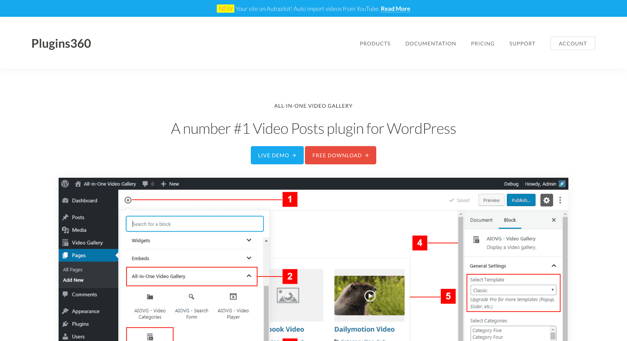
Arriving at the Plugins360 homepage, the first line states “A number #1 Video Posts plugin for WordPress”, which is a bit generic and meaningless. It’s better to use this critical space to focus on the key value your product provides or problems that your product solves. Everyone can say they are #1, but explaining how and why you’re #1 is far more important and can be done pretty effectively in 2 lines on the featured image.
Additionally, it’s unclear what the annotations are on the main hero screenshot. If the point is to show that it’s seamlessly integrated with Gutenberg blocks, that message can be conveyed with a far more effective visual. Those bold red annotations drive all the attention to the screenshot and generate confusion in the way a visitor consumes the content of the page.
Menu & Landing Page Organization
One aspect of the website that is a bit confusing is that the homepage shows information about All-in-One Video Gallery, but there are 2 plugins available for sale under “Products” on the menu.
If both of these products are meant to be unique core products, then the organization of the website should be a bit more clear. Automatic Youtube Gallery is kind of tucked away in the sub-menu, and while it’s a good practice to have separate landing pages for each core product or add-on (and sometimes even separate websites for each core product you offer), there should be a good reason why the second plugin is hidden away and not featured on the homepage. It all depends on how you want to structure your product and brand, which is not clear based on the website structure at this point. Is the second product an add-on or a premium product?

I would recommend having landing pages for each product equally emphasized if they’re individual premium products or listed clearly as add-ons or extensions (which can then be included in a sub-menu as a logical location) each with their own landing page.
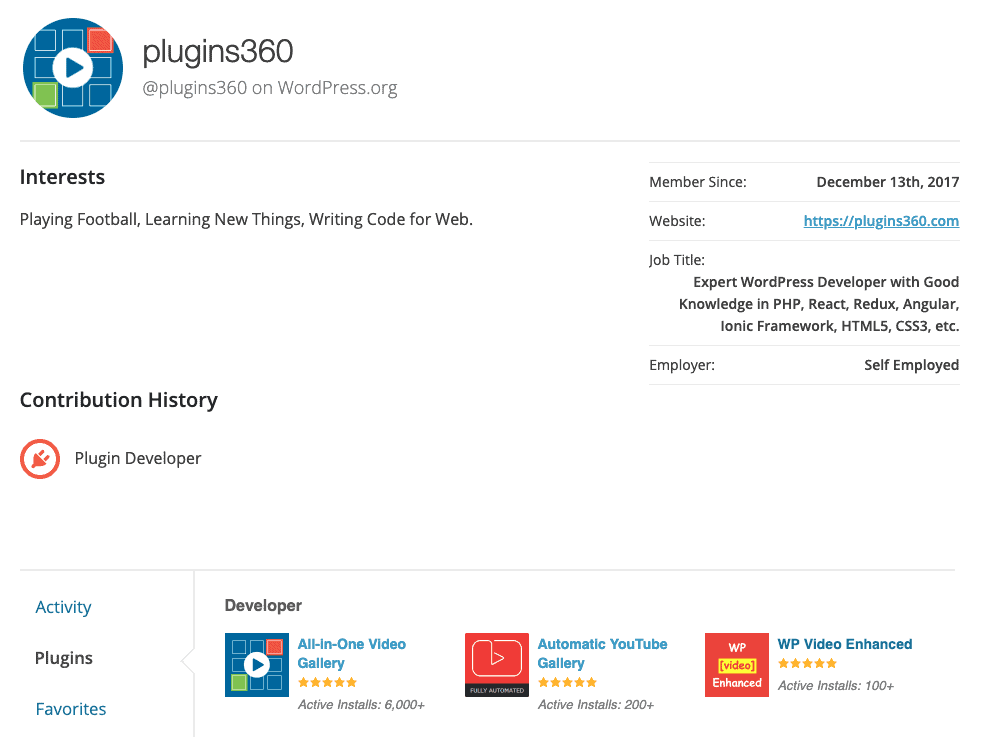
Additionally, this means that the suggestions I made earlier for the title/description should be written based on that structure. It seems that Plugins360 is trying to be seen as one of the experts in video related WordPress plugins, which is exactly what the author’s profile page shows that they’re doing with 3 video related plugins in total. While we’re not going to get deeper into the business model or specifics of the business as a whole or the other products, it’s important to have clear marketing for each product so as not to confuse your site visitors.
A quick side note about the author’s profile page on WordPress.org – the bio and interests could be clearly updated about the business or team behind the product. This is another area where branding can influence user’s decision before opting to use a plugin, and it’s an opportunity to present a professional business approach to your potential users, who will hopefully convert to customers in the future.
Keep in mind new customers may reach your website from many locations on the internet, and the information displayed on your WordPress.org listing and website should be organized as a “catch-all” for website visitors who are in your target market. For the marketing of All-in-One Video Gallery, the products may not be perceived in the most professional way so as to create confidence during the customer journey.
Layout & Design
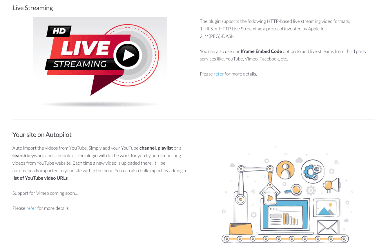
The website design is a bit simplified, specifically in that the white and black text makes it a bit less approachable than bite-size pieces of information broken down into clearly defined sections. On top of that, the graphic elements used are somewhat inconsistent, which makes it look less professional. However, the sections are very informative and appear in a logical order.
Social Proof
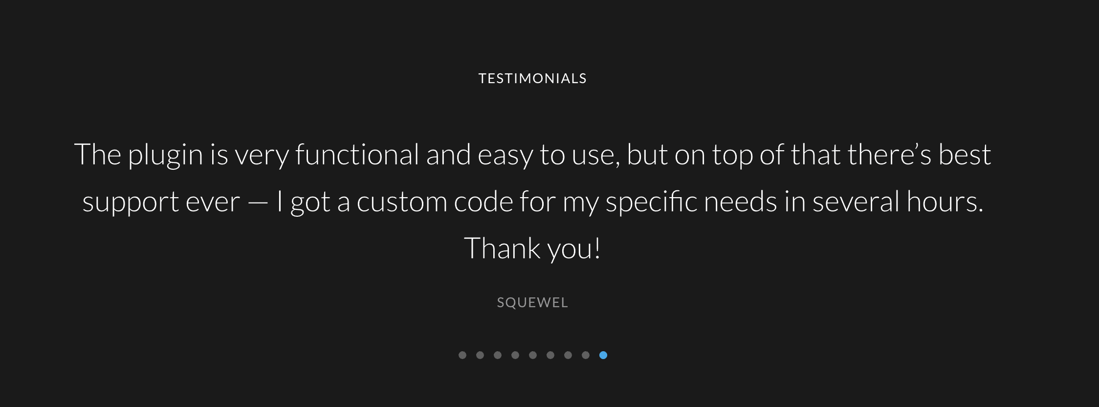
The testimonials section doesn’t stand out compared to the rest of the page, and photos would bring a lot more emphasis to this area. Using the faces of real people makes the testimonials look much more credible and brings legitimacy to your product.
Other forms of social proof are always a good opportunity to implement on your plugin store because they add to the psychological comfort website visitors have when purchasing from you.
Potential customers value the opinion of other people who have used the plugin. Without that kind of valuable evidence on your website – displayed in the best ways possible – your product won’t seem popular or reliable. Think of the times you’ve purchased something online. Are you more likely to purchase a product that has 4.5 stars and 1000 reviews or zero reviews? Or even a product that has just 5 positive reviews instead of none? It adds a lot of comfort knowing that other people had a successful time using the product.
Call to Action (CTA) Buttons
Another opportunity for Plugins360.com is changing the functionality of the “Free Download” button on the homepage. This currently links back to WordPress.org, which some users may have just arrived from. If the goal is Conversion Rate Optimization (CRO), then the website should be seen as one of the central hubs (besides WordPress.org) for getting users directly where they want to go – signing up for the free version, free trial, or buying the premium product. At minimum, the Freemius buy button can be used to collect user email addresses for leads when users download the plugin from the Free Download button, regardless of whether they opt-in to usage tracking through Freemius Insights later. The free version can be “sold” through the buy button as well, preventing a loop for users who just came from WordPress.org to the Plugins360 website.
Another alternative is to completely remove that button altogether because it’s just another point where sales may be lost. This could have two converse effects, including the possibility of increasing the bounce rate if users don’t find a free option or it could improve conversion rates because it removes a possible distraction or roadblock to purchasing.
Whatever path is chosen for these buttons, running experiments while tracking the data is the right way to go.

Pricing Page
The pricing page is probably the 2nd most important and visited page on the site. Google also prioritizes pricing pages in rich links, which means it should be treated as a landing page and include all the social proof and CRO boosters possible.
To create the best user experience in terms of transparency and building trust with the customer, the prices on plugins360.com should appear before clicking the upgrade/purchase button on the pricing table. Presently, the pricing itself doesn’t appear anywhere on the page, and it looks more like a list of features rather than a pricing page.
Usually, it’s best to be upfront about pricing and put it at or near the viewable window on a desktop view of your page. Putting a list of the most valuable features in the pricing column for each premium tier is the best practice, and then including testimonials, customer logos, security seals (which Freemius offers), and other informative details can call help to maximize conversions. All of these items are absent on the All-in-One Video Gallery website.
Including FAQs, refund policy, billing cycle and a switcher for monthly vs annual plans creates transparency and reduces friction at all stages of the purchase process. Here’s a good example of a pricing page:
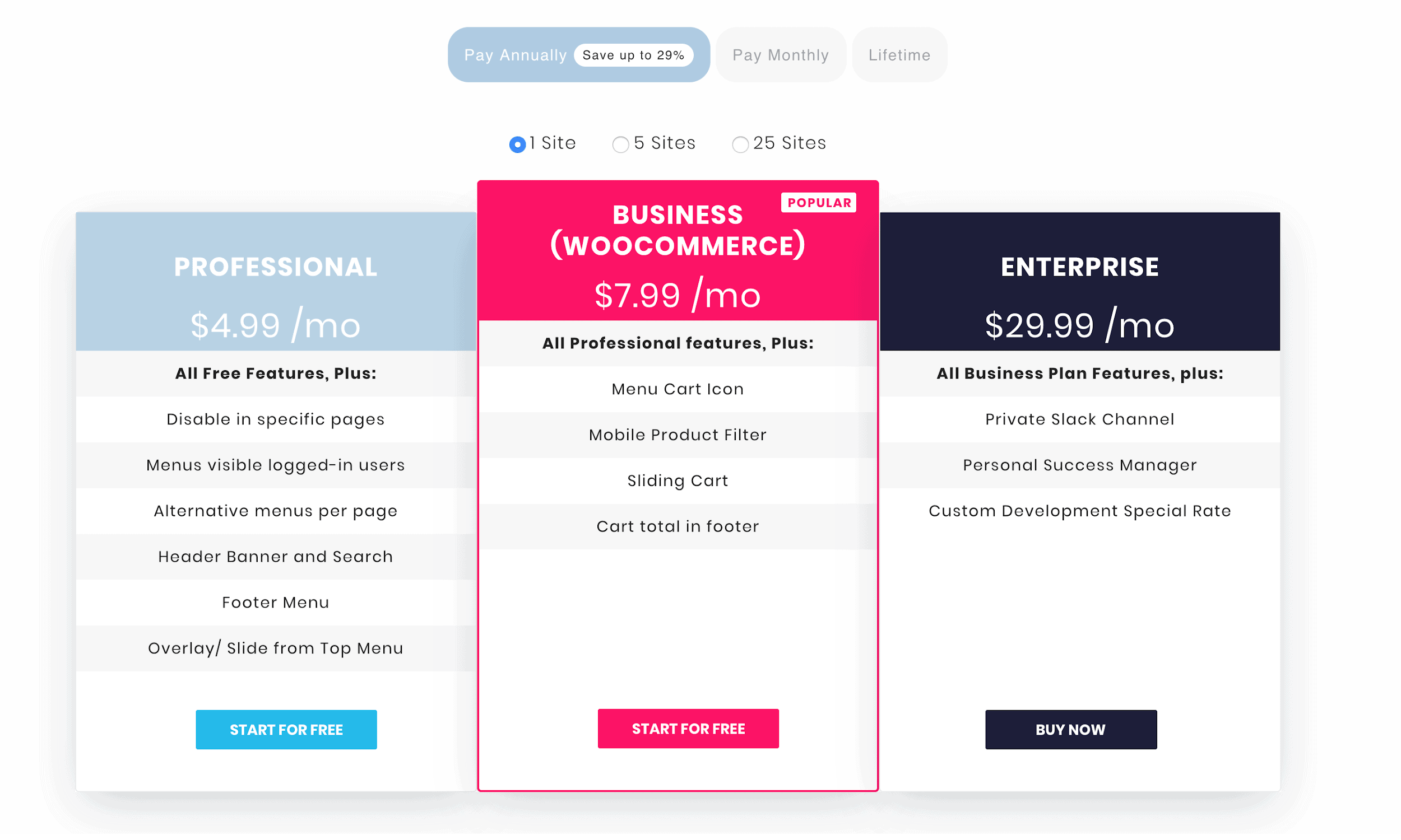
The information on the pricing table can be organized in any way you’d like, and it doesn’t have to follow this style or design. I’m simply sharing this example because it offers all the available information a potential buyer might be looking for, laid out in an organized and logical way.
Additionally, using all the space on the pricing page is an opportunity – rather than wasting space on highlighting the same features across packages, you can say something like “All Pro Features” at the top of the next tier in your pricing structure. This will highlight the upgrade features and make it clear exactly what customers are getting at each pricing level. Here’s what I mean:

A final problem on the pricing Plugins360 pricing page is that there’s nothing indicating what product you’re purchasing. It looks like a generic pricing page not associated with a specific product. The title of the page could be “Pricing for All-in-One Video Gallery Plugin”. This pricing page also creates more confusion because there is a second pricing section on the inner landing page for the other product offered on the website, and the offerings are not specified clearly as they could be.

Conclusion
The All-in-One Video Gallery website is informative and provides all the right information, but the delivery of the information could be improved significantly. There are significant opportunities when it comes to engaging with customers and promoting frictionless conversions.
Keeping that in mind, I suggest that Plugins360 take our advice and implement the suggestions described in one form or another. While our suggestions come from years of experience and studying best practices for selling plugins and themes, it is Plugins360 that know their audience and target market best, so it would be great to do some A/B testing to see what works the best in optimizing conversion rates. Google Optimize is a good way to A/B testing of the content on your site, and there are many other solutions.
Anyway, check you out next time, folks! If you’re selling on Freemius, get in touch for a product audit at yo (at) freemius.com 🙂




Hello Brandon Ernst,
Thanks for auditing my plugin "All-in-One Video Gallery". I'm very grateful to you for this detailed and informative review. This has really helped me to understand all my mistakes and sure I will take the necessary actions immediately.
Best Regards,
San Rosh,
All-in-One Video Gallery