
|
|
This is the second part of our “WordPress Products, Audited” series, where we try to help WordPress plugin and theme developers optimize their products for more sales & conversions in all possible aspects. We noticed that many WordPress theme & plugin creators and sellers are repeating the same mistakes, when it comes to the way they present, position and price their products, so we decided to launch this case-study audit series on the Freemius blog, in the hope that it will act as a source of valuable knowledge which product people can gain from and hopefully even use as action-items for their projects. Our next product audit came through thanks to Golam Samdani who agreed to have ‘GS Team Members’, his WordPress plugin, up for a public poke 🙂
Before we get going I’d just like to remind you all that the advice offered here by us for Golam, and for the rest of you WordPress product owners out there is based on data we have captured from hundreds of WordPress plugins and themes during years of experimentation with the various products in the ecosystem. Remember that our sole intention with this is to try and help WordPress products sell better than they currently do.
Poking Around The Free Version
To get this audit going, let’s first understand the motivation behind the ‘GS Team Members’ plugin:
This plugin provides a way to showcase the team members behind a company on its website. It is capable of showing the member’s Image, Name, Designation, Social connectivity links, etc. It can be displayed anywhere on a site using a shortcode or a widget and it has various settings options with more than 20 templates.
The Hero Image
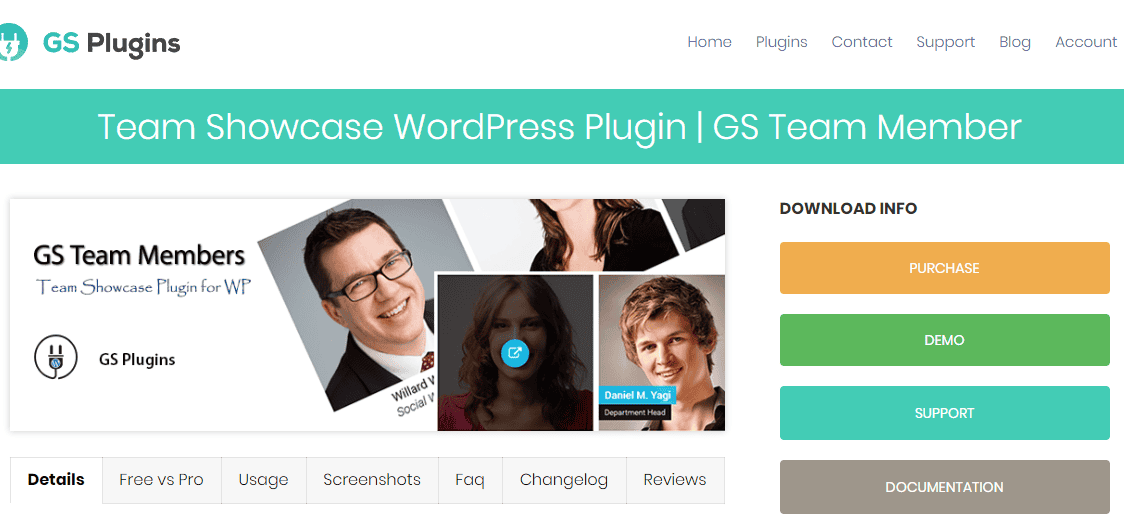
The first thing that stands out when you visit the ‘GS Team Members’ plugin page on the official WordPress.org repository is the fact that the hero image that has been chosen to represent the plugin is a little too generic-looking and does not reveal much about the value this plugin brings to the table.
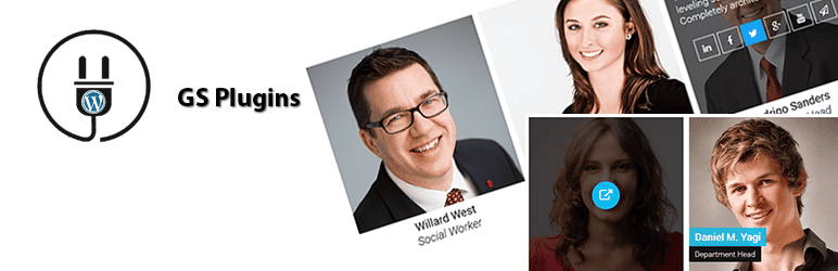
It would be better to focus on 1-2 team members’ profiles and “zoom in”, to be able to actually see what’s going on, instead of having multiple small photos that don’t necessarily help get the best impression.
In addition, the hero image includes the logo and name of the company that’s behind this plugin, but not a custom product logo… This page is a plugin page and everything about it should focus solely on promoting that specific product. A hero image is eminent and super-important for the 1st impression visitors may have on your product, and if it doesn’t necessarily help them understand what it does, or at least makes them more excited about the product then it’s not achieving its purpose.
The Main Video
Right after the plugin’s description paragraph, we get a video. That’s actually a great call!
With that said though, in a perfect world, that video should preferably be a short explainer video that’s optimized for more conversions & installations. The problem, in this case, is that the video we encounter as part of the plugin’s description is actually a 6-minute long installation & usage guide, which demonstrates the entire configuration process. Of course, potential users need to see that too, but this is too soon for that. First, you want to get them excited about the product and feeling like it is valuable for them so that they’ll actually want to watch a configuration/how-to video. The best way to do that is through a short, well-made explainer video. Your more technical screencast should preferably appear under the “Installation” tab, or even further down in the description.
Alternatively, Golam could have simply placed the great GIF animation slider that he has further down, which demos what the final result looks like, instead of that 6-minute video.
This will serve as an explainer and will help get visitors mentally on-board.
Making Sure Frequently Is Indeed Frequent
The FAQ section on the WordPress.org page of the free version is great, as it answers concisely all of the immediate questions that sprung into my mind as I was researching the plugin.
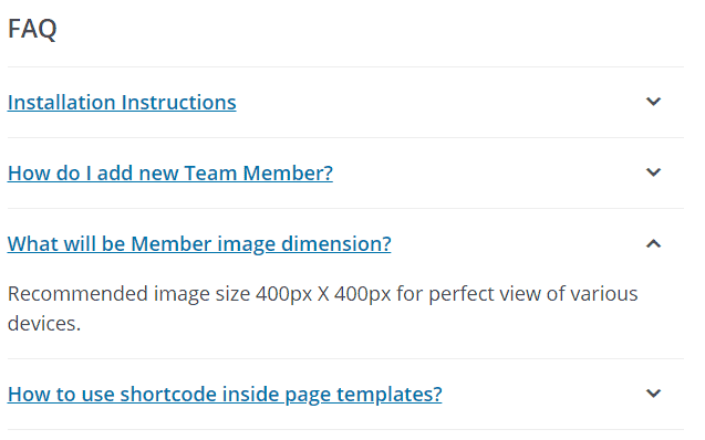
Remember that any additional, more case-specific questions can always be asked and answered on the support forum.
Moving On To The Premium Version – The Website:
Paying Attention To The Competing Elements On A Page
The feature comparison between the ‘GS Team Member’ free version and the Pro one, located at the bottom of the product’s documentation page (and also under the “Free vs Pro” tab on the main page), ends with a somewhat of a discordant note when the following CTA phrase appears:
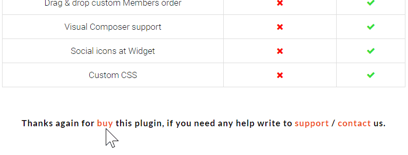
There’s an unfortunate grammatical/type error at the beginning (should be: “Thanks again for buying this plugin…”), which is important to pay attention to, because it’s things like these that may get your potential customers concerned about the level of professionalism you employ into your code writing too. Moreover, I’m wondering about the actual necessity of this. If I’m thanked for already having bought the Pro version of the plugin then there’s no real need to direct me to the product’s landing page, right?
The idea is simple: every element you choose to place on a page needs to provide value by optimizing towards a better conversion rate, as it is competing with the other elements on that same page. This is especially true when links are involved! When a visitor is on a certain page you would do well if you imagine yourself in their shoes and try to anticipate their desired next move. In my opinion, if they’ve already purchased the plugin then purchasing the plugin again is not on the list of their probable next steps. It would be better to think of an alternate CTA, which would provide value for newly acquired customers who may be wandering around, looking for certain things.
Every element you choose to place on a page needs to provide value by optimizing towards a better conversion rate, as it is competing with the other elements on that same page.
Demo? Yes, Please!
Since this plugin is very visual, the demo page is a great idea that helps better grasp the plugin’s capabilities, but I would also like to see an updated collection of links to live client websites, where the plugin can be seen actively running and doing its thing. A portfolio of sorts, if you will. That would help increase the plugin’s credibility, as well as give possible ideas for how to customize it for potential scenarios where the ‘GS Team Member’ plugin can be useful.
The Pricing Is Right
Let’s talk a little about the plugin pricing:
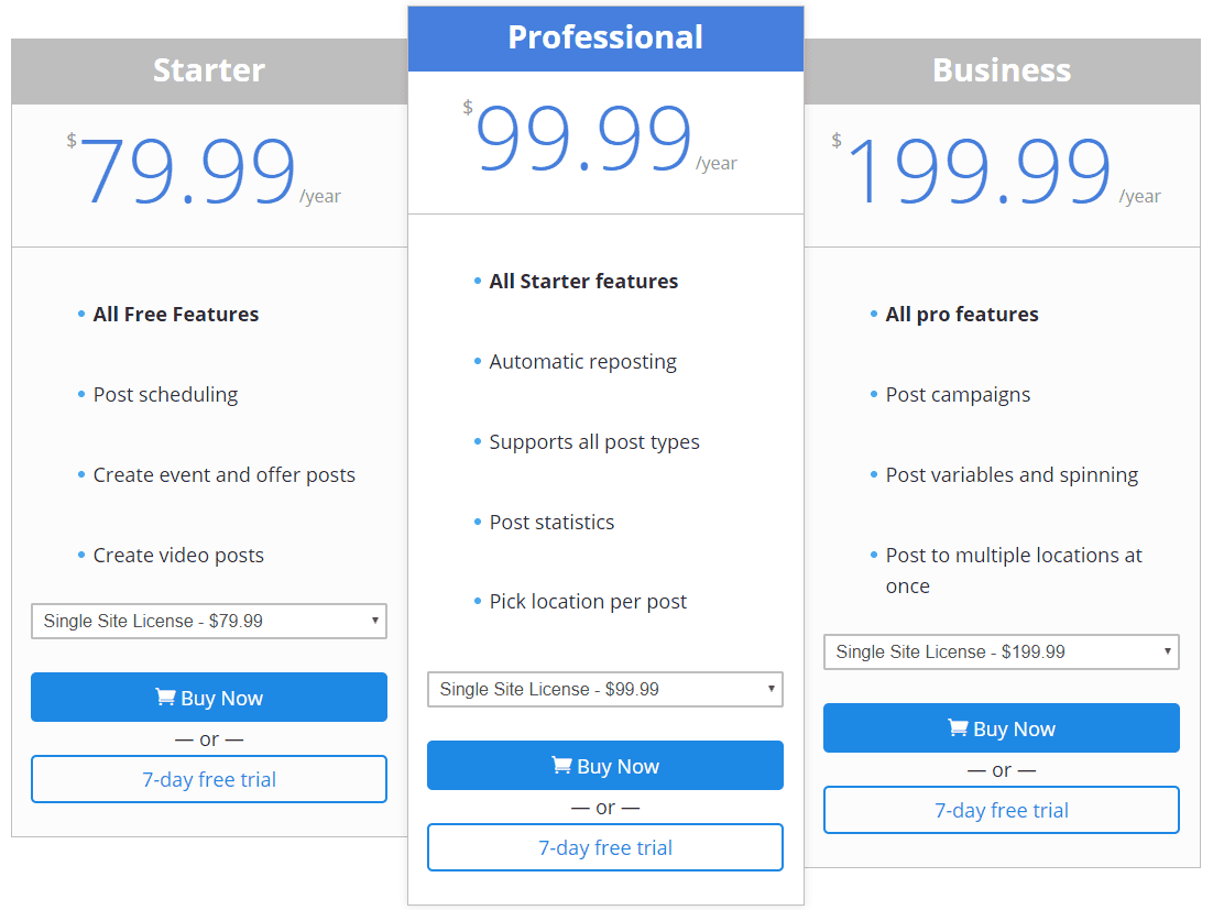
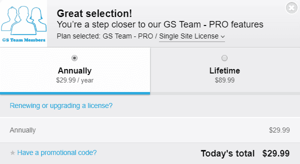
First off, it looks like the prices are not visible on the product’s website, unless you click the PURCHASE button and select your desired license via the popup window. This is not a best practice. Let me explain:
When only displaying a “PURCHASE” button, without exposing the prices somewhere first you’re missing out on the opportunity to use a pricing table, while a pricing table can easily serve as a vital means to help increase your conversion rate.
A pricing table can serve as a vital means to help increase your conversion rate. Make sure you have one on your website.
The Advantages Of A Pricing Table
The biggest issue with not including a pricing table on your product’s website or sales page is the lack of transparency. Slapping a big old “PURCHASE” button on there, without any indication of what to expect once I click it is pretty scary! Some visitors may refrain from clicking it just for the fear of getting instantly charged for a product they’re not yet certain they would like to purchase.
There are so many psychological effects to be applied using pricing tables that it is nothing short of a scandal not to have one on your product website 🙂 Here are a few ways having a pricing table can actively help your product sales:
Recommended Price
You can use the pricing table to visually accentuate and highlight a “Recommended Price” to which you’re looking to draw your visitors and potential customers:
The next level of this would be to actually go the extra mile and tailor each pricing plan to a specific target audience you know is within your realm, just like the guys at Foo Plugins did on their FooGallery plugin’s pricing table:
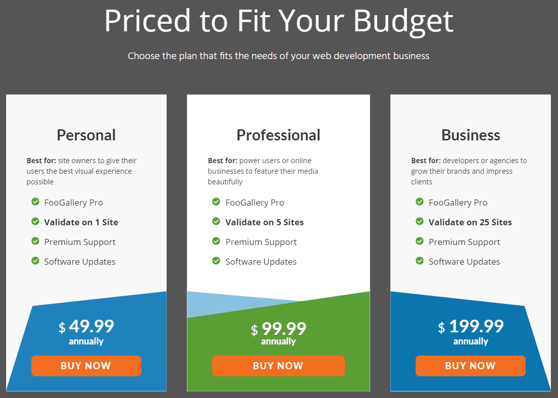
Stating which plan should be considered for which type of user is a very smart move. First, it comes off as fair & honest on their part, as they inform the typical site owner that the Personal plan should suffice and that there’s no need for them to purchase the pricier Business plan, which is aimed at developers or agencies. Second, it’s just plain helpful for any potential plugin buyer who’s trying to compare and understand the discrepancy between the different plans.
A Lower Initial Perceived Investment
When someone can see all of the payment plan options you have in place, one next to the other, their initial perceived investment may be lower. In other words, it could make potential buyers think that their expense is going to be more moderate than it ultimately might.
Why? For the sake of the example, let’s say your product offers a monthly plan (even though in this case ‘GS Team Members’ does not) it is likely going to be priced lower than your annual plan, making it more likely to get tried out by users, rather than having the entire product avoided, due to its usually-higher annual or lifetime options.
As a rule of thumb, it is going to be easier for a potential client to commit to a low amount like $3, in order to be able to test out the premium version for a month. With the monthly option in place, you’ll also be able to offer a discount for the annual license, making it slightly more desirable and increase your overall conversion rate. It’s at least worth experimenting with.
Positioning Features In Conjunction With The Price
When you position the features right next to each plan, it allows you to use them to differentiate each plan and to potentially ask for more money in return for certain included features. When you’re not presenting a pricing table at all you’re missing out on this very commonly used method.
Grab a free copy of our Cheat Sheet for
Selling Plugins and Themes
A growth roadmap with concise, actionable tips for every milestone of WordPress product development.

A Higher Click-through Rate
When you present a pricing table to your potential customers you will likely be increasing your CTR, just because it provides you with additional spots (a purchase button next to, or under each plan on your pricing table) through which users can move down your sales funnel and proceed to the checkout.
The Damaging Nature of Tabbing Content
It seems like a special effort was made to make the plugin’s sales page look very similar to the classic plugin page on the official WordPress.org repository, using the same tabs interface to browse around the information that relates to the plugin:
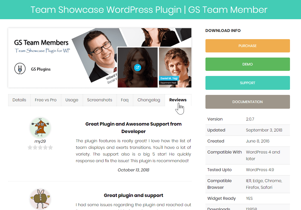
I think that the thought behind this move is great! Most WordPress users and very familiar with the interface on the official WordPress.org plugin repository as they use it pretty often. So instead of forcing the user to adapt to an entirely new user interface on your website – GS Team Members is actually trying to reduce the friction by appearing friendly right out the gate, due to the already familiar UI.
With that said though, I think it is necessary to talk about the negative effects that the tabs UI has on products. I think it is far from being a good practice as it actually “hides” important content behind tabs, that is unless of course you actually trying to hide it…
Trying to decrease friction by imitating the look & feel of a classic plugin page on the official WordPress.org repository is beneficial, but using their tabs interface may defeat your purpose.
Things like your product’s reviews, screenshots, and your comparison between the Free version and the Pro one shouldn’t “hide” behind a tab. Rather, they should prominently be displayed on the page, so they can achieve their desired effect to the maximum. The idea is to figure out what is the “journey” we want to take our visitors through, in order to increase the chances of them finishing it at our checkout screen. Once we know exactly what they need to see and where they need to go through to increase the chances of that happening – there’s no reason to leave it to chance or luck. Unfortunately, when using the dreaded tabs UI – that is effectively what you’re doing because you can’t control whether a visitor is going to open a certain tab and “unhide” the content you’ve placed inside it.
Conclusion
The ‘GS Team Members’ plugin for WordPress websites is a visual product with a very specific purpose – showcasing team members. In that realm, it is very focused and Golam has done a great job with the way he implemented the sales funnel on the website.
With that in mind, I would encourage him to take the suggestion & recommendations expressed here into consideration for his optimization work. While our advice is based on years of studying the field and gaining experience while selling hundreds of WordPress plugins and themes in the WordPress ecosystem it is still Golam who knows his specific target audience and market best, so there’s nothing wrong with doing some A/B testing to find out what actually helps convert your visitors better!
Lastly, if you sell your WordPress product through Freemius and feel like it could use an audit like this one (and you also wouldn’t mind having it publicly appear on the Freemius blog) – please email us to yo at freemius.com


![The Freemium Business Model In The WordPress Ecosystem [+Video] – A Tool For Increasing Sales?](https://freemius.com/blog/wp-content/uploads/2018/10/freemium-business-model-wordpress-featured-image.jpg)