|
|
Welcome to the first edition of our “WordPress Products, Audited” series. We’re thrilled (yes, thrilled!) to launch this series which will enable us to help WordPress theme and plugin developers to optimize their products (this time it’s ‘Elementor Addons’) for more sales & conversions in all possible aspects.
Motivation
One of the key differentiators between Freemius and other popular WP eCommerce solutions that help WordPress plugin and theme developers sell their products from their store is our business model. Unlike EDD or WooCommerce which make their money from selling extensions, we make money only when our makers make money. This alignment of interests incentivizes us to proactively keep helping our makers with things like pricing strategies, business models, conversion rate optimization, marketing advice, branding & design, etc. If we can help a maker to gross more money, we directly benefit from it. As we keep doing those internal “audits” for our makers, we noticed that many WordPress product sellers are making the same mistakes, when it comes to the way they present, position and price their products, so we decided to launch this case-study audit series on the Freemius blog, while also enabling theme and plugin authors that are not necessarily using Freemius to learn from the feedback we offer to our makers, and in the hope that it will act as a source of valuable knowledge from which product people can learn from to use as action-items for their projects.
Intro & Disclaimer
Before we dive into the first product audit, I would like to thank Raghavendra for agreeing to make his WordPress product the first case-study of our series! It takes an unlimited amount of courage to display your product’s guts out in the open like that, and have your decisions publicly and openly reviewed. Sometimes, the opinions that will be expressed here may seem harsh, but as product people, we know that’s the way things work and that we should neither get too emotionally attached to our own decisions nor discouraged when someone tells us we might be wrong and should change some things.
The advice suggested here is based on data captured from hundreds of WordPress plugins and themes, years of experience with the various extensions in the ecosystem, and the conclusions we’ve come to throughout the years. Please remember that our sole intention here is to try and help WordPress plugins & themes sell even better than they currently do.
And with that, let the critiquing begin!
The Product: ‘Elementor Addons’
For the first ever WordPress product audit we asked Raghavendra for permission to use his plugin, ‘Elementor Addons’ as our case-study, and he so kindly agreed.
If we want to be even more precise, Raghavendra actually has a separate WordPress plugin for each of the 4 WordPress page builders he chose to target:
- Elementor Addons
- Beaver Builder Addons
- WPBakery Page Builder (formerly Visual Composer) Addons
- SiteOrigin Widgets
So, pretty much everything we say here is true for all 4 different page builder addons. We’ll be focusing on his Elementor Addons, but everything holds true for the rest of them as well.
What’s In A Name?
So first things first, let’s talk about the brand name. Raghavendra had consulted us about a naming adjustment he was considering for the plugin portion of his business:
“Since we are mainly into plugins now, will switching to a shorter domain like livemeshwp.com help? We’ve been having some issues thinking about what content should go into livemeshthemes.com and how we should relate to the subsidiary sites of plugins like ‘Elementor Addons’.”
That’s a valid thought. If he was going to keep using ‘LiveMesh Themes’ for his WordPress plugins business – it could be confusing for some customers. “Why am I purchasing a plugin from a theme shop? Do I have to purchase their themes in order to be able to use those addons?” are only a couple of potential questions a name/branding adjustment could help avoid.
In this case, ‘LiveMeshWP’ is a great solution because it will continue the LiveMesh branding, rather than flushing it down the drain and will make more sense for the customers.
Pricing Advice
A Small Psychological Pricing Tip
The first and immediate pricing-related advice we would provide for this page would be to reduce the font size of the .99 cents.
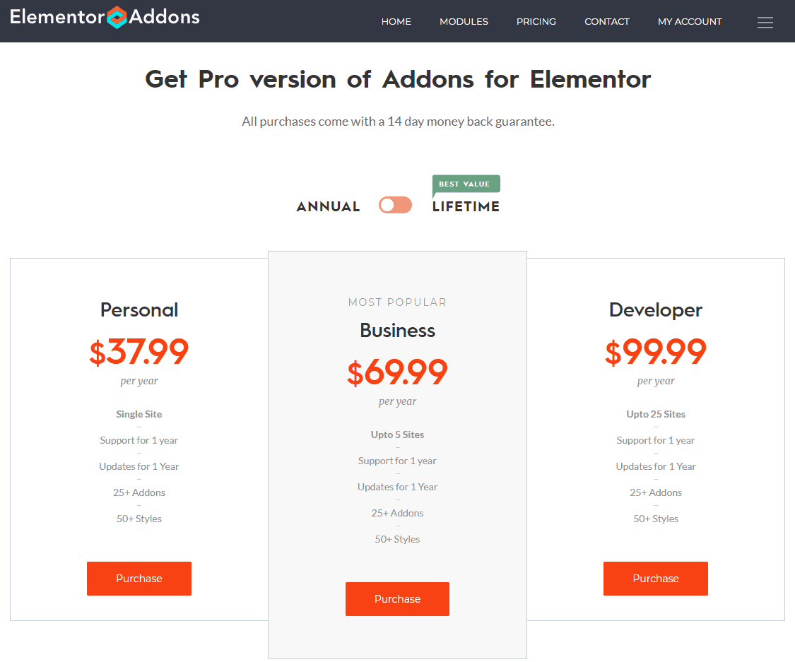
Why?
Because this .99 cent addition is there as a psychological pricing trigger in the first place, and you’re defeating your own purpose by presenting it in such a prominent manner. The idea behind this pricing strategy is to enable the seller to reduce the left digit by one, without actually losing any money on the sale because it is effectively only reducing the price by one cent. So, in this case, instead of selling the Business plan for $70 per month, you’ll “only” be paying $69.99, which seems like significantly less.
Therefore, if the .99 cents is so prominently present, it is “ruining” this psychological pricing trick for us. This can be easily overcome by simply reducing the font size only on the .99, making it stand out less, bringing back the attention to the digit on the left.
Highlight The “Most Popular Plan”
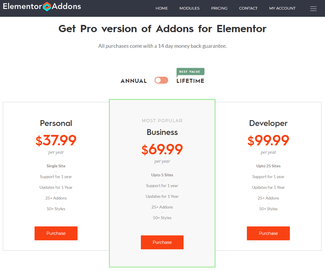
While the Elementor Addons plugin does seem to have a “Most Popular Plan” recommendation, it feels like it is not highlighted enough, and therefore might not actually be gently directing people to that plan, as it should. We would recommend highlighting its borderline blandly, in a way that makes it a little clearer, but does not harm the page design. Here’s a quick suggestion for a delicate way to highlight the recommended plan by wrapping it in a green border:
The Right Lifetime Price
As resellers of WordPress themes and plugins, we can provide valuable, data-based advice to our makers. After noticing that in the case of one LiveMesh Plugin called ‘SiteOrigin Widgets’ – 61.5% of the sales are of Lifetime licenses, to us, this raises a flag that means an inspection is in order. Unless we’re dealing with a certain kind of product, for which purchasing a Lifetime license simply makes more sense, this can be a sign that the pricing is incorrect and may require adjusting, as it is possibly too cheap.
Grab a free copy of our Cheat Sheet for
Selling Plugins and Themes
A growth roadmap with concise, actionable tips for every milestone of WordPress product development.

Our recommendation is to inspect that pricing again and reconsider the preferable price, in order not to sell Lifetime licenses too cheaply. As rule of thumb, lifetime licenses sales should only gross up to 10%, if you’re looking to maintain a sustainable recurring payments business.
The (Social) Proof Is In The Pudding
Here’s a screenshot of the entire Pricing page of the ‘Elementor Addons’:
Try to look at it first from a potential buyer’s point of view. Do you notice anything missing on this page when you consider making a purchase after staring at those prices?
Research shows that 7 in 10 Americans say they look for product reviews before making a purchase and that 63% of consumers indicate that they are more likely to purchase from a site if it has product ratings and reviews.
That’s right – there’s no reason this pricing page should not have customer reviews or perhaps a bunch of well-known brand logos to indicate it is trusted by the “big boys”. Those can help seal the deal for many consumers, and this page is, unfortunately, missing out.
There’s no reason a pricing page should not include customer reviews, or perhaps a bunch of well-known brand logos to indicate it is trusted by the “big boys”.
As it turns out, Raghavendra did bother with those elements for the product’s homepage, but he had left them out of the pricing page, for some reason. Our tip is obviously to include them in there as well, right before the FAQ section:

Landing Page Advice
Be Specific
The top part of the landing page is minimalist and looks great. It seems like an effort was made to not include any distracting elements, but rather focus only on the “must haves”:
- Product logo + main menu
- Main title + short description
- A ‘Purchase Now’ button
- An ‘Addons Demo’ button – we’ll discuss this one in a bit, but it should not be here!
- A hero image
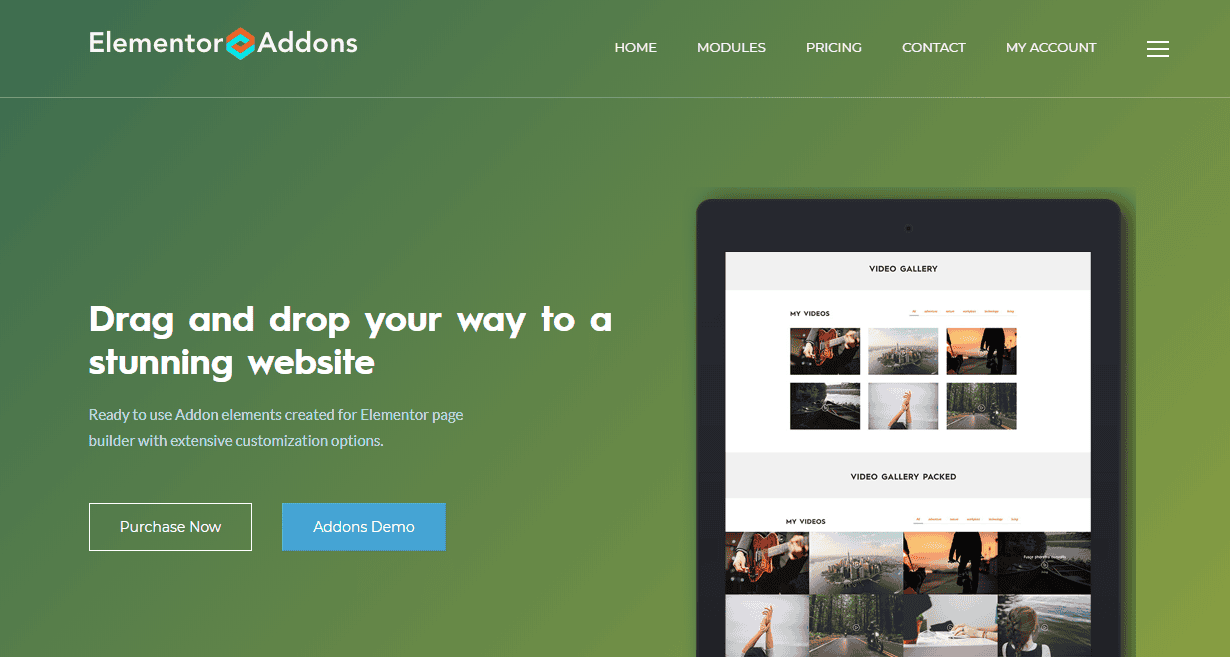
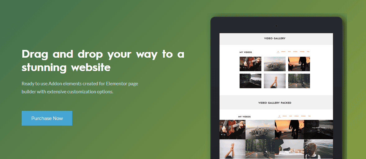
What we would like to emphasize here is the lack of specificity in the main title. It seems too generic to us and could be used on any given page builder website when you come to think about it. Hence, the advice here would be to tweak the main title to be more product-specific, like so:

This should preferably be repeated on every additional occurrence of this generic title all across the website.
Remove Redundant Distractions
As I’ve mentioned above, and as you can easily notice when you visit this product’s landing page, there’s a very prominent “Addons Demo” button, right next to the “Purchase Now” button. In fact, it stands out even more.
We believe that not only should the “buy/purchase” button be the most prominent CTA on the entire website, but also, with most WordPress plugin demos, we have come to the conclusion that many people who check out a plugin demo are not sure about what they should be looking at, and therefore cannot focus on what the plugin/addon is trying to solve for them. If after about 10 seconds the viewer is still unable to figure out the specific purpose of the addon/plugin – they will likely ditch the demo and your website altogether, and go back to Google, searching for alternatives.
Many people who check out a plugin demo are not sure about what they should be looking at, and therefore cannot focus on what the plugin/addon is trying to solve for them.
So, unless you’re selling a very visual plugin/addon like an image gallery, or something of that sort that’s very easy to grasp in a short demo, the solution is to remove the demo button from the site, leaving the visitors with only one option – purchase now.
It is better if the visitor would purchase the addon and then ask for a refund, rather than try out the demo, not understand which part of it is actually your product, and then ditch it (you will have lost them forever).
SEO – Titles Best Practices
Another thing we noticed about this main title is that it has the wrong tag element attached to it in the HTML page structure. It is marked as an H3 title, while there are no H2 title tags on that page at all.
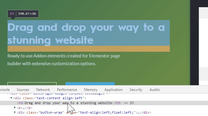
Our recommendation would be to change that title’s tag to H2, in order to push it up in the page’s content hierarchy and importance in the eyes of the search engine scanning bots.
Summary
All in all, it definitely looks like ‘Elementor Addons’ by LiveMesh takes many correct steps in directing their potential customers through their sales funnel, on their way to the desired checkout. We believe that, once Raghavendra applies the advice provided here in this product audit, he is likely to see an even better conversion rate from the potential customers who visit the plugin’s website.
At the end of the day though, opinions may be different and that’s okay. While we are basing our advice on years of experience selling hundreds of WordPress plugins and themes in the ecosystem – there’s never anything wrong with doing some A/B testing to find out what actually works better 🙂
Lastly, if you sell your WordPress product through Freemius and feel like it could use an audit like this one (and you also wouldn’t mind having it publicly appear on the Freemius blog) – please email us to yo at freemius.com



![Writing Smart WordPress Plugin Copy That Drives Installs [case-study]](https://freemius.com/blog/wp-content/uploads/2016/07/Writing-thumb.jpg)
Awesome audit! Your points on improving the pricing page and landing page are great. I've read your book, but still find something useful in this article (the testimonial part in pricing page).
Thanks a lot for sharing!
Thanks, Anh! Glad you found it useful. The pricing page / section is one of the most important parts of your website and have a huge impact on the conversion rate (for good or bad).
Great tips here for pricing given in this blog. Looking forward to buying elementor addons.
Great post for the landing page advice. It helps to improve the traffic and bounce rate of the website.