|
|
Hey folks! This is the newest article in our series “WordPress Products, Audited” where we offer advice for plugin and theme businesses to help you optimize conversion rates. The goal of these product audits is to show how you can increase sales and conversions when selling WordPress products, especially at that critical time when your users are clicking around your website trying to learn about your plugin or theme!
While we don’t cover every aspect of Conversion Rate Optimization (CRO) in each of our audits, we do look for opportunities that can be implemented without too much heavy lifting to have a significant impact on conversion rates in the short-term. Our advice is personalized to the unique situation of each product we’re auditing.
This time around, we’ll be auditing Igor Benić’s website redesign for his plugin WP Simple Giveaways. So, let’s see what CRO strategies can help Igor get more sales!
Optimizing the Call-to-Action Buttons
First, let’s take a look at the most important part of the website – the hero section of the homepage and Call-to-Action (CTA) buttons. After looking through the site a bit, I noticed there’s a button for the free version of the product available on WordPress.org.
While WordPress.org is a good channel for getting free users and converting them to premium, offering the free version on the website homepage is not the best strategy from a conversion point of view because most users will go directly for a free option before making a purchase.
It’s the same situation when you walk into a candy store and they’re giving out free samples – do you take one? If you take one, does that mean you’re committed to buying more candy? Not really…and maybe you’re even less motivated to buy candy after the sample because it satisfied your craving.
But, if you planned to go into the store based on what you saw in the window, you probably would have come out with something even if they weren’t offering free samples. Your expectation would have been to purchase something.
If the best option for the website visitor is to pay for the features they need, there’s a greater likelihood of closing the sale.
When offering free version of your product, it makes sense to want to list it on your website as a marketing opportunity. Logically, it’s something that would be appealing to site visitors and it makes sense that you would want to avoid missing out on users who don’t want to buy anything, but who may still want to try a free version.
To “catch” all these users and avoid missing out on any sales or free users, Igor could implement an “exit-intent” popup that offers a link to download the free version or even a free-trial. With this extra step added, there’s a better chance of converting both types of users.

Video on WordPress.org
The video of the plugin I found on WordPress.org is pretty useful, but the right type of video can improve conversion rates even more. In this case, Igor recorded a 5+ min long walkthrough that goes over the setup process and features of the product.
It would help to optimize this video by shortening it and making it more of a “quick intro” to the product and its benefits. Adding music and a professional voiceover could also help engage users a bit more. This could be done pretty inexpensively with contractors on Fiverr.com or Upwork.
Additionally, I couldn’t find the video anywhere on the Simple Giveaways website after looking through some of the main pages. Even in the video’s current form, it would be helpful to put it on the homepage or at least in the documentation or support area for users who are looking for info on the setup process.
Pricing the Product
There’s a lot of discussion around how to price your plugin or theme and how to make an effective pricing table, so there’s not just one way to do either one.
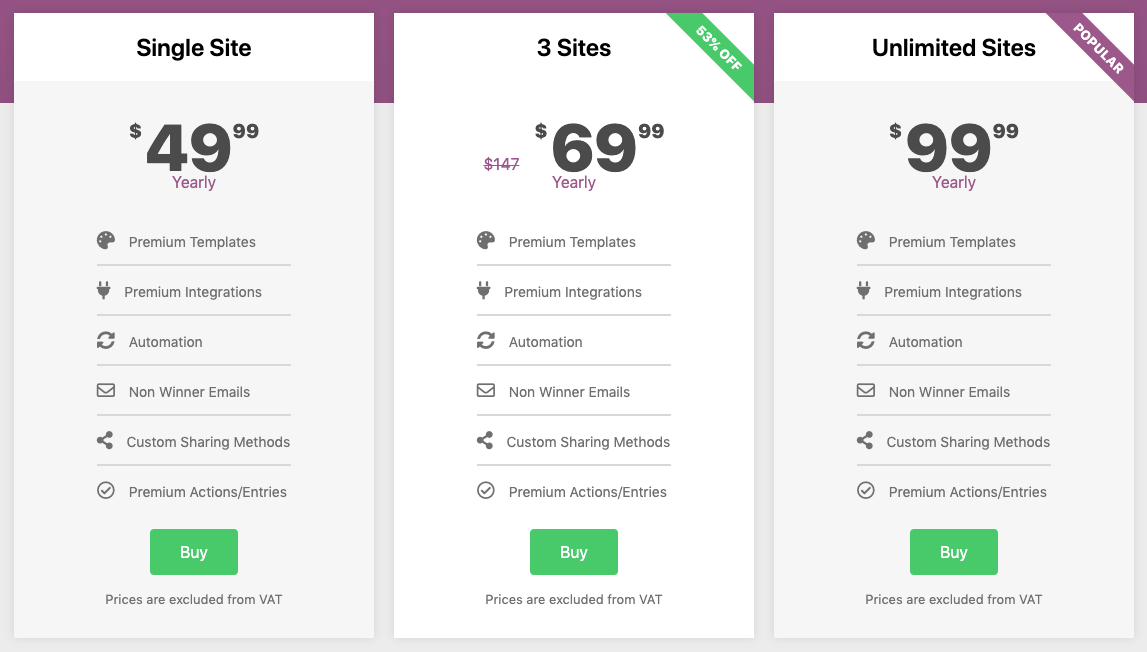
For Simple Giveaways, I notice that the 3 pricing options aren’t too far apart in cost, and they all offer the same features. Strictly from a pricing standpoint, there’s not one plan that stands out from the rest – the plans are only differentiated by the # of sites included in the license.
To make one of the plans the “focus” in the eyes of the potential customer, it could help to differentiate one of the plans from a pricing and features standpoint. For example, some of the features like “premium integrations” or “premium actions/entries” could be offered in the top 2 plans to give more incentive to customers to upgrade to those. The pricing of the lower plan or higher plan could be modified to give more “spread” between the plans and further differentiate the middle plan as the best option, which is already attempted by the pricing table’s highlight of the middle option.
To differentiate the plans even further, Igor could name each plan something like “Starter”, “Professional”, and “Business”. While this doesn’t go as far as naming the plans around buyer personas, it does help users identify with a specific plan without excluding anyone from any of the plans either.
Subscribe and grab a free copy of our WordPress Plugin Business Book
Exactly how to create a prosperous WordPress plugin business in the subscription economy.

After all, most buyers would likely consider themselves as a professional of some kind, which makes each of the plans an attractive possibility. To help users further identify with a specific plan that should fit their needs while not excluding anyone from using any of the options, a small description can be added under the plan title, like: “Recommended for agencies and freelancers.”
Additionally, the features of the plans could be organized to increase the average sale size. If the higher plans had more premium features than the lower plans, it would incentivize customers to purchase the more expensive plans if they need those features.in such a way as to increase the average sale size. If the higher plans had more premium features than the lower plans, this would incentivize customers to purchase the more expensive plans if they need those features. It might currently be hurting the average transaction size to offer all the same features in all the plans.
Most of these changes to the pricing structure can be made pretty easily using the Freemius WordPress SDK by implementing Premium Logic Stripping. Then, it’s just a matter of updating the pricing table a bit more.

The Pricing Table
Testimonials
There are no testimonials or reviews on the pricing page, which has a strong impact on reassuring prospective customers at the most important time in the decision-making process. Adding social proof like this type near the pricing table is always the best practice to help close the sale.
Competing banners
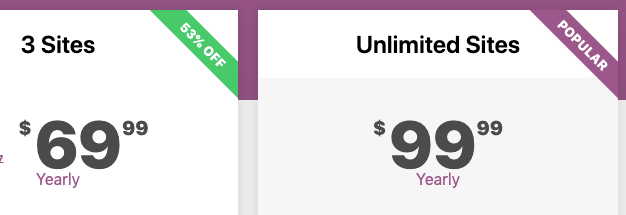
Let’s zoom in a little bit more. On the two pricing options on the right side, there are little labels that say “53% Off” and “Popular”, which bring attention to the two most expensive plans.
This is a good attempt at focusing on the higher end plans with more sites, but it’s generally best practice to “anchor” one of your pricing options as the primary focus. The anchored product should be the one you want to sell the most.
Having two plans with attention grabbers puts a little focus on each of them, which leaves these two options competing with each other, making the decision more difficult and confusing for the customer.

Additionally, it might be helpful to add other, “non-tangible” benefits to the anchored pricing option, like “Priority support” or “Success manager” that will separate it from the rest.
The features are currently the same across all 3 product versions, so there are no differentiating factors between the plans except the number of sites allowed. It’s a reasonable pricing model, but most WordPress users have a single website, so unless you give an extra incentive for the higher plans, most buyers will go for the single-site plan. Therefore, we always encourage our makers to differentiate their plans by more than just the number of sites.

Social Proof
Another useful marketing tactic that can help close the sale is social proof – the psychological effect of making your product appear in high demand and limited supply.
If you are unfamiliar with the value of social proof, you can take a look at our article that talks about the sharing positive experiences from your users. If presented properly, testimonials and reviews can hugely increase the wow effect 💥
While testimonials do appear on the WP Simple Giveaways homepage, some of them are lacking photos, which would give the testimonials more legitimacy from the perspective of the visitor. It also wouldn’t hurt to try to make the testimonials similar in length to give more balance to the page.

The addition of FOMO notifications would also help break down barriers to purchasing by making the product and business appear to be used by a wider community. more transparent and reputable from the customer’s perspective.
Demo pages
Let’s move on to the plugin Demo pages – called “Examples” on the menu. 
For WP Simple Giveaways, in particular, it’s great to show visual examples of what it offers through demo pages. The examples are great in and of themselves because it lets customers visualize and imagine using the product on their site.
One practice I always try to remember is keeping the user on your site and pricing page because you don’t want to lead them away from making a purchase. The “Examples” sub-menu items currently open on the same page, so it might help to make those open in a new tab, keeping the original page open. The parent menu item also leads to an archive of posts that make up the demos, which could be more effective if it wasn’t there or converted into a nicely designed layout.
More best-practices to come
We don’t want to let the cat out of the bag in just one audit! So, we’ll be releasing more product audits in the coming months.
Thanks for reading and feel free to share your feedback with us in the comments below!
Are you a Freemius maker who wants your product audited in an upcoming article? Just ask in the comments or on the Freemius DEV Slack 🙂


So many insights in one article, good point on pricing plans. I would like to propose our website next - https://deothemes.com We just launched few days ago and haven't made any sale so far. So maybe your feedback could help.
Thanks! I sent you an email about adding your site to the Product Audits, Aleksandr.
Cheers,
Brandon