|
|
Optimizing your checkout is a critical yet challenging task. You need to make it seamless, secure, and efficient, as it’s the last hurdle between a potential sale and a paying user, but it’s easier said than done.
Balancing between integrating payment gateways and processing systems, implementing compliance and fraud prevention features, supporting multiple currencies, and improving load times and user interfaces sounds… overwhelming.
But this is exactly where your opportunity to increase checkout conversions lies.
Our guide will help you uncover the key reasons for lost sales at checkout and offer insights to boost your conversion rates, courtesy of our in-house experts:
- Swashata Ghosh, Freemius VP of Engineering
- Atakan Oz, Freemius Senior WordPress Developer

The factors affecting checkout conversions that you can control fall into three main categories:
- Technical
- UX Design
- Messaging
Let’s take a closer look at each of these factors — and learn how to improve them to ensure better conversion rates.
Technical Factors
Technical factors, such as slow-loading pages or websites crashing in the middle of payments, can create a subpar, frustrating user experience that may cause potential customers to abandon their carts.
Some of these technical issues include:
- Page load speed: The time it takes your checkout page to load and become interactive is critical because just a small delay — one of a few seconds — can feel like an eternity to users who expect instant gratification and have a credit card in hand.
Data doesn’t lie: Fast-loading websites (up to 1 second) may have a 5x higher conversion rate than sites that take 10 seconds to load.
- Mobile optimization: Does your checkout process work seamlessly on smartphones and tablets? Mobile commerce is our reality, accounting for two-thirds of overall online shopping. Ignoring this fact is like closing the doors to your software on two-thirds of your potential customers.
A checkout page that’s not optimized for mobile devices can lead to formatting issues, hard-to-click buttons, and frustrating form fills, which, in the end, result in higher cart abandonment rates.
- Technical issues or website crashes: Any glitches, errors, or disruptions that prevent a smooth checkout experience can result in losing a customer. These technical issues may range from minor annoyances, like having to re-enter information after a page refresh, to complete failures, such as payment gateway errors. This can impact aspects beyond checkout conversions, like your reputation and website visits.
- Form processing: How your checkout handles inputs, validations, and submissions is the last step between browsing and buying. It should be smooth, without slow forms or laggy input fields that turn the simple act of entering information into a test of patience.

- Lack of payment options: For 13% of users, the fact that an online store didn’t offer enough payment methods was a deal-breaker. Freemius’ developers even tested this once — removing PayPal as a payment option resulted in a significant drop in conversions.
Note: If you aim to cater to a global market, offering an English-only checkout may have a similar effect as a lack of payment options. Swashata points out Freemius’ multi-language checkout: “We have our checkout translated into Spanish, German, French, Italian, and Dutch, so we can specifically cater to these regions.”
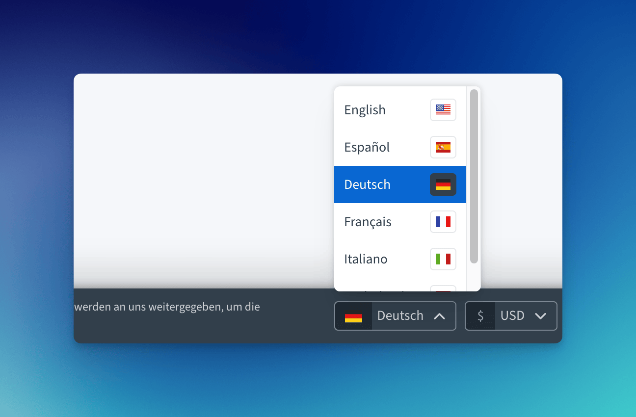
Similarly, a lack of support for multiple currencies can also negatively impact conversions, given that over 90% of users prefer to buy on websites where prices are displayed in their local currency, as it eliminates the additional step of currency conversion.
Addressing Technical Issues: How to Streamline and Speed Up Checkout
Remember the old dial-up days when you could literally brew a cup of coffee while waiting for a page to load? No need for nostalgic reminders of past times on your website, though. To optimize and speed up your pages, do the following:
- Minimize HTTP requests: Audit your website with browser developer tools to find and remove unnecessary requests. This will reduce the overall load time, especially on slower connections. It’s like decluttering your desk: combine multiple CSS files into one, merge several JavaScript files into a single file, and use CSS sprites to combine multiple images. Atakan says assets should only be loaded when necessary. “If your homepage doesn’t have a contact form, skip the JavaScript for it. Keep each page lean by using essentials only.”
Note: Atakan adds that fonts can also be a significant issue. “Stick to two or three fonts max and limit variations like bold or italic to cut down on HTTP requests and speed up your site.”
- Optimize images: Use appropriate image formats, compress images using online tools, and implement responsive images to serve different sizes based on screen resolution. You can also try new formats such as WEBP and AVIF.
These “compress better than JPEG or PNG without losing much quality. WEBP works in most browsers, but AVIF, while even more efficient, isn’t fully supported yet — so have fallback formats ready. These formats keep your site fast and your images crisp,” advises Atakan.
- Use a CDN: Using reliable CDNs can help reduce latency for users far from your main servers. Configure your website to use a CDN for static assets, set up proper cache headers for CDN-delivered content, and voila! Your website is running more smoothly now.
Atakan recommends Cloudflare: “It’s a top free CDN option that speeds up asset delivery and enhances security. It guards against DDoS attacks, blocks malicious bots, and even offers a free SSL certificate. So, you get better performance and security at no extra cost — perfect for any size website!

UX Design Factors
Good checkout UX is clear and allows users to purchase quickly and easily, without entering unnecessary information or encountering unexpected costs at the final step. However, good design is not always the case and many checkouts can be nightmares to get through because of bad, incoherent UX flaws, such as:
- Complicated or lengthy checkout process: Over 20% of online buyers have reported giving up on a purchase because of this issue. Every extra step is a hurdle in the race to conversion, and an overly complex checkout process is like asking users to run a marathon when they just wanted to pop to the corner store.
“WooCommerce has a big checkout form, which can be overwhelming for end users. There are plugins that simplify it, but that’s another extra step you need to take. Essentially, having too many form inputs right on your face can scare customers away,” explains Swashata.
- Account needed first: Forcing users to sign up before they can give you their money screams: we care more about our marketing database than your convenience. This is a leading cause of lost sales, as users may feel it’s not worth the effort for a one-time purchase.
- Total cost surprises: In 2024, 21% of users claim they ditched the checkout process because they weren’t shown the overall cost upfront. Hiding this number until the last moment may make users feel deceived, as nobody likes surprises when it comes to their wallet.
- Lack of clear navigation and user guidance: Does your checkout process feel like navigating a foreign city without a map? A lack of clearly defined checkout steps, like billing information entry, payment method selection, and order summary and confirmation, deprives the user of knowing where they are in the purchase and what’s coming next.
Addressing UX Design Issues: Simplify and Clarify Your Checkout Process
A minimal, user-friendly checkout design can boost your conversion rates. Here are concrete actions you can take to optimize the experience for users:
- Remove unnecessary steps: “The best thing I’ve seen is simplifying the checkout process,” says Atakan. “If people feel like they’re jumping through hoops, they drop off fast. So, streamlining things — fewer clicks, no unnecessary fields — can make a world of difference.”
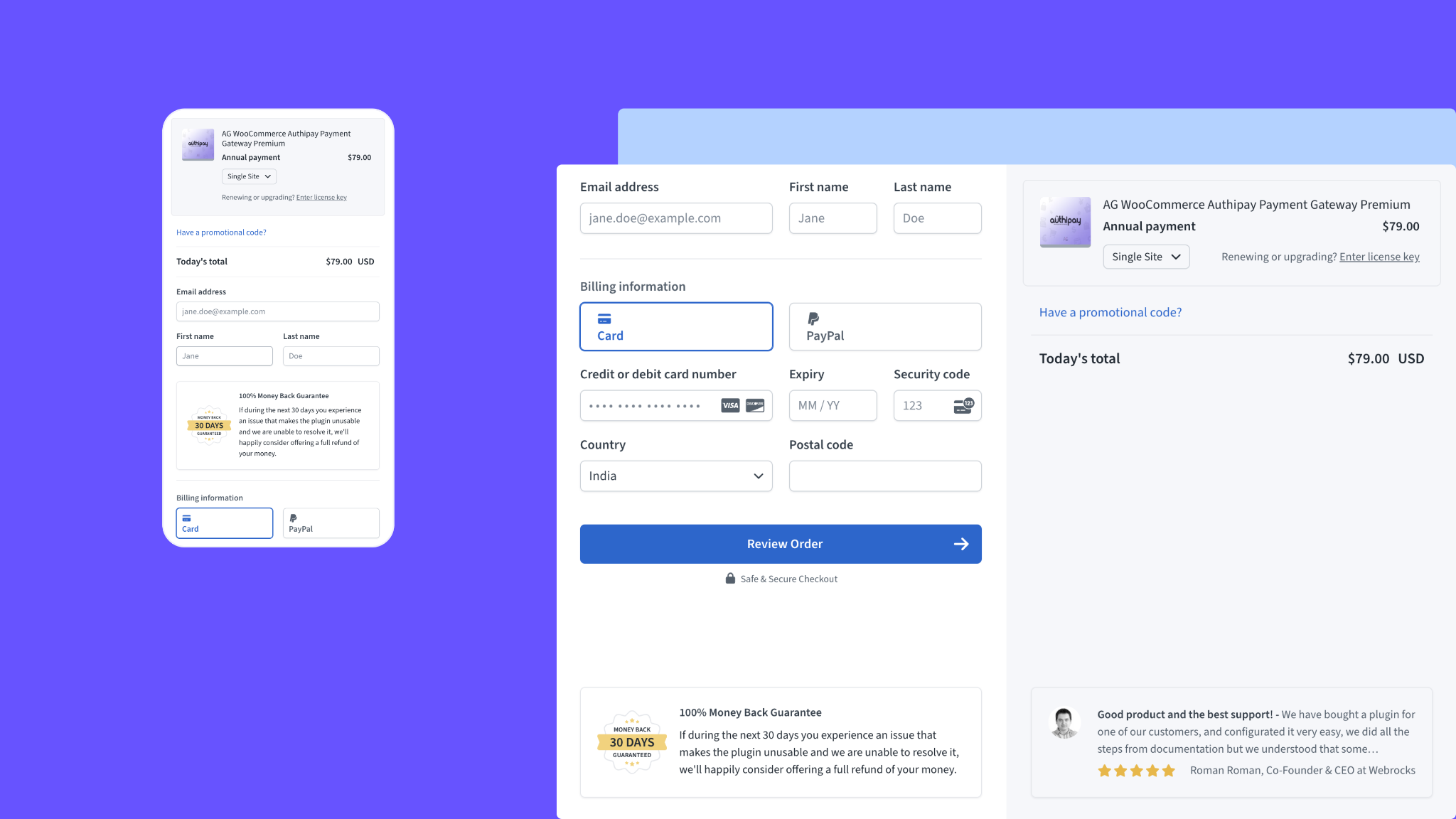
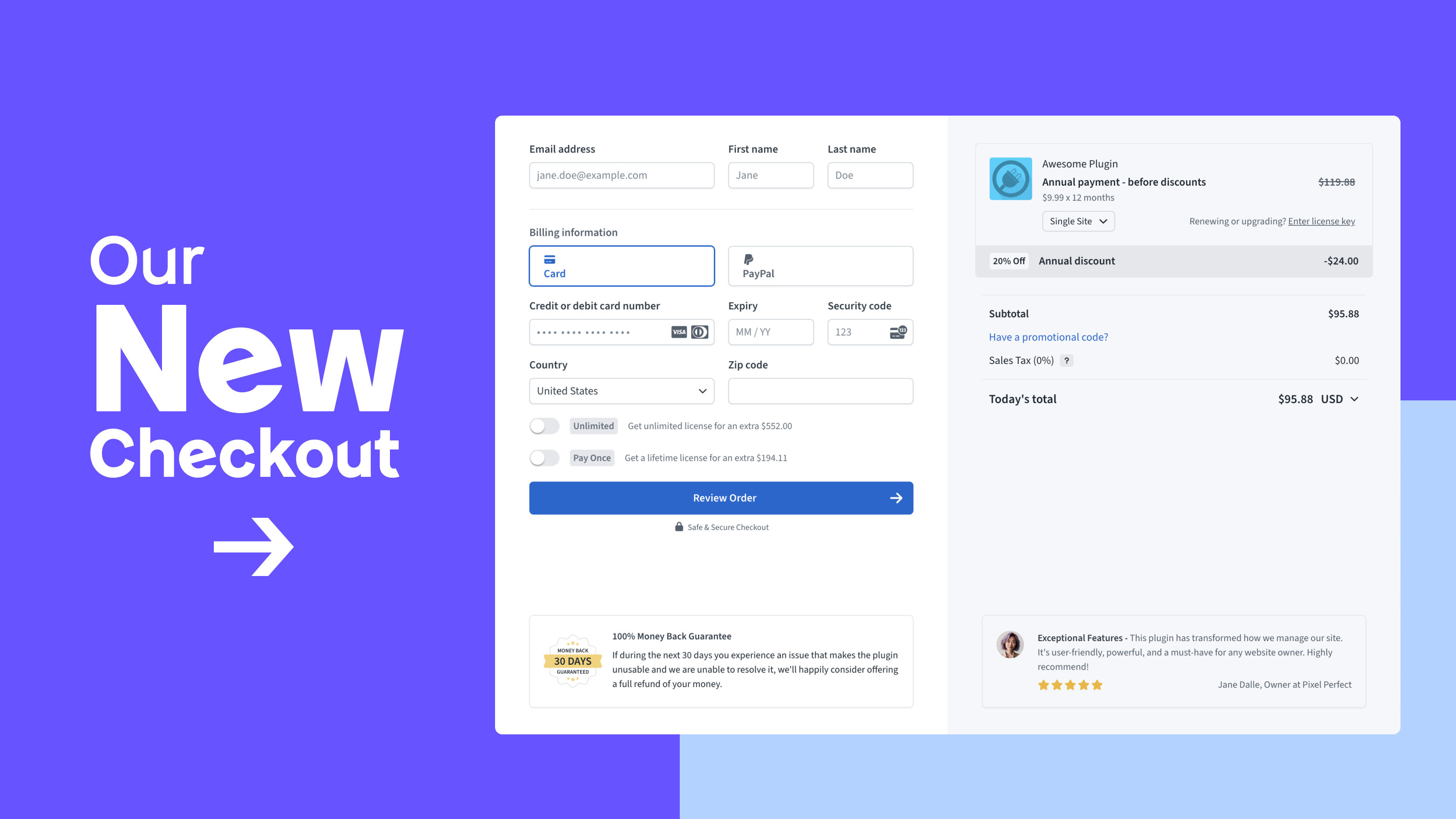
How the Freemius Checkout appears on a maker’s website
Swashata explains how Freemius works to streamline the checkout form and eliminate redundancies: “We don’t show the name and email input if the checkout comes from our WordPress SDK and the user has opted in, which saves a part of the form. Even when collecting names and emails, we don’t show the ‘Confirm’ email input until the email is filled out for the first time. This makes the form small at the first glance, which makes a difference.”
- Implement minimal design: Strip down your checkout to its birthday suit. Just like with too many steps in the process, every unnecessary element is a potential distraction.
Atakan adds that many people feel more features improve the checkout experience, but the opposite is true. “In fact, packing in too many options usually backfires. Less is more — people just want to pay and start using it, so simplicity wins every time.”
Bonus tip: Implement smart defaults and autofill to help speed things up.
- Offer guest checkout: As we mentioned, forcing account creation is like asking for a long-term commitment too early. Offering a guest checkout option removes that pressure from the potential buyer.
- Use progress indicators: If possible, keep the checkout on a single page. If not, show users where they are in the checkout process by displaying a small “Step 2 of 5” icon in the corner of the screen or a progress bar on the top of the screen or below the checkout form.
Note: You can also use UX design to signal the next step, according to Swashata: “When the checkout is loaded, either the email or the credit card field is in focus, giving clear indication of what the user needs to do next. Also, we intentionally have just one big call to action (CTA) — the Purchase button — and that’s it. Clicking on it shows what you need to fill out or just proceed if everything is completed.”
Subscribe and grab a free copy of our WordPress Plugin Business Book
Exactly how to create a prosperous WordPress plugin business in the subscription economy.

Messaging Factors
Clear and compelling messaging throughout the checkout process can help the user make the final decision to buy, resolve their security concerns, and set their expectations regarding the product. Words have the power to make or break a sale, especially in the world of e-commerce. Let’s see how the information you share can impact your conversions.
- Unclear or missing product information: Users need to know exactly what they’re getting. Buying without clear information is like a blind date — risky and more than likely to end in disappointment, so a lack of essential details about what’s being purchased may result in a dropped cart.
- Concerns about security or privacy: Lack of reassurance about the safety of personal and financial information may make users feel like they’re handing their credit card details to a sketchy stranger in a dark alley. In the age of data breaches, users need to feel their sensitive data is top-notch-level secure.
Addressing Messaging Issues: Inform and Reassure Your Users
Transparency isn’t just for windows — it helps build trust and reassure potential buyers that their card information is safe with you.
The checkout page can also be a suitable place to upsell additional products or services your potential customers may need and benefit from.
Here’s how to get these messages across in your checkout process.
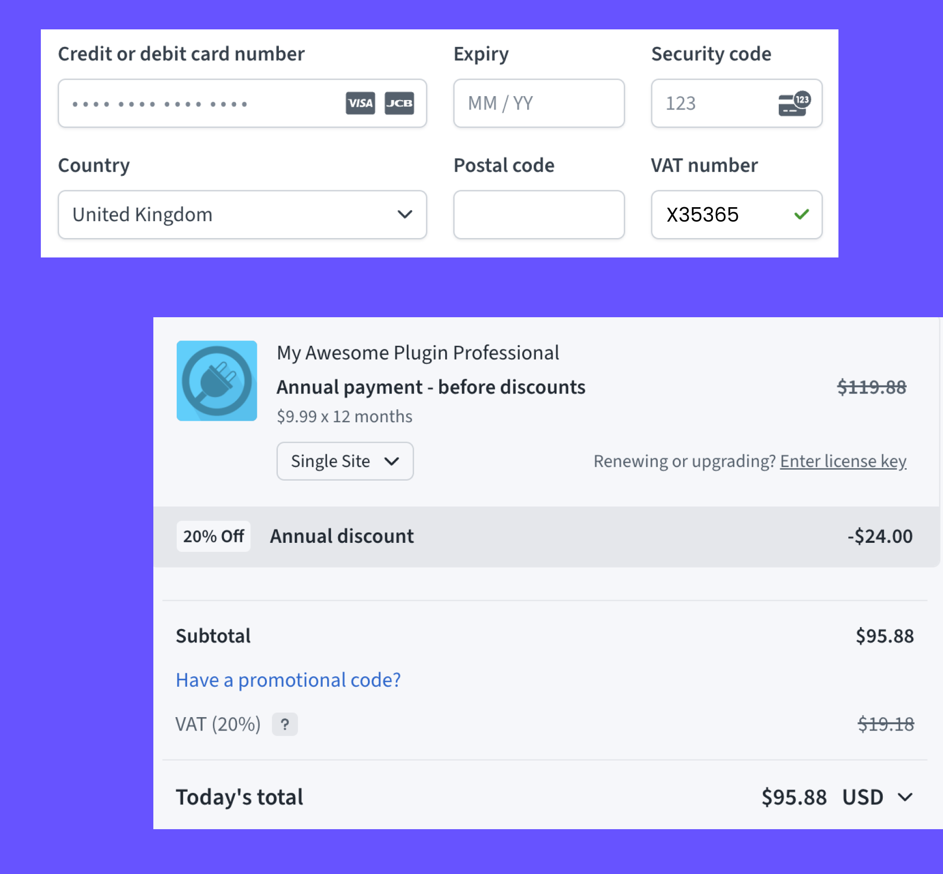
- Display clear pricing: As mentioned earlier, unexpected costs kill conversions, so show the total cost upfront and break down the costs clearly (including sales tax, for example). Let users see where their hard-earned cash is going as you see below in the Freemius checkout:
- Offer discounts: Well-timed discounts can be the nudge that turns hesitant browsers into confident buyers. Consider offering a small discount for first-time purchases or a limited-time offer that creates a sense of urgency. You can also experiment with conditional discounts, like a percentage off for purchasing an annual plan instead of monthly.
- Include upsells and cross-sells: Offering bundles or complementary add-ons may increase conversions, as they’ll see more value in your offer. Also, as our developers’ note, the customer is already in the “buying mode”, so they may be more receptive to additional offers — and it saves them time from having to search for those complementary products separately.
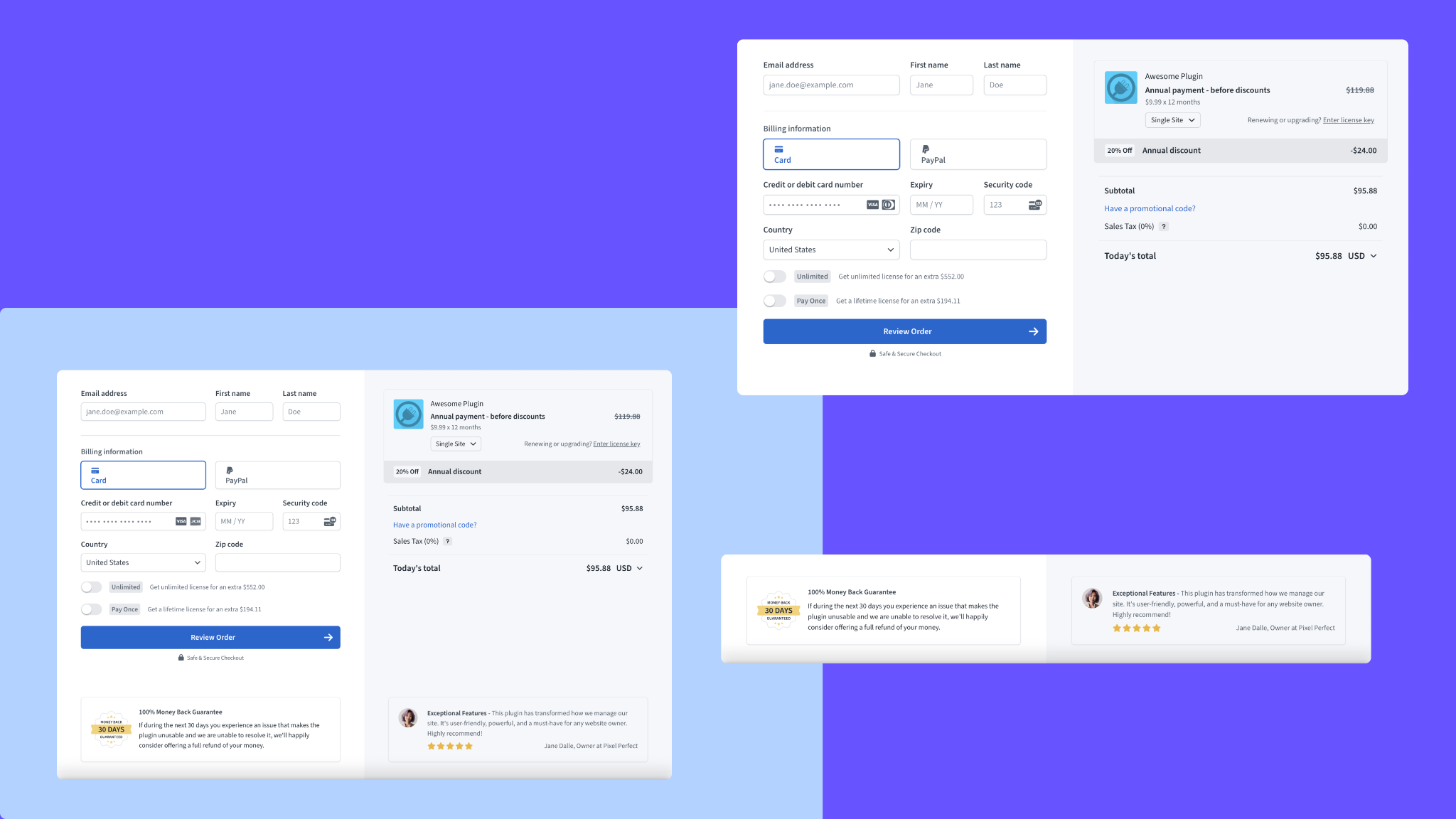
- Implement and demonstrate security features: Include security badges to give buyers peace of mind they’re protected against fraud when entering their card details.
Swashata highlights Freemius’ “security system to detect and stop card testing attacks,” for example. You can also display a clear refund policy and consider adding customer testimonials as proof you’re trustworthy. Here’s how we do it:
Bonus Tip: Cart Abandonment Recovery
Think all’s lost once a potential customer leaves their cart? Don’t give up so quickly.
If you set up an effective cart abandonment mechanism in form of automated emails that remind users of their forgotten items, you can minimize the impact of factors like temporary distraction or connectivity issues that interrupt a purchase.
We track abandoned carts and deploy an automated email campaign that helps recover your lost sales.
Freemius: Your Partner in Checkout Success
At Freemius, we’re always looking for ways to turbocharge software makers’ e-commerce experience and make it as smooth as possible. So, here’s our latest innovation: a beta version of our new JavaScript SDK for the Freemius Checkout that’s set to improve checkout conversion rates significantly.
What’s new exactly?
- The checkout script loads a whopping 60% faster — your pricing page will greet your customers a full second quicker on average
- The checkout app speed has been boosted by 40%
- We’ve removed jQuery from dependencies, making our SDK lighter and more nimble than ever
These improvements mean one thing: several friction-causing factors will be removed from the checkout process, making the purchasing experience better than ever.
Ready to try it out for yourself? Read more in our changelog or reach out to us!