|
|
At Freemius, our mission is simple: we’re continuously striving to find new ways to improve the commercial experience for software makers and their users, to help them thrive. We’re proud and excited to share our top new features and updates from the past two months!
Check out this list of our top six highlights that make software selling with Freemius even better.
New Feature: US Sales Tax Refund Capability Against Exemption Certificate
US Sales Taxes are a major headache. We’re striving to alleviate this burden as much as possible for Freemius sellers so they can spend more time doing what they love: making awesome software products.
Many of our makers have requested the US sales tax refund feature, and we answered their calls.
We’ve seen significant growth in the use of products sold through Freemius by sectors like education, government offices, political parties, churches, and other non-profits. Many of these organizations are eligible for sales tax exemptions. To save them the hassle of filing for a sales tax refund from the state, makers on our platform can now easily accommodate their exemption, issue a sales tax refund from the developer dashboard, and update the subscription so it won’t charge sales tax for future payments.
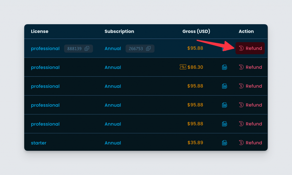
US Sales Sales taxes can be refunded by going to the “Payments” page on the Developer Dashboard and clicking the “Refund” button next to the payment.
Select the “Tax refund of $…” option and provide a valid tax exemption certificate number. Click the “Yes – Refund” button after accepting the disclaimer and voila — all set!
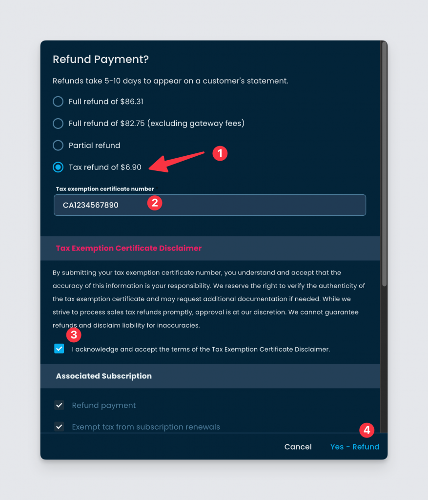
If the payment is associated with a subscription, it will be automatically adjusted not to charge sales tax for future renewals.
To find out more about this helpful new feature, you can check out this post on the Changelog.
Beta Release: Dual-Column Checkout with Upsells and Social Proofing
Most purchases online happen on desktops and PCs (not on mobile).
While a vertical — or single-column — layout makes sense because it presents the entire checkout experience without the need to navigate, it has one major shortcoming: not using the entire “real estate” of desktop displays. And that’s a missed opportunity since the vast majority of purchases occur on desktop devices.
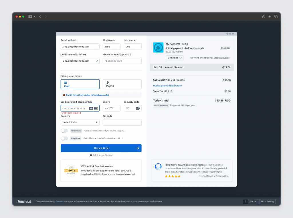
We want to make it as easy as possible for people to buy our makers’ products. We’ve created a new dual-column checkout that’s designed to save buyers the effort of scrolling down in case their screen height isn’t sufficient.
By modernizing the UI and UX, we’ve ensured that the checkout process is not only visually appealing but also intuitive and user-friendly. The simplified and cleaner design minimizes distractions and guides buyers through the process effortlessly.
This flexibility also allows us to cater to different buyer journeys.
For instance, when a seller has a rich website with a buyer’s journey that goes through the homepage and a fully-fledged pricing page, we want to ensure a streamlined checkout process so buyers can quickly complete their purchase with minimal input. Conversely, for audiences driven directly from social media platforms like X, the checkout page should include additional context like social proof and testimonials to build trust and increase purchase confidence.
Moreover, our focus on optimizing the checkout for conversion rate optimization (CRO) means that every element of the design is geared towards increasing the likelihood of a purchase. By incorporating upsells within the checkout process, we also aim to maximize the average purchase amount.
Ultimately, our dual-column checkout is designed to be a simpler, flexible, and highly effective tool that converts more customers + drives higher revenue.
Here are some other changes:
- We’ve built three upsells into the checkout: annual, lifetime, and unlimited.
- These are quick actions that “upgrade” the billing cycle or licenses. For example, giving users the option to choose an annual instead of a monthly subscription can increase the average sales price.
- The upsells are also strategically placed to increase conversion. For example, the license or lifetime upsells are featured just before one is about to click “Review Order”.
- There’s an eye-catching header to properly communicate pricing and different line items to show the breakdown of the total value. The idea is to show relevant numbers and especially discounts to encourage the buyer.
- The checkout supports a full-screen mode. Users can also toggle between full-size and modal-size.
- To aid in conversion, we’ve introduced two social proofing UIs in the checkout:
- A money-back guarantee.
- Showcasing a featured review.
You can read more about the specifics of the new dual-column checkout here. If you’d like to give it a try and participate in the beta testing, please give us your feedback on our Slack community’s #freemius-checkout channel.
New Feature to Duplicate Coupon
Many product makers run seasonal discounts during important sales calendar events like Black Friday and Cyber Monday. Setting up a seasonal discount for a product used to entail creating new coupons every time.
To spare our sellers the trouble, we’ve created a new Developer Dashboard feature that allows them to duplicate existing coupons.
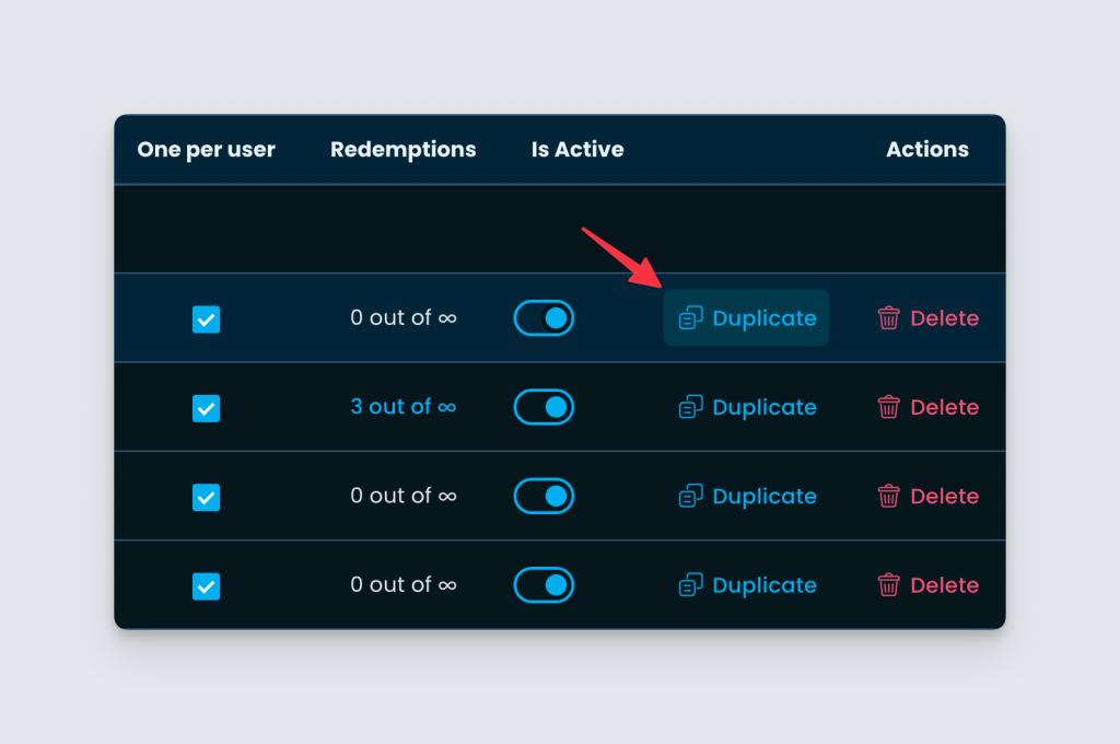
This feature can also be used to create reusable template coupons. Here are two examples of when it may come in handy:
- A seller sends an email to customers after they purchase a plan with a special discount to upgrade to another one. When interacting through support, the seller can create a coupon for a specific use case as long as it is repetitive — in this case, allowing customers to use a discount to upgrade to another plan.
- Another repetitive use case: a legacy customer migrating from CodeCanyon. To continue receiving new updates, legacy customers will need to upgrade to subscribe. The seller offers them a discount as an incentive to buy a subscription.
For both examples, sellers will also want to create a unique coupon for every individual use case to avoid it being shared and abused.
Check out the Changelog for a more detailed explanation of how this new feature works on the store level.
Enhancements to the Users Export from the Developer Dashboard
As part of our data liberation project*, we’ve improved the experience of downloading users from the Developer Dashboard.
Exporting users is useful when running email campaigns. For example, a Freemius maker may want to export their users to send them a BFCM promo.
Previously, this was limited to an export of 10k users. This limit has now increased to 250k users. We’ve also increased the export speed by making it 10x faster.
*Our data liberation project — which allows for the exporting of other tables — gives our makers the freedom to run their own analysis on raw data, without the need the get the data from the API.
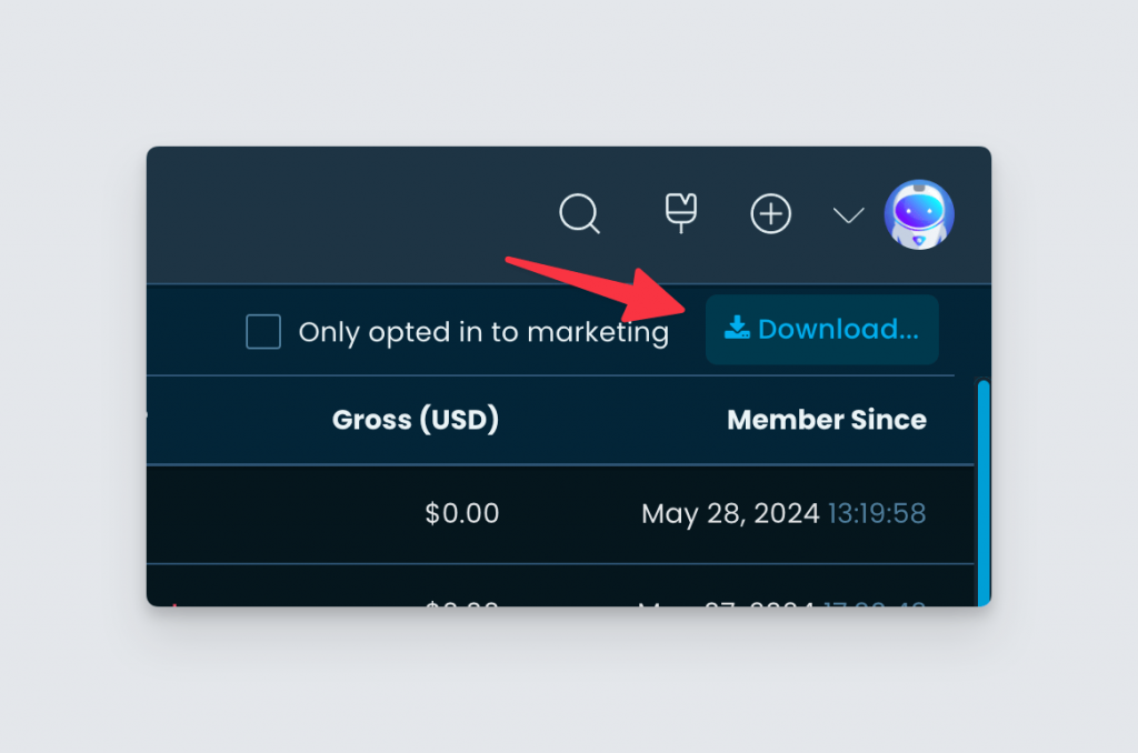
The download works with any active filtering and we have plans to add more download capabilities in other areas of the Developer Dashboard.
For a detailed breakdown of how to download users from the Developer Dashboard, click here.
Password Reset UX Improvements With Password Managers in the Customer Portal
For a while, we were seeing complaints on social media that users were failing to access the Customer Portal when using LastPass.
Recently, we finally managed to hop on a shared screen video call with a user who was facing this issue. During the session, we noticed something wasn’t working right in the password reset process. But it was almost impossible to understand the issue.
Luckily, we recorded the session. After several replays, we spotted a super weird bug with LastPass.
The user had multiple Freemius accounts and the password was being stored in the wrong account on LastPass. Not only was it not saving the new password for the correct account, but it was also overriding the password of the other account, essentially breaking both accounts’ passwords. This was a huge frustration for users who were failing to access the Customer Portal without even knowing why.
Buyers who use LastPass and purchased products from Freemius with different email addresses will no longer experience password storage issues when logging into the Customer Portal.
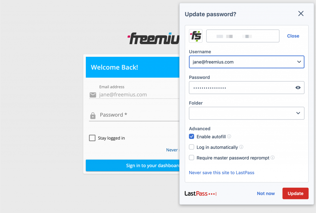
Learn more about the nitty-gritty of the password reset UX improvements here.
Mailchimp Integration Improvements
More good news: we’ve made some major improvements to the Mailchimp integration.
Typically, makers with multiple products in one store use a single MailChimp account. Freemius offers Mailchimp integration at the product level. However, we encountered a bug that prevented the use of the same Mailchimp account for multiple products. This issue hindered makers with several products from syncing all their customers to their Mailchimp account.
We found and fixed the issue and also improved the Mailchimp UX. Now, instead of a single “Connect to Mailchimp” button, a drop-down appears if makers have other Mailchimp integrations, allowing them to select the correct one.
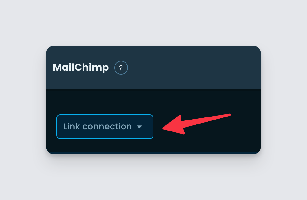
The maker can then choose to create a “New connection” or simply select an existing connection.
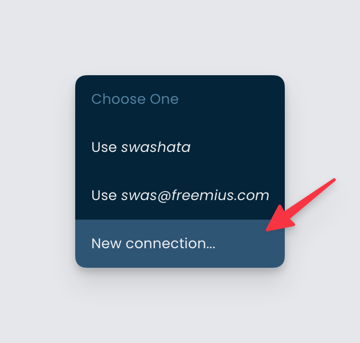
We’ve provided more details about the Mailchimp integration improvements here.
That’s a Wrap!
If you’d like to find out more about the features and enhancements mentioned here, or have any general requests or questions about Freemius, reach out to us here.
To check out what else we’ve been busy with, read our changelog (updated weekly).
If you’d like to learn more about which features have been most requested by our users and cast your vote or make a suggestion for a new feature, check out our feature suggestion board.


