|
|
Creating a popular premium WordPress plugin is a real challenge. People will generally only part with their cash if they have a genuine need that isn’t already met by the myriad of free plugins available on WordPress.org.
Promoting your premium plugin within the user interface of your free offering is an obvious strategy for boosting sales. However, WordPress users are intolerant to ad copy littering their back end.
The solution is to take the time to understand your users, then implement ad copy that will entice (rather than anger) them.
With the above in mind, in this article we will start by exploring what your plugin’s user interface should look like, then reveal how to strategically place Calls to Action (CTAs) to boost sales of your premium plugin.
Step 1: Remove All Existing Advertising Clutter
First of all, if you’re bombarding your users with ads, stop it now.
That advice might seem counterintuitive, but placing more ads – thus making them more annoying – won’t increase your sales. It will only put users off.
Instead, make your plugin’s user interface slick and intuitive. By focusing on making your plugin simple for the user to use, you’re minimizing their interaction cost – the sum of all efforts (mental and/or physical) required by the user to accomplish his goals.
If you clutter your interface with ads, you’re going to increase the user’s cognitive load. As a result, they’ll think your plugin is hard to use, and probably won’t bother using it again.
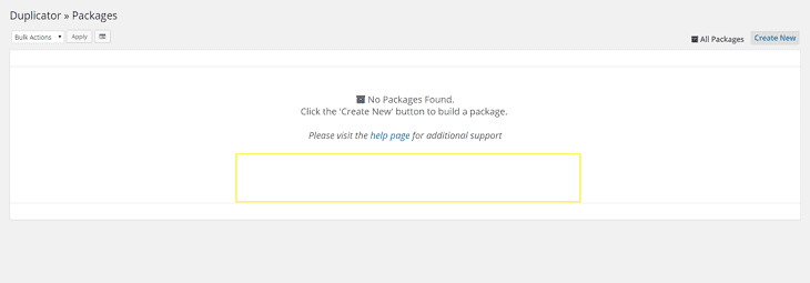
A good example of a plugin with a slick interface is Duplicator:
Although it has a small feature pool, it works flawlessly. The UI is intuitive and minimal, and there are no ads floating around.
The aim here is to start with the best possible blank slate. If your plugin is ad-free and features an intuitive UI, we’re in a great position to implement a thoughtful strategy for boosting plugin sales. Don’t start with the second objective before you’ve completed the first.
Step 2: Position Your Ads Strategically
Contextually speaking, your ads will get noticed more if they’re placed near relevant objects.
Let me explain it with an example:
- Say you’ve built a backup plugin, and you want to get more premium sales.
- Your user lands on the admin page where he has to create his backup manually.
- You can put a text link below the title, saying, “Tired of creating backups manually? Try the Pro version and schedule automatic backups!” The key here is focusing on the pain point. First you ask the question, then you provide the solution.
- Make the link dismissible. Do not force the user to see it again and again.
This is where I’d put an ad if I were Duplicator’s developer:
This approach becomes easier if you’ve adopted the add-on model, as you’ll have the opportunity to strategically place your message for each specific add-on.
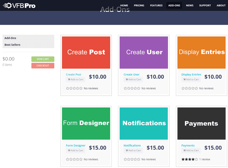
For example, there’s a premium add-on for Visual Form Builder called Form Designer. It lets you design your form without any knowledge of CSS.
I’d place the link to the design editor in the form builder UI. The CTA would be something like: “Want to customize the style of your form? Try the design editor add-on and customize its look with no more than a couple of clicks.”
Step 3: Utilize Persuasive Language Effectively
Don’t use negative language in your ads: it will trigger alarms in your user’s head. Studies have shown that customers react better to positive messages.
Even more importantly, you don’t have a lot of time to grab your user’s attention. You have to make the most out of those few precious seconds.
I recommend the template that TED speakers often use:
- Inform the user and explain the problem.
- Persuade him to take your position.
- Tell him what to do next.
You should avoid stating that something is your opinion. For example, you shouldn’t say, “You might want to target multiple keywords, because we think Google doesn’t rank solely on keywords anymore”.
The problem with that sentence is that it’s just too weak. Instead, you should say something along the lines of, “Google doesn’t rank websites based on keywords alone anymore – it ranks them based on topical relevance. Upgrade to Premium to get more keyword ideas that surround your topic.”
Try to use words like certain, definitely, clearly, strongly, and accurate, which will add weight to your copy. Writing with a strong voice and language demonstrates that you have experience. In turn, this builds trust with your users.
Always use “you”, instead of “we”. This makes the user personally involved. By using the word “you”, you’re making them pay attention to what you have to say.
Using language persuasively is a huge topic, so don’t get too lost in the finer details. If all else fails, place yourself in your user’s shoes and ask yourself what would convince you to upgrade.
Step 4: Keep Your Plugin UI Up to Date With WordPress
The WordPress dashboard changes a lot, which means that you have to keep up with it.
Nothing looks worse than a plugin UI that looks like it belongs with a version of WordPress that hasn’t been in popular use for months or years.
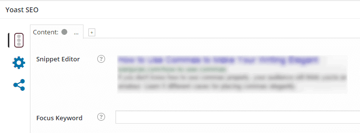
Yoast SEO is a great example of staying current with the latest versions of WordPress’ UI. Here’s how it blends to its surrounding:
Here’s the overlay that appears when the user discovers he needs to analyze the post for multiple keywords:
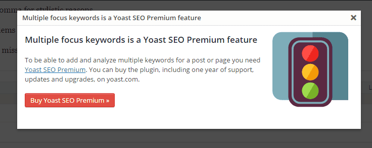
Pretty slick, no?
Conclusion
Promoting a premium plugin version isn’t easy. WordPress users expect to find a free plugin for everything, and to top it all off, they hate advertising.
To have the best chance of selling a premium version of your free plugin, consider the following:
- Don’t overwhelm your users with too many ads, but don’t make it a ghost town either.
- Place your ads strategically.
- Use positive language.
- Keep up with WordPress UI updates.
That’s it from me. What tricks do you use inside of your plugin to increase premium sales? Share your strategies with us below!


![The Freemium Business Model In The WordPress Ecosystem [+Video] – A Tool For Increasing Sales?](https://freemius.com/blog/wp-content/uploads/2018/10/freemium-business-model-wordpress-featured-image.jpg)

It's all about finesse :) definitely going back through our free plugins and sort out some better ads. thanks for all the great content!
I love what you guys are usually up too. This sort of clever work and reporting - keep up the excellent works guys!
Thanks for the article. Promotion and Marketing is by far the hardest part.
Great post. I usually get annoyed when someone placing an ads right in front of your face when you are trying to solve a problem with their plugin. That's why we chose clean UI for our products without any distractions and banners all over the place. Those who need Premium will buy it anyway. Keep your users happy. Peace :)
I personally would advise against the aggressive approach of blocking adblock users access to the content. Tested it on one site – it increased bounce rate and it seems the visitors just went away instead of disabling adblock. Even if adblock users are not direct income source, they may share your content and increase your popularity.
I like the idea of placing ads near engaging content. But, the exact time placement should be good for the visitor. I do not push ad-blocker users to disable the plugin. I want the user to stay on the site whether they want to see the ad. Thanks for the tips.
Adblockers really become a concern among bloggers who are primarily making money from adsense or other contextual ad networks. I also appreciate your suggestion to use native advertising. by the way I will try out your plugins to stop Adblocker. Thanks again for this great and informative article.