Better Product Settings UX, Transfer Flow Updates, and SaaS Refund Improvements
This week we’re rolling out various improvements and bug fixes to our Developer Dashboard. Many of these updates come directly from maker feedback, while others are aimed at improving the overall UX.
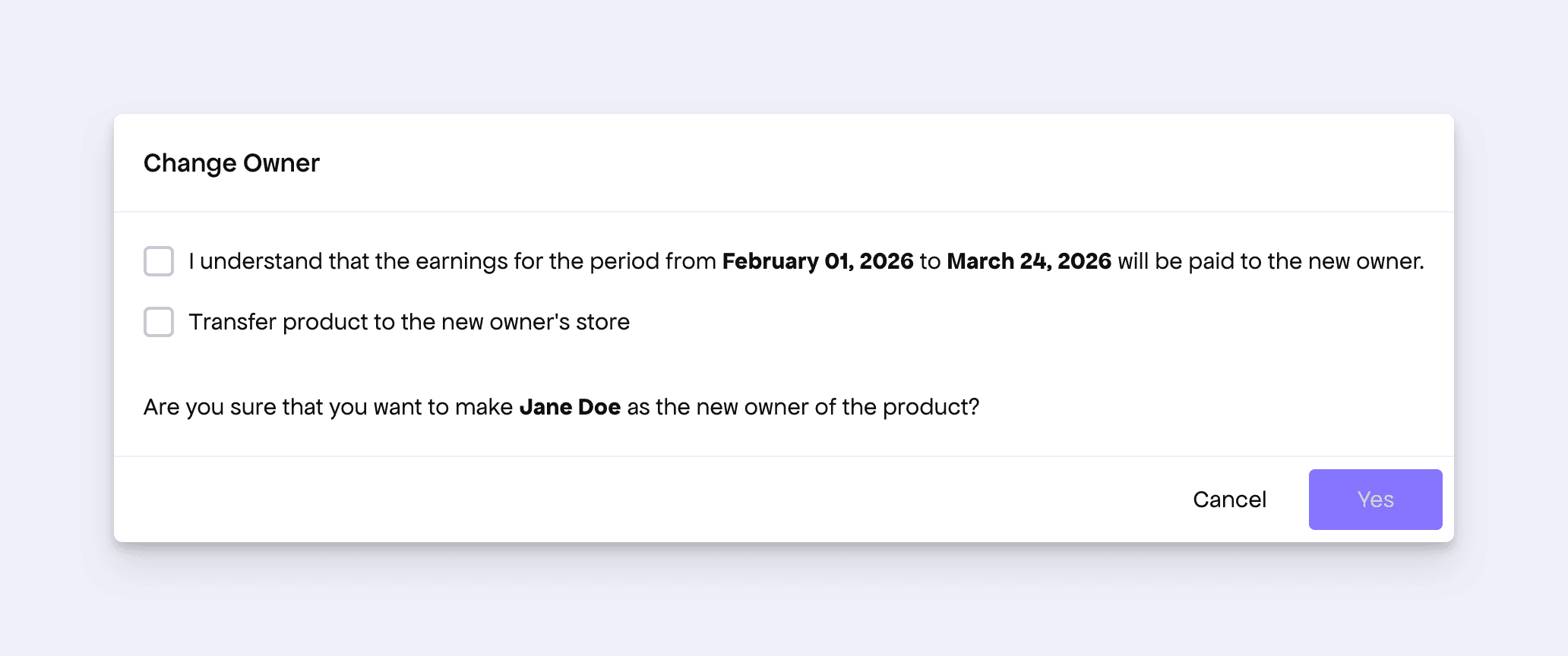
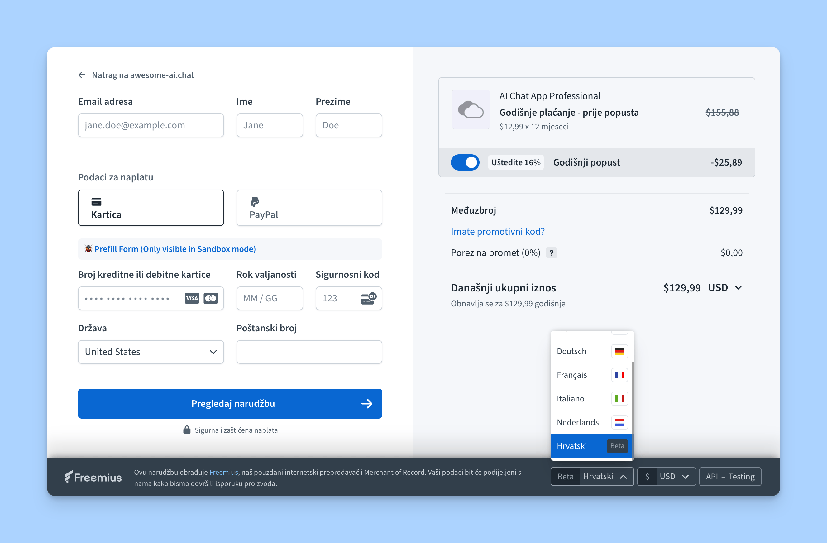
Improved Product Transfer Form
Freemius allows you to easily transfer your product to a new owner. This is especially useful when acquiring or selling a business.

We noticed some inconsistencies in the transfer dialog UI, especially around transferring a product to the new owner’s store. To make the flow easier to understand, we have revised the UI copy.
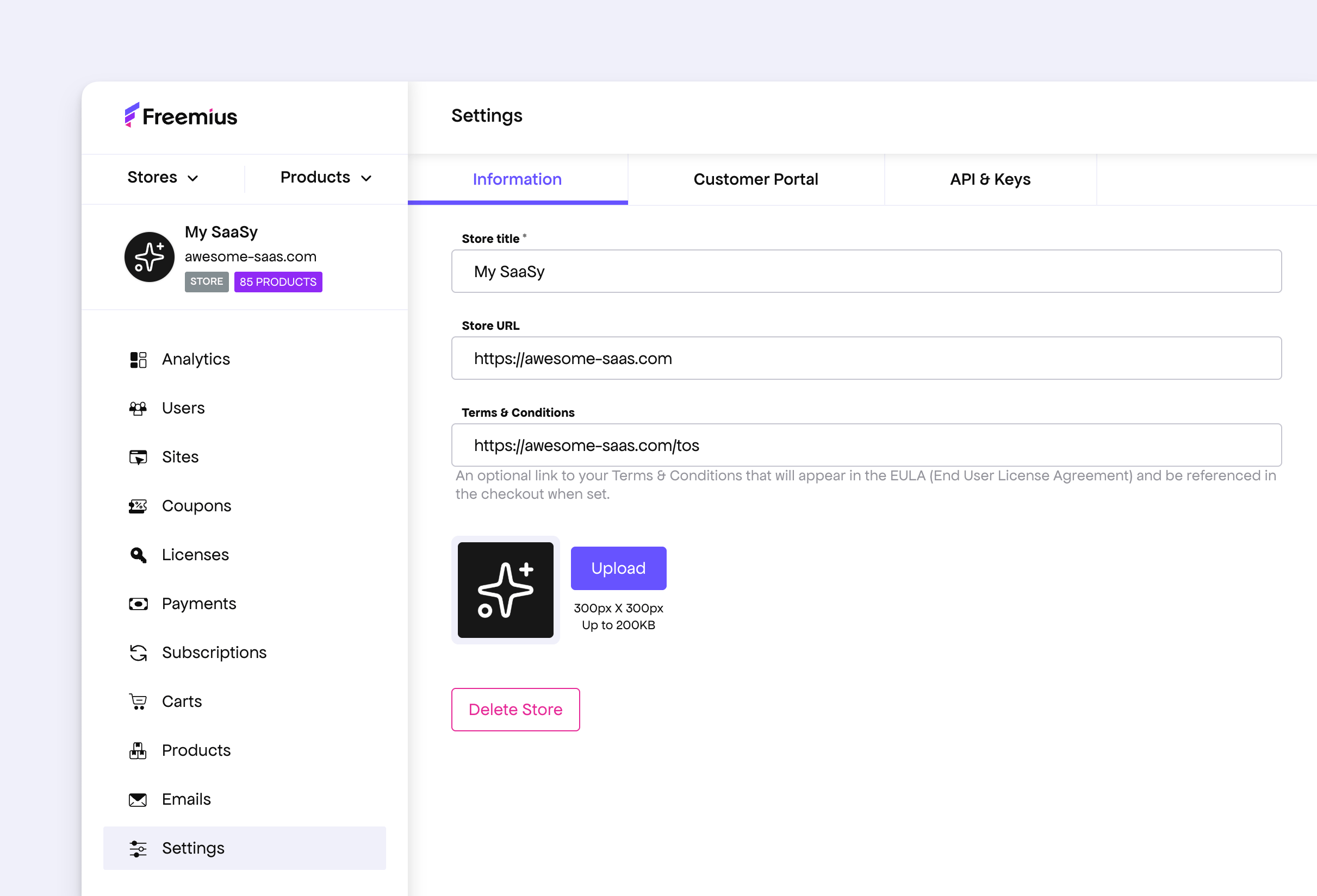
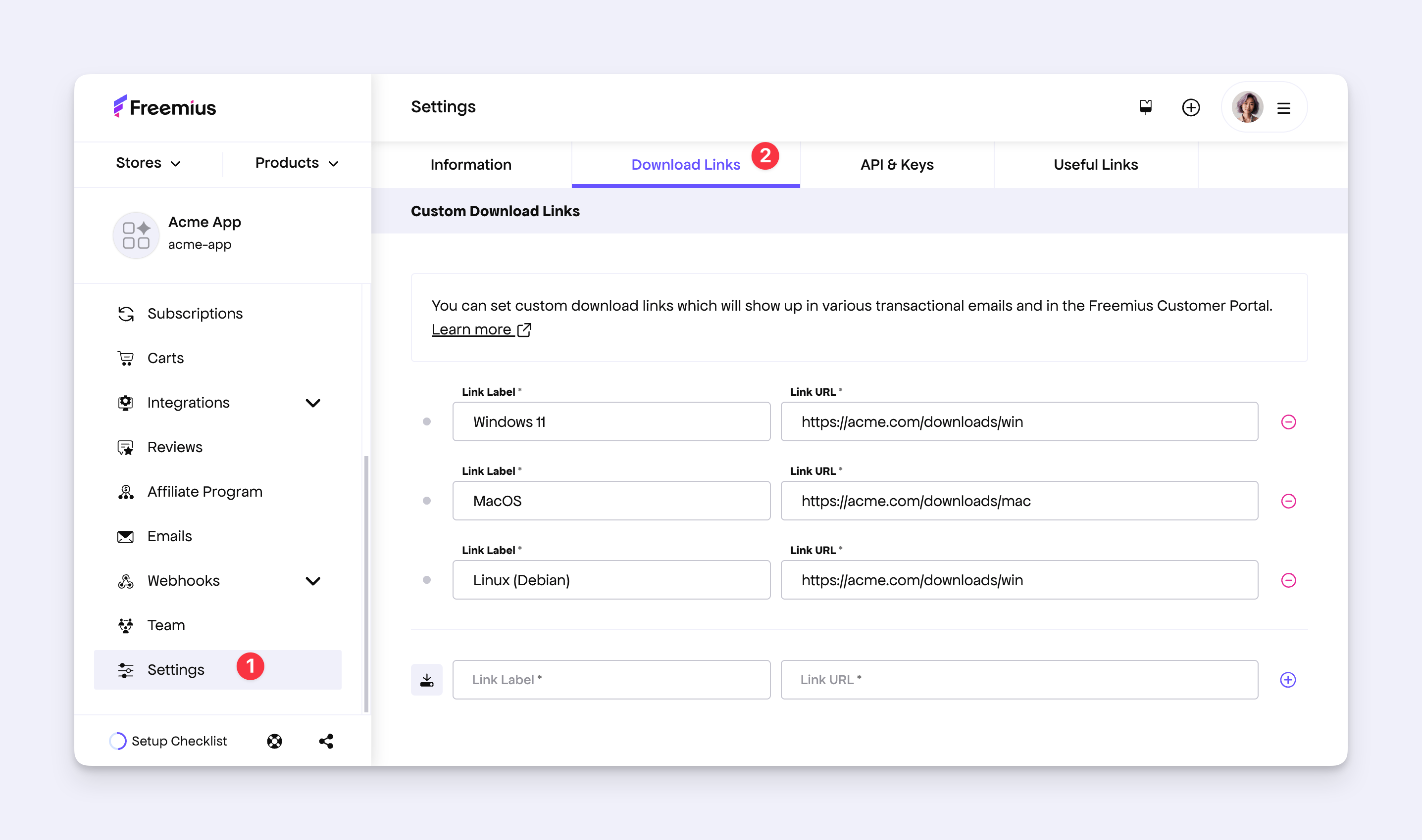
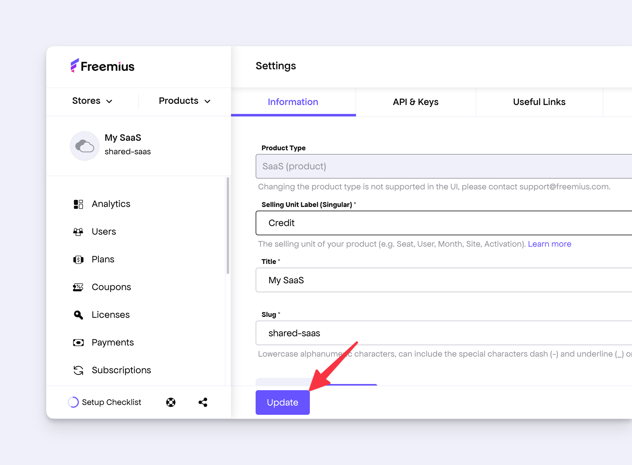
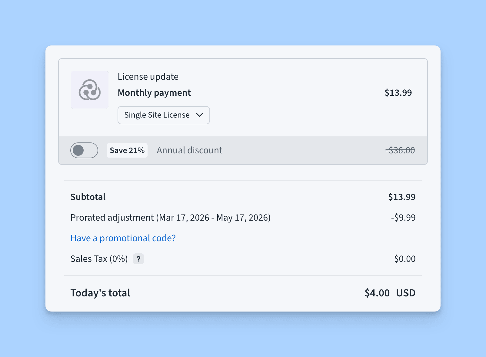
Improved Product Settings Page UX
The product settings page intentionally does not auto-update when configurations are changed. Since some changes can have important side effects, we require makers to click the Update button for the changes to take effect. However, because the button was placed below a long form, it was easy to miss and often caused confusion.

To improve this:
- The Update button will now stay stuck to the bottom whenever there are unsaved changes in the settings.
- If you try to navigate away from the page with unsaved changes, we will show a confirmation message.
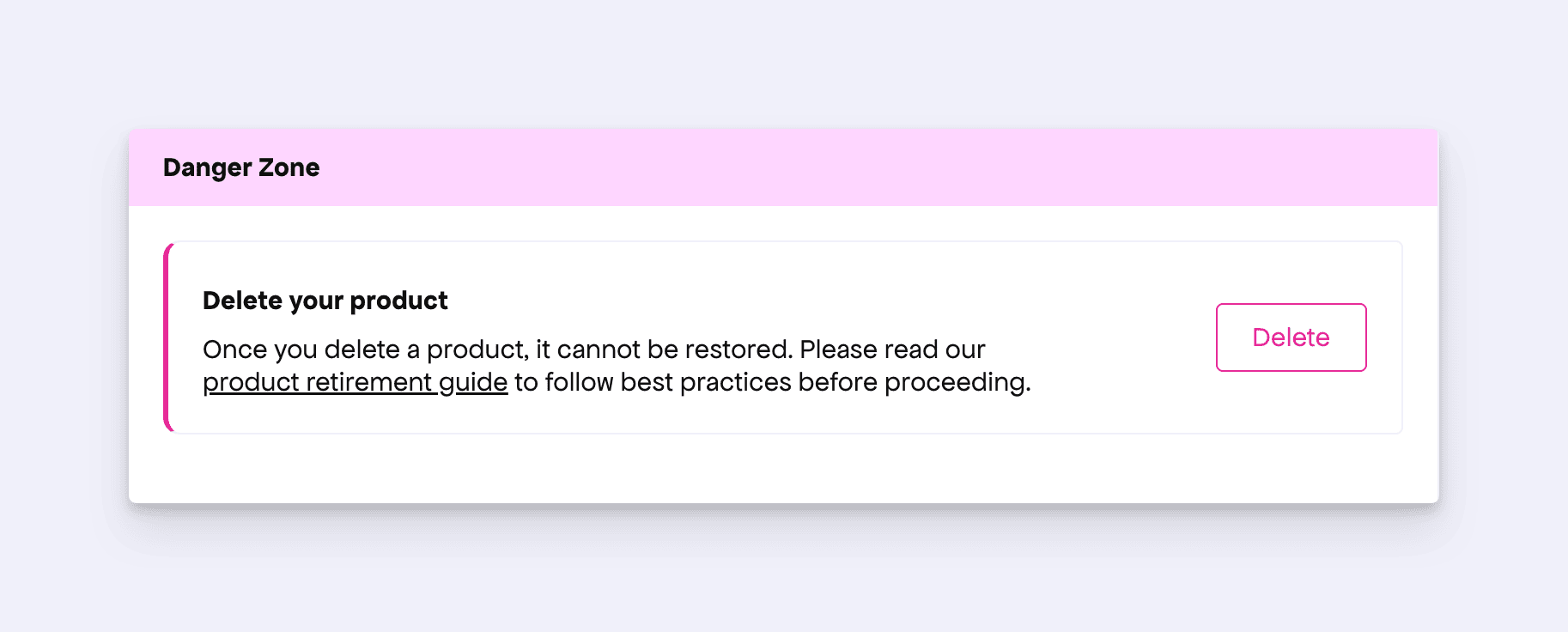
In addition, we noticed that the Delete button was placed next to the Update button.
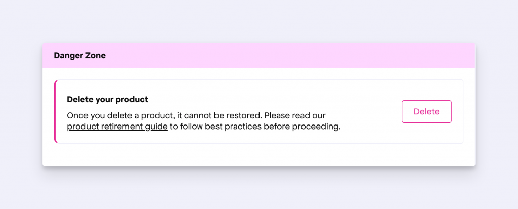
To make the action completely separate, we have moved the Delete button to a separate section and added a disclaimer for this destructive action.
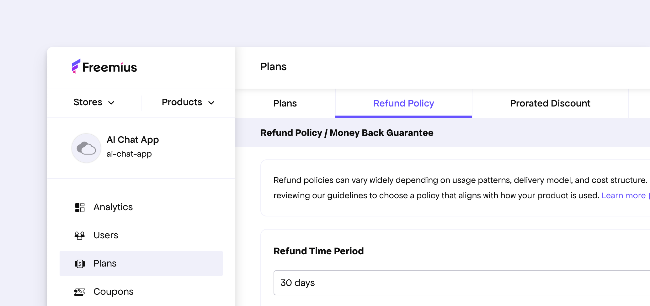
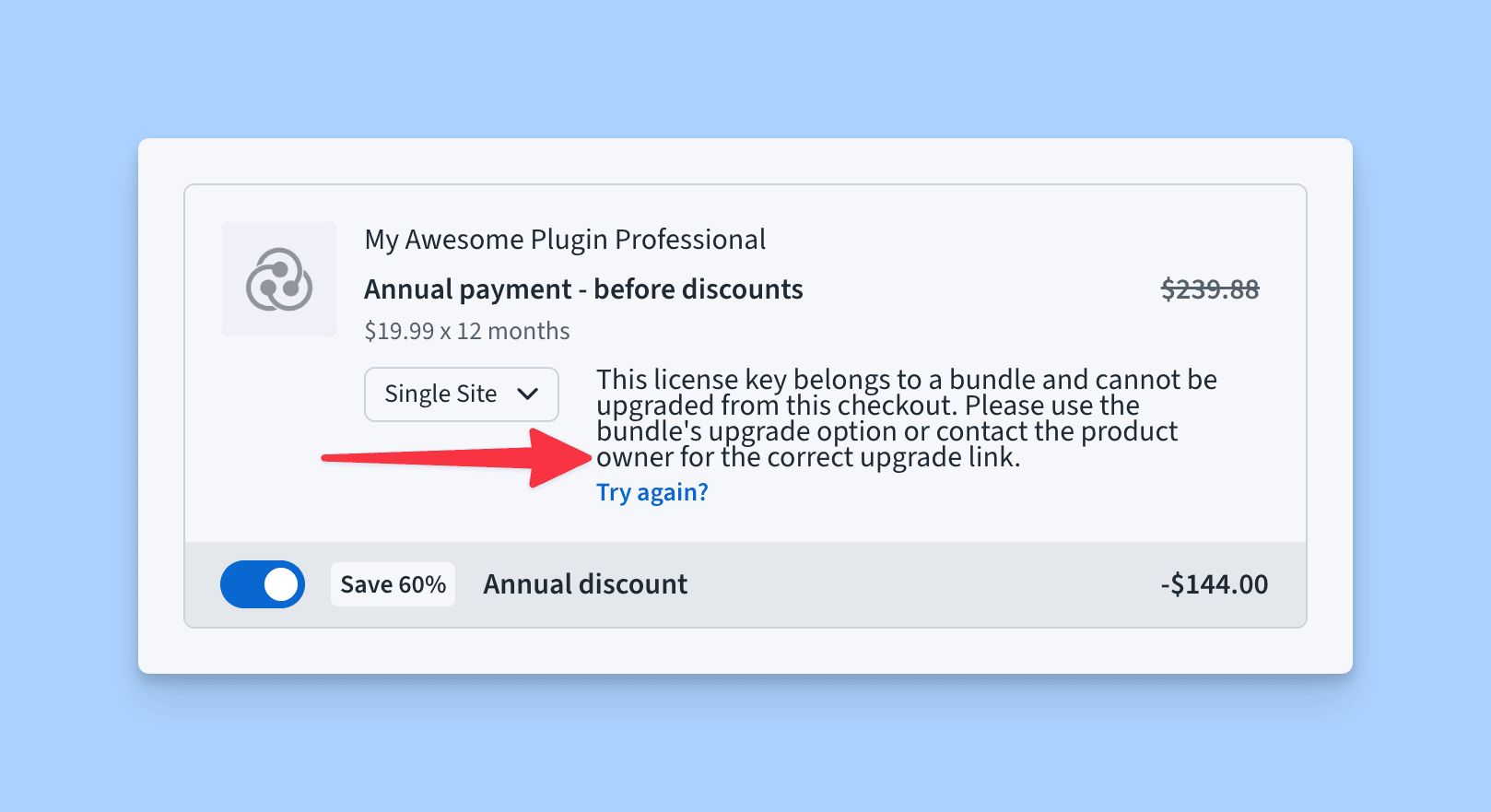
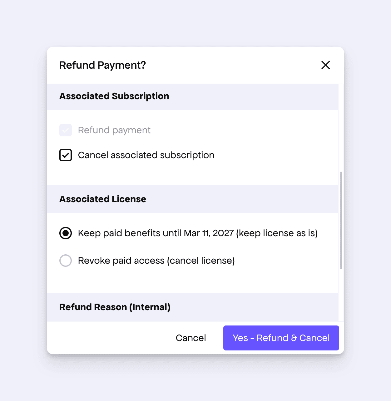
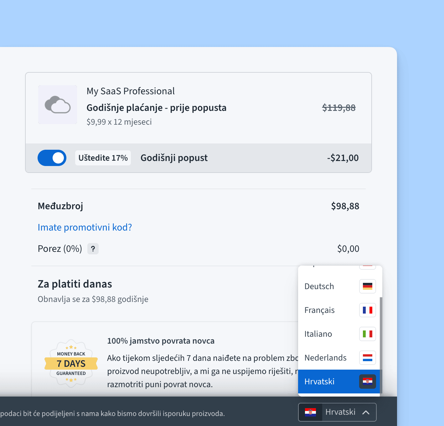
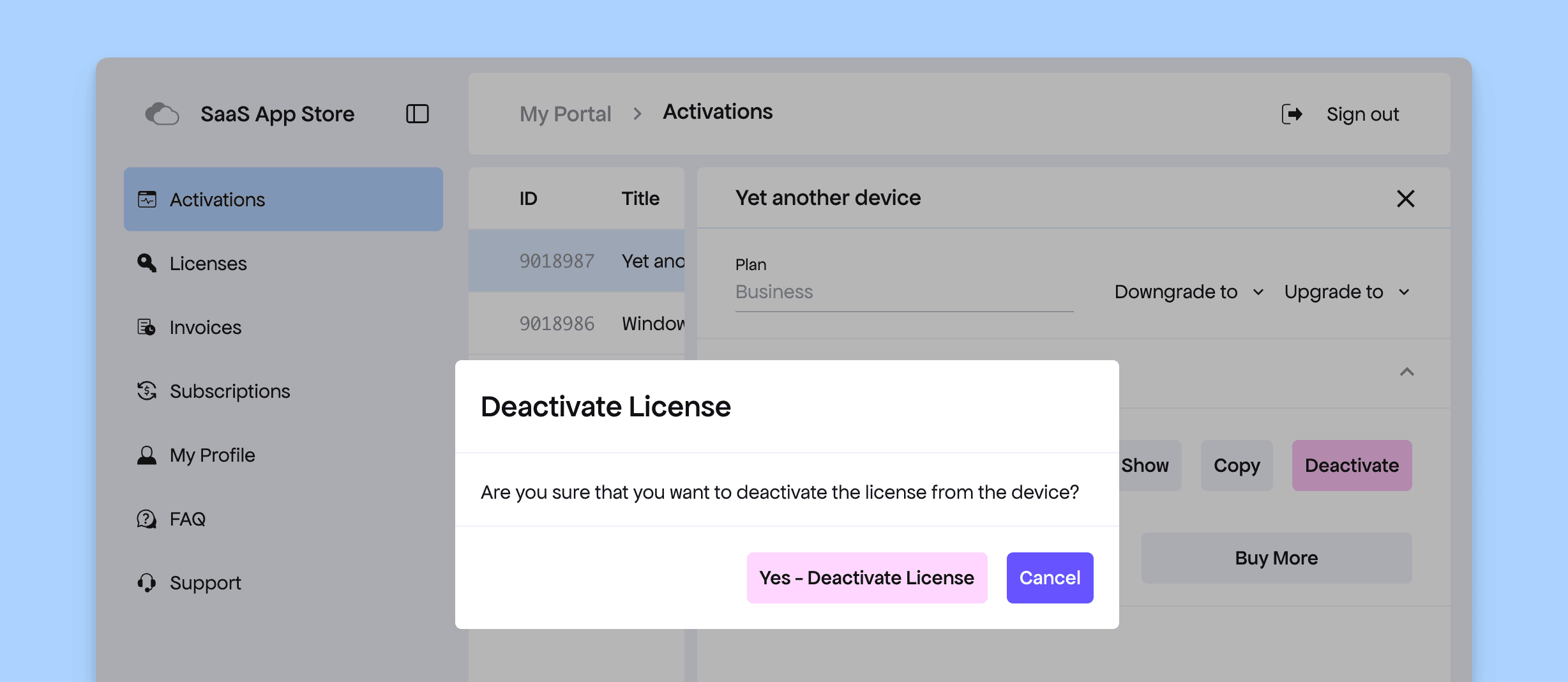
Improved Refund Dialog for SaaS
Freemius allows you to easily process refunds. The refund form is also quite powerful, letting you choose what to do with the associated subscription and license.
However, we noticed that showing options related to WordPress licenses in the SaaS context could be confusing. In WordPress, our SDK treats license flags such as expiration and is_cancelled differently depending on how plans are configured. This gives makers flexibility to block updates while keeping paid access, or revoke paid access altogether. SaaS products, on the other hand, do not have the same behavior or configuration model.
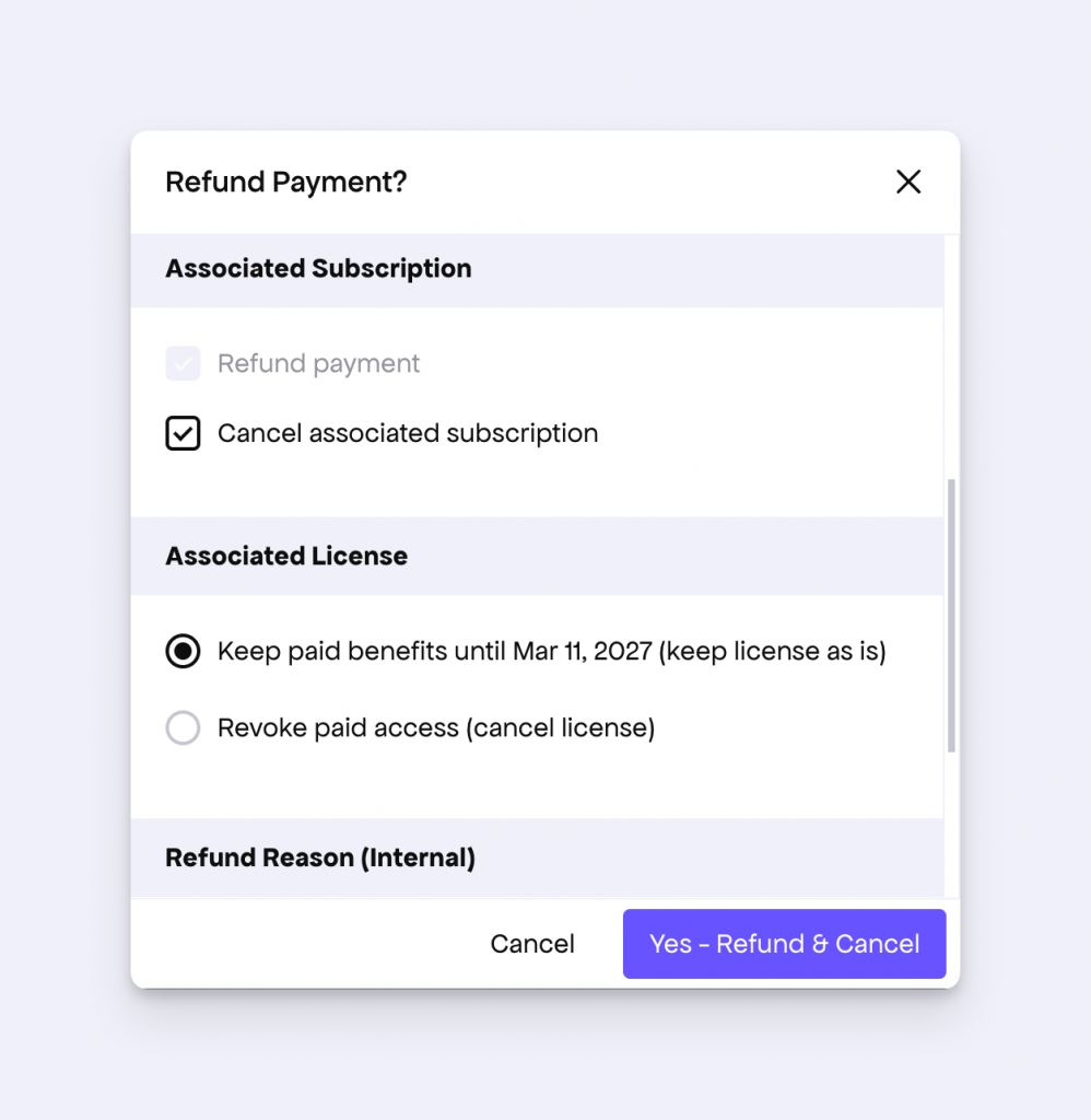
To make the refund flow clearer, we now show only two license-related options in the SaaS refund dialog: whether to keep the paid benefit or revoke it. We hope this makes the system simpler and more intuitive for our SaaS makers.
Other Enhancements
- The registration form has been updated to use the same questionnaire as our new product registration form.
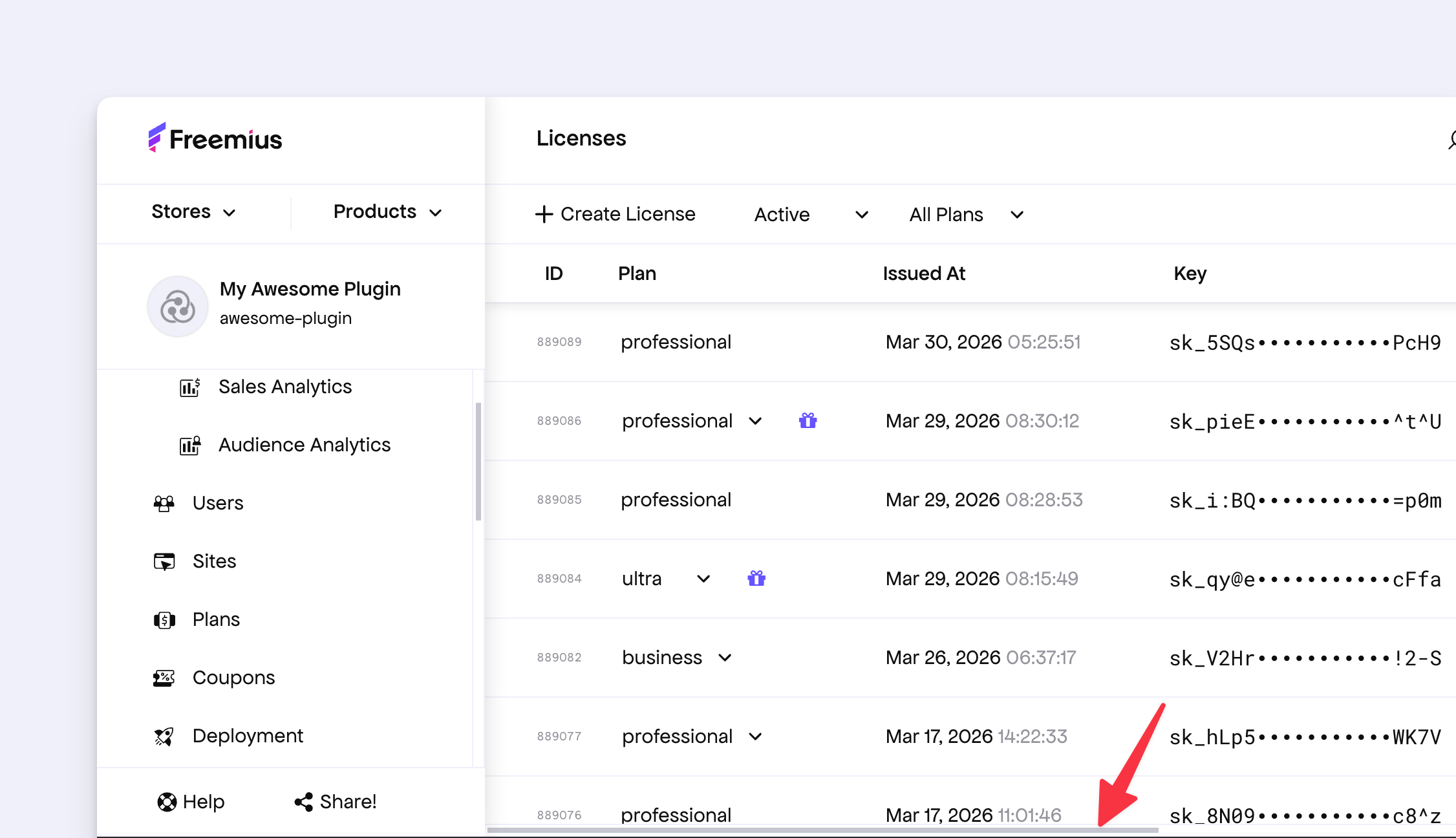
- Fixed a UI glitch where the expiration date of a lifetime license was shown incorrectly.
