|
|
Welcome to another deep dive exploration into the world of Conversion Rate Optimization! Today, I have the pleasure of auditing DeoThemes – a theme shop with some really nice looking WordPress themes for sale and free download. The purpose of these product audits is to help you look through the lens of optimizing conversion rates when thinking through your own plugin or theme marketing strategy. We share our best tips + advice to increase sales, retain customers, and sustainably grow your business based on years of analyzing hundreds of plugin and theme businesses.
First off, I want to thank Alexander Samokhin, Founder of DeoThemes, for letting us audit his product and website publicly. You can get your site audited on our blog too – just add a note in the comments below and we’ll be in touch.
Enough with the formalities – let’s plug-in!
Homepage
The homepage header area has a Call to Action (CTA) button that says “Get Started”. This is a bit confusing because, as a website visitor, I’m not sure what I’m getting started with. It would be helpful to make this button more actionable with different text like “View Themes” or “See our Awesome Themes” or “Browse Themes”.
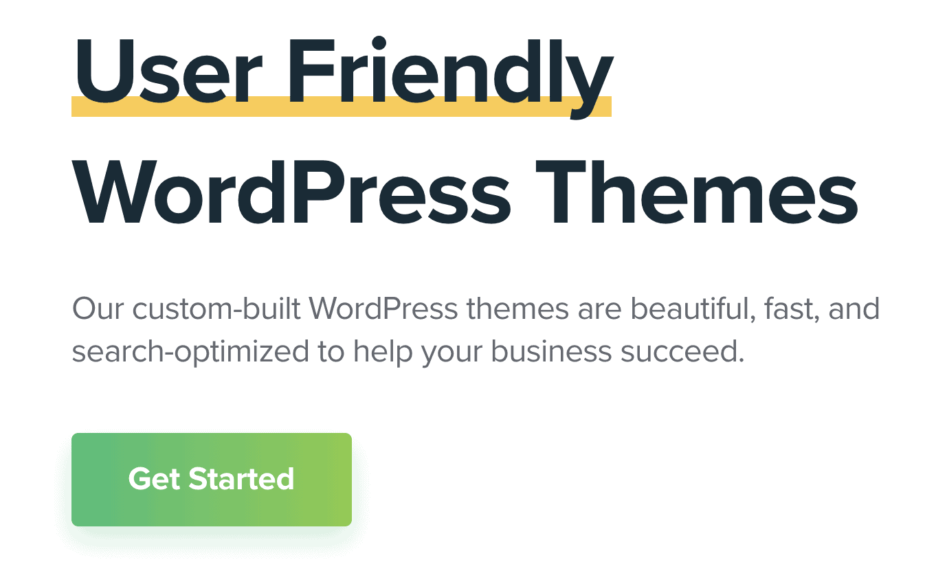
There is a button below the fold that says “View all Themes”, but the hero’s CTA button is arguably the most important and should correspond to a logical and clear action of some kind.
Pricing
When I visit a plugin or theme site, one of the first things I look for is a pricing page on the menu bar. Many visitors who arrive at your site already have the intention of buying a theme – and, often, they will be one step ahead and want to know what it’s going to cost them, along with all the features + benefits that it will provide.
The pricing page is a great way to be transparent about what you offer right upfront. If you set your pricing properly, you won’t be “turning off” potential customers, and it’s a great opportunity to improve their view of your product using social proof, like testimonials.
I can see why DeoThemes probably avoided putting a single pricing page on their menu – and that’s because each theme can be sold separately. This means that the Buy Button for the Personal plan is different on each theme product page.
The Agency and Lifetime plans are bundles of all the themes available on the site. If you navigate through the site, you’ll see the same pricing table shows up on every theme product page and the only difference is the Buy Button for the Personal Plan, which is customized for the theme being described on that page.
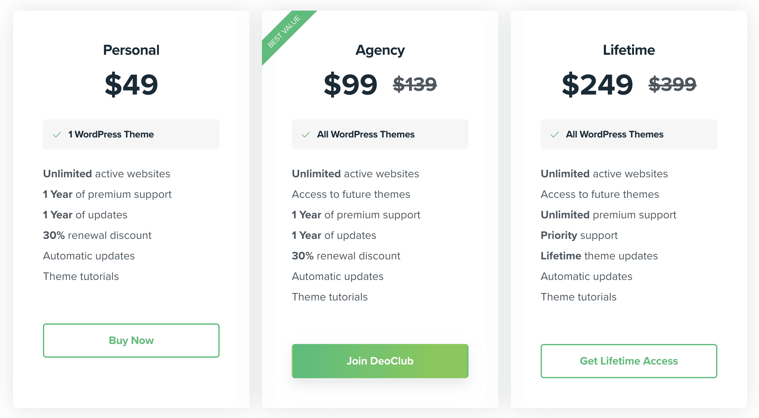
Given the situation (that each theme can be sold separately), this is a fair approach, but for the visitors who want to know their pricing options right away, it will lead to extra clicking around and greater likelihood that visitors will drop off the site.
A middle of the road approach to this would be to have a Pricing page that shares all the pricing details transparently, and instead of a Buy Button for the Personal plan on the core pricing page, it could say something like “Browse Themes”, leading users to browse and review the individual pricing tables.
Additionally, centralizing details on a single pricing page would encourage users who are already interested in joining the club and people who want one product but might consider the club for greater flexibility and benefits.
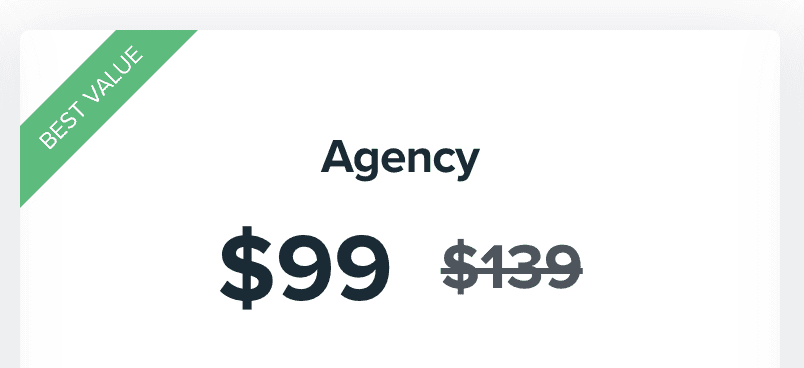
A quick sideline to mention here is that one more benefit of centralizing the pricing page is that if you list that there are 6 themes on the pricing table as part of the purchase instead of “All WordPress Themes”, you can justify the discount on the Agency plan as 66% off $294 instead of $139 (showing the 66% next to it). This small change would further promote the Agency plan as the “best deal” for buyers that don’t want to buy a lifetime package.
Currently, there are four clicks from the homepage to the Buy Button, which is quite a few steps between your visitors’ first arrival to the page and finally getting to the checkout. By adding the pricing page, this can be slimmed down to just two clicks.
For the choosy visitors – they will have the option of browsing around – but for the visitors who may already be interested in getting their pricing details quickly and have “high-intent” to make a purchase, you’re more likely to seal the deal by making the pricing details easily and accessible and focusing on the best plan upfront, which is identified as the Agency plan based on the green “Best Value” indicator.
Centralizing the pricing options on one page would also offer the option of adding another Call to Action button on the homepage that could say something like “Buy All Themes” or “Buy Theme Bundle”.
Unlimited Lifetime Plans
I noticed that the Lifetime plan is totally unlimited. Customers can pay for the theme bundle once and then implement the themes on any number of websites for their entire lives!
Offering unlimited lifetime plans can put you in the tough situation of being required to offer lifetime support for any number of websites, which is just not sustainable in the long-term. Is this something you really want to commit to as a developer with limited time to develop and market your products? You deserve fair compensation for your hard work – and providing support is part of that.
The improvement that can be made here is to limit the number of license activations, or preferably, the number of domains that can be activated with the lifetime plan. It could be 25 activations, 50, or 100 – whatever the number – as long as there is some kind of limit. Additionally, the lifetime plan should be priced according to the number of websites that can use that plan.
This is fair for both sides: The customer will have more realistic expectations if they plan to use your product on a large number of sites like an Agency typically might, and the developer will be protected from having to spend a potentially unlimited amount of time providing support for an unlimited amount of sites.
Moreover, when you have a cap on how much money a single customer can pay, you are leaving money on the table when it comes to larger Enterprise-level customers.
Here’s a video that goes deeper into the details of unlimited lifetime licenses and how to price them properly:
It’s not only the lifetime plan that offers unlimited active websites, but also the other two plans. I suggest putting some kind of limit on the number of site activations for all plans to help set realistic expectations for what kind of support customers can expect to receive.
Additionally, limiting the Personal plan further provides a greater incentive for users to purchase the Agency plan that could offer more active websites.
Renewal Discounts
Furthermore, I see that the Personal and Agency plans offer a renewal discount. This is an outdated practice in the WordPress ecosystem, which was used as an incentive for customers to manually renew their licenses. This practice is no longer necessary (for most products) when selling subscriptions that automatically renew.
With the increasing competition of thousands of plugins and themes on marketplaces, it used to be a race to the bottom for pricing. It’s now become the norm for plugin and theme businesses that continually update their products to receive regular subscription payments for their improved features and ongoing support.
Not only does offering a renewal discount fail to provide a big incentive for users upfront, but you’re cheapening the deal for yourself in the long-term. The number of sales gained from a renewal discount will probably not outweigh the decrease in long-term revenue, so there’s no point in offering a renewal discount.
Subscribe and grab a free copy of our WordPress Plugin Business Book
Exactly how to create a prosperous WordPress plugin business in the subscription economy.

This is particularly true with themes because users are generally more committed to the themes they spend time designing and customizing. While there may be many options to replace a plugin’s functionality if a customer does not want to renew a plugin subscription, it’s less likely they’ll have options to easily replace a theme, which takes longer to customize and replace with a new theme.
This means the renewal discount is just a nice thing to offer a customer, but probably won’t be the determining factor about whether or not they renew. We just released a great video that talks more about this:
Video
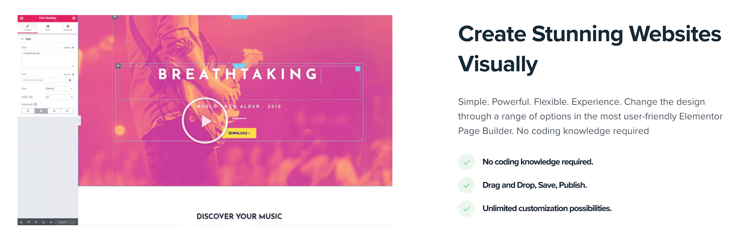
When scrolling through the site, I almost didn’t notice that this was a video because the colors are so light. The content of this video is pretty valuable – it shows the theme being used in action along with Elementor, so playing the video automatically when a visitor scrolls to that section would make it more eye-catching and help illustrate the usability of the product.
There isn’t any audio with this video, so it would not be an intrusive change for visitors.
Video Tutorials
It looks like DeoThemes has created some really useful video tutorials on Youtube. However, the link for these is hidden in the footer.
Embedding each video on the corresponding theme landing pages would add more content value on those pages, allowing visitors to see how the theme works before making a purchase. Most of the current website visitors probably would not come across this link in the footer, decreasing the value of the videos in the sales process and only offering a benefit to paying customers who are looking for info on setting up or using the product.
While spending time creating these videos is already a good investment, they could be used more effectively with the right placement, which would have a better impact on conversion rates.
Landing Pages
This section appears in the header area of each product landing page:

While this information may be useful, I don’t think it needs such a prominent position and takes up space that could be used for something else, like a testimonial or star rating.
Another option would be to move this gray section somewhere else to make the features section a bit more prominent, which is just below it.
Theme Landing Pages
Each theme has its own landing page, but it wouldn’t hurt to put these in a sub-menu of the main menu.
If there are multiple themes, this is a good opportunity to display all the products so visitors can really get a good taste for the products.
Here’s a screenshot of how Elegant Themes displays their products within an enriched sub-menu:
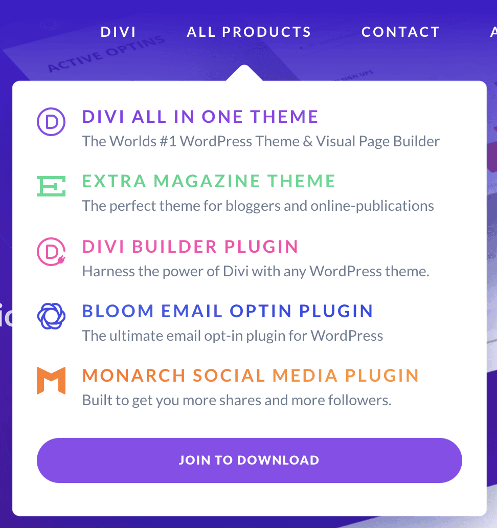
As the site is now, visitors would have to navigate around the site in order to find the landing page for each theme, so it’s less likely that a visitor will actually check all the themes available.
Live Chat
Using live chat on a plugin or theme website is a great way to connect with customers, get to know their needs, and answer any immediate questions. When I opened the live chat though, I saw a message at the top that said “Last active 12/20/2019” – which is over 2 months ago as of the time of writing.
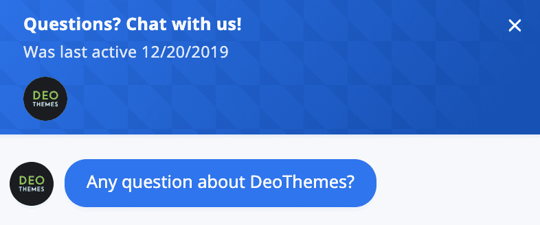
I suggest checking the live chat software and see if this time marker can be removed altogether or kept up to date. It might make some website visitors feel like they’re unlikely to get a support response any time soon, and may turn off some potential customers.
There’s no real reason to have a live chat function that isn’t being actively used unless you prefer to have it there just for submitting email tickets. If that’s the case, it should be clear that there won’t be an immediate response and that the user will have to submit their email address to hear back later.
Potential for Growth
While there’s a lot of other strategies that can be tested out, these should help in optimizing conversion rates and retaining new customers for now.
Feel free to comment below and request a product audit or share your feedback/questions and we’ll be in touch.
Thanks for reading folks and cheers to growing your sales!



Great points, we'll definitely invest more time in fixing these issues. As a side note, we've recently switched from selling on ThemeForest to our own theme shop. And the results has been astonishing. Thanks to Freemius and wordpress.org we've made about 25% of our Envato revenue, just in the 1 month. W00t! :)