|
|
We’ve analyzed hundreds of pricing pages and spotted the same issues over and over — from both Freemius makers and other WordPress developers. Most are making simple mistakes that kill their sales without realizing it.
Want to stop leaving money on the table?
Check out our selection of top-converting pricing pages (plus a blueprint and Elementor template) to show you exactly what works. Think of it as your go-to checklist for building or tweaking pricing pages that actually convert.
Pricing Page Best Practices for WordPress Products
Building a killer pricing page isn’t just about making it look pretty — optimizing for conversions goes way beyond this. From the moment someone lands on it, you need to:
- Prove your worth
- Build trust
- Guide them to the right plan
- Get them to buy (without overwhelming them)
We’ve built a blueprint that shows you exactly how to do this.
Download Pricing Page Blueprint
Tired of running your WordPress business alone? We’ve done the work for you. Get our ready-to-use Elementor template and detailed blueprint — just add your details and go.
Subscribe to our blog & grab your free Pricing Page Blueprint
& Elementor Template
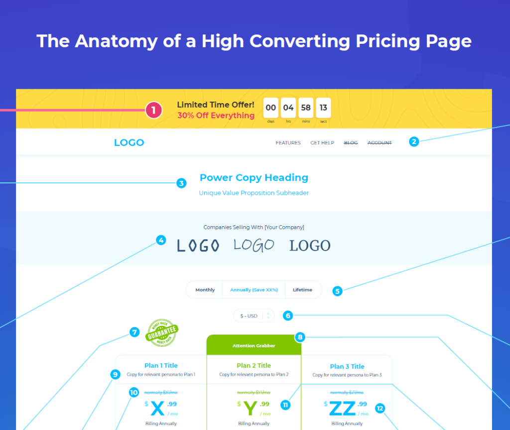
Download your free template with our annotated blueprint for a high-converting pricing page.

Let’s dive into how to make this template work for your business.
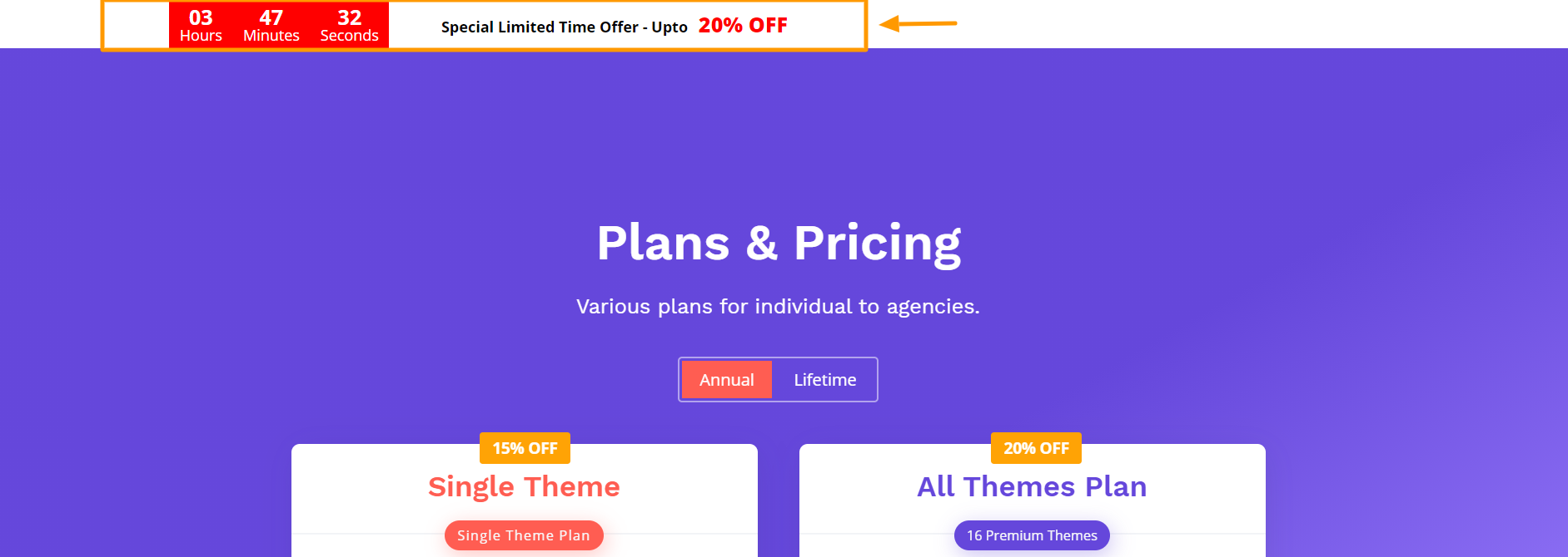
1. Create Urgency
Humans are hardwired to act in urgent situations. So, it makes sense that creating urgency to boost conversions is one of the oldest tricks in the marketing handbook.
An effective way of creating this ‘pressure to purchase’ is with FOMO (Fear of Missing Out).
Humans are hardwired to act in urgent situations & an effective way of creating pressure on your pricing page is using tactics that create FOMO.
You can trigger FOMO by:
- Displaying the number of users who are benefitting from your product or service
- Showing scarcity by displaying limited licenses or limited time to buy the product
- Offering exclusive deals or early-bird discounts for beta customers or pre-release adopters
- Displaying time-based or ‘temporarily permanent’ (always available) offers that countdown to ‘sales end’ in a certain number of hours/days
-
- This works particularly well in the plugin or theme industry because a visitor most likely won’t return to your pricing page as often as they would to a grocery store next to their house. Plugins and themes are purchased infrequently, especially if you don’t sell monthly options.
- Disclaimer: This ‘temporarily permanent’ discount recommendation may be illegal in parts of Europe, so to err on the side of caution it’s a good idea to check on the legalities in the markets where you sell your products.
While creating urgency can reap the sales rewards, you need to be subtle about it. At no time should the customer feel as if you’re overly pushing your product and manipulating their decisions.
An example of urgency done right is ThemeGrill’s countdown timer, which displays a discount of up to 20%. Although this offer is always available, it creates a sense of urgency for new visitors and could drive them to buy.
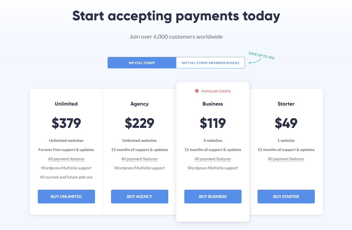
2. Reduce Exit Points
An exit point is any link that distracts visitors from clicking on the main CTA — which is to make the purchase. You can’t remove every single link from a pricing page as they can provide valuable supplementary product information to visitors who’d like to know more about specific features and benefits. The trick is to avoid over-emphasizing the links and grouping them too close together.
Here’s how to reduce unnecessary exit points:
- Create a unique pricing page header and navigation menu with fewer options than your standard website header (same for the footer!)
- Avoid adding links to individual features in the plans comparison section
- Avoid adding popups; they can be pretty distracting and even irritating enough to drive visitors away from your page
It’s a fine balance between making sure visitors don’t feel restricted when navigating or overwhelmed by an abundance of badly placed links.
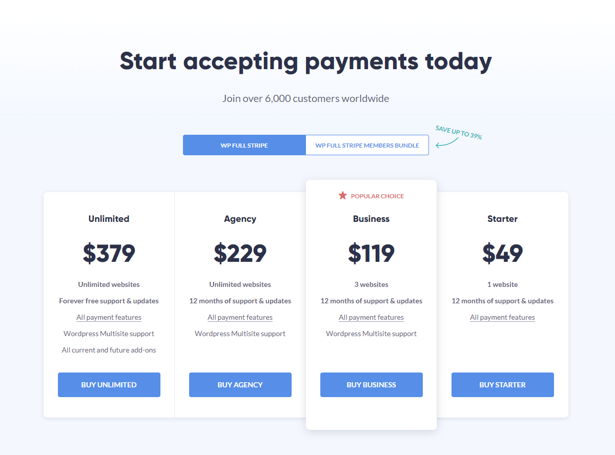
A balance that WP Full Stripe’s pricing page strikes well.
The page has a trim, no-frills structure (I count only one link unrelated to pricing or bundles) and focuses the visitor’s attention on the pricing plan CTAs. Even the ‘Select Your Package’ link at the bottom of the page leads right back to the pricing table. Not many exit points here!
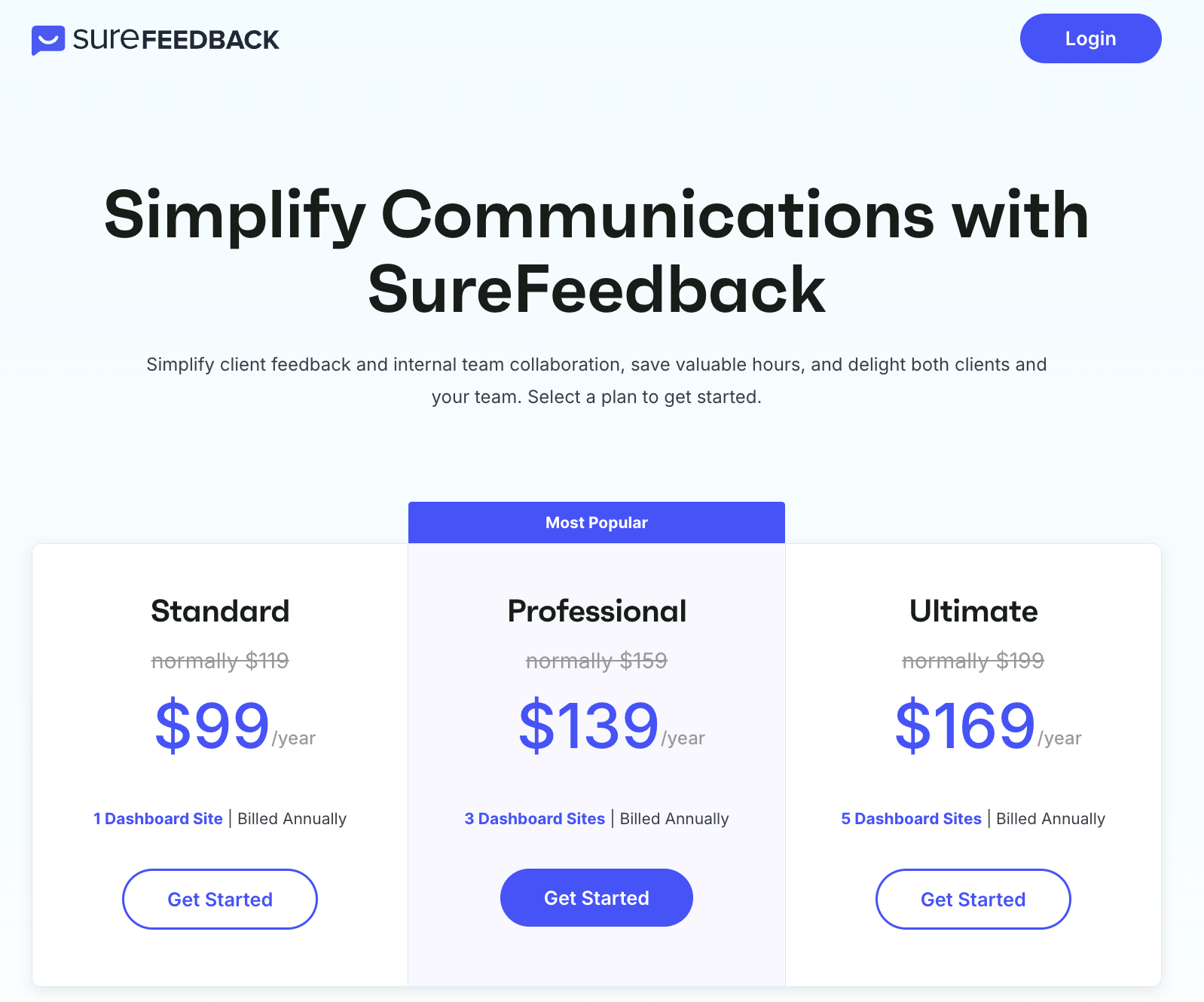
3. Keep the Design and Copy Simple
When it comes to writing and designing web pages, err on the side of simplicity. This is especially true for pricing pages, where visitors have clear purchase intent and shouldn’t be distracted from it.
Bombing your pricing page with loads of elements or long and meandering copy can result in visitors being unable to comprehend the information presented to them. This is called cognitive overload, which happens when the amount of information supplied exceeds a person’s information processing capacity.
For example:
- Unnecessary steps that divert people from a specific goal
- Cluttered design and too much content, with no clear path for the eye to follow
- Too many options to choose from (otherwise known as Hick’s Law or decision paralysis)
- Visual inconsistencies, such as different font sizes and colors, or CTAs that don’t talk to the on-page offering
Avoid the above and let your pricing page breathe by strategically placing areas of “white” space between elements, taking care to include only the necessary copy:
- A product description and a value proposition
- A concise breakdown of your plugin or theme’s most persuasive features
- Highly visible pricing options and differentiation between plans and their features
- A CTA that ‘pops’ and clearly states what action the user should take next
It’s not a given that your pricing page visitors are sold on your product — you should assume they need more convincing. Your value proposition needs to succinctly explain what your product does, why it’s superior to alternatives, and how it solves a specific pain point or enriches a person’s life.
I recommend including this in the header section just below your ‘power copy heading’ or just after the pricing plans. Supplementary information — such as common user queries — can be included in the FAQ section or after the above information.
It’s your choice how lean you want your pricing page to be, and a good example of this ‘less is more’ strategy is SureFeedback’s pricing page:
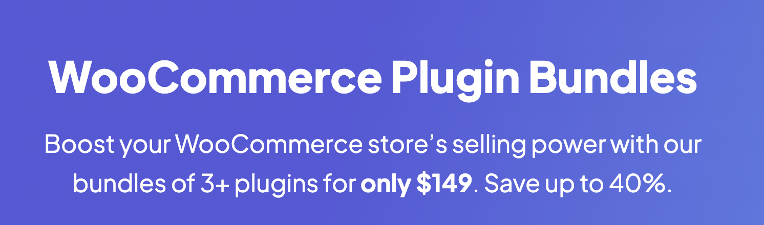
4. Clarify the Value Proposition
Naturally, visitors will ask themselves why they should choose your product over alternatives — and you need to answer them persuasively.
This is where your value proposition comes in. A value proposition explains the need your product fills, the benefits a person can expect from using it, and why it’s better than the alternatives. It’s a concise piece of copy that should tap into and influence a person’s decision-making process.
While you don’t have to create a standalone section that compares your solution to competitors, you must explain why your product is superior. You can achieve this by highlighting your number of active customers or mentioning why other customers use your product and what they gain from it.
IconicWPhosts multiple plugins that help boost conversion for WooCommerce websites. On the bundles pricing page, the heading and subheading explain why the bundle is worth the price tag and exactly what users can expect from it:
5. Include a Monthly Payment Option
Would you consider your plugin expensive compared to the industry standard for alternatives/competitors? If yes, you can make the price less daunting by giving potential customers the option to pay monthly.
It then makes sense to also show the annual prices in monthly increments to help a potential buyer compare the billing cycles.
For example, instead of displaying $100 / year, you can show $7.99 / month that’s billed annually (which works out to ~$96). Psychologically, committing to $7.99 is much easier than $100 per year because it feels like you’re opting for a single-digit price instead of a three-digit price.
In parallel, this technique makes your offer more compelling to buyers who only require your product for the short term. So, even if the monthly price is $19.99 / month, buying your product will be more affordable than your competitor’s.
Check out a pricing experiment we conducted where the removal of a monthly payment option immediately reduced 50% of the annual plan sales. This showcases the power of selling monthly along with annual.
For a monthly payment option to work, a subscription-based service should be in place to automatically charge those customers every month. If your customers have to renew the same subscription every month themselves, offering monthly payments won’t work as effectively because many of them may forget to pay, and some will cancel the service because the manual process is irritating.
While automatic monthly payments are great for customer retention and help you predict your revenue, you need to protect yourself from people with ill-intent. Make sure you can limit some functionality on the server side so that your product is safe from being exploited and you are not giving away the entire product in the first month.
If you are not sure whether monthly subscriptions can work for your product, download our cheat sheet to help you decide:
Grab a free copy of our Cheat Sheet for
Selling Plugins and Themes
A growth roadmap with concise, actionable tips for every milestone of WordPress product development.
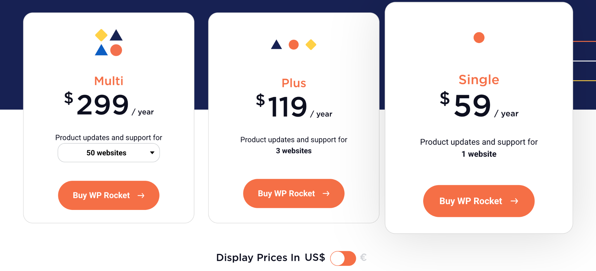
6. Allow Payments in Multiple Currencies
Regardless of where most of your paying customers are located, you should give visitors the choice to pay in their native currency. In addition to creating a positive customer experience, a multi-currency option can boost conversion rates and make it easier to expand your reach into different global markets.
Admittedly, the technological side of things can be challenging if you are self-managing your store. That said, the pros of implementing payments in multiple currencies outweigh the cons in terms of conversion rate and customer satisfaction.
One solution is to integrate the functionality by installing an add-on if you sell with WooCommerce or EDD. Another is to use Freemius, where you get multi-currency functionality built-in. Currently, we support USD, EUR, and GBP.
A good example of a simple, intuitive multi-currency option can be seen on WPRocket’s pricing page. Below the table, there’s a toggle option to switch the price from US Dollars to Euros, making it easier for European customers to purchase the product (presumably because the team has observed growth there or would like to tap into that market). Once the switch is toggled, all the observable prices change, right down to the sticky footer.
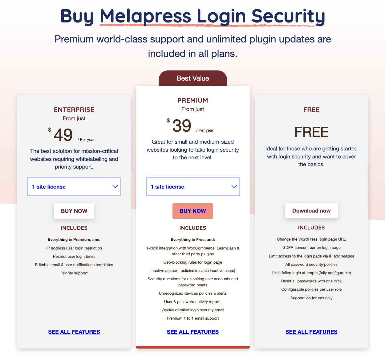
7. Make It Easy to Find Prices
Most of your visitors are on your pricing page to compare costs and plans. If this information is difficult to find they’ll get frustrated (and maybe even a little suspicious).
For example, if you only reveal your prices at checkout (after the visitor has clicked the buy button), they’ll be more likely to abandon the purchase. Why? Because people don’t like being blindsided.
A checkout page is perceived as purely transactional, and surfacing a number on a standalone screen for the first time can make that price look more expensive. Avoid this friction by being upfront with your pricing and placing the tables near the top of the page, as visibly as possible. It’s psychologically more appealing for potential customers to see your product, value proposition, and pricing as part of a cohesive package.
Focus on “what customers will get for the price” rather than “what customers need to pay”.
Password Policy Manager for WordPress follows a standard pricing table structure. When a visitor opens the pricing page, they are presented with a three-tier pricing plan that clearly explains the prices for different durations (monthly or yearly billing). Nothing hidden here!
8. Highlight a Recommended Plan
It’s standard for pricing pages to offer three to four plans. To ensure a potential customer doesn’t experience decision paralysis, recommend the plan you want to be the best seller (your target plan). Simply highlighting the plan by making it slightly larger or adding a ‘most popular’ badge does the job.
It’s worth mentioning that highlighting a specific plan also directs the customer’s attention to the plan you want to push. Here are some of the common practices:
- Highlight your preferred plan’s border
- Add a badge or label with ‘Most Popular’ or ‘Best Value’ text
- Place it next to the most expensive plan to make your preferred plan’s pricing more enticing
ThemeGrill does this well:
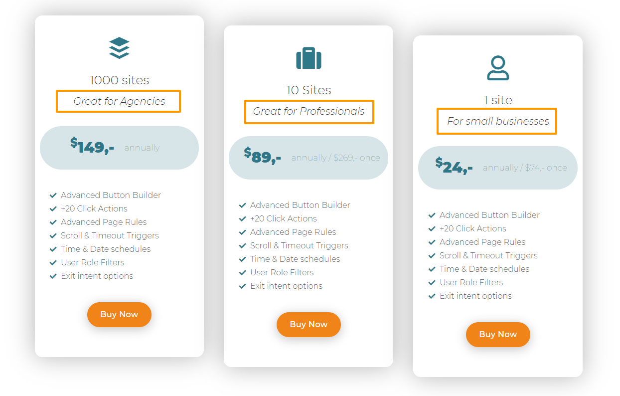
9. Help Visitors Choose the Plan That’s Best For Them
For the most part, WordPress plugin and theme customers fall into four categories:
- Freelancers
- Website owners
- Agencies
- Maintainers
While you can’t identify your visitor’s category, you can create pricing slabs catering to each user category.
Buttonizer makes it clear which plan is suited to who with the number of licenses (the main differentiator) and a simple line of copy above the price:
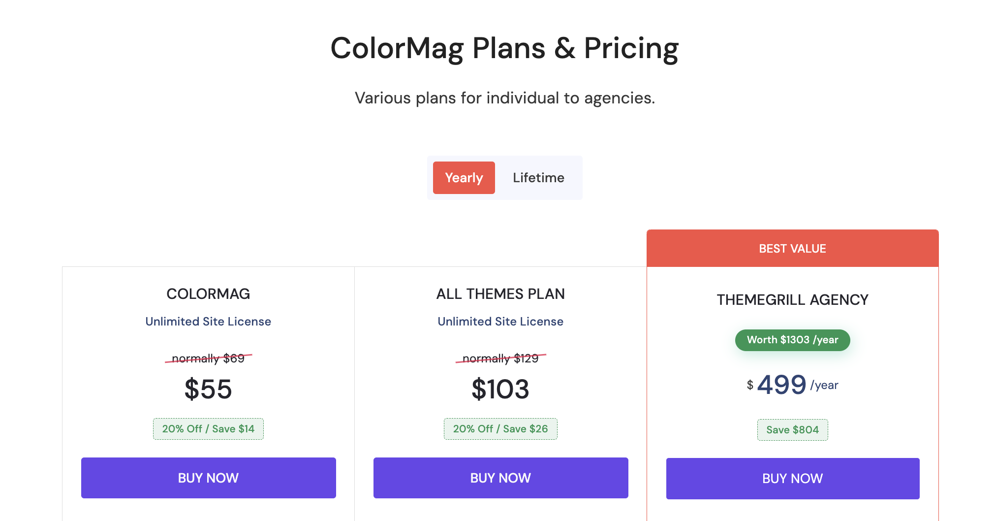
10. Consider Price Anchoring
Price anchoring is a form of cognitive bias that taps into a person’s inclination to make buying decisions based on the first price point they see. For example, a $3000 watch will appear expensive if there’s nothing to compare it to, but if you put it next to a $15000 watch, it’ll seem more reasonably priced.
Even big brands use it to make the price of a product more appealing. Remember the iPad launch event? During his speech, Steve Jobs cleverly displayed a large $999 price tag on the screen. When it was time to reveal the price point, he declared that the iPad was priced at $499 (to an enthusiastic audience).
Would the attendees have had the same reaction if the $499 price tag had been on the screen all along? I don’t think so.
You can also use this technique to steer your customer in the right direction. Simply placing a higher-priced plan before your preferred plan will make its price seem more reasonable.
Take a look at how WP Full Stripe anchors the prices by displaying their expensive plans first and their recommended plan after them.
11. Charm Up the Prices
We can’t escape the fact that our unique psychological traits drive us to make decisions, whether we’re aware of them or not.
Charm pricing is a technique that taps into our subconscious drivers to make a price tag more appealing or nudge a person toward a particular plan or product you want them to buy.
Simply put, reducing round numbers by one cent so that they end in ‘9’ or ‘99’ makes the price tag look far more enticing to potential consumers. For example, dropping a listed price of $100 down to $99.9 or $99.
Not convinced? In an experiment by MIT and the University of Chicago, women’s clothing was used to test this effect with prices set at $34, $39, and $44. Proving the power of ‘9’, sales were higher for the $39 price tag.
Here’s how Divi Kingdom uses the number ‘9’ to charm its potential customers:
12. Avoid Selling Unlimited Lifetime Licenses
While this isn’t a ‘set a stone’ rule and your business strategy will dictate your choice, you should generally avoid offering unlimited licenses.
As mentioned earlier, offering unlimited lifetime licenses caps the amount you can charge potential clients, which is especially important if you cater to bigger businesses that can afford to pay more.
If an enterprise-level agency can buy an unlimited lifetime license when they purchase one of your plans, why would they contact you to discuss your tailored offerings?
Likewise, suppose a ‘real’ enterprise client lands on your pricing page and sees that your ‘normal’ plans offer unlimited lifetime licenses. What would be the point of them opening discussions (and paying more) if smaller clients have lifetime access and there’s nothing to negotiate?
Ultimately, offering unlimited licenses is poor practice. The only cases I can think of that make sense are if your product targets agencies or all of your competitors are doing it, and you don’t want to be left behind.
So, a good rule of thumb is to offer lifetime licenses (but not unlimited lifetime licenses!) when pricing correctly. Further to that, if you’ve been in the market for a few years and know the average CLV of your product is, let’s say, two years, then you can consider offering a lifetime plan, which is somewhere in the region of three times your annual subscription.
If you wish to learn more about offering lifetime licenses, check out Lifetime license for WordPress plugins – the right way!
13. Make Each Plan Distinct With Clear Feature Differentiation
Developers often fall into the trap of making the number of sites/licenses the only clear difference between plans. This is strategically unsound because — except for products that specifically target developers and agencies — most of them have vast target audiences that consist of users with a single website. Not three, and definitely not 20.
It follows then that if the only differentiation between your plans is the number of license activations, you automatically make the higher plans irrelevant to a huge majority of your audience. There’s just no reason in the world for someone with a single website to go for a higher-priced plan, regardless of how appealing the discounted prices are.
This simple restriction makes the lower pricing tiers the most popular by default, limiting room for pricing psychology — the buyer essentially becomes blind to anything else because the higher-priced plans are simply irrelevant to them.
Prospects will have more reason to choose one plan over the other if you clearly differentiate your plans by adding (and subtracting) features. More options mean more reasons to purchase, which can equal a higher rate of conversions and higher ASP (Average Selling Price).
To make one plan look more appealing than the other, consider stripping features from lower-priced plans and adding attractive, killer features to the plan you want users to gravitate towards — the previously mentioned ‘target plan’.
This way, your users will have several unique, financially sound reasons to choose the higher-priced plan.
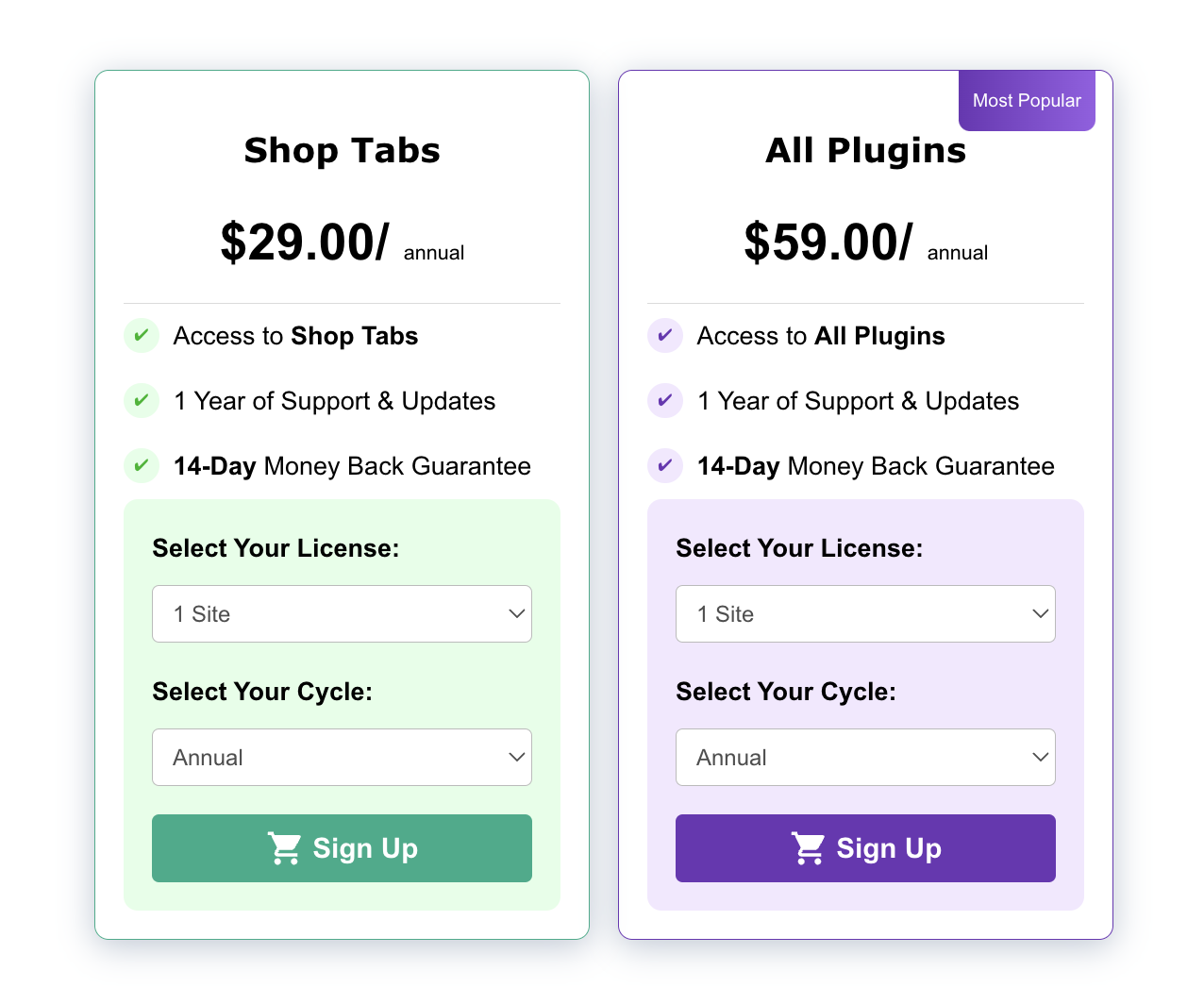
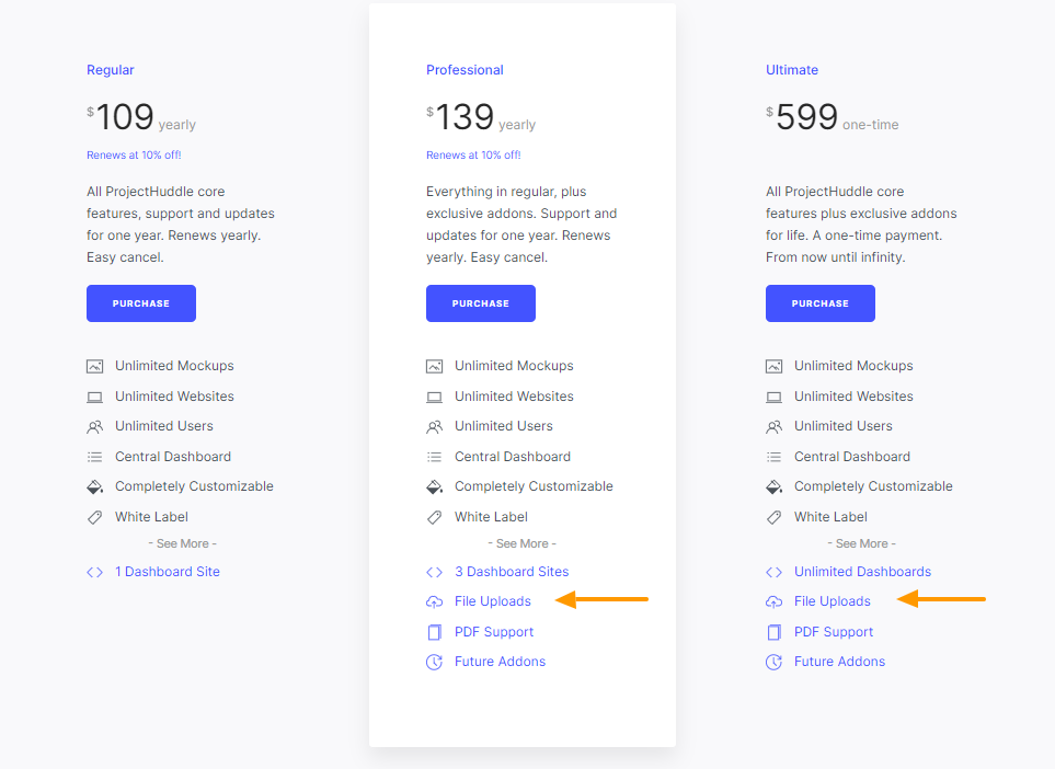
Take a look at SureFeedback’s pricing page. The regular, lower-priced plan does not include appealing features like file uploads, PDF support, and future add-ons. The only way to get these features is to choose either the Professional or Ultimate plan.
14. Be Specific About the Value Your Bundles or Memberships Offer
If you run a theme shop, an add-ons-based plugin business, or have multiple complementary products, offering bundles or memberships is a great way to upsell. But, many developers fail to convey the specific value each bundle package brings to the table.
For example, many theme shops will plug an upsell bundle when users decide to buy a single theme. Showing the buyer that they can get an additional 30 themes for an extra $50 may sound like a compelling financial offer, but it has no value-based meaning if you don’t clarify what those 30 themes are or what specific value they offer.
It would be the equivalent of selling a black box with the message: “Pay us an extra $50 for more! Trust us, it’s worth it”. You need to provide some insights into why the bundle is worth purchasing apart from getting X number of themes for a better price.
You don’t need to put down every single product included in the bundle, but you should mention your most appealing and popular ones in bullet points or short, digestible chunks of information. Highlight the verticals/niches that the packages cater to — this will focus the relevant buyer persona’s attention on the bundle intended for them.
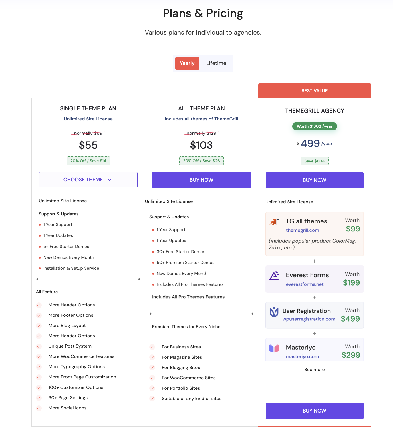
ThemeGrill uses this technique well. When a user lands on their single theme pricing page, they are presented with an option for the ‘All Themes Plan’. The tier highlights ThemeGrill’s three most popular themes and which verticals the themes are designed for. The bundle is made even more appealing by extra benefits such as ‘Access to Future Themes’.
15. Make Your Buy Buttons ‘Pop’
I’ve seen many pricing pages — most notably for themes — where the buy button/call-to-action (CTA) is ‘hidden’ at the bottom of the page, meaning visitors must scroll for miles to uncover where they should take action.
This is an obvious friction point in the buyer’s journey and could irritate prospects enough to make them abandon mid-scroll.
In addition to placing your CTAs close to the top of the page, these simple techniques will make them more impactful and subtly nudge visitors to click on the plan that you want them to:
- Use contrasting colors to make the buttons ‘pop’.
- Include ‘mouse hover’ animations to pull the visitor’s gaze toward the button(s)
- Enlarge the CTA of your preferred plan and use another color to differentiate it
- Ensure your CTA makes contextual sense. If your page copy talks about starting a free trial, adding ‘Buy Now’ to the button creates a disconnect and will confuse visitors. A better, more logical way of getting people to click would be ‘Start Your Free Trial’ or ‘Get Started’.
Here’s a good example:
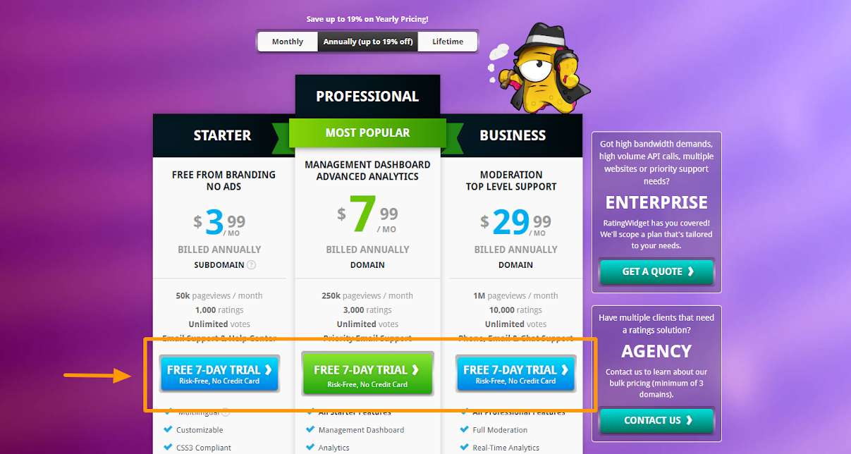
Rating-Widget offers a 7-day free trial, which is clearly mentioned in the CTA along with the subheader ‘Risk-Free, No Credit Card’. This copy reassures visitors and highlights the persuasive benefit of going with the free trial.
16. Offer a Free Trial
This is more of a business strategy than a pricing page optimization technique, so it’s important to ascertain if offering free trials makes sense for you.
For example, if it takes time for your product benefits to materialize, then offering 7-day free trials won’t make much sense.
But, if users can see positive results from your plugin off the bat, then free trials can significantly boost conversions by making the onboarding process easier and allowing users to explore all of the paid features with no strings attached.
When deciding on the validity and logistics of offering free trials, consider the following:
- Does your product’s value grow over time?
- Is it hard for your customers to switch to a competing product?
- Should you ask for credit card details for free trial signup?
- How long should your free trial be?
We answer these questions in our Ultimate Guide to Free Trials for WordPress Plugins and Themes.
17. Avoid Highlighting the Free Version
It’s pretty much taken for granted that there will be more free-to-paid upgrades than direct purchases in a freemium business. If that is not the case, then something is wrong with the design of the freemium model structure of that business.
Regardless of the ratio, a free offer should not be highlighted as it will reduce your conversion rate to paid. Think about it — if there’s no free offer on the site, a visitor will either purchase or abandon it. However, if there is an option, it will reduce the number of visitors buying as some will opt to go the free route.
That said, there are benefits to offering a free version. One is that it can increase conversions by making onboarding easier and allowing users to take the product for a spin before making a paid commitment. If they like it, they’ll buy it. The other obvious benefit is that it is simply better to get a free user (who may become your ambassador if they truly enjoy the product) than nobody at all!
So, how should you go about offering a free version if you want to avoid highlighting it?
Save your free version as a ‘last resort’, but only if you don’t offer free trials without a payment method. There are enough solid UX mechanics and techniques to visualize this ‘last resort’ offer effectively (such as a pop-up/under triggered when a user has spent a certain amount of time on your pricing page).
The Buttonizer Pro plugin uses this technique well. At first, only the paid plans are listed on the pricing page. After around 10 seconds, a pop-under appears in the lower-right corner, informing visitors about the free version. Those straddling the fence may be convinced to give the product a go when there’s no monetary commitment.
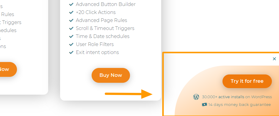
There’s also a CTA section at the bottom of the page that presents visitors with free and premium links. This is a clever ‘last effort’ to convince undecided (or day-dreaming) visitors
who’ve scrolled down to take action.
In terms of where the free version should be in your pricing page CTA hierarchy, I recommend you order them as such:
- Paid offer
- Trial with a payment method
- Trial without a payment method
- Free version
If you do offer a free trial without a payment method, I advise revealing it in the exit-intent popup instead of your free version. There’s an increased likelihood that users will upgrade if they’ve used the product successfully up until the trial’s end.
Not convinced the above would work for your particular plugin or theme? Another effective method is to add limited-time free trials for your product’s paid version. But more on that later 😉
18. Address Concerns as Much as Possible
Your product’s value proposition has likely struck a chord with your pricing page visitors. Even so, they’re still in the research phase and need to be convinced that your prices and features align with their needs. Even more importantly, that the business behind the product is credible.
While some visitors will be assured by an SSL certificate, others need more convincing before handing over their credit card details. For the more cautious, adding security badges to your pricing page is a good way to go.
To build confidence in their payment gateways, many of our makers use the Freemius security badge to assure prospects that there’s no need to be concerned about their credit card info ending up in the wrong hands.
Here’s how FooGallery allays any concerns potential customers may have about security:
Further to that, you should also make your payment methods super clear so that visitors know they can easily purchase using their tried-and-trusted payment method. Here’s how OceanWP, one of the most popular WordPress themes, uses badges from trusted payment gateways to build credibility:
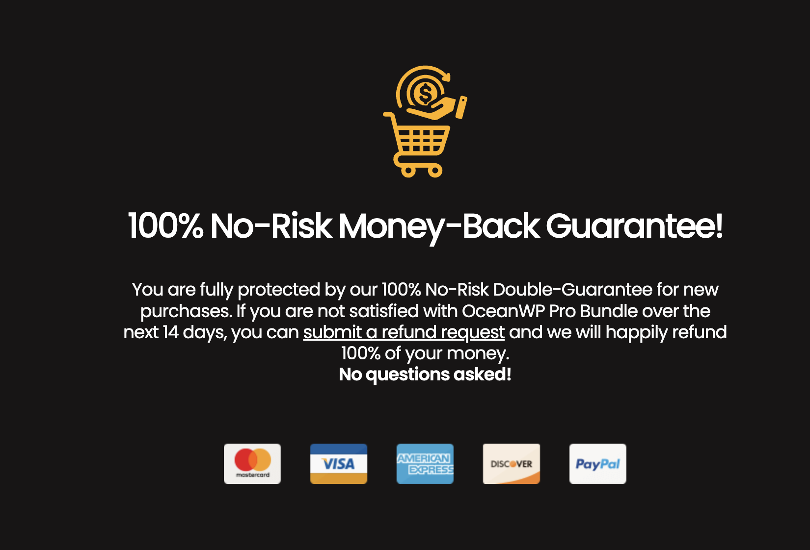
There will be instances where the above techniques are not enough to convince a visitor to purchase. For these scenarios, a money-back guarantee and making your refund policy as clear as possible will give prospects ‘purchase peace of mind’ as they know they’ll be able to recoup costs should the plugin or theme prove unsatisfactory.
Remember, part of a successful buyer’s journey is addressing as many potential customer concerns as possible.
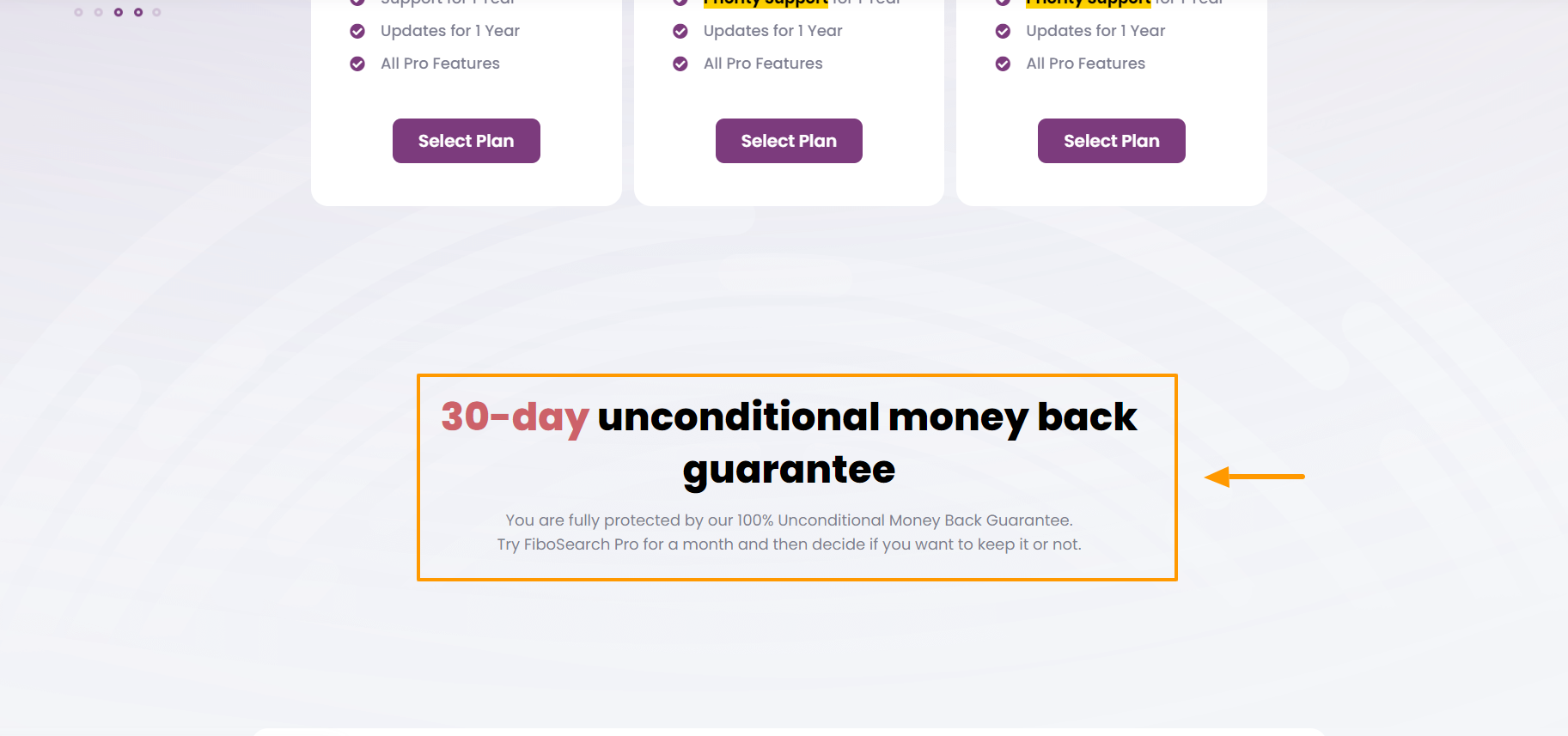
In the below example, FiboSearch sets the tone for a positive business relationship by offering a 30-day money-back guarantee, using impactful words and phrases like “unconditional” and “fully protected”:
19. Cater to Enterprise Clients
Broadening the scope of your target market to include enterprise clients can increase your revenue in a big way. That said, business dealings with larger clients can be more demanding, complex, and time-consuming.
For example, not only do you need to tailor a custom plan/price for each enterprise, but you also have to go through multiple steps and decision makers to close the deal, as bigger companies tend to have longer sales cycles.
You’ll probably get fewer enterprise requests in comparison to other clients, but if you can convert even one or two of them, you’ll be able to increase your overall revenue significantly. I’ve seen plugin and theme developers quote 20 to 30 times more than what an average customer pays and still convert an enterprise client!
To cater to larger companies on your pricing page, consider implementing the following techniques:
- Add a ‘Contact Us’ option next to the pricing slabs specifically for enterprise businesses
- Do not quote a price/price range, as there’s no one-size-fits-all solution, and packages should be tailored to each client
- Avoid selling unlimited lifetime licenses, as this puts a cap on the amount a business can pay you
- Add trust badges and your existing enterprise client logos (if you have any) to the ‘Contact Us’ page.
- Be available and prepared for a pre-sales call with potential enterprise clients when needed.
- You’ll be quoting numbers higher than your normal (clearly visible) pricing tiers, so you need to be able to justify why you’ve increased the cost.
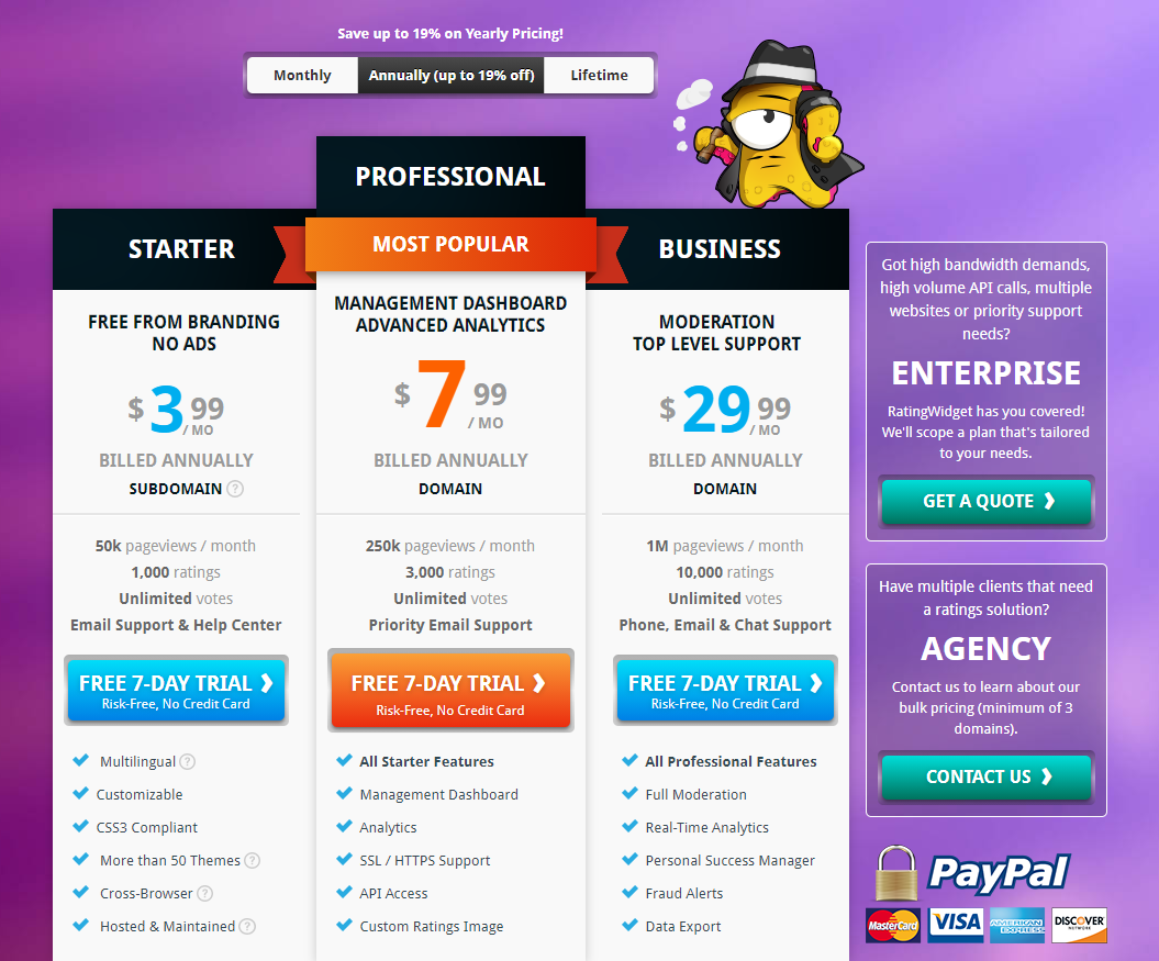
As a good example of how to specifically cater to larger businesses, Rating-Widget’s pricing page directs visitors from larger businesses to an enterprise-specific page with an eye-catching ‘Get a Quote’ CTA button beneath a bold header that clearly states who the tailored plans are for.
For more information on increasing sales from bigger businesses, check out this in-depth article about selling WordPress products to enterprise companies..
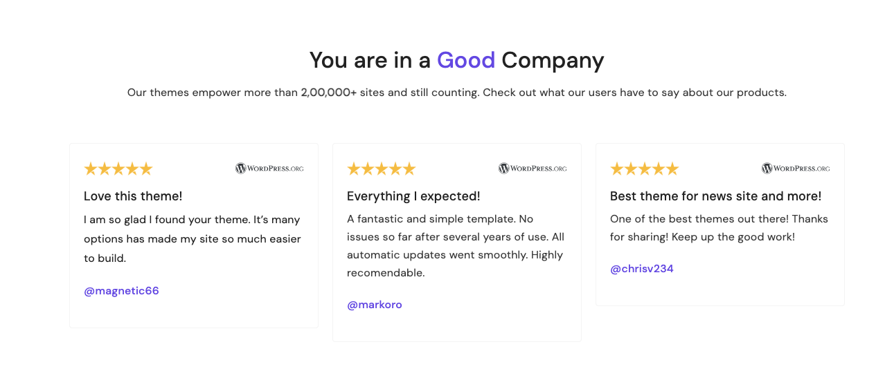
20. Add Social Proof
Testimonials and reviews are a go-to method for adding social proof and product validation to your pricing page. You should choose reviews that answer questions or clear up any doubts a potential customer may have, as well as testimonials from respected figures in the WordPress ecosystem to boost credibility.
Don’t have any at the moment? Not a problem! This video will teach you how to generate and curate glowing reviews and testimonials for your plugin and theme.
Here’s how ThemeGrill showcases theirs:
Another way to build trust through social proof is by adding logos of popular brands that use your product. You can handpick the logos and create a full-width banner to showcase your bigshot clients.
Here’s how REI Conversion (a product for land investors) uses industry brand logos to boost their social proof.

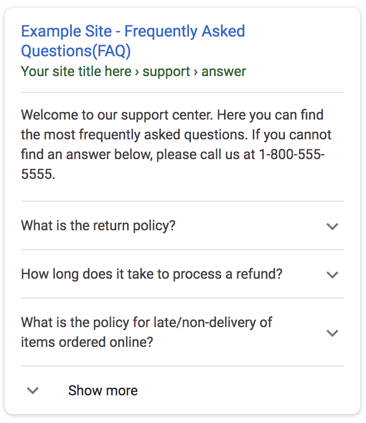
21. Add an FAQ Section
A pricing page FAQ should assist visitors without them having to contact support (which adds unnecessary friction at this point). To enrich this section and empower your visitors, you need to identify the common business-related queries, concerns, and objections prospects and customers have about your product.
One of the most common things potential buyers seek in an FAQ is information about your refund policy.
While there is a wide spectrum of refund policies (such as ‘no questions asked’ guarantees), the main purpose of highlighting the refund policy here is to align expectations on what the buyer can expect — and not necessarily to guarantee money back if they aren’t satisfied with the product.
Being transparent about your policies in advance can build credibility/confidence by assuring potential customers there won’t be any surprises down the line.
Additional FAQ best practices include avoiding product technicalities and focusing on renewals, subscriptions, free trials, product plans, and usability.
But the benefits of an FAQ don’t end there!
Beyond helping to create a streamlined buyer’s journey, an FAQ section can also improve your pricing page’s visibility. You can take advantage of this by implementing an FAQ schema with structured data. This will help your FAQ section pop up in Google’s search results, which can boost your SEO score and even get you featured in the snippets section on Google’s first page.
Here’s what an FAQ schema’s rich results look like:
22. Add an Exit-Intent Popup
Proven to improve conversion rates, exit-intent popups are ingenious mechanisms that give you one last chance to convert visitors as they leave your website. Set it up once, and it’ll work automatically to save sales opportunities before they’re lost!
For pricing page popups, providing a discount works best. By giving ‘abandoners’ a limited-time discount, you give yourself the best shot of turning visitors into paying customers.
At Freemius, you get this functionality built-in. When a potential customer moves their cursor out of the tab, this triggers an exit-intent popup, giving the visitor a chance to activate the discount code before they leave.
This is how WPStackable uses the exit-intent mechanism:
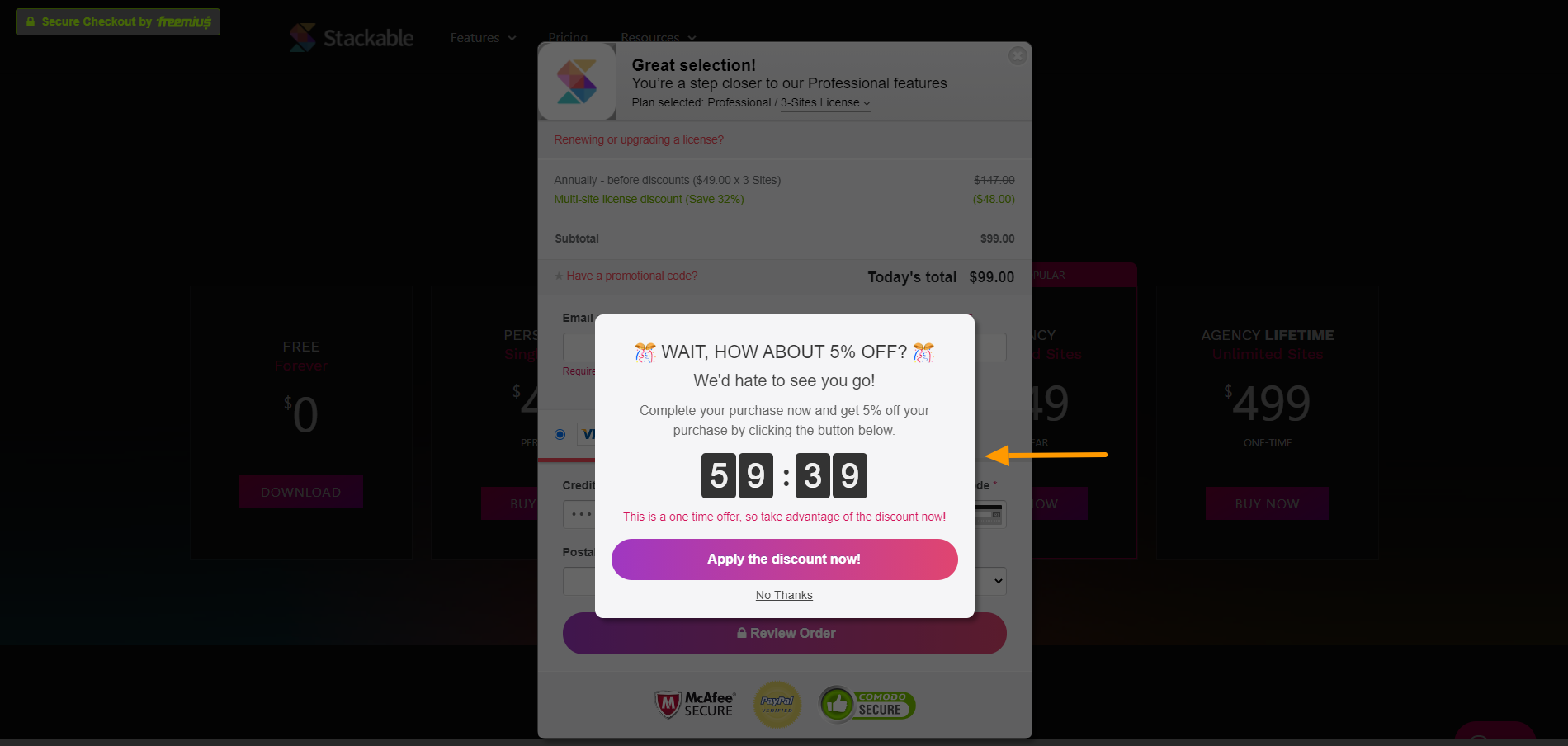
Offering a discount is a great technique to reel visitors back in, but you need to calculate a discount percentage that’s big enough to grab the visitor’s attention and still makes financial sense for you.
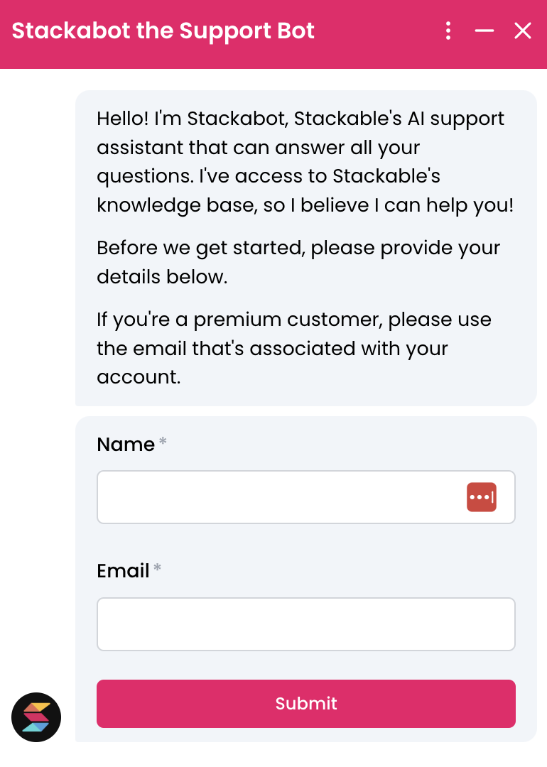
23. Be Ready for Pre-Sale Queries
Most people have questions about a product or service before they commit to buying it, and you can cover many of these in the FAQ section. Of course, FAQs can’t answer every single question a visitor may have, so you need to include a simple way for them to contact you.
Such as live chat.
Online customer support software can be highly effective because it connects visitors who have queries or complaints to flesh-and-blood humans with answers and solutions (in real time). There are plenty of reliable options to choose from, such as Drift, LiveChat, ChatBot, and Olark. Find the one that suits your requirements and get chatting!
If your team is small and cannot handle a high live support load, you can add a ‘Contact Us’ option that lets you respond in due time. But don’t take too long! You should strike while a potential customer’s sales intent is hot and reply to presale queries as soon as possible — the longer you take to reply, the more likely it is they’ll search for alternatives.
Here’s how Stackable uses the live chat icon to answer pre-sale queries.
Keep Testing and Improving
There’s no one-size-fits-all pricing page strategy; just because something worked for one business doesn’t mean it will work for you. Your pricing page is unique to your theme or plugin, so it requires constant testing, optimizing, and fine-tuning to improve the conversion rate.
Testing out new techniques, analyzing the results, and taking actions based on those analytics is the essence of effective marketing.
If you are thinking of rebuilding your pricing page, take a step back, research, and try to understand your buyer’s journey. Consider the CTA, headline, features, FAQs, and even the actual pricing, and then start building the page for the results you want.
Keep in mind that multiple, simultaneous tweaks tend to give inaccurate and unactionable data. If you are making major changes, it’s good to implement one at a time to get accurate results from that specific optimization. One step at a time 🙂
Want to read more about putting the right price on your plugin or theme? Check out our guide to pricing WordPress products.