Customize Checkout Style with CSS
You can always write any custom CSS to modify the style of the checkout in any way you want. But the checkout has two layers of abstraction with CSS variables to help you do some easy modifications.
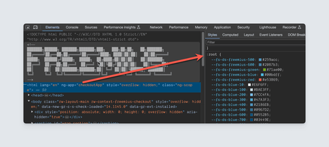
Please use the devTool and inspect the :root (html) element to discover the variables.
Below, we give you some quick introductions.
Layer One - Color Palettes
--fs-ds-freemius-*: These are the Freemius brand colors and are used by default as primary and accent colors.--fs-ds-blue-*: These colors are used as complementary colors or replacements as primary in the SDK embedded checkout.--fs-ds-neutral-*: Used for text, background, border, separator, etc. Majority of the components of the checkout use colors from this palette.--fs-ds-green-*: Colors for success related components.--fs-ds-yellow-*: Colors for warning related components.--fs-ds-red-*: Colors for error related components.--fs-ds-white-*: Colors for the main background.
You will find that most variables come with a shade, for example --fs-ds-yellow-**100**, --fs-ds-yellow-**200**, etc. While replacing the colors, please try to keep the lightness at a similar level to the original color to make sure the contrast does not suffer.
For example, if you want to use the blue-gray color palette from the material design spec, you would want to write CSS like this:
:root {
  --fs-ds-neutral-10: #eceff1;
  --fs-ds-neutral-100: #cfd8dc;
  --fs-ds-neutral-200: #b0bec5;
  --fs-ds-neutral-300: #90a4ae;
  --fs-ds-neutral-400: #78909c;
  --fs-ds-neutral-500: #607d8b;
  --fs-ds-neutral-600: #546e7a;
  --fs-ds-neutral-700: #455a64;
  --fs-ds-neutral-800: #37474f;
  --fs-ds-neutral-900: #263238;
}
Please note that it is important to override the :root directly for the color change to take effect.
Layer Two - Theme colors
In the next layer of abstraction, we can define themes for different components. Search for CSS variables like --fs-ds-theme-* and you will find we define different combinations for different components you see on the page.
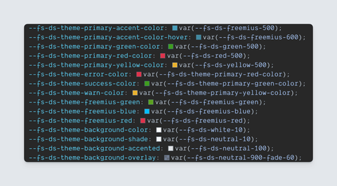
These variables always use values from the palettes, but you are free to modify them in any way you wish. This set of variables gives you the most flexibility to “theme” different components as you see fit.
For example, if you wish to change the primary color of the form to purple, just the following change in CSS is enough.
:root {
  --fs-ds-theme-primary-accent-color: #673ab7;
  --fs-ds-theme-primary-accent-color-hover: #512da8;
}
Just like before, please make sure to use the :root selector.
Other Variables
Apart from the major two types of variables, we also have the following:
--fs-ds-appearance-*: Controls component height, radius, animation, gutter, etc.--fs-ds-typography-*: Controls page typography, for eg, font size, line height, weight, etc.--fs-ds-box-shadow-*: Different box shadows used by different components.
We hope this information helps you to create a scalable CSS modification for your checkout which would guarantee minimum breakage when we update our system. Please feel free to contact us if you have any queries.
Styling SDK embedded Checkout
To style the embedded checkout from our WP SDK, apply your theme related variables directly to the .dashboard-mode selector. For example
.dashboard-mode {
  --fs-ds-theme-primary-accent-color: #673ab7;
  --fs-ds-theme-primary-accent-color-hover: #512da8;
}
This will make the colors purple only when the checkout is loaded from the WP SDK.
Adding your custom CSS from the Developer Dashboard
Once you have readied the CSS, you need to host it on your server with a https (secure) link.
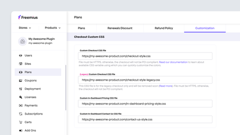
Then go to Plans → Customization and put the URL under the Custom Checkout CSS file field.